Concrete poetry
Concrete, pattern, or shape poetry is an arrangement of linguistic elements in which the typographical effect is more important in conveying meaning than verbal significance. It is sometimes referred to as visual poetry, a term that has now developed a distinct meaning of its own. As such, concrete poetry relates more to the visual than to the verbal arts and there is a considerable overlap in the kind of product to which it refers. Historically, however, concrete poetry has developed from a long tradition of shaped poems in which the words are arranged in such a way as to depict their subject.
Development
Though the term ‘concrete poetry’ is modern, the idea of using letter arrangements to enhance the meaning of a poem is old. Such shaped poetry was popular in Greek Alexandria during the 3rd and 2nd centuries BCE, although only the handful which were collected together in the Greek Anthology now survive. Examples include poems by Simmias of Rhodes in the shape of an egg,[1] wings[2] and a hatchet,[3] as well as Theocritus’ pan-pipes.[4]
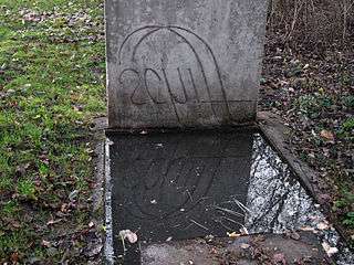
The post-Classical revival of shaped poetry seems to begin with the Gerechtigkeitsspirale (spiral of justice), a relief carving of a poem at the pilgrimage church of St. Valentin in the German town of Hesse. The text is carved in the form of a spiral on the front of one of the church pews[5] and is one of several decorative designs there created in 1510 by master carpenter Erhart Falckener.
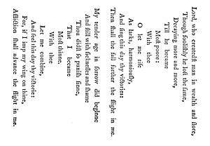
Early religious examples of shaped poems in English include "Easter Wings" and "The Altar" in George Herbert’s The Temple (1633)[6] and Robert Herrick’s "This cross tree here" (in the shape of a cross) from his Noble Numbers (1647).[7] An alternative religious precursor is Micrography, a technique for creating visual images by Hebrew-speaking artists who create pictures using tiny arrangements of Biblical texts organized usually on paper in images which illustrate the text used. As noted in the entry, micrography allows the creation of images of natural objects by observant Jews without directly breaking the prohibition of creating "graven images" that might be interpreted as idolatry. The technique is now used by both religious and secular artists and is similar to the use of Arabic texts in Islamic calligraphy.[8]
European secular examples include poems in the shape of wine flagons by Rabelais[9] and Charles-François Panard,[10] and the Slovene France Prešeren's "A Toast" (Zdravljica, 1844) with stanzas in the shape of wine-glasses.[11] This approach was taken up at the start of the 20th century by Guillaume Apollinaire in his inventive calligrammes, with poems in, among others, the shape of a necktie, a fountain and raindrops running down a window.
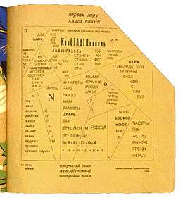
In that era also there were typographical experiments by members of avant-garde movements such as Futurism, Dada and Surrealism in which lay-out moved from an auxiliary expression of meaning to artistic primacy. Thus the significance of the sound poetry in Marinetti’s Zang Tumb Tumb (1912) is expressed through pictorial means. Similarly in Germany Raoul Hausmann claimed that the typographic style of his 'Phonemes' allowed the reader to recognise what sound was intended.[12] In Russia the Futurist poet Vasily Kamensky went so far as to term the typography of his Tango with Cows, published in 1914, 'ferro-concrete poems' (zhelezobetonnye poemy), long before the name became current elsewhere.
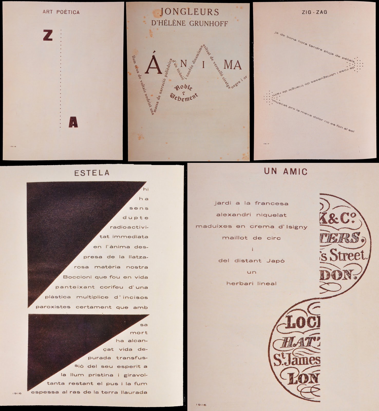
A further move away from overt meaning occurred where ‘poems’ were simplified to a simple arrangement of the letters of the alphabet. Louis Aragon, for example, exhibited the sequence from a to z and titled it "Suicide" (1926), while Kurt Schwitters’ "ZA (elementary)" has the alphabet in reverse,[13] and the Catalan writer Josep Maria Junoy (1885-1955) placed just the letters Z and A at the top and bottom of the page under the title "Ars Poetica".[14]
Post-war concrete poetry
During the early 1950s two Brazilian artistic groups producing severely abstract and impersonal work were joined by poets linked to the São Paulo magazine Noigrandes who began to treat language in an equally abstract way. Their work was termed "concrete poetry" after they exhibited along with the artists in the National Exhibition of Concrete Art (1956/57). The poets included Augusto de Campos, Haroldo de Campos and Décio Pignatari, who were joined in the exhibition by Ferreira Gullar, Ronaldo Azeredo and Wlademir Dias Pino from Rio de Janeiro. In 1958 a Brazilian concrete poetry manifesto was published and an anthology in 1962.[15]
Houédard claimed that it was the 1962 publication in The Times Literary Supplement of a letter from the Brazilian E.M. de Melo e Castro that awakened British writers such as himself, Ian Hamilton Finlay and Edwin Morgan to the possibilities of Concrete Poetry.[16] However, there were by this time other European writers producing similar work, principally Eugen Gomringer, who considered that a poem should be "a reality in itself" rather than a statement about reality,[17] and "as easily understood as signs in airports and traffic signs".[18] The difficulty in defining such a style is admitted by Houédard’s statement that "a printed concrete poem is ambiguously both typographic-poetry and poetic-typography".[19]
Another difficulty of definition is caused by the way such works cross artistic boundaries into the areas of music and sculpture, or can alternatively be defined as sound poetry, visual poetry, found poetry and typewriter art.[20] Henri Chopin’s work was related to his musical treatment of the word. Kenelm Cox (1927-68) was a kinetic artist "interested in the linear, serial aspects of visual experience but particularly in the process of change," whose revolving machines transcended the static page in being able to express this.[21] Ian Hamilton Finlay’s concrete poetry began on the page but then moved increasingly towards three dimensional figuration and afterwards to site-specific art in the creation of his sculpture garden at Little Sparta. The Italian Maurizio Nannucci's Dattilogrammmi experiments (1964/1965) were also transitional, preluding his move into light art.[22]
Bob Cobbing, who was also a sound poet, had been experimenting with typewriter and duplicator since 1942. Of its possibilities in suggesting the physical dimension of the auditory process, he declared that "One can get the measure of a poem with the typewriter’s accurate left/right & up & down movements; but superimposition by means of stencil and duplicator enable one to dance to this measure."[23] Houédard’s entirely different work was also produced principally on the typewriter but approximates more to painterly and sculptural procedures.[24] So too does that of the American Minimalist artist Carl André, beginning from about 1958 and in parallel with his changing artistic procedures.[25] And in Italy Adriano Spatola (1941-88) developed the artistic fragmentation of language using various visual techniques in his Zeroglifico (1965/6).[26]
Edwin Morgan’s experiments with concrete poetry covered several other aspects of it, including elements of found poetry ‘discovered’ by misreading and isolating elements from printed sources. "Most people have probably had the experience of scanning a newspaper page quickly and taking a message from it quite different from the intended one. I began looking deliberately for such hidden messages…preferably with the visual or typographical element part of the point."[27] Another aspect of the search for unintended concordances of meaning emerges in A Humument, the lifework of the visual artist Tom Phillips, who uses painterly and decorative procedures to isolate them on the page.[28]
Despite such blurring of artistic boundaries, concrete poetry can be viewed as taking its place in a predominantly visual tradition stretching over more than two millennia that seeks to draw attention to the word in the space of the page, and to the spaces between words, as an aid to emphasising their significance.[29]
Bibliography
- Bob Cobbing (ed), GLOUP and WOUP, Gillingham 1974
- Peter Finch (ed), Typewriter Poems, Cardiff 1972
- Dick Higgins, Pattern Poetry: Guide to an Unknown Literature, State University of New York, 1987
- Maurizio Nannucci, Exempla, Anthology of concrete and visual poetry, Florence 1970
- John Sharkey (ed), Mindplay, an anthology of British Concrete Poetry, London 1971
- Denckner, Klaus Peter (Trans.Harry Polkinhorn) 'From Concrete to Visual poetry'Kaldron-online & Light & Dust Anthology of Poetry 2000
See also
References
- ↑ FAMSF
- ↑ Wikimedia
- ↑ Text art history
- ↑ FAMSF
- ↑ Higgins, p.71
- ↑ Online example
- ↑ Online text
- ↑ Online examples
- ↑ Wikimedia
- ↑ FAMSF
- ↑ "The Manuscript of Zdravica by France Prešeren" – via Wikimedia.
- ↑ Christian Scholz, "Relations between sound poetry and visual poetry", in Visible Language 35.1, 2001, p.94
- ↑ Peter Mayer, Alphabetic and Letter Poems, London 1978, pp.51-2
- ↑ Poemes i cal·ligrames (1920)
- ↑ Claus Clüver, "The Noigandres Poets and Concrete Art", 2006
- ↑ Sharkey, p.9
- ↑ "From Line to Constellation", 1954, trans. by Mike Weaver in Image Magazine, Dec. 1964.
- ↑ Sharkey, p.12
- ↑ Peter Mayer, "Concrete poems just are", Eye Magazine 20, Spring 1996
- ↑ Alan Riddell’s 1975 anthology Typewriter Art is available online
- ↑ Cobbing, GLOUP & WOUP
- ↑ Musée d'Art Moderne
- ↑ Finch, pp.45-6
- ↑ Examples in Socks, June 2014
- ↑ Examples in Socks, April 2014
- ↑ Spatola archive
- ↑ The section Newspoems 1965-71 in Themes on a Variation, Manchester 1988, pp.63-112
- ↑ Tom Phillips, A Humument, a treated Victorian novel, London 1980, pp.1-41 online; and a selection of pages in the Tate Gallery
- ↑ "Reading space in visual poetry", Writing Technologies, Vol.4 2012, pp.75-106
Further reading
- Medium-Art, Selection of Hungarian Experimental Poetry, editors Zoltan Frater and Andras Petocz, published by Magveto, 1990, Budapest, ISBN 963-14-1680-1
- Rasula, Jed and Steve McCaffery: Imagining Language: An Anthology, The MIT Press, 2001
- Solt, Mary Ellen:Concrete Poetry: A World View, Indiana University Press, 1970
- Robert G. Warnock and Roland Folter: "The German Pattern Poem", in Festschrift Detlev Schumann, Munich 1970, pp. 40–73
External links
- Walker, John. "Concrete Poetry". Glossary of Art, Architecture & Design since 1945, 3rd. ed
- Concrete Poetry: A World View by Mary Ellen Solt on UbuWeb, which hosts a large amount of concrete poetry (Visual Poetry)
- Ancient Greek pattern poems