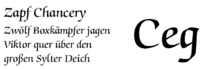
ITC Zapf Chancery
 | |
| Category | Script |
|---|---|
| Designer(s) | Hermann Zapf |
| Foundry | ITC |
ITC Zapf Chancery is a family of script typefaces designed by the type designer Hermann Zapf. It is one of the three typefaces designed by Zapf that are shipped with computers running Apple's Mac OS.[1] It is one of the core PostScript fonts.[2]
History
Zapf Chancery was announced in 1979 in six styles from light to bold, the demibold and bold styles being released without italics. It was named after the English name for a Renaissance handwriting style later adapted as an inspiration for early printing.[3][4]
Variants and similar typefaces
Like many typefaces of the period, imitations of Zapf Chancery were created for specific uses and by competing companies.
URW Chancery L by URW (Unternehmensberatung Rubow Weber — from the founders' names[5] now retitled URW++) provides a GPL-ed clone of the font. An extended version TeX Gyre Chorus is another similar typeface based on the URW Chancery L font. This typeface is released in formats compatible with LaTeX as well as with modern OpenType compatible systems.
 | |
| Category | Script |
|---|---|
| Designer(s) | Patricia Saunders |
| Foundry | Monotype |
A popular lookalike design has been Monotype Corsiva, by Patricia Saunders at the Monotype Corporation. Monotype at the time created or licensed many lookalike typefaces for Microsoft software with identical metrics to popular fonts, including Century Gothic, Arial and Book Antiqua, also a Zapf knockoff. Zapf resigned from ATypI (Association Typographique Internationale) over what he viewed as its hypocritical attitude toward unauthorized copying by prominent ATypI members, specifically Monotype.[6][7][8] However, a court case concluded that Corsiva was sufficiently separate as a design to avoid payment of damages, noting that while the fonts were "similar", "the typeface is based upon 15th and 16th Century calligraphic designs from Rome and Venice. In fact, Ms. Saunders' research and work done on creating Corsiva was televised on the BBC program, Landmarks."[9]
References in Pop Culture
In Season 5 Episode 1 of The Office (US), Pam begins taking courses at the Pratt Institute in New York. She goes to the wrong classroom on her first day. She finds this out when her instructor begins with, "Sorry I'm late. I accidentally switched my alarm clock setting to Zapf Chancery. Which is my terrible segue way into our course, Expressive Typography in New Media."
See also
References
- ↑ Kathleen Carroll (February 4, 2001). "RESPONSIBLE PARTY/HERMANN ZAPF; Written on Wall (And in Windows)". New York Times.
- ↑ http://www.adobe.com/products/postscript/pdfs/ps3fonts.pdf
- ↑ "ITC Zapf Chancery". Linotype. Retrieved 28 September 2014.
- ↑ Strizver, Ilene. "The Story of Zapf Chancery". fonts.com. Retrieved 28 September 2014.
- ↑ MyFonts.com - URW
- ↑ Simonson, Mark. "Monotype's Other Arials". marksimonson.com. Retrieved 21 August 2014.
- ↑ Simonson, Mark. "The Scourge of Arial". marksimonson.com. Retrieved 21 August 2014.
- ↑ "Monotype Corsiva". Microsoft.
- ↑ "Monotype v. ITC". Open Jurist.