Kabel (typeface)
 | |
| Category | Sans-serif |
|---|---|
| Classification | Geometric sans-serif |
| Designer(s) | Rudolf Koch |
| Foundry | Gebr. Klingspor |
| Variations |
Stempel Kabel Karat |
| Shown here | ITC Kabel |
Kabel is a geometric sans-serif typeface designed by German typeface designer Rudolf Koch, and released by the Klingspor foundry in 1927. Today the typeface is licensed by the Elsner+Flake GbR foundry.
Design
The face was not named after any specific cable, although the Zugspitze cable car had been completed in 1926, and a Berlin-Vienna facsimile telegraphy line opened in 1927. The name had techie cachet in its day (Piet Zwart's NKF kabel catalogue of 1927 is well-known) and is primarily metaphorical and allusive, a pun referring to both the monolinear construction of the face, and the role of type as a means of communication.
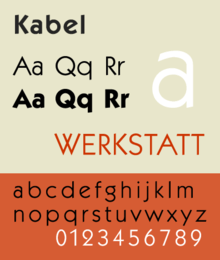
Like its contemporary Futura it bears influence of two earlier geometric sans-serif typefaces; the 1919 Feder Schrift, drawn by Jakob Erbar, and more so his 1922 design called Erbar. Still, Kabel is as much Expressionist as it is Modernist, and may be considered as a sans serif version of his 1922 Koch Antiqua, sharing many of its character shapes and proportions, most notably its peculiar 'g'. Stroke weights are more varied than most geometric sans-serifs, and the terminus of vertical strokes are cut to a near eight-degree angle. This has the effect of not quite sitting on the baseline and making for a more animated, less static feeling than Futura. Uppercase characters are broad and show influence of monumental roman capitals. The capital W has a superimposed, splayed structure similar to Garamond and the G has no terminal. Lowercase characters a, e, and g show a link with Carolingian script and Venetian old-style serif typefaces of the 15th century.
Victor Caruso's 1975 revival, licensed by D Stempel AG, for the International Typeface Corporation follows the formulary ITC approach of a dramatically increased x-height accompanied by multiple weights from Book to Ultra; this has also been resold under the name Koch Geometric.[1] Separately, Bhikkhu Pesala created the open-source revival Kabala, named after a Pāli word meaning 'a morsel of food' due to its intended use in Buddhist religious publications.[2] This release is inspired by the ITC weight set and structure, but adds a number of features including italics, small caps and combined characters.
Prominent usage
- Kabel is used in the popular board game Monopoly.[3]
- The typeface was used in the opening credits for the movie, Yellow Submarine.[4]
- Kabel Black in lower-case is used as the typeface in the logo for supermarket chain Piggly Wiggly.[5]
- United States Army Used Kabel Black in Recruitment advertisements for their "Be All You Can Be" and later "Be All That You Can Be" campaigns.
- NBC's logotypes are in Kabel, and a heavyweight Kabel was also used for NBC Sports' on-screen graphics from 1985 to 1989.
- WPHL-TV uses the kabel font starting in late 1994 and continues with capital text version until January 2001.
- A shadowed bold weight version of Kabel was used for many years on MTV as the typeface in the opening/closing lower third credits of music videos until 2011, when sister network MTV Jams used it for the last time.
- The Velvet Underground's albums White Light/White Heat and The Velvet Underground, both designed by Billy Name, use the typeface.
- My Bloody Valentine's album Loveless, as well as its follow up MBV, used the typeface. The band's main songwriter, Kevin Shields, also wrote songs for the soundtrack of the Sofia Coppola film Lost in Translation, which used a heavy weight version of the typeface for its titles.
- Kabel is used at the typeface for the Self album Breakfast with Girls.
- The ultra version of Kabel is used in the opening/closing credits of The Fresh Prince of Bel-Air.
- The typeface was used in the titling of the TV series Joey. The typeface was used in its book weight.
- Kabel Black was used in the opening episode titles of the Disney cartoon series DuckTales, Chip 'n Dale Rescue Rangers, Talespin and Darkwing Duck.
- Kabel is used in the closing credits of G.I. Joe: The Movie
- Kabel is used on the cards, box and instruction booklets of the popular 1990s handheld electronic game Barcode Battler.
- Kabel is used for the cast aluminum lettering on most buildings around Cornell University's Ithaca, New York campus.
- Kabel was used in the logo of the Toronto Maple Leafs hockey club from 1970 through 2016.
- ITC Kabel Medium is the font used for the Georgia Times logo.
- The K Desktop Environment uses Kabel in its logo and related artwork.
- Kabel is used in the O RLY? internet meme image.
- Kabel is used in some The Sims 3 logotypes.
- Kabel is used throughout the SimCity Social game.
- Kabel is also used throughout the Nintendo 64's Super Smash Bros., as well as in the middle of the game's logo.
- Kabel is also used by a Machinima artist for The Sims 3 named "NephetsYUI" on YouTube for his logo and texts on his videos.
- Kabel is also used throughout Daft Punk's video series "The Collaborators", promoting their album Random Access Memories.
- Kabel is used in the logo for popular YouTuber "iJustine".
- Kabel was used in the campaign ads for the 1976 Presidential campaign of Jimmy Carter.
- Kabel was used in the episode title cards and end credits of the Funimation dub of Dragon Ball.
- The Six Flags corporate logo.
- Kabel was used on the cover of Black Sabbath's Master of Reality album.
- Kabel Black is used in the Chuck E. Cheese's logo.
Google's corporate typeface, 'Product Sans', has some similarities to Kabel, in particular the angled 'e', but other features such as the 'M' and 'g' are very different, resembling Helvetica or Futura.[6] Product Sans is a proprietary design not available for licensing.
Notes
- ↑ "Koch Geometric". Fontsite. Retrieved 4 September 2015.
- ↑ Pesala, Bhikku. "Kabala". Retrieved 4 September 2015.
- ↑ DeLeone, Brad. "DeLeone Designs - Typographic Poster (Kabel)". DeLeone Designs. Retrieved 11 October 2014.
- ↑ Hudson, Rob (5 September 2013). "Yellow Submarine (1968) Opening Credits". Fonts In Use. Retrieved 12 October 2014.
- ↑ "Piggly Wiggly Font". Font Meme. Retrieved 12 October 2014.
- ↑ "Product Sans specimen" (PDF). Google. Retrieved 4 September 2015.
References
- Blackwell, Lewis. 20th Century Type. Yale University Press: 2004. ISBN 0-300-10073-6.
- Fiedl, Frederich, Nicholas Ott and Bernard Stein. Typography: An Encyclopedic Survey of Type Design and Techniques Through History. Black Dog & Leventhal: 1998. ISBN 1-57912-023-7.
- Jaspert, W. Pincus, W. Turner Berry and A.F. Johnson. The Encyclopædia of Type Faces. Blandford Press Lts.: 1953, 1983. ISBN 0-7137-1347-X.
- Macmillan, Neil. An A–Z of Type Designers. Yale University Press: 2006. ISBN 0-300-11151-7.
External links
| Wikimedia Commons has media related to Kabel (typeface). |