Lexicon (typeface)
 | |
| Category | Serif |
|---|---|
| Classification | Old-style |
| Designer(s) | Bram de Does |
| Foundry | The Enschedé Font Foundry |
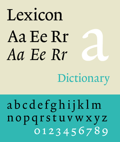
Lexicon is a serif typeface designed by Dutch type designer Bram de Does between the years 1989 and 1992. The typeface was specially designed for use at very small point sizes in Van Dale's Dictionary of the Dutch Language.
History
Lexicon was De Does' second typeface, his first one being Trinité. After the release of Trinité, De Does held a lecture at the 1983 edition of ATypI. Some of his peers had asked him when his next typeface would be released, and in his lecture he announced that there would be no new typefaces from his hand. According to him, he would not be able to design something significantly different from the Renaissance inspired roman like Trinité. In 1989 however, he was approached by the designer of the Van Dale dictionary, who wanted to test Trinité for use at 7pt. De Does suggested to specially design a new typeface instead.
The first rough drawings were made with a felt-tipped pen, and then photographically reduced to be able to judge the design at the right size. The editors of the dictionary were happy with the results, and accepted the offer to produce the typeface. De Does worked together with Peter Matthias Noordzij, who used Ikarus to digitize the drawings that De Does made. The first version of 1992 was optimized for legibility at the point sizes that were used in the dictionary. The version that is published by The Enschedé Font Foundry (TEFF) was released in 1995.
Characteristics
As a result of this, there are two versions of Lexicon: Lexicon no. 1 and Lexicon no. 2. The difference between these two lie in the extenders: Lexicon no. 1 is basically the dictionary version, which has very short extenders, while Lexicon no. 2 has extenders of a more regular length. Lexicon has been designed for optimal legibility, specifically when set very small. This is achieved, in part, by its large x-height—resulting in open counters—and by the relatively small capital letters. Just as Trinité, Lexicon shows a strong calligraphic influence, specifically that of the broad-nibbed pen.
Both versions of Lexicon consist of a roman and an italic, all in six weights (named with letters A to F). There are several types of numbers available; tabular old-style figures, tabular lining figures, proportional old-style figures, and superior and inferior figures.
Applications
- The typeface is still being used by the Van Dale dictionary.
- The Dutch newspaper NRC Handelsblad (and nrc•next) used the typeface from 2001 until 2013. De Does designed a special version to be used for the large headlines.
- The ESV Study Bible published in America by Crossway uses the typeface for its body text.[1]
- The Slovak Ecumenical Bible (interconfessional translation) first published in 2007 (1st corrected ed. 2008, 2nd corrected [pocket] ed. 2011) uses this typeface.
- The contemporary art magazine ArtReview has used the typeface since its 2013 redesign.[2]
References
- ↑ "ESV Study Bible". Crossway. Retrieved 6 September 2012.
- ↑ "Creative Review". Creative Review. Retrieved 19 January 2015.
- Jan Middendorp, Dutch Type, 010 Publishers, Rotterdam (2004), p 158–165.
External links
- (Dutch) Original drawings of Lexicon in the Collection Bram de Does on the website of the University of Amsterdam (high resolution in a picture viewer).
- (Dutch) Lexicon on the TEFF website.