MA plot
An MA plot is an application of a Bland–Altman plot for visual representation of two channel DNA microarray gene expression data which has been transformed onto the M (log ratios) and A (mean average) scale.
Explanation
Microarray data is often normalized within arrays to control for systematic biases in dye coupling and hybridization efficiencies, as well as other technical biases in the DNA probes and the print tip used to spot the array.[1] By minimizing these systematic variations, true biological differences can be found. To determine whether normalization is needed, one can plot Cy5 (R) intensities against Cy3 (G) intensities and see whether the slope of the line is around 1. An improved method, which is basically a scaled, 45 degree rotation of the R vs. G plot is an MA-plot.[2] The MA-plot is a plot of the distribution of the red/green intensity ratio ('M') plotted by the average intensity ('A'). M and A are defined by the following equations.


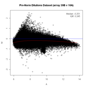
M is, therefore, the binary logarithm of the intensity ratio (or difference between log intensities) and A is the average log intensity for a dot in the plot. MA plots are then used to visualize intensity-dependent ratio of raw microarray data (microarrays typically show a bias here, with higher A resulting in higher |M|, i.e. the brighter the spot the more likely an observed difference between sample and control). The MA plot uses M as the y-axis and A as the x-axis and gives a quick overview of the distribution of the data.
In many microarray gene expression experiments, an underlying assumption is that most of the genes would not see any change in their expression therefore the majority of the points on the y-axis (M) would be located at 0, since Log(1) is 0. If this is not the case, then a normalization method such as LOESS should be applied to the data before statistical analysis. (On the diagram below see the red line running below the zero mark before normalization, it should be straight. Since it is not straight, the data should be normalized. After being normalized, the red line is straight on the zero line and shows as pink/black.)
Packages
Several Bioconductor packages, for the R software, provide the facility for creating MA plots, these include affy (ma.plot, mva.pairs), limma (plotMA), marray (maPlot), and edgeR(maPlot)
Similar "RA" plots can be generated using the raPlot function in the caroline CRAN R package.
Example in the R programming language
library(affy)

if (require(affydata))
{
     data(Dilution)
}

y <- (exprs(Dilution)[, c("20B", "10A")])

x11()

ma.plot( rowMeans(log2(y)), log2(y[, 1])-log2(y[, 2]), cex=1 )

title("Dilutions Dataset (array 20B v 10A)")

library(preprocessCore)

#do a quantile normalization
x <- normalize.quantiles(y)

x11()

ma.plot( rowMeans(log2(x)), log2(x[, 1])-log2(x[, 2]), cex=1 )
title("Post Norm: Dilutions Dataset (array 20B v 10A)")

See also
References
- ↑ YH Yang, S Dudoit, P Luu, DM Lin, V Peng, J Ngai, TP Speed. (2002). Normalization for cDNA microarray data: a robust composite method addressing single and multiple slide systematic variation. Nucleic Acids Research vol. 30 (4) pp. e15.
- ↑ Dudoit, S, Yang, YH, Callow, MJ, Speed, TP. (2002). Statistical methods for identifying differentially expressed genes in replicated cDNA microarray experiments. Stat. Sin. 12:1 111-139