Otl Aicher
| Otl Aicher | |
|---|---|
| Born |
Otto Aicher 13 May 1922 Ulm, Germany |
| Died |
1 September 1991 (aged 69) Günzburg, Germany |
| Nationality | German |
| Alma mater | Academy of Fine Arts Munich |
| Occupation | Graphic designer, typographer |
| Spouse(s) | Inge Scholl |
| Relatives |
Robert Scholl (father-in-law) Sophie Scholl (sister-in-law) Hans Scholl (brother-in-law) |


Otto "Otl" Aicher (13 May 1922 – 1 September 1991) was a German graphic designer and typographer. He is best known for having designed pictograms for the 1972 Summer Olympics in Munich that proved influential on the use of stick figures for public signage, as well as designing the typeface Rotis. Aicher also co-founded the Ulm School of Design.
Early life and career
Aicher was born in Ulm, in the south-western state of Baden-Württemberg, on 13 May 1922. Aicher was a classmate and friend of Werner Scholl, and through him met Werner's family, including his siblings Hans and Sophie Scholl, both of whom would be executed in 1943 for their membership in the White Rose resistance movement in Nazi Germany. Like the Scholls, Aicher was strongly opposed to the Nazi movement. He was arrested in 1937 for refusing to join the Hitler Youth, and consequently he was failed on his abitur (college entrance) examination in 1941. He was subsequently drafted into the German army to fight in World War II, though he tried to leave at various times. In 1945 he deserted the army, and went into hiding at the Scholls' house in Wutach.
In 1946, after the end of the war, Aicher began studying sculpture at the Academy of Fine Arts Munich. In 1947, he opened his own studio in Ulm.
In 1952 he married Inge Scholl, the older sister of Werner, Hans, and Sophie.
Ulm School of Design
In 1953, along with Inge Scholl and Max Bill, he founded the Ulm School of Design (Hochschule für Gestaltung Ulm), which became one of Germany's leading educational centres for design from its founding until its closure in 1968. Faculty and students included such notable designers as Tomás Maldonado and Peter Seitz.
Aicher was heavily involved in corporate branding and designed the logo for German airline Lufthansa in 1969.
1972 Munich Olympics
In 1966 Aicher was asked by the organisers of the 1972 Summer Olympics in Munich to become the Olympic Games' lead designer. He was asked to create a design for the Olympics that complemented the architecture of the newly built stadium in Munich designed by Günther Behnisch. Aicher consulted with Masaru Katsumie, who had designed the previous 1964 Tokyo Olympic Games.[1]
Basing his work in part on iconography for the '64 Games, Aicher created a set of pictograms meant to provide a visual interpretation of the sport they featured so that athletes and visitors to the Olympic village and stadium could find their way around.[1] He created pictograms using a series of grid systems and a specific bright colour palette that he chose for these Games. These designs were directly influential on the DOT pictograms, developed in 1974 by the United States Department of Transportation, which applied the same principles to standard public signage such as those for toilets and telephones; the DOT pictograms have in turn been used around the world. The series of pictograms he created was not a simple task; the goal of each pictogram was to function as a clear sign of the activity it represented while simultaneously maintaining its universal comprehension.[2]
Otl Aicher also helped to design the logo of the Munich Olympics. He went through several stages with his design team before finally finding the successful emblem. One of their first ideas was to use an element of the city's coat of arms or Münchner Kindl within the design which showed a monk or child pointing into the distance while clasping a book in his hand. Other ideas were to use the surrounding areas of the city, referencing the sun, mountains and landscape within the design.[1] Finally the "Strahlenkranz" was created, a garland which represented the sun but also the five Olympic rings merged in a spiral shape. Designer Coordt von Mannstein reworked Aicher's original design through a mathematical calculation to amalgamate the garland and spiral together to get the final design.[1]
The colours chosen for the designs of the games were selected to reflect the tones of the Alps. The mountains in blue and white would make up the palette of colours which also included green, orange and silver.[1] The colours were used to identify allocated themes such as media, technical services, celebrity hospitality and public functions and each had a different colour so visitors could differentiate the themes around the stadium and village. Uniforms were colour-coordinated to represent these themes, the Olympic staff could be identified as working for a particular department by the colour they were wearing.[1]
Aicher used the typeface Univers for the Olympic designs.[1] The design team produced 21 sports posters to advertise the sports at the games, using the official design colours and also including the logo and "München 1972". The design team used a technique called "posterization" for the graphics on the posters, separating the tonal qualities from the images and using the official munich colours for these games. This had to be produced manually as photoshop did not exist at this time.[1] The first of these posters that was created manually in this way was a poster of the Olympic stadium which became the official poster for these games. these posters were displayed all around the city of Munich and around the Olympic sites. Posters were hung in twos alongside posters designed by famous artists chosen to represent this Olympics such as David Hockney, R. B. Kitaj, Tom Wesselmann and Allen Jones.[1]
He also created the first official Olympic Mascot, a striped dachshund named Waldi.
| Aicher's pictograms at the 1972 Munich Olympics | ||||||||||||||
|---|---|---|---|---|---|---|---|---|---|---|---|---|---|---|
|
Later work


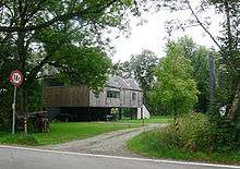
In 1980 Otl Aicher became a consultant of the kitchen manufacturer bulthaup. He created the rotis font family in 1988, naming it after the domicile of Rotis in the city of Leutkirch im Allgäu, where Aicher lived and kept his studio which is still used today by bulthaup.
He also designed the logo for the University of Konstanz as well as Munich Airport, the latter consisting of the letter M in a simple sans-serif font.
Death and after
Aicher died in Günzburg on 1 September 1991, after he was struck by a vehicle while mowing the grass at Rotis.[3]
He was honoured by the Munich City Council on 6 May 2010, when a street, Otl-Aicher-Straße, in the City's Borough No. 12 (Schwabing-Freimann) was named after him.
Publications
Aicher wrote many books on design and other subjects, including:
- "The Kitchen is for Cooking" (1982)
- "Walking in the Desert" (1982)
- "Critique of the Automobile" (1984)
- "Inside the War" (1985)
- "The World as Design" (Die Welt Als Entwurf) (1991)
- "Analog and Digital" (Analog Und Digital) (1991)
Publications on Otl Aicher and his work:
- Foster, Norman: Otl Aicher 1991. In: David Jenkins (Hg.): On Foster ... Foster On, München: Prestel, 2000, pp. 592–595, ISBN 3-7913-2405-5
- Rathgeb, Markus: Otl Aicher - Design as a method of action. PhD thesis at The University of Reading, 2001
- Rathgeb, Markus: Otl Aicher. Phaidon Press, 2006, ISBN 0714843962. (Monograph)
References
External links
- Biography at linotype.com
- Otl Aicher, Museum of Modern Art (MOMA), New York City
- Article on Aicher's Munich Olympics work
- 72:Otl Aicher and the Munich Olympiad – February 2007 museum exhibition
- Biography at 72 exhibition
- Otl Aicher otlaicher.de
- München braucht eine Otl-Aicher-Straße Project to honor the work of Otl Aicher as a communication designer in Munich.
- Spiele: Otl Aicher's Olympic Graphic Design 2008 exhibition in San José, California

.svg.png)