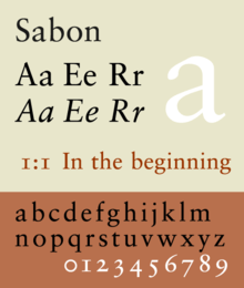
Sabon
 | |
| Category | Serif |
|---|---|
| Classification | Old-style |
| Designer(s) | Jan Tschichold |
| Foundry | Monotype, Stempel |
Sabon is an old-style serif typeface designed by the German-born typographer and designer Jan Tschichold (1902–1974) in the period 1964–1967.[1] It was released jointly by the Linotype, Monotype, and Stempel type foundries in 1967. The design of the roman is based on types by Claude Garamond (c. 1480–1561), particularly a specimen printed by the Frankfurt printer Konrad Berner. Berner had married the widow of a fellow printer Jacques Sabon, the source of the face's name, who had bought some of Garamond's type after his death. The italics are based on types designed by a contemporary of Garamond's, Robert Granjon. It is effectively a Garamond revival, though a different name was chosen as many other modern typefaces already carry this name.
A classic typeface for body text, Sabon's longstanding popularity has transcended its origin as a commission to fit a tight set of business requirements. Tschichold was commissioned by a coalition of German printers to create a typeface that could be printed identically on Linotype, Monotype or letterpress equipment, simplifying the process of planning lines and pagination when printing a book. The italic and bold styles were to take up exactly as much space as the roman, a feature that was particularly advantageous with the duplexed hot metal typesetting equipment of the period.[2][3][4] Finally, the new font was to be five per cent narrower than their existing Monotype Garamond, in order to save space and money.[5] Sabon's name was therefore appropriate: a Frenchman who had moved to Frankfurt, he had played a role in bringing Garamond's type into use in German printing four hundred years before.
Tschichold was well known as an eminent book designer in his own right, having promoted the now-popular ragged right style of book layout. A modernist, after the war, from 1947 to 1949, he played a hugely significant role in British book design, creating a unified, simple and inexpensive layout design for Penguin Books, a publisher which specialised in issuing cheap paperbacks. In his early life, he had lived in Leipzig and in the 1920s had devised a "universal alphabet" for German, improving its non-phonetic spellings and promoting the replacement of the jumble of fonts with a simple sans serif. For the German printers, he crafted Sabon as a font that modernized the classics and honed each letter's fine details, particularly the evenness of the serifs. In doing so, Tschichold took careful account of the added weight needed to form a strong impression on modern paper, with mechanized machines subtly "kissing" the surface with ink rather than stamping or rolling it.[6][7]
History
Sabon was developed in the early 1960s for a group of German printers who were complaining about the lack of a "harmonized" or uniform font that would look the same whether set by hand or on a Monotype or Linotype machine. They were quite specific about the sort of font that might fit the bill, rejecting the modern and fashionable in favour of solid 16th century tradition - something modelled on Garamond and Granjon. The requirement that all weights have the same width was influenced by the 'duplex' system of lead casting Linotype: each Linotype-matrix can cast two different characters: roman or italic, roman or bold, which must have the same width. It also meant that the typeface then only required one set of copyfitting data (rather than three) when compositors had to estimate the length of a text prior to actual typesetting (a common practice before computer-assisted typesetting).[8][9]
An early first use of Sabon was the setting of the Washburn College Bible in 1973 by the American graphic designer Bradbury Thompson. All books of the King James biblical text were set by hand in a process called thought-unit typography, where Thompson broke the lines at their spoken syntactical breaks.
Sabon was also used as the typeface in the 1979 Book of Common Prayer of the Episcopal Church (United States), as well as all of that church's secondary liturgical texts (such as the Book of Occasional Services and Lesser Feasts and Fasts).
Sabon was used in the 2000s as the official logo typeface of Stanford University until 2012.[10] It is also used by Örebro University, together with the typeface Trade Gothic.[11] Vogue and Esquire use a slightly modified version of it for headlines.[12] Since 2010, First Things has used Sabon for the page text in its print edition.
A variety of digital releases of Sabon exist with different prices and licensing, sold by both Adobe and Linotype. Fontsite released a version under the name Savoy, while Bitstream released a less faithful version under the name of Classical Garamond.[13][14]
Sabon Next
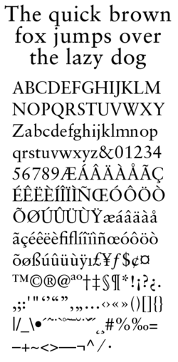
Jean-François Porchez designed the revival of Sabon known as Sabon Next. Sabon Next is based upon Tschichold's 1967 Sabon design for the Stempel foundry and Porchez' study of original Garamond models. The family consists of 6 weights, without Greek and Cyrillic support. It supports ISO Adobe 2, Adobe CE, Latin Extended characters. Unlike in Sabon, Porchez rejected the approach of a matching-width italic for a more traditional design, narrower than the roman style.
OpenType features include Small caps (except in Black weight), Ligatures, Special ligatures, Alternates, Caps figures, Oldstyle figures, Tabular figures, Fractions, Superiors, Ornaments, Swash, Proportional Lining figures.
Sabon Next Display

It is a variant of Regular weight Sabon Next designed for 20pt or above.
Sabon Next Ornaments
It is a collection of printers' ornaments and dingbats. The glyphs can also be found in the OpenType Sabon Next (except in Black weights) fonts.
Sabon Infant
This version of the typeface has single-story versions of the letters a and g, and is used in children's books but is very rare.
Sabon eText (2013)
It is a version of Sabon optimized for screen use, designed by Steve Matteson.[15] Changes include increased x-heights, heavier hairline and serifs, wider inter-character spacing, more open counters, adjusted thicks to thins ratio.[16]
The family includes 4 fonts in 2 weights (regular, bold), with complementary italics. OpenType features include case-sensitive forms, fractions, ligatures, lining/old style figures, ordinals, superscript, small capitals.
References
- ↑ Ronneberger, Volke (2002). "Die Sabon von Jan Tscichold" (PDF). Publishing Praxis. Retrieved 13 December 2015.
- ↑ Haralambous, Yannis (2007). Fonts & Encodings (1st ed.). Sebastopol, Calif.: O'Reilly Media. pp. 377–381. ISBN 978-0-596-10242-5. Retrieved 13 December 2015.
- ↑ Shaw, Paul. "Flawed Typefaces". Print magazine. Retrieved 30 June 2015.
- ↑ Haslam, Andrew; Baines, Phil (2005). Type & typography (2nd ed.). London: Laurence King. p. 99. ISBN 978-1-85669-437-7.
- ↑ Cf. S. Garfield, Just My Type, p.251.
- ↑ Cf. S. Garfield, Just My Type, Profile Books, London (2010), pp.251-253.
- ↑ "Just what makes a Garamond a Garamond?". Linotype. Retrieved 11 December 2015.
- ↑ Cf. A. Bartram, Typeforms: A History, British Library & Oak Knoll Press, London (2007), s.v. Sabon.
- ↑ Berry, John D. "The Next Sabon". Creative Pro. Retrieved 22 April 2016.
- ↑ Stanford University Identity Toolkit, . Retrieved 2012-11-15.
- ↑ Örebro University Design Guidelines, . Retrieved 2012-05-29.
- ↑ Cf. S. Garfield, Just My Type, p.253; B. Willen & N. Strals, Lettering & Type, Princeton Architectural Press, New York City (2009), Sabon and Its Current Usage.
- ↑ "Classical Garamond". MyFonts. Monotype. Retrieved 19 April 2015.
- ↑ "Savoy". FontSpring. Retrieved 19 April 2015.
- ↑ Matteson, Steve. "Type Q&A: Steve Matteson from Monotype". Typecast. Monotype. Retrieved 27 March 2016.
- ↑ eText Typefaces: Typefaces for High-Quality e-Reading Experiences
Bibliography
- Friedl, Friederich, Nicholas Ott and Bernard Stein. Typography: An encyclopedic survey of type design and techniques through history. Black Dog & Leventhal: 1998. ISBN 1-57912-023-7.
- Lawson, Alexander S., Anatomy of a Typeface. Godine: 1990. ISBN 978-0-87923-333-4.
- Meggs, Philip B. and Rob Carter.Typographic Specimens: The Great Typefaces. Wiley: 1993. ISBN 0-471-28429-7.
- Meggs, Philip B. and McKelvey, Roy.Revival of the Fittest: Digital Versions of Classic Typefaces. RC Publications: 2000. ISBN 1-883915-08-2.
- Meggs, Philip B. History of Graphic Design. John Wiley & Sons: 1998. ISBN 0-470-04265-6.
- Perfect, Christopher & Rookledge, Gordon. Rookledge's Classic International Typefinder. Laurence King Publishing: 2004. ISBN 978-1-85669-406-3.
External links
| Wikimedia Commons has media related to Sabon (typeface). |
- www.tschichold.de.
- Special issue 321 of Idea magazine on Jan Tschichold.
- Short biography of Jan Tschichold at Textism.
- Type Gallery - Linotype Sabon
- Sabon Linotype.
- Sabon Monotype.
- Sabon Next by Jean-François Porchez.
- Sabon Next Font Family - by Jean François Porchez
- Sabon eText
- Linotype updates a classic: Sabon Next – new life for an old font
- Linotype font mix ideal for newspapers - August 18, 2004: Sabon Next takes on the press
- General information about the font Sabon and its design
- Volker Ronneberger: Die Sabon von Jan Tschichold, Publishing-Praxis (German), p.56-58, November 2002