University of California Old Style
 | |
| Category | Serif |
|---|---|
| Classification | Old-style |
| Designer(s) | Frederic Goudy |
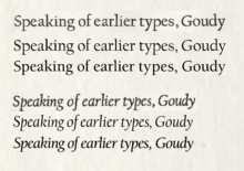
| Shown here | University of California Old Style metal type in regular and italic styles, compared to two digitisations: Californian FB and ITC Berkeley Old Style Medium. |
University of California Old Style is a serif font designed by Frederic Goudy and created for the University of California Press from 1936-8.[1] It is one of Goudy's most popular serif fonts.
University of California is an 'old-style' serif font, one inspired by the styles of printing popular before the late eighteenth century. Goudy described it as particularly inspired by the 'Fell Types', a collection of 1670s fonts used by Oxford University Press, while other details such as the tilted cross-stroke of the 'e' recall what is now called the 'Venetian' style of typeface design, used by printers such as Nicolas Jenson up to the 1490s. Intended for fine book printing, the design has a delicate grace and strokes that alternate between thick and thin. Serifs are fine slabs with minimal bracketing. Goudy provided a set of swash capitals as alternates for the italic.
Like many of Goudy's other families, it has been rereleased and made generally available after his death, under a variety of (often shorter) names. While no longer the corporate font of the University of California Press, it retains a strong popularity in academia and is used as a corporate font by several universities.
Creation
Goudy used the font to set his book Typologia (1940) which was printed by the University of California Press in the new font, and he describes his inspiration for it in the chapter The Story of a Type.[2] He described it as particularly intended to be intended to be attractive in mass and said that the italic was intended to be "a refined letter, yet not, I hope, one which may be called prudish…some letters are a bit exuberant. As an italic is [mostly used] to emphasise a word…or sometimes merely to give a lighter touch, I have allowed myself to incorporate here and there in my font some forms more or less fanciful." It was finished just before a fire that destroyed Goudy's workshop, engraving machine and plan drawings, and Goudy noted in his book that it was lucky that he had posted off finished work to Monotype to use as a basis for making punches for their hot metal typesetting system, allowing some letters to be redrawn from patterns.
Goudy created the design from a position of great eminence as one of the most popular typeface designers of the first half of the twentieth century, and almost uniquely for type founders of the period as an independent artisan, not employed by any one company and free to pursue his own projects.[3][4][5] However, tastes were changing away from his work even at the time he was commissioned by the University Press.[6] Contemporary trends in graphic design saw a movement away from Goudy's love of warm, organic and rounded serif fonts, in favour crisper designs, such as sharp geometric sans-serif fonts and harder, more robust serifs such as Monotype's Times New Roman.[7][8] Of his more than a hundred fonts designed (counting regular or roman fonts and italics separately) it would be his last-but two creation of a roman and italic. Goudy had high ambitions for his design, and wrote to California that "I'm trying hard to make it a magnum opus and maybe the effort is preventing more rapid progress - maybe magnum opuses aren't made so consciously."[2]
Naming
For a name, Goudy preferred 'Berkeley' after the press's location, which, he thought more 'aristocratic' than the alternative proposal of 'Californian'. However, the Samuel Farquhar, the University Press's manager, requested a name change in order to avoid associating its name with just one of the university system's campuses.[2] Both the proposed alternatives would later be used by rereleases.
Public use
After the original type was commissioned for private use, 'California' was released publicly by different companies, first in 1958, by Lanston Monotype as 'Californian' and then under the name of 'Berkeley Old Style' by ITC. Both these versions have been digitised.
Digitisations
In digital versions ITC released Berkeley Old Style under its pre-existing name.[9] Digital versions were also issued as 'Californian' by Font Bureau (included with some versions of Microsoft Office and by LTC (in different digitisations) and by Richard Beatty under the name of 'University Old Style'.[10][11][12][13] Most of these versions added a bold type, which Goudy did not design himself. Font Bureau added a more delicate optical size for display use.[14]
Academic use
Although no longer the corporate font of the University of California Press or System, Goudy's font remains popular in academic use. As of 2016, it remains the corporate font of UC Davis, University of San Diego and Iowa State University; it is also used on the UC Berkeley word mark.[15][16][17]
References
- ↑ Goudy, Frederic (1946). A Half-Century of Type Design and Typography: 1895-1945, Volume 1. New York: The Typophiles. pp. 216–9. Retrieved 26 February 2016.
- 1 2 3 Goudy, Frederic (1940). "VI: The Story of a Type". Typologia. Berkeley: University of California Press. pp. 47–65. ISBN 0-520-03308-6. Retrieved 27 February 2016.
- ↑ "TYPE BY GOUDY - Modern Mechanix". Modern Mechanix.
- ↑ Carter, Matthew. "Goudy, the good ol' boy (Bruckner biography review)". Eye Magazine. Retrieved 5 February 2016.
- ↑ Shaw, Paul. "An appreciation of Frederic W. Goudy as a type designer". Retrieved 12 July 2015.
- ↑ Updike, John. "A Bull in the Typography Shop: a review of Frederic Goudy by D. J. R. Bruckner". New York Times. Retrieved 5 February 2016.
- ↑ Simon Loxley (12 June 2006). Type: The Secret History of Letters. I.B.Tauris. pp. 134–5. ISBN 978-1-84511-028-4.
- ↑ Loxley, Simon (31 March 2006). Type: The Secret History of Letters. I.B.Tauris. pp. 93–102. ISBN 978-0-85773-017-6.
- ↑ Stan, Tony. "ITC Berkeley Old Style". MyFonts. ITC. Retrieved 27 February 2016.
- ↑ "Californian FB". Font Bureau. Retrieved 19 June 2015.
- ↑ "LTC Californian". MyFonts. LTC. Retrieved 27 August 2015.
- ↑ "University Old Style (an alternative Berkeley Old Style digitisation by Fontsite)". Fontsite. Retrieved 27 August 2015.
- ↑ Beatty, Richard. "University Old Style". Fontshop. Retrieved 4 November 2015.
- ↑ "Californian FB". MyFonts. Font Bureau. Retrieved 27 February 2016.
- ↑ "UC Davis Marketing Toolbox: Fonts". UC Davis. Retrieved 27 February 2016.
External vendors working with UC Davis must purchase copies of Berkeley from Monotype and Proxima Nova from FontSpring.
- ↑ "USD Visual Style Guide". University of San Diego. Retrieved 27 February 2016.
- ↑ "Iowa State University Visual Identity System". Iowa State University. Retrieved 27 February 2016.