Beatrice Warde
Beatrice Warde (September 20, 1900 – September 16, 1969, née Beatrice Becker) was a communicator on typography. She was the only daughter of May Lamberton Becker, a journalist on the staff of the New York Herald Tribune, and Gustave Becker, composer and teacher.
Beatrice was educated at Barnard College at Columbia University. At the age of eleven she had developed a love of calligraphy, and this grew in her college years to an interest in the history of letter forms. She became acquainted with Bruce Rogers and, on his recommendation, was appointed after graduation to the post of assistant librarian to the American Type Founders Company. She worked in Jersey City under Henry Lewis Bullen, where she concentrated on self-education and research. While there she became acquainted with eminent typographers including Daniel Berkeley Updike and Stanley Morison, who later played a highly influential part in her professional life.
She remained there from 1921–1925, and in 1922 married Frederic Warde, printer to Princeton University, a gifted typographic designer, and fully familiar with the possibilities of mechanical typesetting. The Wardes moved to Europe in 1925, but their marriage ended in separation in November 1926, soon followed by an amicable divorce.
Monotype employment
Beatrice Warde spent time investigating the origins of the Garamond design of type, and published the results in The Fleuron under the pen-name "Paul Beaujon". Beatrice Warde recalled she had given 'Paul Beaujon' persona 'a man of long grey beard, four grandchildren, a great interest in antique furniture and a rather vague address in Montparnasse.' Her conclusion that many typefaces previously attributed to Claude Garamont were in fact made ninety years later by Jean Jannon was a lasting contribution to scholarship.[1][lower-alpha 1] She noted that the deception confused, but was not immediately suspected by other historians, who were surprised to read a work by Frenchman in idiomatic English and mocking received wisdom by quoting from The Hunting of the Snark.[3]
After publishing her discovery of Garamond's origin, "Paul Beaujon" was in 1927 offered the part-time post of editor of the Monotype Recorder, and Warde accepted—to the astonishment of Lanston Monotype Corporation executives in London, who were expecting a man. She was promoted to publicity manager in about 1929, a post she retained until her retirement in 1960 on her 60th birthday. She thought of herself as an outsider, working in a man's world, but she gained respect for her work and her personal qualities.
The Monotype years
This period saw the Anglo-American "Typographic Renaissance", since type-casting machines such as the Monotype and the Linotype permitted the revival of historic type faces, and the design of new ones. The Monotype was particularly suited to this work since the types were cast individually, permitting letter fit on par with hand-set type.
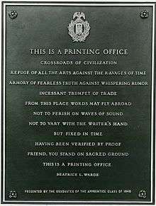
The Monotype Corporation had appointed Stanley Morison as typographic advisor in 1923, and he used the Monotype Recorder and Monotype Newsletter—the firm's main advertising mediums—as a vehicle for publicising new designs. Morison instigated the production of Monotype broadsides displaying the full range of a new design in multiple sizes, which could serve as sales literature for printers to show their customers, or be framed for display in their reception rooms. Among the designers whose work the corporation adopted were Eric Gill. His Gill Sans of 1928 was widely acclaimed and was followed in 1932 by Perpetua titling capitals, modelled on the lettering on Trajan's Column in Rome. Beatrice Warde penned her famous broadside This is a Printing Office, to show this typeface off. It has since been found on the walls of numerous printing offices, has been cast in bronze and is mounted at the entrance to the United States Government Printing Office in Washington, D. C., has been translated into numerous languages and has been parodied.
The Crystal Goblet
"The Crystal Goblet" is an essay on typography by Beatrice Warde. The essay was first delivered as a speech, called "Printing Should Be Invisible," given to the British Typographers' Guild at the St Bride Institute in London, on October 7, 1930.[4] [5] Like many of Warde's other writings, the essay was written with the intent to be spoken before printed, as she carefully considered the invocations of voice, presence, and personal connection while reading aloud.[5]
The essay is notable historically as a call for increased clarity in printing and typography. It is now significant as a common reading in the study of typography and graphic design. The essay has been reprinted many times and is a touchstone for the concept of "clear" typography and the straightforward presentation of content.
Days after her 1930 address, the lecture appeared in a newsletter called the British & Colonial Printer & Stationer. It was printed again as a pamphlet in 1932 and 1937. Thenceforward, it appeared as either "The Crystal Goblet" or "The Crystal Goblet, or Printing Should Be Invisible." In 1955 it was published again and reached its widest audience yet in a book called The Crystal Goblet: Sixteen Essays on Typography.
Typically, design historians associate Stanley Morison as the source of "new traditionalist" ideas and "credit Beatrice Warde with spreading his influence.[6] "The Crystal Goblet" is rich with metaphors. The title itself is a reference to a clear vessel holding wine, where the vessel, the printed word, gives no obstruction to the presentation of its content, the text. Warde poses a choice between two wine glasses: one of "solid gold, wrought in the most exquisite patterns" and one of "crystal-clear glass."
| “ | Now the man who first chose glass instead of clay or metal to hold his wine was a "modernist" in the sense in which I am going to use that term. That is, the first he asked of this particular object was not "How should it look?" but "What must it do?" and to that extent all good typography is modernist. | ” |
Throughout the essay, Warde argues for the discipline and humility required to create quietly set, "transparent" book pages.
Other works
In addition to her work with the Monotype Corporation, Warde devoted much time after her retirement to the education of apprentices, tirelessly lecturing at schools of printing, inspiring them to become design-conscious craftsmen.
Her achievement
Alan Hutt (see reference) wrote in 1969:
- She was an original typographical scholar of the first rank (the 'Paul Beaujon' Garamond and other studies in The Fleuron and The Monotype Recorder); she was a practicing typographer of sure taste and a calligrapher of elegance; for over 30 years she was a brilliant editor of the Recorder and the Monotype Newsletter, as part of her devoted service to The Monotype Corporation as its publicity manager; she was Stanley Morison's inseparable and incomparable lieutenant in the great work of Britain's typographical renaissance; she was beyond peer as a public expositor, and propagandist for, good typography.
Warde made herself part of a larger campaign to "raise the standards" of commercial publishing, but is usually associated with "the new traditionalist" typographic movement. But her work had particular impact in the 1990s when the "legibility wars" in graphic design became pronounced.[7]
Beatrice Warde's writings
The more important ones on printing are listed in 'I am a Communicator' (see reference below)
Books
- An American in England (Pen name of Warde), Enjoying England: A book about an enchanted Island, published by the LNER, 1931
- Compiler of Token of Freedom c 1940, (An anthology given to every child who was evacuated to North America during World War II)
- The Crystal Goblet: sixteen essays on typography, 1955
- During World War 2 she also contributed to American Outpost Newsletter, and her mother featured her letters about London in the New York Herald Tribune
Articles
- "Type Faces, Old and New" in The Library, Fourth Series Vol. XVI. No. 2, September 1935 p. 121-143.
References
- Online
- Shelley Gruendler, 'Beatrice Warde'. 20th century Graphic Communication: Technology, Society and Culture. (First annual Friends of St Bride conference, September 24 and 25, 2002)[8]
- Printed
- Simon Loxley. The Secret History of Letters. I.B.Tauris & Co. Ltd: 2004. ISBN 1850433976/ISBN 978-1850433972.
- Anon, 'Pioneer in a Man's World' in The Times, February 10, 1964; p 13; Issue 55931; col A. A short feature article about her life and work with portrait.
- Anon, Obituary, Mrs Beatrice Warde. First Lady of Typography, in The Times, September 16, 1969, p 12, Issue 57666, col, E.
- Professor Arthur Newell, Obituary, Mrs Beatrice Warde, in The Times September 25, 1969, p 12; Issue 57674; col G.
- Alan Hutt, 'Beatrice Warde, a personal tribute' in Monotype Newsletter, 86, December 1969, p 18
- Anon, 'I am a communicator'. The Monotype Recorder, Volume 44, number 1, Autumn 1970. A selection of writings and talks by Beatrice Warde/Paul Beaujon.
- Nicolas Barker, Stanley Morison. 1972 ISBN 0-674-83425-9
- James Moran, Stanley Morison, his typographic achievement, 1971 ISBN 0-85331-300-8
- Emily McVarish, TheCrystal Goblet': The Underpinnings of Typographic Convention," Design and Culture 2:3 (November, 2010), 285-307
- Notes
- ↑ Warde, Beatrice (1926). "The 'Garamond' Types". The Fleuron: 131–179.
- ↑ "Jannon". French Ministry of Culture.
- ↑ De Bondt, Sara. "Beatrice Warde: Manners and type". Eye Magazine. Retrieved 3 December 2015.
- ↑ Jacob, H. ed., Beatrice Warde, The Crystal Goblet: Sixteen Essays on Typography, Sylvan Press, London, 1955.
- 1 2 McVarish, Emily, "'The Crystal Goblet': The Underpinnings of Typographic Convention," Design and Culture, 2:3, 285-307
- ↑ McVarish, p. 285
- ↑ McVarish, Emily, p. 299
- ↑ STbride.org