Grotesque (Stephenson Blake typefaces)
 | |
| Category | Sans-serif |
|---|---|
| Classification | Grotesque |
| Foundry | Stephenson Blake |
The Stephenson Blake Grotesque fonts are a series of sans-serif fonts created by printing company Stephenson Blake of Sheffield mostly around the end of the nineteenth century.[1]
Stephenson Blake's grotesque faces are in the traditional "grotesque" style of sans-serif, with folded-up letterforms and a solid structure not intended for extended body text.[2] Forming a sprawling series, they include several unusual details, such as an 'r' with a droop, very short descenders and considerable variation in stroke width, creating a somewhat eccentric, irregular impression.[3][4] Rather than "true" italics, with letterforms influenced by handwriting, sharper obliques are used, in which the letterforms are slanted but do not take on handwriting characteristics.
Much less artistically and systematically designed than later families like Univers and Helvetica, they were very commonly used in British commercial printing in the metal type era, with a revival of interest as part of a resurgence of use of such "industrial" sans-serifs around the 1950s.[5][6][7] Writing in The Typography of Press Advertisement (1956), printer Kenneth Day commented that the family "has a personality sometimes lacking in the condensed forms of the contemporary sans cuttings of the last thirty years."[8] Jeremy Tankard has described them as the "most idiosyncratic of designs".[9]
Family
.jpg)
.jpg)
The family of typefaces was sold by number rather than using weight names. Commonly used numbers included:
- Grotesque No. 5 - condensed
- Grotesque No. 6 - wide[10]
- Grotesque No. 7 - (shown on specimen, above) light condensed
- Grotesque No. 8 - wide, bold[10]
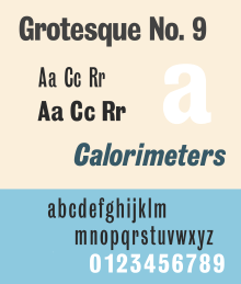
- Grotesque No. 9 - (shown on specimen, above) condensed, bold. Particularly popular and has been digitised.[11][12]
- Grotesque No. 10 - regular weight and width[13]
- Grotesque No. 66 - wide[14]
Stephenson Blake also used the terms "Condensed" and "Elongated Sans Serif" in some cases.
A particularly popular member of the family is Grotesque No. 9, a bold condensed weight, and its companion oblique.[15] Users of "Grot No. 9" include Wyndham Lewis's 1914 avant-garde magazine Blast and more recently Q magazine.[16][17][18][19]
The Stephenson Blake Grotesques of the late nineteenth century should not be confused with the first sans-serif font ever made, the Caslon Egyptian of c. 1816 which Stephenson Blake sold, which was a quite separate design.
Related fonts

Similar designs include:
- Monotype Grotesque
- The Miller and Richard grotesque family[20]
- "Bureau Grotesque" family from Font Bureau, a loose modern adaptation.[21][22]
- Kilburn by Adrian Talbot, a digital-period version of the condensed styles.[23][24]
The modern corporate font of Sheffield, Wayfarer designed by Jeremy Tankard, is designed with some influences of the Stephenson Blake Grotesque series but predominantly based on their unrelated sans-serif Granby.[25][26][9]
References
- ↑ http://www.klingspor-museum.de/KlingsporKuenstler/Schriftgiessereien/StepensonBlake/StephensonBlake.pdf
- ↑ Phil Baines; Andrew Haslam (2005). Type & Typography. Laurence King Publishing. p. 73. ISBN 978-1-85669-437-7.
- ↑ Dodd, Robin (2006). From Gutenberg to OpenType: an illustrated history of type from the earliest letterforms to the latest digital fonts. Lewes: Ilex. p. 126. ISBN 9781904705772.
- ↑ Alex W. White (6 September 2016). Listening to Type: The Art of Making Language Visible. Skyhorse Publishing Company, Incorporated. p. 572. ISBN 978-1-62153-538-6.
- ↑ "Grotesque Type and an Indian Pilot". Thyrsus Press. Retrieved 8 October 2016.
- ↑ http://www.klingspor-museum.de/KlingsporKuenstler/Schriftdesigner/Pechey/EPechey.pdf
- ↑ Print Design and Production. p. 56.
- ↑ Day, Kenneth (1956). The Typography of Press Advertisement. pp. 86–8.
- 1 2 Tankard, Jeremy. "Wayfarer". Jeremy Tankard Typography. Retrieved 31 July 2016.
Application of the original Granby Condensed type was, however, difficult practically. It was not available in digital form, and felt to be just too condensed, with the proportion of ascender to x-height, too uncomfortable for use on the signing project. So there arose an opportunity to design a new typeface and at the same time tailor it to the specific needs of the Sheffield project. It was also an opportunity to widen the typographic references for the new font. I was keen to look at other early sans serif types, especially those from Stephenson, Blake and most notably their Grotesque series. These most idiosyncratic of designs are full of warmth, have an informal rhythm and a vitality to their shapes, all of which help create interesting word patterns. The rhythm of Wayfarer is similar to that of Granby, but it is combined with an approach to character detailing which echoes the informal variety found in the Grotesques.
- 1 2 "Grotesque No. 6 & 8 in use - Fonts In Use".
- ↑ "Grotesque No 9 - Webfont & Desktop font « MyFonts".
- ↑ "Grotesque No. 9 in use - Fonts In Use".
- ↑ Frederick W. Lambert (1972). Letter Forms: 110 Complete Alphabets. Courier Corporation. pp. 12, 48–9. ISBN 978-0-486-22872-3.
- ↑ "Transport Age magazine covers". 1 December 2014.
- ↑ Hutt, Allen (1973). The Changing Newspaper: typographic trends in Britain and America 1622-1972 (1. publ. ed.). London: Fraser. pp. 135, 146–7 etc. ISBN 9780900406225.
- ↑ Yiannakopoulou, Konstantina. "How BLAST magazine has changed literature". Typeroom. Retrieved 9 October 2016.
- ↑ Mattern, Isabelle. "U5 #3 – Blast/Bless: Grotesque No. 9". Isabelle Mattern (blog). Retrieved 9 October 2016.
- ↑ Mattern, Isabelle. "Blast/Bless: Grotesque No. 9". Isabelle Mattern (blog). Retrieved 9 October 2016.
- ↑ Cowles, Andy. "'There are no skeletons in the closet, and I got knighted, so that proves it, doesn't it?'". Coverthink (blog). Retrieved 15 October 2016.
- ↑ "Sans-Serifs & Grotesques (Miller & Richard) in use - Fonts In Use".
- ↑ "Type Network".
- ↑ "Bureau Grot in use - Fonts In Use".
- ↑ Coles, Stephen. "New Additions: November 2014". Identifont. Retrieved 9 October 2016.
- ↑ Talbot, Adrian. "Kilburn". MyFonts. Talbot Type. Retrieved 9 October 2016.
- ↑ Bramley, Ellie Violet. "Subliminal power of city fonts". The Guardian. Retrieved 31 July 2016.
- ↑ Tankard, Jeremy. "Commissions: Connect Sheffield". Jeremy Tankard Typography. Retrieved 31 July 2016.
External links
- American specimen (photographed by Nick Sherman)
- Grotesque No. 9 (photographed by Stephen Coles)
- Sans of note (Nick Sherman photographs)
- Stephenson Blake specimen, 1908