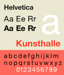
Helvetica
 | |
| Category | Sans-serif |
|---|---|
| Classification | Neo-grotesque sans-serif |
| Designer(s) | Max Miedinger, Eduard Hoffmann |
| Foundry | Haas Type Foundry |
| Date released | 1957 |
| Re-issuing foundries | Mergenthaler Linotype Company |
| Design based on | Akzidenz-Grotesk |
Helvetica is a widely used sans-serif typeface developed in 1957 by Swiss typeface designer Max Miedinger with input from Eduard Hoffmann.
It is a neo-grotesque or realist design, one influenced by the famous 19th century typeface Akzidenz-Grotesk and other German and Swiss designs. Its use became a hallmark of the International Typographic Style that emerged from the work of Swiss designers in the 1950s and 60s, becoming one of the most popular typefaces of the 20th century.[1] Over the years, a wide range of variants have been released in different weights, widths and sizes, as well as matching designs for a range of non-Latin alphabets. Notable features of Helvetica as originally designed include the termination of all strokes on horizontal or vertical lines and unusually tight letter spacing, which give it a dense, compact appearance.
Developed by the Haas'sche Schriftgiesserei (Haas Type Foundry) of Münchenstein, Switzerland, its release was planned to match a trend: a resurgence of interest in turn-of-the-century grotesque typefaces among European graphic designers that also saw the release of Univers by Adrian Frutiger the same year.[2] Hoffmann was the president of the Haas Type Foundry, while Miedinger was a freelance graphic designer who had formerly worked as a Haas salesman and designer.[3]
Miedinger and Hoffmann set out to create a neutral typeface that had great clarity, no intrinsic meaning in its form, and could be used on a wide variety of signage.[3] Originally named Neue Haas Grotesk (New Haas Grotesque), it was rapidly licensed by Linotype and renamed Helvetica, being similar to the Latin adjective for Switzerland, Helvetia.[4] The font name was changed to Helvetica in 1960.[5] A feature-length film directed by Gary Hustwit was released in 2007 to coincide with the 50th anniversary of the typeface's introduction in 1957.[6]
History
Influences of Helvetica included Schelter-Grotesk and Haas' Normal Grotesk. Attracting considerable attention on its release as Neue Haas Grotesk, Linotype adopted Neue Haas Grotesk for widespread release.
In 1960, its name was changed by Haas' German parent company Stempel to Helvetica (meaning Swiss in Latin) in order to make it more marketable internationally. It comes from the Latin name for the pre-Roman tribes of what became Switzerland. Intending to match the success of Univers, Arthur Ritzel of Stempel redesigned Neue Haas Grotesk into a larger family.[7][8] The design was popular, and rapidly made available for phototypesetting systems as well as for the original metal type. Many imitations and knock-offs were rapidly created.
In the late 1970s and 1980s, Linotype licensed its version to Xerox and then Adobe and Apple, guaranteeing its importance in digital printing by making it one of the core fonts of the PostScript page description language.[9][10] The rights to it are now held by Monotype Imaging, which acquired Linotype; the advanced Neue Haas Grotesk release (discussed below) was co-released with Font Bureau.[2]
Characteristics
Helvetica can’t do everything...it can be really weak in small sizes. Shapes like ‘C’ and ‘S’ curl back into themselves, leaving tight " apertures"—the channels of white between a letter’s interior and exterior... The lowercase ‘e,' the most common letter in English and many other languages, takes an especially unobliging form. These and other letters can be a pixel away from being some other letter.
- tall x-height, which makes it easier to read in smaller sizes and at distance
- quite tight spacing between letters
- An oblique rather than italic style, a common feature of almost all grotesque and neo-grotesque typefaces.
- narrow t and f.
- square-looking s.
- bracketed top flag of 1.
- rounded off square tail of R.
- concave curved stem of 7
- two-storied a (with curves of bowl and of stem), a standard neo-grotesque feature
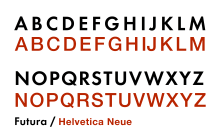
Like many neo-grotesque designs, Helvetica has narrow apertures, which limit its legibility onscreen and at small print sizes. It also has no visible difference between upper-case 'i' and lower-case 'L', although the number 1 is quite identifiable with its flag at top left.[12][13] Its tight, display-oriented spacing may also pose problems for legibility.[14] In situations where this matters, other designs intended for legibility at small sizes above all, such as Verdana, Meta or Trebuchet or a monospace font such as Courier, which makes all letters quite wide, may be more appropriate.[15]
Usage
-

Helvetica on the logo of Cassina S.p.A., showing its traditionally tight letterspacing
-
Helvetica used on signs in Vienna, 1973
-
Helvetica is used on signage on the Chicago 'L'
-

Helvetica used in the logo of the National Film Board of Canada
-

Helvetica used in a UK government publication
Helvetica is among the most widely used sans-serif typefaces.[16] Versions exist for Latin, Cyrillic, Hebrew, Greek, Japanese, Korean, Hindi, Urdu, Khmer, and Vietnamese alphabets. Chinese faces have been developed to complement Helvetica.
Helvetica is a popular choice for commercial wordmarks, including those for 3M (including Scotch Tape), American Apparel, BASF, Blaupunkt, BMW, Diaspora, ECM, Funimation, General Motors, J. C. Penney, Jeep, Kawasaki, Knoll, Lufthansa, Motorola, Nestlé, Panasonic, Parmalat, Philippine Airlines, Sears, Skype, Target, Texaco, Tupperware, Viceland, and Verizon.[17] Apple used Helvetica as the system typeface of iOS until 2015.[18][19] Notably, from 1967 to 2013, the logo for American Airlines featured two upper case As (AA) and a wordmark using the font.
Helvetica is widely used by the U.S. government; for example, federal income tax forms are set in Helvetica, and NASA used the type on the Space Shuttle orbiter.[20] Helvetica is also used in the United States television rating system. The Canadian government also uses Helvetica as its identifying typeface, with three variants being used in its corporate identity program, and encourages its use in all federal agencies and websites.[21]
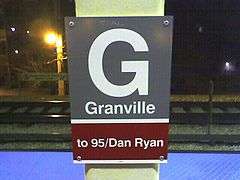
Helvetica is commonly used in transportation settings.[22] New York City's Metropolitan Transportation Authority (MTA) adopted Helvetica for use in signage in 1989. From 1970 to 1989, the standard font was Standard Medium, an American release of Akzidenz-Grotesk, as defined by Unimark's New York City Transit Authority Graphic Standards Manual. The MTA system is still rife with a proliferation of Helvetica-like fonts, including Arial, in addition to some old signs in Medium Standard, and a few anomalous signs in Helvetica Narrow.[23][24][25]
Helvetica is also used in the Washington Metro, the Chicago 'L', Philadelphia's SEPTA, and the Madrid Metro.[26] Amtrak used the typeface on the "pointless arrow" logo, and it was adopted by Danish railway company DSB for a time period.[27] In addition, the former state-owned operator of the British railway system developed its own Helvetica-based Rail Alphabet font, which was also adopted by the National Health Service and the British Airports Authority.
The typeface was displaced from some uses in the 1990s to the increased availability of other fonts on digital desktop publishing systems and criticism from type designers including Erik Spiekermann and Martin Majoor, both of whom have criticised the design for its omnipresence and overuse.[2] Majoor has described Helvetica as 'rather cheap' for its failure to move on from the model of Akzidenz-Grotesk.[28][29]
Media coverage
An early essay on Helvetica's public image as a font used by business and government was written in 1976 by Leslie Savan, a writer on advertising at the Village Voice.[30] It was later republished in her book The Sponsored Life.[31]
In 2007, Linotype GmbH held the Helvetica NOW Poster Contest to celebrate the 50th anniversary of the typeface.[32][33] Winners were announced in the January 2008 issue of the LinoLetter.
In 2007, director Gary Hustwit released a documentary film, Helvetica (Plexifilm, DVD), to coincide with the fiftieth anniversary of the typeface. In the film, graphic designer Wim Crouwel said, "Helvetica was a real step from the 19th century typeface... We were impressed by that because it was more neutral, and neutralism was a word that we loved. It should be neutral. It shouldn't have a meaning in itself. The meaning is in the content of the text and not in the typeface." The documentary also presented other designers who associated Helvetica with authority and corporate dominance, and whose rebellion from Helvetica's ubiquity created new styles.
From April 2007 to March 2008, the Museum of Modern Art in New York City displayed an exhibit called "50 Years of Helvetica",[34] which celebrated the many uses of the typeface. In 2011 the Disseny Hub Barcelona displayed an exhibit called Helvetica. A New Typeface?. The exhibition included a timeline of Helvetica’s consolidation over the last fifty years with a view to understanding its role in the history of design, as well as its antecedents and its subsequent influence. The itinerary started out with a selection of local works, highlighting the top-quality design of current and past creations whose common denominator is their use of Helvetica.[35]
Variants

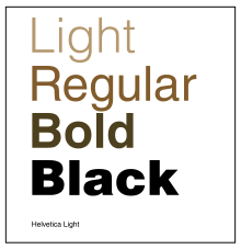

Helvetica Light
Helvetica Light was designed by Stempel's artistic director Erich Schultz-Anker, in conjunction with Arthur Ritzel.[36]
Helvetica Inserat (1957)
Helvetica Inserat (German for advertisement) is a version designed in 1957 primarily for use in the advertising industry: this is a narrow variant that is tighter than Helvetica Black Condensed. It gives the glyphs an even larger x-height and a more squared appearance, similar to Schmalfette Grotesk. Strikethrough strokes in $, ¢ are replaced by a non-strikethrough version. 4 is opened at the top.
Helvetica Compressed (1966)
Designed by Matthew Carter for cold type. It shares some design elements with Helvetica Inserat, but uses a curved tail in Q, downward pointing branch in r, and tilde bottom £. Carter has said that in practice it was designed to be similar to Schmalfette Grotesk and to compete in this role with British designs Impact and Compacta, as this style was popular at the time.[37]
The family consists of Helvetica Compressed, Helvetica Extra Compressed and Helvetica Ultra Compressed fonts. It has been digitised, for instance in the Adobe Helvetica release. It is used on the League of Gentlemen logo.
Helvetica Rounded (1978)
Helvetica Rounded is a version containing rounded stroke terminators. Only bold, black, bold condensed, and bold outline fonts were made, with outline font not issued in digital form by Linotype.
Helvetica Narrow
Helvetica Narrow is a version where its width is between Helvetica Compressed and Helvetica Condensed. However, the width is scaled in a way that is optically consistent with the widest width fonts.
The font was developed when printer ROM space was very scarce, so it was created by mathematically squashing Helvetica to 82% of the original width, resulting in distorted letterforms and thin vertical strokes next to thicker horizontals.[38]
Because of the distortion problems, Adobe dropped Helvetica Narrow in its release of Helvetica in OpenType format, recommending users choose Helvetica Condensed instead. However, in Linotype's OpenType version of Helvetica Narrow, the distortions found in the Adobe fonts are non-existent.
Alternative styles
Helvetica Textbook
Helvetica Textbook is an alternate design of the typeface, which uses 'schoolbook' stylistic alternates to increase distinguishability: a seriffed capital 'i' and 'j' to increase distinguishability, a 'q' with a flick upwards and other differences. The 'a', 't' and 'u' are replaced with designs similar to those in geometric sans-serifs such as those found in Futura.[39]
Language variants
The Cyrillic version was designed in-house in the 1970s at D Stempel AG, then critiqued and redesigned in 1992 under the advice of Jovica Veljović.[40]
Matthew Carter designed the Helvetica Greek.[41]
Lebanese designer Nadine Chahine designed Neue Helvetica Arabic.[42]
(Neue) Helvetica Thai (2012)
Thai font designer Anuthin Wongsunkakon of Cadson Demak Co. created Thai versions of Helvetica and Neue Helvetica fonts.[43][44] The design uses loopless terminals in Thai glyphs,[45][46] which had also been used by Wongsunkakon's previous design, Manop Mai (New Manop).[47]
Initial release included 6 fonts in OpenType Com format for each family in 3 weights (light, regular, bold) and 1 width, with complementary italics. OpenType features include fractions, glyph composition/decomposition.
Digitisations
Linotype and Monotype
Neue Helvetica (1983)

Helvetica Neue is a reworking of the typeface with a more structurally unified set of heights and widths. Other changes include improved legibility, heavier punctuation marks, and increased spacing in the numbers.
Neue Helvetica uses a numerical design classification scheme, like Univers. The font family is made up of 51 fonts including 9 weights in 3 widths (8, 9, 8 in normal, condensed, extended widths respectively), and an outline font based on Helvetica 75 Bold Outline (no Textbook or rounded fonts are available). Linotype distributes Neue Helvetica on CD.[48] Helvetica Neue also comes in variants for Central European and Cyrillic text.
It was developed at D. Stempel AG, a Linotype subsidiary. The studio manager was Wolfgang Schimpf, and his assistant was Reinhard Haus; the manager of the project was René Kerfante. Erik Spiekermann was the design consultant and designed the literature for the launch in 1983.[49]
Designer Christian Schwartz, who would later release his own digitisation of the original Helvetica designs (see below), expressed disappointment with this and other digital releases of Helvetica: "Much of the warm personality of Miedinger's shapes was lost along the way...digital Helvetica has always been one-size-fits-all, which leads to unfortunate compromises...the spacing has ended up much looser than Miedinger's wonderfully tight original at display sizes but much too tight for comfortable reading at text sizes."[50]
iOS used first Helvetica then Helvetica Neue[51] as its system font. All releases of Mac OS X prior to OS X Yosemite used Lucida Grande as the system font. The version of Helvetica Neue used as the system font in OS X 10.10 is specially optimised; Apple's intention is to provide a consistent experience for people who use both iOS and OS X.[52] Apple replaced Helvetica Neue with San Francisco in iOS 9 and OS X El Capitan.[53]
Neue Helvetica W1G (2009)
It is a version with Latin Extended, Greek, Cyrillic scripts support. Only OpenType CFF font format was released.
The family includes the fonts from the older Neue Helvetica counterparts, except Neue Helvetica 75 Bold Outline. Additional OpenType features include subscript/superscript.
Helvetica World
Also called Helvetica Linotype,[54] Helvetica World supports Arabic, Cyrillic, Greek, Hebrew, and Vietnamese scripts.
The family consists of four fonts in 2 weights and 1 width, with complementary italics.
The Arabic glyphs were based on a redesigned Yakout font family from Linotype. Latin kerning and spacing were redesigned to have consistent spacing.[55] John Hudson of Tiro Typeworks designed the Hebrew glyphs for the font family,[56] as well as the Cyrillic, and Greek letters.[57]
Neue Helvetica eText (2011)
It is a version of Neue Helvetica optimised for on-screen use, designed by Akira Kobayashi of Monotype Imaging.
The family includes 8 fonts in 4 weights and 1 width, with complementary italics (45, 46, 55, 56, 65, 66, 75, 76). OpenType features include numerators/denominators, fractions, ligatures, scientific inferiors, subscript/superscript.[58]
Neue Haas Grotesk (2010)
Christian Schwartz's digitisation for Font Bureau is based on the original Helvetica drawings.[59][60][61] It was released with an article on the history of Helvetica by Indra Kupferschmid.[62]
Unlike earlier digitisations, Schwartz created two different optical sizes for body text and display sizes, which have different spacing metrics giving tighter spacing at display size and looser spacing to increase legibility in body text. The release includes a number of features not present on digitisations branded as Helvetica, including corrected-curve obliques, tabular figures and stylistic alternates such as separate punctuation sets for upper- and lower-case text.[63] Writing for Typographica, typeface designer Matthew Butterick described the release as better than any previous digital release of Helvetica: "As someone who’s worked with cold-metal Helvetica, I can vouch for the fact that it’s never looked better...My sole criticism of the face [is] its ungainly name, which I’m regrettably certain will limit its visibility and hence its uptake. "Neue Haas Grotesk" makes it sound like a second cousin of Akzidenz Grotesk that’s just stumbled in from the hinterlands. But no, it is the rightful heir to the Helvetica throne. It should carry the Helvetica name."[64] Users include Bloomberg Businessweek and the Whitney Museum.[65][66] It originated from an abandoned redesign plan for the Guardian newspaper. The release does not include condensed weights or Greek and Cyrillic support.
Helvetica clones

As one of the most iconic typefaces of the twentieth century, derivative designs based on Helvetica were rapidly developed, taking advantage of the lack of copyright protection in the phototypesetting font market of the 1960s and 70s onwards.[67][68] Some of these were straight clones, simply intended to be direct substitutes.[69] Many of these are almost indistinguishable from Helvetica, while some add subtle differences.
Substitute Helvetica designs that have survived into or originated during the digital period have included Monotype's Arial, Compugraphic's CG Triumvirate, ParaType's Pragmatica, Bitstream's Swiss 721, URW++'s Nimbus Sans, Scangraphic's Europa Grotesk and others.[67][70]
Nimbus Sans
URW++ produced a modification of Helvetica called Nimbus Sans. This is an extremely large font family with optical sizes spaced for different sizes of text and other variants such as stencil styles. Florian Hardwig has described its display-oriented styles, with tight spacing, as more reminiscent of Helvetica as used in the 1970s from cold type than any official Helvetica digitisation.[71]
Arial and MS Sans Serif
Monotype's Arial, designed in 1982, while different from Helvetica in some few details, has identical character widths, and is indistinguishable by most non-specialists. The characters C, G, R, Q, 1, a, e, r, and t are useful for quickly distinguishing Arial and Helvetica.[72] Differences include:
- Helvetica's strokes are typically cut either horizontally or vertically. This is especially visible in the t, r, f, and C. Arial employs slanted stroke cuts.
- Helvetica's G has a well-defined spur; Arial does not.
- The tail of Helvetica's R is more upright whereas Arial's R is more diagonal.
- The number 1 of Helvetica has a square angle underneath the upper spur, Arial has a curve.
- The Q glyph in Helvetica has a straight cross mark, while the cross mark in Arial has a slight snake-like curve.
The design was created to substitute for Helvetica in digital printing, since Helvetica was a standard font design in this market. Arial (and many other clones of the period) are metrically identical to the PostScript version of Helvetica, so that a document designed in Helvetica could be displayed and printed correctly without IBM having to pay for a Helvetica license.[73][74][75]
Microsoft's "Helv" design, later known as "MS Sans Serif", is a sans-serif typeface that shares many key characteristics to Helvetica, including the horizontally and vertically aligned stroke terminators and more-uniform stroke widths within a glyph.
CNN Sans
In 2016, CNN introduced an Helvetica Neue-inspired font designed by Monotype Imaging known as CNN Sans. The font was commissioned in 30 different weights to facilitate multi-platform usage across its properties.[76][77][78]
CNN Sans has some resemblance to Helvetica Neue, while adding some few modifications in the characters, notably the numerical "1" having base, which Helvetica Neue doesn't have.
Free Helvetica substitute fonts
Nimbus Sans L, a version of URW's Nimbus Sans spaced to match the standard Linotype/PostScript version of Helvetica, was released under the GNU General Public License in 1996, and donated to the Ghostscript project to create a free PostScript alternative.[79][80] It (or a derivative) is used by much open-source software such as R as a system font.[81][82] A derivative of this family known as "TeX Gyre Heros" has been prepared for use in the TeX scientific document preparation software.[83]
FreeSans, a free font descending from URW++ Nimbus Sans L, which in turn descends from Helvetica.[84] It is one of free (GPL) fonts developed in GNU FreeFont project, first published in 2002.
Liberation Sans is a metrically equivalent font to Arial developed by Steve Matteson at Ascender and published by Red Hat under the SIL Open Font License.[85][86] It is used in some GNU/Linux distributions as default font replacement for Arial.[87] Oracle funded the additional development of Liberation Sans Narrow in 2010.[88][89] Google commissioned a variation named Arimo for Chrome OS.
Much more loosely, Roboto was developed by Christian Robertson of Google as the system font for its Android operating system; this has a more condensed design with the influence of straight-sided geometric designs like DIN 1451.
Derivative designs
Some fonts based on Helvetica are intended for different purposes and have clearly different designs. Digital-period font designer Ray Larabie has commented that in the 1970s "everyone was modifying Helvetica with funky curls, mixed-case and effects".[90] Indeed, in one 1973 competition to design new fonts, three of the twenty winners were decorative designs inspired by Helvetica.[91]
Forma (1968)
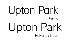
Created by Aldo Novarese at the Italian type foundry Nebiolo, Forma was a geometric-influenced derivative of Helvetica with a 'single-storey' 'a' and extremely tight spacing in the style of the period.[92][93][94] It was offered with 'request' stylistic alternates imitating Helvetica more closely.[92][95] Forma has been digitised by SoftMaker as "Formula" and (in a much more complete version with optical sizes) by Font Bureau for Tatler magazine.[96]
Helvetica Flair and others
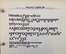
Designed by Phil Martin at Alphabet Innovations, Helvetica Flair is an unauthorised phototype-period redesign of Helvetica adding swashes and unicase-inspired capitals with a lower-case design. Considered a hallmark of 1970s design, it has never been issued digitally. It is considered to be a highly conflicted design, as Helvetica is seen as a spare and rational typeface and swashes are ostentatious: font designer Mark Simonson described it as "almost sacrilegious". Martin would later claim to have been accused of "typographic incest" by one German writer for creating it.
Helvetica Flair was one of several derivative fonts created by Martin in the 1970s (and a particularly questionably legal one, since it was directly named 'Helvetica').[97][98] Martin also produced 'Heldustry', a fusion of Helvetica and Eurostile,[99] and 'Helserif', a redesign of Helvetica with serifs,[100] and these have both been digitised.[69][101][102]
Shatter LET (1973)
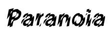
Designed by Vic Carless, Shatter assembles together slices of Helvetica to make a typeface that seems in motion, or broken and in pieces.[103] It was published by Letraset after jointly winning their 1973 competition to design new fonts.[91]
Writing in 2014, designer Tim Spencer praised the design for its ominous effect, writing that it offered "glitch-like mechanical aggression [inspired by] cold, machine-induced paranoia. It attacked the Establishment’s preferred information typography style with a sharp edge and recomposed it in a jarring manner that still makes your eyes skitter and your brain tick trying to recompose it. Shatter literally sliced up Swiss modernist authority."[104]
Larabie
In the digital period, Ray Larabie has released several digital fonts based on 70s-period adaptations: Coolvetica, Movatif and GGX88.[105][106]
Local Gothic
Inspired by noticeboards using stencilled or plastic letters from a variety of sources, Christian Schwartz created the font 'Local Gothic', which randomly mixes capitals in the loose style of several popular American display capital fonts, Helvetica Bold among them.[107]
Popular culture
In 2011, one of Google's April Fools' Day jokes centered around the use of Helvetica. If a user attempted to search for the term "Helvetica" using the search engine, the results would be displayed in the font Comic Sans.[108]
References
- ↑ Shinn, Nick. "Uniformity" (PDF). Nick Shinn. Graphic Exchange. Retrieved 1 July 2015.
- 1 2 3 Kupferschmid, Indra. "I had never loved Helvetica". Retrieved 5 October 2015.
- 1 2 Helvetica (Documentary). 2007-09-12.
- ↑ Shaw, Paul. "Helvetica and Univers addendum". Blue Pencil. Retrieved 1 July 2015.
- ↑ Majoor, Martin. "Inclined to be dull". Eye. 16 (63): 33–7.
- ↑ Shaw, Paul. "The Univers of Helvetica: A Tale of Two Typefaces". Print. Retrieved 26 June 2016.
- ↑ "myfonts: Arthur Ritzel". New.myfonts.com. 1999-02-22. Retrieved 2009-06-08.
- ↑ Shaw, Paul. "Helvetica & Univers". Blue Pencil. Retrieved 1 July 2015.
- ↑ Shaw, Paul. "Some history about Arial". Paul Shaw Letter Design. Retrieved 22 May 2015.
- ↑ Simonson, Mark. "Monotype's Other Arials". Mark Simonson Studio. Retrieved 14 July 2015.
- ↑ Covert, Adrian. "Why Apple's New Font Won't Work On Your Desktop". FastCoDesign. Retrieved 28 November 2014.
- ↑ Spiekermann, Erik. "Helvetica Sucks". Spiekermann blog. Retrieved 15 July 2015.
- ↑ Spiekermann, Erik. "Comment on Twitter". Twitter. Retrieved 14 June 2015.
- ↑ Spolsky, Joel. "User Interface Design For Programmers". Joel On Software. Retrieved 15 July 2015.
- ↑ Herrmann, Ralf. "The Design of a Signage Typeface". i love typography. Retrieved 27 July 2015.
- ↑ "Uses of Helvetica". Fonts In Use.
- ↑ "BBC News - Helvetica at 50". 2007-05-09. Retrieved 2009-02-20.
- ↑ "Daring Fireball: 4". John Gruber.
- ↑ Rawsthorn, Alice. "Helvetica: The little typeface that leaves a big mark". The New York Times. Retrieved 11 January 2016.
- ↑ Helvetica (Documentary). 2007-09-12.
- ↑ "Federal Identity Program Manual - 1.1 Design". Treasury Board of Canada Secretariat. Retrieved 2015-06-19.
A consistent typography is fundamental to corporate identity, and three faces from the Helvetica type family have been adopted for purposes of the FIP. They were chosen for their versatility, excellent legibility and contemporary design.
- ↑ "A Brief History of Fonts in Transit" (PDF). livewellcollaborative.org/. Retrieved 2015-06-22.
- ↑ Shaw, Paul. "The (Mostly) True Story of Helvetica and the New York City Subway". AIGA. Retrieved 6 November 2016.
- ↑ Bierut, Michael. "When in Helvetica". Wall Street Journal. Retrieved 6 November 2016.
- ↑ Lee, Jennifer. "How Helvetica Took Over the Subway". New York Times. Retrieved 6 November 2016.
- ↑ "Elementos Básicos de Identidad Corporativa de Metro de Madrid" [Basic Elements of the Corporate Identity of the Metro of Madrid] (PDF). metromadrid.es (in Spanish). Metro de Madrid. Retrieved 2015-06-23.
- ↑ "Eye blog » Rue Britanica.Typeface name changes after Eye magazine goes to press". Blog.eyemagazine.com. 2009-04-20. Retrieved 2013-09-21.
- ↑ Majoor, Martin (Spring 2007). "Inclined to be dull". Eye. Retrieved 3 August 2015.
- ↑ Spiekermann, Erik (1987). "Post Mortem or how I once designed a typeface for Europe's biggest company" (PDF). Baseline (9): 6–9. Retrieved 20 March 2016.
- ↑ Lupton, Ellen. "Forever Helvetica". Metropolis Magazine. Retrieved 4 July 2016.
- ↑ Savan, Leslie (1994). The Sponsored Life: Ads, TV, and American Culture. Philadelphia: Temple University Press. ISBN 9781439904909.
- ↑ "Linotype Announces Helvetica NOW Poster Contest". Creativepro.com. Retrieved 2009-06-08.
- ↑ "Helvetica NOW Poster Contest". Linotype.com. 2008-08-19. Retrieved 2009-06-08.
- ↑ "Exhibitions 2007: 50 Years of Helvetica". Museum of Modern Art, New York. Retrieved 2008-11-16.
- ↑ Helvetica. A New Typeface? at Disseny Hub Barcelona
- ↑ de Jong, Cees W; Purvis, Alston W; Friedl, Friedrich. "Creative Type: A Sourcebook of Classic and Contemporary Letterforms". Thames & Hudson. ISBN 978-0-50051229-6. Archived from the original on April 22, 2009. Retrieved 2009-06-08.
- ↑ Drucker, Margaret Re ; essays by Johanna; Mosley, James (2003). Typographically speaking : the art of Matthew Carter (2. ed.). New York: Princeton Architectural. p. 53. ISBN 9781568984278.
- ↑ "Type 1 ("PostScript") to OpenType font conversion". Adobe. Retrieved 2009-06-08.
- ↑ "Helvetica Textbook". FontShop. Retrieved 20 March 2016.
- ↑ "Helvetica Cyrillic". Fonts. Adobe. Retrieved 2009-06-08.
- ↑ "TYPO.18" (PDF) (magazine). CZ: Svettisku. December 2005.
- ↑ "Download Neue Helvetica® Arabic font family". Linotype.com. Retrieved 2013-09-21.
- ↑ "Helvetica now available in Thai" (World Wide Web log). Linotype. Mar 2003.
- ↑ "Helvetica jetzt auch in Thai – Eine der beliebtesten Schriften ab sofort in neuer Sprachversion bei Linotype erhältlich" (in German). 2012-03-20.
- ↑ Wongsunkakon, Anuthin (2 March 2012). "Note on Helvetica Thai". anuthin.org. Retrieved 25 May 2015.
- ↑ "Helvetica Thai". Linotype.
- ↑ "Manop Mai" (distribution). Anuthin + Cadson Demak. Dec 2009.
- ↑ "Linotype Library presents entire New Helvetica family on a single CD". Linotype.com. Retrieved 2009-06-08.
- ↑ "Who Made Helvetica Neue?" Archived June 8, 2015, at the Wayback Machine., typophile.com
- ↑ Schwartz, Christian. "Neue Haas Grotesk". Retrieved 28 November 2014.
- ↑ Gruber, John (29 June 2010). "Daring Fireball: 4". daringfireball.net. Retrieved May 25, 2015.
It’s a subtle change, but Apple has changed the system font for the iPhone 4, from Helvetica to Helvetica Neue. The change is specific to the iPhone 4 hardware (or more specifically, the Retina Display), not iOS 4.
- ↑ "OS X Human Interface Guidelines: Designing for Yosemite". Apple Developer. Apple, Inc. 2014-10-16. Retrieved 18 October 2014.
The use of Helvetica Neue also gives users a consistent experience when they switch between iOS and OS X.
- ↑ Stinson, Liz (2015-06-09). "Why Apple Abandoned the World's Most Beloved Typeface". Wired. Condé Nast. Retrieved 2015-07-24.
- ↑ "The Language Whiz — Helvetica Linotype". Linotype.com. 2007-10-16. Retrieved 2009-06-08.
- ↑ "Linotype Releases 1100+ OpenType Fonts: Release a Significant Step Towards Format's Acceptance". Typographica.org. August 6, 2003. Archived from the original on 2008-07-04. Retrieved 2009-06-08.
In the Comments Section: The biggest differences are the new Greek, Cyrillic and Hebrew designs, and the presence of Arabic support based on the radically redesigned Yakout Linotype (not a perfect match for the Helvetica, but the most appropriate in the Linotype Library; this is 'core font' Arabic support: not for fine typography). There is also a large maths and symbol set in each font (not complete maths typesetting support, but more than you'll get in most fonts). The only big change in the Latin is that the whole thing has been respaced. The old Helvetica Std Type 1 and TT fonts inherited, via phototype, the unit metrics of the original hot metal type. This led to all sorts of oddities in the sidebearings, which were cleaned up during development of Helvetica Linotype. It is still quite a tightly spaced typeface by today's standards, but the spacing is now consistent. It was also re-kerned. Helvetica Linotype has also been extensively hinted for screen. -- John Hudson
- ↑ "Experimental Arabic Type". Typographica.org. Retrieved 2009-06-08.
- ↑ Macmillan, Neil. An A–Z of Type Designers. Yale University Press: 2006. ISBN 0-300-11151-7.
- ↑ "Download Neue Helvetica® eText font family". Linotype.com. Retrieved 2013-09-21.
- ↑ "Neue Haas Grotesk". The Font Bureau, Inc. p. Introduction.
- ↑ "Neue Haas Grotesk - Font News". Linotype.com. Retrieved 2013-09-21.
- ↑ "Schwartzco Inc". Christianschwartz.com. Retrieved 2013-09-21.
- ↑ "Neue Haas Grotesk". History. The Font Bureau, Inc.
- ↑ "Neue Haas Grotesk". The Font Bureau, Inc. Retrieved 23 December 2013.
- ↑ Butterick, Matthew. "Neue Haas Grotesk". Typographica. Retrieved 22 October 2014.
- ↑ "Whitney rebranding". EJS. Retrieved 16 July 2015.
- ↑ "Bloomberg Businessweek redesign interviews". SPD. Retrieved 16 July 2015.
- 1 2 Simonson, Mark. "The Scourge of Arial". Mark Simonson Studio Notebook. Retrieved 19 March 2016.
Many type manufacturers in the past have done knock-offs of Helvetica that were indistinguishable or nearly so. For better or worse, in many countries—particularly the U.S.—while typeface names can be protected legally, typeface designs themselves are difficult to protect. So, if you wanted to buy a typesetting machine and wanted the real Helvetica, you had to buy Linotype. If you opted to purchase Compugraphic, AM, or Alphatype typesetting equipment, you couldn’t get Helvetica. Instead you got Triumvirate, or Helios, or Megaron, or Newton, or whatever. Every typesetting manufacturer had its own Helvetica look-alike. It’s quite possible that most of the “Helvetica” seen in the ’70s was actually not Helvetica.
- ↑ Downer, John. "Call It What It Is". Emigre. Retrieved 20 March 2016.
- 1 2 Loxley, Simon. "Font Wars: A Story On Rivalry Between Type Foundries". Smashing Magazine. Retrieved 20 March 2016.
- ↑ Devroye, Luc. "Helvetica clones". Type Design Information. Retrieved 20 March 2016.
- ↑ Hardwig, Florian. "National Trust Tree Appeal Poster". Fonts In Use. Retrieved 20 March 2016.
- ↑ How to Spot Arial at Mark Simonson Studio
- ↑ Shaw, Paul. "Arial Addendum no. 3". Blue Pencil. Retrieved 1 July 2015.
- ↑ Shaw (& Nicholas). "Arial addendum no. 4". Blue Pencil. Retrieved 1 July 2015.
- ↑ McDonald, Rob. "Some history about Arial". Paul Shaw Letter Design. Retrieved 22 May 2015.
- ↑ "CNN now has its own font … for some reason". NewscastStudio. 22 April 2016. Retrieved 29 April 2016.
- ↑ "CNN Customizes New Company-Wide Font". 2016-05-02. Retrieved 2016-08-30.
- ↑ "CNN Sans". Vimeo. Retrieved 2016-09-28.
- ↑ "Finally! Good-quality free (GPL) basic-35 PostScript Type 1 fonts." (TXT). Retrieved 2010-05-06.
- ↑ "ghostscript-fonts-std-4.0.tar.gz - GhostScript 4.0 standard fonts - AFPL license" (TAR.GZ). 1996-06-28. Retrieved 2010-05-06.
- ↑ "Fonts". R Cookbook. Retrieved 7 April 2016.
- ↑ Horton, Nicholas. "Specifying fonts in graphics". SAS & R. Retrieved 7 April 2016.
- ↑ "URW Palladio". The LaTeX font catalogue. TeX Users Group Denmark. Retrieved 7 April 2016.
- ↑ "GNU FreeFont - Design notes". 2009-10-04. Retrieved 2010-07-02.
- ↑ LiberationFontLicense – License Agreement and Limited Product Warranty, Liberation Font Software, retrieved 2012-12-19
- ↑ LICENSE - liberation-fonts, retrieved 2012-12-19
- ↑ Mandriva Linux 2008 Release Tour, retrieved 2010-04-04,
integrated into Mandriva Linux 2008
- ↑ "OpenOffice.org 3.3 New Features".
- ↑ Liberation Fonts, Fedora
- ↑ Larabie, Ray. "Coolvetica". Typodermic Fonts. Retrieved 19 March 2016.
- 1 2 Purcell, Chris. "Letraset International Typeface Competition Winners 1973". Fonts in Use. Retrieved 8 June 2016.
- 1 2 Kupferschmid, Indra. "Finding Forma". Font Bureau. Retrieved 20 March 2016.
- ↑ Colizzi, Alessandro. "Forma, Dattilo, Modulo: Nebiolo's last efforts to produce a universal typeface". academia.edu. Retrieved 20 March 2016.
- ↑ Colizzi, Alessandro. "Forma, Dattilo, Modulo. Nebiolo's last effort to produce a 'universal' typeface". ATypI conference 2013. Retrieved 20 March 2016.
- ↑ Miklavčič, Mitja. "Forma: a typeface designed by a committee". Mitja-M. Archived from the original on August 22, 2011. Retrieved 20 March 2016.
- ↑ "Formula Serial". MyFonts. Retrieved 3 July 2016.
- ↑ Simonson, Mark. "Interview with Phil Martin". Typographica. Retrieved 30 August 2014.
- ↑ Puckett, James. "Helvetica Flair (photo of specimen book)". Flickr.
- ↑ "Heldustry". MyFonts. URW++. Retrieved 19 March 2016.
- ↑ "Helserif". MyFonts. URW++. Retrieved 19 March 2016.
- ↑ Coles, Stephen. "Twitter post". Twitter. Retrieved 20 March 2016.
[From a Helserif ad:] "Look what happened to Helvetica. It grew wings."
- ↑ Budrick, Callie. "Vintage Fonts: 35 Adverts From the Past". Print. Retrieved 20 March 2016.
- ↑ Winch, Andrew. "Vic Carless Obituary". The Guardian. Retrieved 19 October 2014.
- ↑ Spencer, Tim. "Kern Your Enthusiasm: Shatter". HiLoBrow. Retrieved 19 October 2014.
- ↑ Larabie, Ray. "Movatif". Typodermic Fonts. Retrieved 19 March 2016.
- ↑ Larabie, Ray. "GGX88". Typodermic Fonts. Retrieved 19 March 2016.
- ↑ Schwartz, Christian. "Local Gothic". Schwartzco/Commercial Type. Retrieved 19 March 2016.
- ↑ Pickel, Janet (1 April 2011). "April Fool's Day: Helvetica becomes Comic Sans and Gmail Motion is on the move". The (Harrisburg, PA) Patriot-News. Retrieved 1 April 2011.
Further reading
- Wallis, Lawrence W (2000). Modern Encyclopedia of Typefaces 1960-90. London: Lund Humphries Publishers Ltd. ISBN 0-85331-567-1.
- Müller, Lars; Langer, Axel; Kupferschmid, Indra (2007). Malsy, Victo, ed. Helvetica forever: Story of a typeface. Baden, Switzerland: Lars Müller Publishers. ISBN 978-3-03778-121-0.
External links
| Wikimedia Commons has media related to Helvetica. |
- Typophile Typowiki: Helvetica
- To Helvetica and Back — 77 Years
- HELVETICA site for Independent Lens on PBS
- linotype.com: Helvetica Typeface Family overview & related Information
- Helvetica documentary site
- All About Helvetica Font
- Arial vs Helvetica
- MoMA Exhibition (2007), 50 Years of Helvetica
- Helvetica at 50 — BBC News article
- The Helvetica Hegemony: How an unassuming font took over the world — article in Slate, published May 25, 2007
- Helvetica: The little typeface that leaves a big mark — Herald Tribune article on the 50 years of Helvetica
- Alternatives to Helvetica: two overlapping articles by Stephen Coles at fontfeed.com and fontshop.com.
- Alternatives to Helvetica: article at typefacts.com
- Helvetica: Old and Neue
- Helvetica forever (book, exhibition, products)
- The Helvetica Story and Complete Collection
Typography terminology | |||||||||||||||
|---|---|---|---|---|---|---|---|---|---|---|---|---|---|---|---|
| Page | |||||||||||||||
| Paragraph | |||||||||||||||
| Character |
| ||||||||||||||
| Classifications |
| ||||||||||||||
| Punctuation | |||||||||||||||
| Typesetting | |||||||||||||||
| Typographic units | |||||||||||||||
| Digital typography |
| ||||||||||||||
| Related | |||||||||||||||
| |||||||||||||||