News Gothic
 | |
| Category | Sans-serif |
|---|---|
| Classification | Grotesque sans-serif |
| Designer(s) | Morris Fuller Benton |
| Foundry | American Type Founders |
News Gothic is a realist sans-serif typeface designed by Morris Fuller Benton, and released by the American Type Founders (ATF) in 1908. The typeface was originally drawn in two lighter weights, a medium text weight using the title News Gothic, and a closely related light weight marketed under the name Lightline Gothic. The typeface family was enlarged in 1958 with the addition of two bold weights. News Gothic is similar in proportion and structure to Franklin Gothic, also designed by Benton, but lighter.
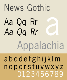
News Gothic, like other Benton sans serif typefaces, follows the grotesque model. Shapes that distinguish it from the neo-grotesque are the two-story lowercase a and the two-story lowercase g. Also distinctive are the blunt terminus at the apex of the lowercase t, and the location of the tail of the uppercase Q completely outside the bowl. The letter forms are compact, and descenders are shallow. The typeface differs from other realist sans-serifs in its organic shapes and subtle transitions of stroke width, all contributing to a less severe, humanist tone of voice. For much of the twentieth century News Gothic was used in newspaper and magazine publishing. For use in headlines, it was designed with condensed and extra-condensed styles.
'Gothic' was an early twentieth century term for sans-serifs, found mostly in the United States and Canada. It was also used in the UK, along with 'grotesque'. In Germany the term 'Grotesk' was used.
Hot metal release

- News Gothic
- News Gothic Italic
- News Gothic Condensed
- News Gothic Extra Condensed
- News Gothic Extra Condensed Title
- News Gothic Bold
- News Gothic Condensed Bold
As with Franklin Gothic, the foundry expanded the line sometime later, adding two more variants:
- News Gothic Bold (1958) designed by John L. “Bud” Renshaw
- News Gothic Condensed Bold (1965) designed by Frank Bartuska
Cold type copies
Virtually all producers of cold type offered their own versions of News Gothic under different names:[1]
- News Gothic — Alphatype, Autologic, Berthold, Compugraphic, Dymo, Harris, MGD Graphic Systems, Monotype, Varityper
- Gothstar Trade — Star/Photon
- Toledo — Graphic Systems Inc.
Digital releases

Because there is no active descendant of the American Type Founders Corporation making digital typefaces, News Gothic has been revived in digital form in many different versions from different sources.
Benton Sans is particularly notable as a greatly expanded font family based on News Gothic by Font Bureau, adding additional features such as wide styles and extra-bold weights. At 80 styles, it is one of the most complete digital renditions of the News Gothic style.[2] Its users include Newsweek, Fortune magazine, the Boston Globe and Sotheby's.[3]
Digital releases actually named News Gothic have a variety of features, often adding in weights not present in the original design or removing some less popular ones. For example, Bitstream's release is rare in including the extra-condensed styles. URW++'s (also sold by Fontsite) is only sold in one width but in a wide range of weights and with italics for every weight, while Linotype's lacks a light weight or any condensed styles.[4][5] Monotype's revival, a subset of which is included with many Microsoft products, features the condensed style but not extra-condensed, and has wider spacing than several others. Adobe, Monotype, Linotype and Bitstream have their own versions. The Bitstream version of News Gothic was extended with Cyrillic glyphs in 2005 and Greek glyphs in 2009 by Dmitry Kirsanov for ParaType, and is sold by them separately.[6]
News Gothic No. 2 is an enhanced version of News Gothic produced by the D. Stempel AG type foundry in 1984. It adds more weights to the News Gothic family than were available in other versions.The OpenType version of the No. 2 family comes in 6 weights with complementary italic fonts, supports ISO Adobe 2, Adobe CE, Latin Extended character sets. Adobe, Monotype, Linotype and Bitstream have their own versions. The Bitstream version of News Gothic was extended with Cyrillic glyphs in 2005 and Greek glyphs in 2009 by Dmitry Kirsanov for ParaType.[7]
Adobe Source Sans Pro is a single-width design based on the ATF version of News Gothic from their 1923 type specimen catalog, but differs in having true italics and a larger x-height for use with onscreen display. It was released in 2012 as Adobe's first open source font under the SIL Open Font License.[8]
News Cycle is an open-source variant by Nathan Willis based on 1908 specimens of News Gothic typeface from ATF extended with full Latin, Greek, and Cyrillic glyphs. It is an open source typeface licensed under the SIL Open Font License.[9][10]
Similar designs
Linotype called their similar design Trade Gothic while the Ludlow version was known as Record Gothic. Intertype copied the face under the same name and added a variant, News Gothic Bold (1955). Baltimore Type’s copy was called Balto Gothic, while their copy of Inland Type Foundry’s Inland Gothic No. 6 was perversely sold under the name News Gothic.[11]
In 1916, Sol Hess made alternate rounded characters for News Gothic Extra Condensed and the resulting face was sold by Lanston Monotype as Jefferson Gothic, which was also sold by Baltimore Type as Tourist Extra Condensed In 1935, M.F. Benton did much the same thing for A.T.F. and the face was called Phenix.
Ludlow’s Record Gothic began as a mere knock-off but, between 1956 and 1961, their in-house designer, R. Hunter Middleton made many original additions to the family including:[12]
- Record Gothic Condensed Italic
- Record Gothic Extended + Italic
- Record Gothic Bold + Italic
- Record Gothic Bold Condensed
- Record Gothic Bold Extended + Italic
- Record Gothic Bold Extended Reverse
- Record Gothic Thinline condensed
- Record Gothic Heavy Condensed
- Record Gothic Light Medium-Extended
- Record Gothic Medium-Extended + Italic
- Record Gothic Bold Medium-Extended
- Record Gothic Heavy Medium-Extended
Record Gothic is, again, a very inconsistent family, and has never been fully digitised.[13]
Usages

- The identity for the Brooklyn Academy of Music, designed by Michael Bierut, heavily uses News Gothic.
- The font on black Otis elevator pushbuttons (manufactured from the 1920s through the 1960s), the rounded Otis Lexan touch-sensitive buttons (manufactured from the 1960s through the 1980s) and floor indicators (1920s through the 1970s) primarily uses News Gothic, while the font on the squared Otis Lexan touch-sensitive buttons (manufactured from the 1960s through the 1980s) uses News Gothic Demi Bold.
- The text in figures of the scientific general Nature Magazine is set in News Gothic.
- The bold variant of News Gothic is used in the logo for the Swedish pop group ABBA, a logo conceived in 1976 by Rune Söderqvist. It should also be noted that the scanning used for the logo comes from Adobe, not Monotype.[14] The font is/was also used in promotional materials for the group, as well as CD and DVD liner notes.
- News Gothic Bold is also used in the artwork for The Fame Monster by Lady Gaga, possibly in a deliberate stylistic homage to ABBA.
- The numbers on split-flap displays on most 1970s Bob Stewart Productions game shows were News Gothic Bold.
- News Gothic Bold was used in Saul Bass' opening title sequence for Alfred Hitchcock's 1960 thriller, Psycho.
- News Gothic Bold was used in the Star Wars opening crawl for the main body of the text, as well as for the closing credits of each of the films in that series.
- The version of News Gothic that was on IBM typesetters was used widely by Fluxus artists such as George Maciunas (in his Fluxpublications) and George Brecht (in his event scores).[15][16]
- The logo adopted by Polaroid Corporation in the late 1950s, designed by Paul Giambarba, is set in News Gothic, as was much of the type on the company's packaging and documentation up until the 1980s.
- The Style Network uses the News Gothic typeface in its on-air identity along with a bold weight of the Didot typeface.
Heidelberg Gothic, a variant of News Gothic, is the house font of the Heidelberg Gruppe.[17]
JCP News Gothic commissioned by JC Penney consists of two new weights coordinated with Monotype News Gothic, and is designed for use in advertising campaigns.[18]
Bibliography
- Baines, Phil, Hastam, Andrew. Type and Typography. Watson-Guptill Publications: 2005. ISBN 0-8230-5528-0.
- Blackwell, Lewis. 20th Century Type. Yale University Press: 2004. ISBN 0-300-10073-6.
- Fiedl, Frederich, Nicholas Ott and Bernard Stein. Typography: An Encyclopedic Survey of Type Design and Techniques Through History, Black Dog & Leventhal: 1998. ISBN 1-57912-023-7.
- Jaspert, W. Pincus, W. Turner Berry and A. F. Johnson. The Encyclopædia of Type Faces, Blandford Press Lts.: 1953, 1983. ISBN 0-7137-1347-X.
- Macmillan, Neil. An A–Z of Type Designers. Yale University Press: 2006. ISBN 0-300-11151-7.
- Meggs, Phillip B. Revival of the Fittest, RC Publications, Inc: 2002. ISBN 1-883915-08-2.
References
- ↑ Lawson, Provan, and Romano, "Primer Metal Typeface Identification," pp. 34 - 35.
- ↑ "Benton Sans". Font Bureau. Retrieved 29 August 2015.
- ↑ "Benton Gothic". Fonts in Use. Retrieved 29 August 2015.
- ↑ "URW++ News Gothic". MyFonts. URW++. Retrieved 29 August 2015.
- ↑ "Linotype News Gothic". MyFonts. Linotype. Retrieved 29 August 2015.
- ↑ "News Gothic Font". Paratype. Retrieved 30 September 2014.
- ↑ "News Gothic Font". Paratype. Retrieved 30 September 2014.
- ↑ "Source Sans Pro: Adobe's first open source type family". TypeKit. Retrieved 30 September 2014.
- ↑ Willis, Nathan. "News Cycle font family". Launchpad. Retrieved 30 September 2014.
- ↑ "News Cycle". Open Font Library. Retrieved 9 December 2014.
- ↑ MacGrew, "American Metal Typefaces of the Twentieth Century," pp. 230 - 231.
- ↑ MacGrew, "American Metal Typefaces of the Twentieth Century," pp. 264 - 267.
- ↑ Coles, Stephen. "Record Gothic: fictional samples". Fonts in Use. Retrieved 29 August 2015.
- ↑ hem.bredband.net/b138451/logo/
- ↑ www.amazon-noir.com/BOOKS/6_%20The_Fluxus_Reader_Ken_Friedman.pdf
- ↑ ubu.clc.wvu.edu/historical/gb/index.html
- ↑ Devroye, Luc. "Heidelberg Gothic and Antiqua". Luc Devroye. Retrieved 30 September 2014.
- ↑ "JCP News Gothic". Terminal Design. Retrieved 30 September 2014.
External links
- ATF's 1912 specimen book, showing News Gothic on pages 698-709. Many sample settings including ads and newspaper designs.
- ATF's 1923 specimen book (their legendary last major specimen before the Depression), showing News Gothic and many related types. News Gothic samples are 472-477 (original page numbers).
- News Gothic Font Family – by Morris Fuller Benton
- News Gothic No. 2 Font Family – by Morris Fuller Benton
- News/Trade/Franklin Gothic alternatives - survey by Stephen Coles