Security visualisation

Security Visualisation is a subject that broadly covers the aspect of Big Data, Visualisation, human perception and Security. Each day, we are collecting more and more data in the form log files and it is often meaningless if the data is not analyzed thoroughly. Big Data mining techniques like Map Reduce help narrow down the search for meaning in vast data. Data visualisation is a data analytics technique, which is used to engage the human brain into finding patterns in data.
Recognition and cognition of patterns will lead to the recognition and cognition of anomalous patterns as well. Security Visualisation helps a security analyst identify imminent vulnerability and attacks in a network. Simple visualisations like bar charts and pie charts are naïve and unintuitive when it comes to Big Data. Special, customized visual techniques like Choropleth map and Hive Plot are often desired for effective communication of Big Data. The book "Applied Security Visualisation" is an in-depth study of the correlation between Security and Data Visualisation. [1]
Sophisticated Visualisations
Choropleth
Choropleth is a Visualization that depicts the intensity of a quantity through color shading. It can be useful in finding areas of interest through the variations in color and therefore a human readers attention will be drawn to the area that requires security attention. A Choropleth map is a geographical map in which the states or counties are shaded to depict region of interest.


Hive Plot
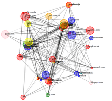
Computer Networks are often very troublesome to visualize because they end up looking complicated and difficult to understand. A force Diagram that is used to depict a computer network often ends up looking like a ball of hair when the number of nodes is large. Hence, making force diagrams unsuitable for unorganised Big Data. A hive plot is considered an improvement to Force-directed graph drawing especially suited for big data. Nodes are arranged along three or more axes and edges between nodes are drawn as Bezier curves. [2]
Heatmap
A Heat Map is a visual technique similar to the Choropleth Map. However, a Heat Map is shaded with gradient colors, which are usually computed using a normalized Heat Map function. These maps can be used to recognize areas that require attention through varying shades and patterns of Color Gradient.
ELISHA
ELISHA is a visual anomaly detection system. The tool aims at identifying Multiple Origin Autonomous system (MOAS) conflicts in a Border Gateway Protocol network. A MOAS conflict is identified by changes in color of the connected nodes in a BGP network. [3]
References
- ↑ Marty, Raffael (2008). Applied Security Visualization. Addison-Wesley Professional. Pearson Education. ISBN 0-321-51010-0.
- ↑ Krzywinski, Martin (2011). "Hive Plots — Rational Approach to Visualizing Networks". Briefings in Bioinformatics. doi:10.1093/bib/BBR069.
- ↑ S.T. Teoh; et al. "ELISHA: A Visual-Based Anomaly Detection System for the BGP Routing Protocol" (PDF).