Watercolor painting

Watercolor (American English) or watercolour (Commonwealth and Ireland), also aquarelle (French loanword), a diminutive of the Latin for water, is a painting method in which the paints are made of pigments suspended in a water-based solution. Watercolor refers to both the medium and the resulting artwork.
The traditional and most common support—material to which the paint is applied—for watercolor paintings is paper. Other supports include papyrus, bark papers, plastics, vellum, or leather, fabric, wood, and canvas. Watercolor paper is often made entirely or partially with cotton, which gives a good texture and minimizes distortion when wet.[1] Watercolors are usually translucent, and appear luminous because the pigments are laid down in a pure form with few fillers obscuring the pigment colors. Watercolors can also be made opaque by adding Chinese white.
In East Asia, watercolor painting with inks is referred to as brush painting or scroll painting. In Chinese, Korean, and Japanese painting it has been the dominant medium, often in monochrome black or browns. India, Ethiopia, and other countries have long watercolor painting traditions as well. Fingerpainting with watercolor paints originated in mainland China.
History
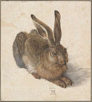
Watercolor painting is extremely old, dating perhaps to the cave paintings of paleolithic Europe, and has been used for manuscript illustration since at least Egyptian times but especially in the European Middle Ages. However, its continuous history as an art medium begins with the Renaissance. The German Northern Renaissance artist Albrecht Dürer (1471–1528), who painted several fine botanical, wildlife, and landscape watercolors, is generally considered among the earliest exponents of watercolor. An important school of watercolor painting in Germany was led by Hans Bol (1534–1593) as part of the Dürer Renaissance.
Despite this early start, watercolors were generally used by Baroque easel painters only for sketches, copies or cartoons (full-scale design drawings). Notable early practitioners of watercolor painting were Van Dyck (during his stay in England), Claude Lorrain, Giovanni Benedetto Castiglione, and many Dutch and Flemish artists. However, botanical illustration and wildlife illustration perhaps form the oldest and most important traditions in watercolor painting. Botanical illustrations became popular during the Renaissance, both as hand-tinted woodblock illustrations in books or broadsheets and as tinted ink drawings on vellum or paper. Botanical artists have traditionally been some of the most exacting and accomplished watercolor painters, and even today, watercolors—with their unique ability to summarize, clarify, and idealize in full color—are used to illustrate scientific and museum publications. Wildlife illustration reached its peak in the 19th century with artists such as John James Audubon, and today many naturalist field guides are still illustrated with watercolor paintings.
English school
Several factors contributed to the spread of watercolor painting during the 18th century, particularly in England. Among the elite and aristocratic classes, watercolor painting was one of the incidental adornments of a good education; mapmakers, military officers and engineers used it for its usefulness in depicting properties, terrain, fortifications, field geology, and for illustrating public works or commissioned projects. Watercolor artists were commonly brought with the geological or archaeological expeditions, funded by the Society of Dilettanti (founded in 1733), to document discoveries in the Mediterranean, Asia, and the New World. These expeditions stimulated the demand for topographical painters, who churned out memento paintings of famous sites (and sights) along the Grand Tour to Italy that was undertaken by every fashionable young man of the time.
In the late 18th century, the English cleric William Gilpin wrote a series of hugely popular books describing his picturesque journeys throughout rural England, and illustrated them with self-made sentimentalized monochrome watercolors of river valleys, ancient castles, and abandoned churches. This example popularized watercolors as a form of personal tourist journal. The confluence of these cultural, engineering, scientific, tourist, and amateur interests culminated in the celebration and promotion of watercolor as a distinctly English "national art". William Blake published several books of hand-tinted engraved poetry, provided illustrations to Dante's Inferno, and he also experimented with large monotype works in watercolor. Among the many other significant watercolorists of this period, were Thomas Gainsborough, John Robert Cozens, Francis Towne, Michael Angelo Rooker, William Pars, Thomas Hearne, and John Warwick Smith.
From the late 18th century through the 19th century, the market for printed books and domestic art contributed substantially to the growth of the medium. Watercolors were used as the basic document from which collectible landscape or tourist engravings were developed, and hand-painted watercolor originals or copies of famous paintings contributed to many upper class art portfolios. Satirical broadsides by Thomas Rowlandson, many published by Rudolph Ackermann, were also extremely popular.
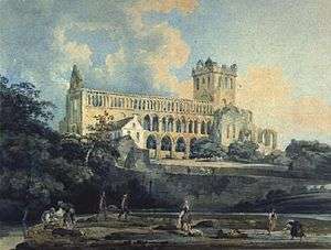
The three English artists credited with establishing watercolor as an independent, mature painting medium are Paul Sandby (1730–1809), often called the "father of the English watercolor", Thomas Girtin (1775–1802), who pioneered its use for large format, romantic or picturesque landscape painting, and Joseph Mallord William Turner (1775–1851), who brought watercolor painting to the highest pitch of power and refinement, and created hundreds of superb historical, topographical, architectural, and mythological watercolor paintings. His method of developing the watercolor painting in stages, starting with large, vague color areas established on wet paper, then refining the image through a sequence of washes and glazes, permitted him to produce large numbers of paintings with "workshop efficiency" and made him a multimillionaire, partly by sales from his personal art gallery, the first of its kind. Among the important and highly talented contemporaries of Turner and Girtin, were John Varley, John Sell Cotman, Anthony Copley Fielding, Samuel Palmer, William Havell, and Samuel Prout. The Swiss painter Louis Ducros was also widely known for his large format, romantic paintings in watercolor.
The confluence of amateur activity, publishing markets, middle class art collecting and 19th-century technique led to the formation of English watercolor painting societies: the Society of Painters in Water Colours (1804, now known as the Royal Watercolour Society) and the New Water Colour Society (1832, now known as the Royal Institute of Painters in Water Colours). (A Scottish Society of Painters in Water Colour was founded in 1878, now known as the Royal Scottish Society of Painters in Watercolour.) These societies provided annual exhibitions and buyer referrals for many artists. They also engaged in petty status rivalries and aesthetic debates, particularly between advocates of traditional ("transparent") watercolor and the early adopters of the denser color possible with body color or gouache ("opaque" watercolor). The late Georgian and Victorian periods produced the zenith of the British watercolor, among the most impressive 19th-century works on paper, due to artists Turner, Varley, Cotman, David Cox, Peter de Wint, William Henry Hunt, John Frederick Lewis, Myles Birket Foster, Frederick Walker, Thomas Collier, and many others. In particular, the graceful, lapidary, and atmospheric watercolors ("genre paintings") by Richard Parkes Bonington created an international fad for watercolor painting, especially in England and France in the 1820s.
The popularity of watercolors stimulated many innovations, including heavier and more sized wove papers, and brushes (called "pencils") manufactured expressly for watercolor. Watercolor tutorials were first published in this period by Varley, Cox, and others, establishing the step-by-step painting instructions that still characterize the genre today; The Elements of Drawing, a watercolor tutorial by English art critic John Ruskin, has been out of print only once since it was first published in 1857. Commercial brands of watercolor were marketed and paints were packaged in metal tubes or as dry cakes that could be "rubbed out" (dissolved) in studio porcelain or used in portable metal paint boxes in the field. Contemporary breakthroughs in chemistry have made many new pigments available, including prussian blue, ultramarine blue, cobalt blue, viridian, cobalt violet, cadmium yellow, aureolin (potassium cobaltinitrite), zinc white, and a wide range of carmine and madder lakes. These pigments, in turn, stimulated a greater use of color with all painting media, but in English watercolors, particularly by the Pre-Raphaelite Brotherhood.
United States

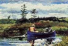
Watercolor painting also became popular in the United States during the 19th century; outstanding early practitioners included John James Audubon, as well as early Hudson River School painters such as William H. Bartlett and George Harvey. By mid-century, the influence of John Ruskin led to increasing interest in watercolors, particularly the use of a detailed "Ruskinian" style by such artists as John W. Hill Henry, William Trost Richards, Roderick Newman, and Fidelia Bridges. The American Society of Painters in Watercolor (now the American Watercolor Society) was founded in 1866. Late-19th-century American exponents of the medium included Thomas Moran, Thomas Eakins, John LaFarge, John Singer Sargent, Childe Hassam, and, preeminently, Winslow Homer.
Europe
%2C_Autumn_landscape_in_Rybiniszki%2C_1902.jpeg)
Watercolor was less popular in Continental Europe. In the 18th century, gouache was an important medium for the Italian artists Marco Ricci and Francesco Zuccarelli, whose landscape paintings were widely collected.[2] Gouache was used by a number of artists in France as well. In the 19th century, the influence of the English school helped popularize "transparent" watercolor in France, and it became an important medium for Eugène Delacroix, François Marius Granet, Henri-Joseph Harpignies, and the satirist Honoré Daumier. Other European painters who worked frequently in watercolor were Adolph Menzel in Germany and Stanisław Masłowski in Poland.
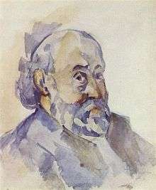
Unfortunately, the careless and excessive adoption of brightly colored, petroleum-derived aniline dyes (and pigments compounded from them), which all fade rapidly on exposure to light, and the efforts to properly conserve the twenty thousand J. M. W. Turner paintings inherited by the British Museum in 1857, led to an examination and negative reevaluation of the permanence of pigments in watercolor. This caused a sharp decline in their status and market value. Nevertheless, isolated practitioners continued to prefer and develop the medium into the 20th century. Gorgeous landscape and maritime watercolors were done by Paul Signac, and Paul Cézanne developed a watercolor painting style consisting entirely of overlapping small glazes of pure color.
20th and 21st centuries
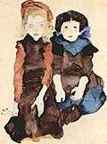
Among the many 20th-century artists who produced important works in watercolor, Wassily Kandinsky, Emil Nolde, Paul Klee, Egon Schiele, and Raoul Dufy must be mentioned. In America, the major exponents included Charles Burchfield, Edward Hopper, Georgia O'Keeffe, Charles Demuth, and John Marin (80% of his total work is watercolor). In this period, American watercolor painting often imitated European Impressionism and Post-Impressionism, but significant individualism flourished in "regional" styles of watercolor painting from the 1920s to 1940s. In particular, the "Cleveland School" or "Ohio School" of painters centered around the Cleveland Museum of Art, and the "California Scene" painters were often associated with Hollywood animation studios or the Chouinard Art Institute (now California Institute of the Arts). The California painters exploited their state's varied geography, Mediterranean climate, and "automobility" to reinvigorate the outdoor or "plein air" tradition. The most influential among them were Phil Dike, Millard Sheets, Rex Brandt, Dong Kingman, and Milford Zornes. The California Water Color Society, founded in 1921 and later renamed the National Watercolor Society, sponsored important exhibitions of their work. Although the rise of abstract expressionism, and the trivializing influence of amateur painters and advertising- or workshop-influenced painting styles, led to a temporary decline in the popularity of watercolor painting after c. 1950, watercolors continue to be utilized by artists like Martha Burchfield, Joseph Raffael, Andrew Wyeth, Philip Pearlstein, Eric Fischl, Gerhard Richter, Anselm Kiefer, and Francesco Clemente. In Spain, Ceferí Olivé created an innovative style followed by his students, such as Rafael Alonso López-Montero and Francesc Torné Gavaldà. In Mexico, the major exponents are Ignacio Barrios, Edgardo Coghlan, Ángel Mauro, Vicente Mendiola, and Pastor Velázquez. In the Canary Islands, where this pictorial technique has many followers, there are stand-out artists such as Francisco Bonnín Guerín, José Comas Quesada, and Alberto Manrique.
Modern watercolor paints are now as durable and colorful as oil or acrylic paints, and the recent renewed interest in drawing and multimedia art has also stimulated demand for fine works in watercolor. As art markets expand, painting societies continue to add members, and aging baby boomers increasingly retire to more contemplative hobbies, so that watercolor painting, at both the amateur and professional level, continues its popularity.
Materials
Paint
Watercolor paint consists of four principal ingredients:
- pigments, natural or synthetic, mineral or organic
- gum arabic as a binder to hold the pigment in suspension and fix the pigment to the painting surface
- additives like glycerin, ox gall, honey, and preservatives to alter the viscosity, hiding, durability or color of the pigment and vehicle mixture
- solvent (water), the substance used to thin or dilute the paint for application, which evaporates when the paint hardens or dries
The term watermedia refers to any painting medium that uses water as a solvent and that can be applied with a brush, pen, or sprayer. This includes most inks, watercolors, temperas, caseins, gouaches, and modern acrylic paints.
The term watercolor refers to paints that use water-soluble, complex carbohydrates as a binder. Originally (in the 16th to 18th centuries), watercolor binders were sugars and/or hide glues, but since the 19th century, the preferred binder is natural gum arabic, with glycerin and/or honey as additives to improve plasticity and solubility of the binder, and with other chemicals added to improve product shelf life.
The term bodycolor refers to paint that is opaque rather than transparent. It usually refers to opaque watercolor, known as gouache.[3] Modern acrylic paints are based on a completely different chemistry that uses water-soluble acrylic resin as a binder.
Commercial watercolors
Watercolor painters before the turn of the 18th century had to make paints themselves using pigments purchased from an apothecary or specialized "colorman". The earliest commercial paints were small, resinous blocks that had to be wetted and laboriously "rubbed out" in water. William Reeves (1739–1803) started his business as a colorman around 1766. In 1781, he and his brother, Thomas Reeves, were awarded the Silver Palette of the Society of Arts, for the invention of the moist watercolor paint-cake, a time-saving convenience, coincidentally introduced in the "golden age" of English watercolor painting.
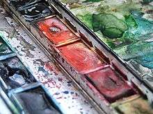
Modern commercial watercolor paints are available in two forms: tubes or pans. The majority of paints sold are in collapsible metal tubes in standard sizes (typically 7.5, 15 or 37 mL) and formulated to a consistency similar to toothpaste. Pan paints (actually small dried cakes or bars of paint in an open plastic container) are usually sold in two sizes, full pans (approximately 3 cc of paint) and half pans (favored for compact paint boxes). Pans are historically older but commonly perceived as less convenient; they are most often used in portable metal paint boxes, also introduced in the mid-19th century, and are preferred by landscape or naturalist painters.
Owing to modern industrial organic chemistry, the variety, saturation, and permanence of artists' colors available today has improved. However, the art materials industry is too small to exert any market leverage on global dye or pigment manufacture. With rare exceptions, all modern watercolor paints utilize pigments that were manufactured for use in printing inks, automotive and architectural paints, wood stains, concrete, ceramics and plastics colorants, consumer packaging, foods, medicines, textiles and/or cosmetics. Paint manufacturers buy very small supplies of these pigments, mill them with the vehicle, solvent, and additives, and package them.
The most widely used and globally available brands of commercial watercolors are Daler-Rowney, Daniel Smith, Winsor & Newton, Da Vinci, Holbein, Maimeri, M. Graham, Reeves, Schmincke, Sennelier, Royal Talens, Lukas 1862, Soho Urban Artist, and Turner Artists'. Some British-made watercolors can be found in craft stores in America and other countries.
Color names
Many artists are confused or misled by labeling practices common in the art materials industry. The marketing name for a paint, such as "indian yellow" or "emerald green", is often only a poetic color evocation or proprietary moniker; there is no legal requirement that it describe the pigment that gives the paint its color.
To remedy this confusion, in 1990 the art materials industry voluntarily began listing pigment ingredients on the paint packaging, using the common pigment name (such as "cobalt blue" or "cadmium red"), and/or a standard pigment identification code, the generic color index name (PB28 for cobalt blue, PR108 for cadmium red) assigned by the Society of Dyers and Colourists (UK) and the American Association of Textile Chemists and Colorists (USA) and known as the Colour Index International. This allows artists to choose paints according to their pigment ingredients, rather than the poetic labels assigned to them by marketers. Paint pigments and formulations vary across manufacturers, and watercolor paints with the same color name (e.g., "sap green") from different manufacturers can be formulated with completely different ingredients.
Transparency
Watercolor paints are customarily evaluated on a few key attributes. In the partisan debates of the 19th-century English art world, gouache was emphatically contrasted to traditional watercolors and denigrated for its high hiding power or lack of "transparency"; "transparent" watercolors were exalted. Paints with low hiding power are valued because they allow an underdrawing or engraving to show in the image, and because colors can be mixed visually by layering paints on the paper (which itself may be either white or tinted). The resulting color will change depending on the layering order of the pigments. In fact, there are very few genuinely transparent watercolors, neither are there completely opaque watercolors (with the exception of gouache); and any watercolor paint can be made more transparent simply by diluting it with water.
"Transparent" colors do not contain titanium dioxide (white) or most of the earth pigments (sienna, umber, etc.) which are very opaque. The 19th-century claim that "transparent" watercolors gain "luminosity" because they function like a pane of stained glass laid on paper – the color intensified because the light passes through the pigment, reflects from the paper, and passes a second time through the pigment on its way to the viewer—is false: watercolor paints do not form a cohesive paint layer, as do acrylic or oil paints, but simply scatter pigment particles randomly across the paper surface; the transparency consists in the paper being directly visible between the particles.[4] Watercolors appear more vivid than acrylics or oils because the pigments are laid down in a more pure form with no or fewer fillers (such as kaolin) obscuring the pigment colors. Furthermore, typically most or all of the gum binder will be absorbed by the paper, preventing it from changing the visibility of the pigment.[4] Even multiple layers of watercolor do achieve a very luminous effect without fillers or binder obscuring the pigment particles.
Pigments characteristics
Staining is a characteristic assigned to watercolor paints: a staining paint is difficult to remove or lift from the painting support after it has been applied or dried. Less staining colors can be lightened or removed almost entirely when wet, or when rewetted and then "lifted" by stroking gently with a clean, wet brush and then blotted up with a paper towel. In fact, the staining characteristics of a paint depend in large part on the composition of the support (paper) itself, and on the particle size of the pigment. Staining is increased if the paint manufacturer uses a dispersant to reduce the paint milling (mixture) time, because the dispersant acts to drive pigment particles into crevices in the paper pulp, dulling the finished color.
Granulation refers to the appearance of separate, visible pigment particles in the finished color, produced when the paint is substantially diluted with water and applied with a juicy brush stroke; pigments notable for their watercolor granulation include viridian (PG18), cerulean blue (PB35), cobalt violet (PV14), and some iron oxide pigments (PBr7).
Flocculation refers to a peculiar clumping typical of ultramarine pigments (PB29 or PV15). Both effects display the subtle effects of water as the paint dries, are unique to watercolors, and are deemed attractive by accomplished watercolor painters. This contrasts with the trend in commercial paints to suppress pigment textures in favor of homogeneous, flat color.
Grades
Commercial watercolor paints come in three grades: "Artist" (or "Professional"), "Student", and "Scholastic". Many watercolors are more vibrant if they are in higher quality pigment.
- Artist watercolors contain a full pigment load, suspended in a binder, generally natural gum arabic. Artist quality paints are usually formulated with fewer fillers (kaolin or chalk) which results in richer color and vibrant mixes. Conventional watercolors are sold in moist form, in a tube, and are thinned and mixed on a dish or palette. They are used on paper and other absorbent surfaces that have been primed to accept water-based paint.
- Student grade paints have less pigment, and often are formulated using two or more less expensive pigments. Student watercolors have working characteristics similar to professional watercolors, but with lower concentrations of pigment, less expensive formulas, and a smaller range of colors. More expensive pigments are generally replicated by hues. Colors are designed to be mixed, although color strength is lower. Hues may not have the same mixing characteristics as regular full-strength colors.
- Scholastic watercolors come in pans rather than tubes, and contain inexpensive pigments and dyes suspended in a synthetic binder. Washable formulations feature colors that are chosen to be non-staining, easily washable, suitable for use even by young children with proper supervision. They are an excellent choice for teaching beginning artists the properties of color and the techniques of painting.
Reserves
As there is no transparent white watercolor, the white parts of a watercolor painting are most often areas of the paper "reserved" (left unpainted) and allowed to be seen in the finished work. To preserve these white areas, many painters use a variety of resists, including masking tape, clear wax, or liquid latex, that are applied to the paper to protect it from paint, then pulled away to reveal the white paper. Resist painting can also be an effective technique for beginning watercolor artists. The painter can use wax crayons or oil pastels prior to painting the paper. The wax or oil mediums repel or resist the watercolor paint. White paint (titanium dioxide PW6 or zinc oxide PW4) is best used to insert highlights or white accents into a painting. If mixed with other pigments, white paints may cause them to fade or change hue under light exposure. White paint (gouache) mixed with a "transparent" watercolor paint will cause the transparency to disappear and the paint to look much duller. White paint will always appear dull and chalky next to the white of the paper; however this can be used for some effects.
Brushes
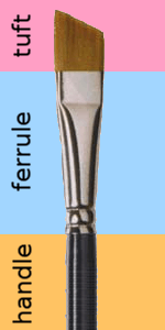
A brush consists of three parts: the tuft, the ferrule and the handle.
- The tuft is a bundle of animal hairs or synthetic fibers tied tightly together at the base;
- The ferrule is a metal sleeve that surrounds the tuft, gives the tuft its cross sectional shape, provides mechanical support under pressure, and protects from water wearing down the glue joint between the trimmed, flat base of the tuft and the handle;
- The lacquered wood handle, which is typically shorter in a watercolor brush than in an oil painting brush, has a distinct shape—widest just behind the ferrule and tapering to the tip.
When painting, painters typically hold the brush just behind the ferrule for the smoothest brushstrokes.
Major watercolor brush manufacturers include Daler-Rowney, Arches, Silver Brush Ltd, Black Velvet® series, Creative Mark, DaVinci, Escoda, Isabey, Raphael, Kolonok, Robert Simmons, and Winsor & Newton. As with papers and paints, it is common for retailers to commission brushes under their own label from an established manufacturer like Blick Art Materials, Cheap Joe's, Daniel Smith, and Utrecht.
Hairs and fibers
Brushes hold paint (the "bead") through the capillary action of the small spaces between the tuft hairs or fibers; paint is released through the contact between the wet paint and the dry paper and the mechanical flexing of the tuft, which opens the spaces between the tuft hairs, relaxing the capillary restraint on the liquid. Because thinned watercolor paint is far less viscous than oil or acrylic paints, the brushes preferred by watercolor painters have a softer and denser tuft. This is customarily achieved by using natural hair harvested from farm raised or trapped animals, in particular sable, squirrel, or mongoose. Less expensive brushes, or brushes designed for coarser work, may use horsehair or bristles from pig or ox snouts and ears.
However, as with paints, modern chemistry has developed many synthetic and shaped fibers that rival the stiffness of bristle and mimic the spring and softness of natural hair. Until fairly recently, nylon brushes could not hold a reservoir of water at all so they were extremely inferior to brushes made from natural hair. In recent years, improvements in the holding and pointing properties of synthetic filaments have gained them much greater acceptance among watercolorists. New fibers have hollow centers that draw color into them and hold as much, if not more color than natural hair brushes. They release color as well as natural hair brushes and are available in a wide array of softness for various needs. Creative Mark's Mimik Kolinsky, Squirrel and Bristle are among the very latest of such brushes.
There is no market regulation on the labeling applied to artists' brushes, but most watercolorists prize brushes from kolinsky (Russian or Chinese) sable. The best of these hairs have a characteristic reddish-brown color, darker near the base, and a tapering shaft that is pointed at the tip but widest about halfway toward the root. Squirrel hair is quite thin, straight, and typically dark, and makes tufts with a very high liquid capacity; mongoose has a characteristic salt and pepper coloring. Bristle brushes are stiffer and lighter colored. "Camel" is sometimes used to describe hairs from several sources (none of them a camel).
In general, natural hair brushes have superior snap and pointing, a higher capacity (hold a larger bead, produce a longer continuous stroke, and wick up more paint when moist) and a more delicate release. Synthetic brushes tend to dump too much of the paint bead at the beginning of the brush stroke and leave a larger puddle of paint when the brush is lifted from the paper, and they cannot compete with the pointing of natural sable brushes and are much less durable. On the other hand, they are typically much cheaper than natural hair, and the best synthetic brushes are now very serviceable; they are also excellent for texturing, shaping, or lifting color, and for the mechanical task of breaking up or rubbing paint to dissolve it in water.
A high quality sable brush has five key attributes: pointing (in a round, the tip of the tuft comes to a fine, precise point that does not splay or split; in a flat, the tuft forms a razor thin, perfectly straight edge); snap (or "spring"; the tuft flexes in direct response to the pressure applied to the paper, and promptly returns to its original shape); capacity (the tuft, for its size, holds a large bead of paint and does not release it as the brush is moved in the air); release (the amount of paint released is proportional to the pressure applied to the paper, and the paint flow can be precisely controlled by the pressure and speed of the stroke as the paint bead is depleted); and durability (a large, high quality brush may withstand decades of daily use).
Most natural hair brushes are sold with the tuft cosmetically shaped with starch or gum, so brushes are difficult to evaluate before purchasing, and durability is only evident after long use. The most common failings of natural hair brushes are that the tuft sheds hairs (although a little shedding is acceptable in a new brush), the ferrule loosens, or the wood handle shrinks, warps, cracks, or flakes off its lacquer coating.
Shapes
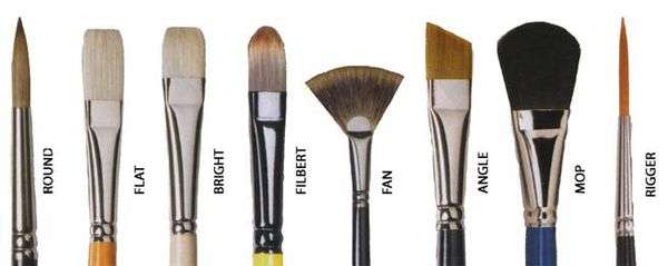
Natural and synthetic brushes are sold with the tuft shaped for different tasks. Among the most popular are:
- Rounds. The tuft has a round cross section but a tapering profile, widest near the ferrule (the "belly") and tapered at the tip (the "point"). These are general purpose brushes that can address almost any task.
- Flats. The tuft is compressed laterally by the ferrule into a flat wedge; the tuft appears square when viewed from the side and has a perfectly straight edge. "Brights" are flats in which the tuft is as long as it is wide; "one stroke" brushes are longer than their width. "Sky brushes" or "wash brushes" look like miniature housepainting brushes; the tuft is usually 3 cm to 7 cm wide and is used to paint large areas.
- Mops (natural hair only). A round brush, usually of squirrel hair and, decoratively, with a feather quill ferrule that is wrapped with copper wire; these have very high capacity for their size, especially good for wet in wet or wash painting; when moist they can wick up large quantities of paint.
- Filbert (or "Cat's Tongue", hair only). A hybrid brush: a flat that comes to a point, like a round, useful for specially shaped brush strokes.
- Rigger (hair only). An extremely long, thin tuft, originally used to paint the rigging in nautical portraits.
- Fan. A small flat in which the tuft is splayed into a fan shape; used for texturing or painting irregular, parallel hatching lines.
- Acrylic. A flat brush with synthetic bristles, attached to a (usually clear) plastic handle with a beveled tip used for scoring or scraping.
- Dagger. A flat brush with angled tuft. Able to produce fine lines with the pointed edge just touching the paper or a flat wide stroke with the entire edge.
A single brush can produce many lines and shapes. A "round" for example, can create thin and thick lines, wide or narrow strips, curves, and other painted effects. A flat brush when used on end can produce thin lines or dashes in addition to the wide swath typical with these brushes, and its brushmarks display the characteristic angle of the tuft corners.
Every watercolor painter works in specific genres and has a personal painting style and "tool discipline", and these largely determine his or her preference for brushes. Artists typically have a few favorites and do most work with just one or two brushes. Brushes are typically the most expensive component of the watercolorist's tools, and a minimal general purpose brush selection would include:
- 4 round (for detail and drybrush)
- 8 round
- 12 or 14 round (for large color areas or washes)
- 1/2" or 1" flat
- 12 mop (for washes and wicking)
- 1/2" acrylic (for dissolving or mixing paints, and scrubbing paints before lifting from the paper)
Sizes
The size of a round brush is designated by a number, which may range from 0000 (for a very tiny round) to 0, then from 1 to 24 or higher. These numbers refer to the size of the brass brushmakers' mould used to shape and align the hairs of the tuft before it is tied off and trimmed and, as with shoe lasts, these sizes vary from one manufacturer to the next. In general a #12 round brush has a tuft about 2 to 2.5 cm long; tufts are generally fatter (wider) in brushes made in England than in brushes made on the Continent: a German or French #14 round is approximately the same size as an English #12. Flats may be designated either by a similar but separate numbering system, but more often are described by the width of the ferrule, measured in centimeters or inches.
Watercolor pencil
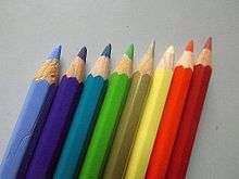
Watercolor pencil is another important tool in watercolors techniques. This water-soluble color pencil allows to draw fine details and to blend them with water. Noted artists who use watercolor pencils include illustrator Travis Charest.[5] A similar tool is the watercolor pastel – broader than a watercolor pencil and able to quickly cover a large surface.
Paper
Most watercolor painters before the 19th century had to use whatever paper was available: Thomas Gainsborough was delighted to buy some paper used to print a Bath tourist guide, while the young David Cox preferred a heavy paper used to wrap packages. James Whatman first offered a wove watercolor paper in 1788, and the first machine-made ("cartridge") papers from a steam powered mill in 1805.
Now, watercolor painters typically paint on paper specifically formulated for watermedia applications. Watercolor paper is essentially blotting paper marketed and sold as an art paper and, if unsized, can be used as a substitute for blotter. Lower end watercolor papers which may contain wood pulp resemble heavy paper, while higher end varieties are usually entirely cotton or linen content and more porous like blotter.[6] Watercolor paper is traditionally torn and not cut.
Fine watermedia papers are manufactured under the brand names Arches, Canson, The Langton (The Langton Prestige), Strathmore, Winsor & Newton, Bockingford, Cartiera Magnani, Fabriano, Hahnemühle, Lanaquarelle, Millford, Saunders Waterford, and Zerkall. There has been a resurgence in handmade papers by Twinrocker, Velke Losiny, Ruscombe Mill, and St. Armand.
All art papers can be described by eight attributes: furnish, color, weight, finish, sizing, dimensions, permanence, and packaging.
Furnish
The traditional furnish or material content of watercolor papers is cellulose, a structural carbohydrate found in many plants. The most common sources of paper cellulose are cotton, linen, or alpha cellulose extracted from wood pulp. To make paper, the cellulose is wetted, mechanically macerated or pounded, chemically treated, rinsed, and filtered to the consistency of thin oatmeal, then poured out into paper making moulds. In handmade papers, the pulp is hand poured ("cast") into individual paper moulds (a mesh screen stretched within a wood frame) and shaken by hand into an even layer. In industrial paper production, the pulp is formed by large papermaking machines that spread the paper over large cylinders—either heated metal cylinders that rotate at high speed (machinemade papers) or wire mesh cylinders that rotate at low speed (mouldmade papers). Both types of machine produce the paper in a continuous roll or web, which is then cut into individual sheets.
Weight
The basis weight of the paper is a measure of its density and thickness. It is described as the gram weight of one square meter of a single sheet of the paper, or grams per square meter (gsm). Most watercolor papers sold today are in the range between 280gsm to 640gsm. (The previous Imperial system, expressed as the weight in pounds of one ream or 500 sheets of the paper, regardless of its size, obsolete in some areas, is still used in the United States. The most common weights under this system are 300 lb (heaviest), 200 lb 140 lb, and 90 lb.) Heavier paper is sometimes preferred over lighter weight or thinner paper because it does not buckle and can hold up to scrubbing and extremely wet washes. Watercolor papers are typically almost a pure white, sometimes slightly yellow (called natural white), though many tinted or colored papers are available. An important diagnostic is the rattle of the paper, or the sound it makes when held aloft by one corner and shaken vigorously. Papers that are dense and made from heavily macerated pulp have a bright, metallic rattle, while papers that are spongy or made with lightly macerated pulp have a muffled, rubbery rattle.
Finish
All papers obtain a texture from the mold used to make them: a wove finish results from a uniform metal screen (like a window screen); a laid finish results from a screen made of narrowly spaced horizontal wires separated by widely spaced vertical wires. The finish is also affected by the methods used to wick and dry the paper after it is "couched" (removed) from the paper mold or is pulled off the papermaking cylinder.
Watercolor papers come in three basic finishes: hot pressed (HP), cold press (CP or, in the UK, "Not", for "not hot pressed"), and rough (R). These vary greatly from manufacturer to manufacturer.
- Rough papers are typically dried by hanging them like laundry ("loft drying") so that the sheets are not exposed to any pressure after they are couched; the wove finish has a pitted, uneven texture that is prized for its ability to accent the texture of watercolor pigments and brushstrokes.
- Cold pressed papers are dried in large stacks, between absorbent felt blankets; this acts to flatten out about half of the texture found in the rough sheets. CP papers are valued for their versatility.
- Hot pressed papers are cold pressed sheets that are passed through heated, compressing metal cylinders (called "calendering"), which flattens almost all the texture in the sheets. HP papers are valued because they are relatively nonabsorbent: pigments remain on the paper surface, brightening the color, and water is not absorbed, so it can produce a variety of water stains or marks as it dries.
These designations are only relative; the CP paper from one manufacturer may be rougher than the R paper from another manufacturer. Fabriano even offers a "soft press" (SP) sheet intermediate between CP and HP.
Sizing
Watercolor papers are traditionally sized, or treated with a substance to reduce the cellulose absorbency. Internal sizing is added to the paper pulp after rinsing and before it is cast in the paper mould; external or "tub" sizing is applied to the paper surface after the paper has dried. The traditional sizing has been gelatin, gum arabic, or rosin, though modern synthetic substitutes (alkyl ketene dimers such as Aquapel) are now used instead. The highly absorbent papers that contain no sizing are designated waterleaf.
Dimensions
Most art papers are sold as single sheets of paper in standard sizes. Most common is the full sheet (22" x 30"), and half sheets (15" x 22") or quarter sheets (15" x 11") derived from it. Larger (and less standardized) sheets include the double elephant (within an inch or two of 30" x 40") and emperor (40" x 60"), which are the largest sheets commercially available. Papers are also manufactured in rolls, up to about 60" wide and 30 feet long. Finally, papers are also sold as watercolor "blocks"—a pad of 20 or so sheets of paper, cut to identical dimensions and glued on all four sides, which provides high dimensional stability and portability, though block papers tend to have subdued finishes. The painter simply works on the exposed sheet and, when finished, uses a knife to cut the adhesive around the four sides, separating the painting and revealing the fresh paper underneath.
Permanence
Finally, the best art papers are designated archival, meaning they will last without significant deterioration for a century or more. Archival means that the papers are made entirely of high alpha cellulose or 100% cotton or linen fiber (that is, they are lignin free, as lignin causes darkening and embrittlement under light exposure), pH neutral (meaning there is no residual acidity left from the chemical processing of the pulp), buffered (a small quantity of an alkaline compound, usually calcium carbonate, is added to the furnish to neutralize the effect of atmospheric acids), and free of any artificial paper brighteners or whiteners (e.g., ultraviolet dyes). The content designations "100% cotton" or "100% cotton rag" have little significance to the actual quality or handling attributes of the paper. (A wide range of papers using alternative plant fibers, some of them not archival, are available from Asian manufacturers; some watercolor painters even employ sheets of printable plastic, sold under brand names such as Yupo and Polyart.) Synthetic paper has a high ph value and works well with all watermedia paint
Quality test
A useful test of paper quality is simply to burn a small piece of the paper in an ashtray: pure cellulose completely burns away to a wispy, whitish gray ash. The absorbency of a paper is assessed by licking it. The mechanical strength of the paper is assessed by repeatedly folding it back and forth along a single crease. The stability of the paper (amount of cockling when soaked) and its response to lifting paint (the paper should not shred or tear) is best tested by making a painting on it.
Stretching
All cellulose fibers absorb moisture and expand along the length of the fiber when wet; this produces the familiar buckling or warping called cockling. Evenly wetted, machinemade papers typically curl along one dimension, revealing the curvature of the cylinder they were formed on; some mouldmade papers and all handmade papers cockle in a random, uneven pattern. Handmade papers typically have four natural deckles (feathery, uneven edges) left by the paper mould; mouldmade papers have two natural deckles along the edges of the web, and two simulated deckles produced by cutting the sheet with a jet of compressed water; machinemade papers have no deckles.
In the 19th century, before modern high quality and heavy weights of paper were available, watercolor painters preferred to "stretch" papers before painting on them, to minimize or eliminate cockling and to provide a firm painting support. The paper was first completely immersed in water for 10–15 minutes, then laid completely flat on a board. The paper edges were fixed with gummed tape, starch glue, or tacks, and the paper was left to dry. (As paper dries it shrinks, producing a high tension across the paper surface; when painted on, this tension takes up the expansion produced by the paper cockling, so that the paper remains flat.) When the painting was finished, the gummed or glued edge of the paper, including the deckle (which was considered unsightly) was trimmed away. Many watercolor painters still stretch their papers, but because natural deckles are appreciated today for their decorative, handmade effect, the modern preference is to work on unstretched papers, either by using a heavier weight of paper, by allowing paper to dry out before it becomes too saturated, or by exploiting the artistic effects that cockling can produce.
Techniques

Watercolor painting has the reputation of being quite demanding; it is more accurate to say that watercolor techniques are unique to watercolor. Unlike oil or acrylic painting, where the paints essentially stay where they are put and dry more or less in the form they are applied, water is an active and complex partner in the watercolor painting process, changing both the absorbency and shape of the paper when it is wet and the outlines and appearance of the paint as it dries. The difficulty in watercolor painting is almost entirely in learning how to anticipate and leverage the behavior of water, rather than attempting to control or dominate it.
Many difficulties occur because watercolor paints do not have high hiding power, so previous efforts cannot simply be painted over; and the paper support is both absorbent and delicate, so the paints cannot simply be scraped off, like oil paint from a canvas, but must be laboriously (and often only partially) lifted by rewetting and blotting. This often induces in student painters a pronounced and inhibiting anxiety about making an irreversible mistake. Watercolor has a longstanding association with drawing or engraving, and the common procedure to curtail such mistakes is to make a precise, faint outline drawing in pencil of the subject to be painted, to use small brushes, and to paint limited areas of the painting only after all adjacent paint areas have completely dried.
Another characteristic of watercolor paints is that the carbohydrate binder is only a small proportion of the raw paint volume, and much of the binder is drawn between the hydrophilic cellulose fibers of wet paper as the paint (and paper) dries. As a result, watercolor paints do not form an enclosing layer of vehicle around the pigment particles and a continuous film of dried vehicle over the painting support, but leave pigment particles scattered and stranded like tiny grains of sand on the paper. This increases the scattering of light from both the pigment and paper surfaces, causing a characteristic whitening or lightening of the paint color as it dries. The exposed pigment particles are also vulnerable to damaging ultraviolet light, which can compromise pigment permanency.
Watercolor paint is traditionally and still commonly applied with brushes, but modern painters have experimented with many other implements, particularly sprayers, scrapers, sponges, or sticks, and have combined watercolors with pencil, charcoal, crayon, chalk, ink, engraving, monotype, lithography, and collage, or with acrylic paint.
Many watercolor painters, perhaps uniquely among all modern visual artists, still adhere to prejudices dating from the 19th century rivalry between "transparent" and bodycolor painters. Among these are injunctions never to use white paint, never to use black paint, only to use transparent color, or only to work with "primary" color mixtures. In fact, many superb paintings flout some or all of these guidelines, and they have little relevance to modern painting practice.
Perhaps only with the exception of egg tempera, watercolor is the painting medium that artists most often compound themselves, by hand, using raw pigment and paint ingredients purchased from retail suppliers and prepared using only kitchen utensils. Even with commercially prepared paints, watercolor is prized for its nontoxic, tap-ready solvent, lack of odor or flammability, prompt drying time, ease of cleanup and disposal, long shelf life, and independence from accessory equipment (jars, rags, easels, stretchers, etc.). Its portability makes it ideal for plein air painting, and painters today can buy compact watercolor kits—containing a dozen or more pan paints, collapsible brushes, water flask, brush rinsing cup, and fold out mixing trays—that fit neatly into a coat pocket.
Washes and glazes
Basic watercolor technique includes washes and glazes. In watercolors, a wash is the application of diluted paint in a manner that disguises or effaces individual brush strokes to produce a unified area of color. Typically, this might be a light blue wash for the sky. There are many techniques to produce an acceptable wash, but the student method is to tilt the paper surface (usually after fixing it to a rigid flat support) so that the top of the wash area is higher than the bottom, then to apply the paint in a series of even, horizontal brush strokes in a downward sequence, each stroke just overlapping the stroke above to pull downward the excess paint or water (the "bead"), and finally wicking up the excess paint from the last stroke using a paper towel or the tip of a moist brush. This produces an airy, translucent color effect unique to watercolors, especially when a granulating or flocculating pigment (such as viridian or ultramarine blue) is used. Washes can be "graded" or "graduated" by adding more prediluted paint or water to the mixture used in successive brush strokes, which darkens or lightens the wash from start to finish. "Variegated" washes, which blend two or more paint colors, can also be used, for example as a wash with areas of blue and perhaps some red or orange for a sky at sunrise or sunset.
A glaze is the application of one paint color over a previous paint layer, with the new paint layer at a dilution sufficient to allow the first color to show through. Glazes are used to mix two or more colors, to adjust a color (darken it or change its hue or chroma), or to produce an extremely homogenous, smooth color surface or a controlled but delicate color transition (light to dark, or one hue to another). The last technique requires the first layer to be a highly diluted consistency of paint; this paint layer dissolves the surface sizing of the paper and loosens the cellulose tufts in the pulp. Subsequent layers are applied at increasingly heavier concentrations, always using a small round brush, only after the previous paint application has completely dried. Each new layer is used to refine the color transitions or to efface visible irregularities in the existing color. Painters who use this technique may apply 100 glazes or more to create a single painting. This method is currently very popular for painting high contrast, intricate subjects, in particular colorful blossoms in crystal vases brightly illuminated by direct sunlight. The glazing method also works exceptionally well in watercolor portraiture, allowing the artist to depict complex flesh tones effectively.
Wet in wet
Wet in wet includes any application of paint or water to an area of the painting that is already wet with either paint or water. In general, wet in wet is one of the most distinctive features of watercolor painting and the technique that produces a striking painterly effect.
The essential idea is to wet the entire sheet of paper, laid flat, until the surface no longer wicks up water but lets it sit on the surface, then to plunge in with a large brush saturated with paint. This is normally done to define the large areas of the painting with irregularly defined color, which is then sharpened and refined with more controlled painting as the paper (and preceding paint) dries.
Wet in wet actually comprises a variety of specific painting effects, each produced through different procedures. Among the most common and characteristic:
- Back runs (also called blossoms, blooms, oozles, watermarks, backwashes, or runbacks). Because the hydrophilic and closely spaced cellulose fibers of the paper provide traction for capillary action, water and wet paint have a strong tendency to migrate from wetter to drier surfaces of the painting. As the wetter area pushes into the dryer, it plows up pigment along its edge, leaving a lighter colored area behind it and a darker band of pigment along an irregular, serrated edge. Back runs can be subtle or pronounced, depending on the consistency of the paint in the two areas and the amount of moisture imbalance. Back runs can be induced by adding more paint or water to a paint area as it dries, or by blotting (drying) a specific area of the painting, causing the wetter surrounding areas to creep into it. Back runs are often used to symbolize a flare of light or the lighting contour on an object, or simply for decorative effect.
- Paint Diffusion. Because of osmotic imbalance, concentrated paint applied to a prewetted paper has a tendency to diffuse or expand into the pure water surrounding it, especially if the paint has been milled using a dispersant (surfactant). This produces a characteristic feathery, delicate border around the color area, which can be enhanced or partially shaped by tilting the paper surface before the water dries, shaping the diffusion with surface water flow.
- Pouring Color. Some artists pour large quantities of slightly diluted paint onto separate areas of the painting surface, then by using a brush, spray bottle of water and/or judicious tilting of the painting support, cause the wet areas to gently merge and mix. After the color has been mixed and allowed to set for a few minutes, the painting is tipped vertically to sheet off all excess moisture (the lighter colors across the darker ones), leaving behind a paper stained with random, delicate color variations, which can be further shaped with a wet brush or added paint while the paper is still wet. A popular variation uses separate areas of red, yellow, and blue paint which, when mingled and drained, produce a striking effect of light in darkness; areas of white are reserved by first covering them with plastic film, masking tape, or a liquid latex resist. (The technique was actually invented and used for similar effect, by J. M. W. Turner.)
- Dropping In Color. In this technique a color area is first precisely defined with diluted paint or clear water, then more concentrated paint is dropped into it by touching the wet area with a brush charged with paint. The added paint can be shaped by tilting or stroking; back runs can be induced by adding pure water or concentrated paint, or the color can be lightened by wicking up paint with a moist brush. A striking, tesselated effect is produced when many precisely defined and interlocking areas are separately colored with this randomly diffusing technique.
- Salt Texture. Grains of coarse salt, sprinkled into moist paint, produce small, snowflake-like imperfections in the color. This is especially effective when the color area is a wash that displays the texture more clearly. It should be remembered when using salt that salt will rot the paper eventually. A similar effect can be produced by spraying a moist (not shiny but still cool to the touch) paint area with water, using a spray bottle held two or three feet above the painting surface, or by sprinkling a wet paint with coarse sand or sawdust.
- Cling-film technique. The use of kitchen cling-film to create special effects in watercolor painting. A wash of watercolor is applied to paper and cling-film is laid over the wet pigment. The cling-film is then manipulated manually using fingers to form a series of ridges that resemble ripples in water or long grasses. Once the pigment is completely dry, the cling-film is removed and the texture is revealed in greater clarity.
Watercolor painters also learn to apply paint to paper and then, when the paint has dried to the right point, brush along the edge of the paint with a flat, mop, or sky brush charged with a moderate amount of clear water. This new area of water pulls the wet paint outward in a diffusion fan that is controlled by judging the wetness of the paint and the amount of water applied; if excessive water is used, this brushing produces both an outward diffusion and a back run into the drying paint. This method is useful to produce transitions in value or color within narrow bands, such as the locks of hair in a portrait head.
Drybrush
At the other extreme from wet in wet techniques, drybrush is the watercolor painting technique for precision and control, supremely exemplified in many botanical paintings and in the drybrush watercolors of Andrew Wyeth. Raw (undiluted) paint is picked up with a premoistened, small brush (usually a #4 or smaller), and then applied to the paper with small hatching or crisscrossing brushstrokes. The brush tip must be wetted but not overcharged with paint, and the paint must be just fluid enough to transfer to the paper with slight pressure and without dissolving the paint layer underneath. The goal is to build up or mix the paint colors with short precise touches that blend to avoid the appearance of pointillism. The cumulative effect is objective, textural, and highly controlled, with the strongest possible value contrasts in the medium. Often it is impossible to distinguish a good drybrush watercolor from a color photograph or oil painting, and many drybrush watercolors are varnished or lacquered after they are completed to enhance this resemblance.
Scumbling (in the 19th century, called "crumbling color" or "dragging color") is an unrelated technique of loading a large, moist flat or round brush with concentrated paint, wicking out the excess, then lightly dragging the side or heel of the tuft across the paper to produce a rough, textured appearance, for example to represent beach grass, rocky surfaces or glittering water. The amount of texture that can be produced depends on the finish or tooth of the paper (R or CP paper works best), the size of the brush, the consistency and quantity of the paint in the brush, and the pressure and speed of the brush stroke. Moist paper will cause the scumbled color to diffuse slightly before it dries.
Diluting and mixing watercolor paints
When using watercolors, it is important to use the full range of paint consistency. The densest possible color is obtained by using the paint as it comes from the tube. The lightest color is obtained by using paint heavily diluted with water, or applied to the paper and then blotted away with a paper towel. Generally, paint directly from the tube should be used only with drybrush application: if the paint is used to completely cover the paper it typically dries to a dull, leathery appearance (called bronzing). Usually one part tube paint must be diluted with 2 to 3 parts water to eliminate bronzing in paint applied with a large brush to dry paper; with 4 to 6 parts water to produce the most saturated color; and with still more water to produce delicate tints of color and to enhance pigment textures (granulation or flocculation). The main point is to take advantage of the complete range of paint effects that are produced at different paint consistencies.
Tube paints are normally used with a flat palette that provides compartmentalized paint wells (for holding separate paint colors) and a large mixing area for mixing or diluting paints; pan paints are arrayed in enameled metal paint boxes that provide shallow mixing areas in the folding cover or in a fold out faceted tray. With tube paints, the excess paint remaining in the palette paint wells should be cleaned out only if the paint has become dirtied with another paint; otherwise the paints should be allowed to dry out promptly and completely, as this prevents mold from forming. Despite the common misconception, there is no visual difference between the viscous paint packaged in tubes and the dried paints in pans. Tube paints left to dry in paint wells are used in exactly the same way as pan paints—the painter simply drips or sprays water over the paint a few minutes before starting work. The only notable difference is that some tube paints, such as viridian or cerulean blue, produce a gritty, uneven paint mixture when left to dry and then rewetted.
There are three finesses to color mixtures with watercolors. First, the raw or "pure" paint in the paint wells should never be discolored with any other paint. To ensure this, colors are mixed by picking up the desired quantity of dissolved paint from the prewetted paint well, using a moist, clean brush, then applying the paint onto the flat mixing area of the palette. Then the brush is rinsed before picking up any other paint. Once all paints are on the mixing area, they are mixed and/or applied to the painting.
Second, colors can be mixed in at least four ways: (1) by completely mixing together on the palette the paints that exactly match a desired color; (2) by loading together in a large brush the separate paints that approximately match the desired color, then letting these partially mix as the paint is applied to the paper; (3) by laying down first a single paint color, then "dropping in" the remaining paint colors with the brush while the painted area is still wet; (4) by glazing the paints as separate layers, one over another. Each technique has its purpose—the first provides color accuracy (for photorealist painting), the second provides color variety (especially in dark colors), the third produces many "wet in wet" effects between wetter and drier paint areas (for greater color expressiveness), the fourth can produce a variety of luminous, iridescent, or "broken color" effects, similar to mixtures with pastel chalks.
Third, watercolors should be used confidently: applied with a single stroke or joined strokes, then left alone to dry. Color muddiness or dullness typically comes from excessively brushing wet paint after it has been applied to the paper, or adding new layers of paint onto paper that has soaked water into its pulp (capillary action draws the paint inside the paper, dulling the color, rather than letting it dry on the surface). Overbrushing and "color soaking" are the most common flaws of novice watercolor paintings.
Minimal palettes
Palette is also the term for a specific selection of paints (or "colors"). Though commercial watercolor brands typically include up to 100 or more paint colors in tubes, subtractive pigment mixtures can produce a complete range of colors from a small number of specific paints. Indeed, as a matter of economy, convenience, or technique, painters have often preferred palettes comprising the smallest practical selection of paints.
The smallest practical palette consists of one dark neutral paint, typically including a carbon black pigment or, in works before 1800, a sepia ink. As this single paint can only communicate value gradations from full strength (dark) to white paper, it produces monochrome images, often supplemented and sharpened by an underdrawing or additions in pen and ink.
A familiar choice is the "primary" palette consisting of a magenta (traditionally but inaccurately identified as "red"), yellow, and cyan (traditionally "blue") paint, each representing a subtractive primary color. This palette can mix all possible hues, though the purple, orange, and green mixtures are characteristically rather dull or dark, and most color mixtures require use of all three paints. The primary palette is therefore useful to demonstrate that compactness also affects convenience (the difficulty involved in mixing any common color) and color saturation (generally, the paint mixture gamut or total number of unique colors it is possible to mix with a palette). Leonardo, in his notebooks, cited red, yellow, green, and blue (along with white and black) as the "painter's primaries", though he may not have had a specific palette in mind; but replacing the cyan paint with a deep blue paint (such as ultramarine blue), and adding a green paint, greatly improves the saturation of both purple and green mixtures in a compact four-paint selection, and allows a dark neutral or black to be mixed directly, using only red and green.
In the 19th century a six paint "split primary" palette was introduced and is still advocated today as a solution to the mixing limitations of the three paint "primary" palette. It is based on the three traditional subtractive primary colors (red, yellow, and blue), each in a "warm" and "cool" version (specific pigments listed as examples for each color choice):
- "warm" yellow: Cadmium Yellow Medium (PY35)
- "cool" yellow: Cadmium Lemon (PY35)
- "warm" red: Cadmium Scarlet (PR108)
- "cool" red: Quinacridone Carmine (PV19)
- "warm" blue: Ultramarine Blue (PB29)
- "cool" blue": Phthalo Blue (Green Shade) (PB15).
This selection was advocated so that bright or saturated mixtures could be produced by related primary colors, e.g. the brightest orange is the mixture of a yellow with some red in it (warm yellow) and a red with some yellow in it (warm red); the brightest green is the mixture of a yellow with some blue in it (cool yellow) with a blue with some yellow in it (cool blue). This palette is typically justified with the argument that paints are "impure" carriers of "primary color"; a misunderstanding of the nature of subtractive color mixture that appears in Michel-Eugene Chevreul's "Simultaneous Color Harmony and Contrast" published in 1839.[7]
A modern approach to the six paint palette (trademarked in the printing industry as a "hexachrome" palette) jettisons the "impure paint" rationalization and simply focuses on obtaining the largest gamut from a limited selection of available pigments. This leads to a more equal spacing of paints around the hue circle, and the inclusion of a green paint. As a result, the mixture of any two paints adjacent on the hue circle usually produces the most saturated color mixtures for every hue between them (specific pigments listed as examples for each color choice):
- yellow: Cadmium Yellow Pale (PY35 or PY37) or Benzimidazolone Yellow (PY151 or PY154)
- red orange: Pyrrol Orange (PO73) or Cadmium Scarlet (PR108)
- magenta: Quinacridone Magenta (PR122) or Quinacridone Rose (PV19)
- blue violet: Ultramarine Blue (PB29)
- cyan: Phthalo Turquoise (PB16) or Phthalo Cyan (PB17)
- green: Phthalo Green (PG7 Blue Shade or PG36 Yellow Shade).
Both the "split primary" and "hexachrome" palettes obtain dull or darkened colors, including a "neutral" (dark gray or black), by mixing together paints or colors on opposite sides of the hue circle—especially orange or scarlet with cyan, and carmine or magenta with green.
As a matter of convenience, painters typically also add one or more paints made with an iron oxide pigment (the so-called "earth" pigments) and sold under the marketing names yellow ochre, raw sienna, raw umber, burnt sienna, burnt umber and/or venetian red. Exactly the same brown or ochre colors can be matched with either of the six paint palettes, but it is tedious to do. As dark colors also require inconvenient mixing, most painters prefer to add a premixed dark neutral paint containing a carbon (black) pigment and a tinting pigment to produce a slight color bias, usually sold under the marketing names indigo, payne's gray, neutral tint or sepia.
See also
| Wikimedia Commons has media related to Watercolor painting. |
- Acrylic paint
- Acrylic painting techniques
- History of painting
- Gouache
- Oil paint
- Category:Watercolorists
Notes
- ↑ "Watercolor Paper: How to Choose the Right Paper for Use with Watercolors". Art is Fun. Retrieved 2015-10-06.
- ↑ Brown, David Blayney. "Watercolour." Grove Art Online. Oxford Art Online. Oxford University Press. Retrieved April 26, 2014.
- ↑ The Oxford Dictionary of Art and Artists, Ian Chilvers, Oxford University Press USA, 2009
- 1 2 D. Kraaijpoel & C. Herenius. (2007) Het kunstschilderboek — handboek voor materialen en technieken, Cantecleer, p. 183
- ↑ FAQ: "What materials do I use?" The Official Unofficial Travis Charest Gallery; December 1, 2000; Accessed August 30, 2010
- ↑ Pike, John (2006). Watercolor. Mineola, N.Y.: Dover. p. 27. ISBN 0486447839.
- ↑ M.E. Chevreul, De la loi du contraste simultané des couleurs et de l’assortiment des object colorés, Paris 1839
References
History
- Andrew Wilton & Anne Lyles. The Great Age of British Watercolours (1750–1880). Prestel, 1993. ISBN 3-7913-1254-5
- Anne Lyles & Robin Hamlyn. British watercolours from the Oppé Collection. Tate Gallery Publishing, 1997. ISBN 1-85437-240-8
- Christopher Finch. American Watercolors. Abbeville Press, 1991. ASIN B000IBDWGK
- Christopher Finch. Nineteenth-Century Watercolors. Abbeville Press, 1991. ISBN 1-55859-019-6
- Christopher Finch. Twentieth-Century Watercolors. Abbeville Press, 1988. ISBN 0-89659-811-X
- Eric Shanes. Turner: The Great Watercolours. Royal Academy of Arts, 2001. ISBN 0-8109-6634-4
- Martin Hardie. Water-Colour Painting in Britain (3 volumes: I. The Eighteenth Century; II. The Romantic Period; III. The Victorian Period.). Batsford, 1966–1968. ISBN 1-131-84131-X
- Michael Clarke. The Tempting Prospect: A Social History of English Watercolours. British Museum Publications, 1981. ASIN B000UCV0XO
- Moore, Sean. Ultimate Visual Dictionary. Dorling Kindersley, 1994. ISBN 0-7513-1050-6
Tutorials & Technique
- Rex Brandt. The Winning Ways of Watercolor: Basic Techniques and Methods of Transparent Watercolor in Twenty Lessons. Van Nostrand Reinhold, 1973. ISBN 0-442-21404-9
- David Dewey. The Watercolor Book: Materials and Techniques for Today's Artist. Watson-Guptill, 1995. ISBN 0-8230-5641-4
- Donna Seldin Janis. Sargent Abroad: Figures and Landscapes. Abbeville Press; 1st edition (October 1997). ISBN 978-0-7892-0384-7.
- Charles LeClair. The Art of Watercolor (Revised and Expanded Edition). Watson-Guptill, 1999. ISBN 0-8230-0292-6
- Royal Watercolour Society. The Watercolour Expert. Cassell Illustrated, 2004. ISBN 1-84403-149-7
- John Ruskin. The Elements of Drawing [1857]. Watson-Guptill, 1991. ISBN 0-8230-1602-1 (Reprints from other publishers are also available.)
- Pip Seymour. Watercolour Painting: A Handbook for Artists. Lee Press, 1997. ISBN 0-9524727-4-0
- Stan Smith. Watercolor: The Complete Course. Reader's Digest, 1995. ISBN 0-89577-653-7
- Curtis Tappenden. Foundation Course: Watercolour. Cassell Illustrated, 2003. ISBN 1-84403-082-2
- Edgar A. Whitney. Complete Guide to Watercolor Painting. Watson-Guptill, 1974. [Dover Edition ISBN 0-486-41742-5]
Materials
- Ian Sideway. The Watercolor Artist's Paper Directory. North Light, 2000. ISBN 1-58180-034-7
- Jacques Turner. Brushes: A Handbook for Artists and Artisans. Design Press, 1992. ISBN 0-8306-3975-6
- Sylvie Turner. The Book of Fine Paper. Thames & Hudson, 1998. ISBN 0-500-01871-5
- Michael Wilcox. The Wilcox Guide To The Best Watercolor Paints. School of Colour Publications, 2000. ISBN 978-0-9679628-0-1
External links
| Wikibooks has a book on the topic of: Introduction to Art/Paints (Water-Based) |
- American Watercolor Society
- National Watercolor Society (USA)
- Belgian Watercolour Institute
- Handprint guide to watercolors
- Watercolor Tutorials
- Watercolor Painting technique in the East
- Demonstrations on watercolors
- Video Lessons of Watercolor Painting
- "Watercolour Painting". Paintings & Drawings. Victoria and Albert Museum. Retrieved 2007-08-21.