Parisine
 | |
| Category | Sans-serif |
|---|---|
| Designer(s) | Jean-François Porchez |
| Foundry | Typofonderie |
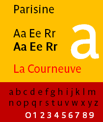 | |
| Sample | |
Parisine is a typeface created by Jean-François Porchez. Distributed by Typofonderie.
It is used in Paris Métro, tramways, buses and RER parts operated by the RATP in Île-de-France.
Parisine
It was originally developed in 1996 as a custom typeface in Bold and Bold Italic developed for the RATP to improve signage legibility and space economy. The design was based on the proportions of Helvetica Bold, condensed at 90%.
In 1999, the font was extended to a font family for multiple uses like communication material, maps, etc. In 2000, hinted TrueType versions were added for internal corporate use. The name Parisine is a trademark of the RATP.
Parisine Std
It is an OpenType variant of Parisine. A small caps version was produced called Parisine SC, see Parisine PRO for Small Caps.
OpenType features include ligatures, fractions, ordinals/superior letters and figures, caps figures, oldstyle figures (SC versions only), a tabular figures.
Parisine PRO
It is an OpenType variant of Parisine, which further expanded upon Parisine Std. Previous version of Parisine PRO was called Parisine PTF.
Each member of the family is composed of more than 720 glyphs and feature around 26700 kerning pairs.
OpenType features include small caps, case forms, ligatures, special ligatures, alternates, stylistic sets, caps figures, oldstyle figures, tabular figures, fractions, superscript/subscript, superior/inferior figures, ordinals/superior letters and figures, and ornaments.
Parisine Plus
It is a variant with alternate designs. It includes extra ligatures over the respective classic designs.
Parisine Plus Std
Some additional alternates glyphs are included in PostScript Type 1 format.
OpenType features include ligatures, fractions, ordinals/superior letters and figures, caps figures, oldstyle figures (SC versions only), and tabular figures.
Parisine Plus PRO
It is an expanded OpenType variant of Parisine Plus Std. It was released at the same time as Parisine. Previous version of Parisine Plus PRO was called Parisine Plus PTF.
Each member of the family is composed of more than 900 glyphs and feature around 40000 kerning pairs.
OpenType features include small caps, case forms, ligatures, special ligatures, alternates, stylistic sets, swashes, caps figures, oldstyle figures, tabular figures, fractions, superscript/subscript, superior/inferior figures, ordinals/superior letters and figures, and ornaments.
Parisine Office
Parisine Office was a version created for RATP in 2005, as replacement of Gill Sans. It became the first variant designed in OpenType. The font was commercially available in June 2008.
It consists of over 600 characters, and is metric-compatible with Gill Sans. The family has been includes font weights with complementary italics.
OpenType features include case forms, ligatures, special ligatures, alternates, swashes, caps figures, oldstyle figures, semi oldstyle figures, tabular figures, fractions, superscript/subscript, superior/inferior figures, ordinals/superior letters and figures, and ornaments.
Parisine Office PRO
It is an extension of the original Parisine Office font, featuring smaller x-height, more cursive italic lowercase glyphs than in Parisine, a bit like Parisine Plus, extended character sets. Previous version of Parisine Office PRO was called Parisine Office PTF.
OpenType features include small caps, case forms, ligatures, special ligatures, alternates, stylistic sets, caps figures, oldstyle figures, tabular figures, fractions, superscript/subscript, superior/inferior figures, ordinals/superior letters and figures, and ornaments.
Parisine Girouette (2012)
It is a custom version of Parisine designed by Jean-François Porchez under the ZeCraft foundry, for use with LED displays on RATP buses.
Parisine Girouette Frontale is used for the main direction on the front of bus and was designed quite narrow to display a maximum of content.
Parisine Girouette Latérale is also designed at 50% of the size of the main typeface, to set information on the side of the bus. The Bold font is used for the final direction, while the Regular/Light is used for intermediate stops.
Family naming convention
With exception of Parisine SC, Parisine Office, Parisine Girouette, each family contains 6 weights with complementary italics, but it is further divided into 3 subfamily, where the subfamily with Clair suffix includes 2 lightest weights, Sombre suffix includes 2 heaviest weights, subfamily without suffix includes 2 middle weights. Fonts in each subfamily are always named Regular, Italic, Bold, Bold Italic, regardless of actual font weights across the family.
In 2010, The Gris subfamily was added to Parisine PRO family, which includes 2 intermediate font weights between Parisine PRO Clair and Parisine PRO.
In 2013, The Gris subfamily was added to Parisine Plus families, which includes 2 intermediate font weights between Parisine Plus Clair and Parisine Plus. However, Parisine Plus Gris Regular is weighted between Parisine Plus Clair Bold and Parisine Plus Regular, while Parisine Plus Gris Bold is weighted between Parisine Plus Regular and Parisine Plus Bold.
Awards
Parisine Office won a Star of the Observeur 07 at the Design Observeur 07 (Observeur du design 07).[1][2]
Parisine Girouette won a star at Observeur du design 13 under the graphic design, visual identity category.[3]
Parisine Girouette won a prize in 44e Palmarès Prix 2012 under the Typography category, typeface design category.[4]
See also
External links
- Typofonderie: Parisine
- Typofonderie: Parisine Plus
- Typofonderie: Parisine Office
- ZeCraft pages: Parisine, Parisine Girouette
- Métro Type, history behind the font
- Le Parisine, une typo parisienne covers history of Parisine