Typographic ligature

In writing and typography, a ligature occurs where two or more graphemes or letters are joined as a single glyph. An example is the character æ as used in English, in which the letters a and e are joined. The common ampersand (&) developed from a ligature in which the handwritten Latin letters e and t (spelling et, from the Latin for "and") were combined.[1]
History
The origin of typographical ligatures comes from the invention of writing with a stylus on fibrous material (like paper) or clay. Businessmen especially who needed a way to speed up the process of written communication found that conjoining letters and abbreviating words for lay use was more convenient for record keeping and transaction than the bulky long forms. The earliest known script, Sumerian cuneiform, includes many cases of character combinations that, over time, gradually evolve from ligatures into separately recognizable characters. Ligatures figure prominently in many historical manuscripts, notably the Brahmic abugidas, or the bind rune of the Migration Period Germanic runic inscriptions.

Medieval scribes who wrote in Latin increased their writing speed by combining characters and by introducing notational abbreviations. Others conjoined letters for aesthetic purposes. For example, in blackletter, letters with right-facing bowls (b, o, and p) and those with left-facing bowls (c, e, o, d, g and q) were written with the facing edges of the bowls superimposed. In many script forms, characters such as h, m, and n had their vertical strokes superimposed. Scribes also used notational abbreviations to avoid having to write a whole character in one stroke. Manuscripts in the fourteenth century employed hundreds of such abbreviations.
Modifications to script bodies like these usually originate from legal, business and monastic sources, with the emphasis shifting from business to monastic sources by around the 9th and 10th centuries. This is due to the rise of Christianity as the official state religion of the Roman Empire starting primarily in the 4th century. Its power base was firmly centered around the See of Rome by the 9th century as the predominant financial sponsor of scholastic development throughout the middle ages. The Roman Catholic influence on the development of scripts is evidenced by the building of churches and monasteries across Europe that served as the foundation and even legal authority of higher learning for that period. The fact that little literature not related to Christianity or religious themes is seen from this time period has caused many modern scholars not interested in that dynamic of history to declare it "the Dark Ages," as though people simply "stopped writing" for a few hundred years. Rather, the enthusiasm in developing scripts was redirected from profiting from business to profiting from religion, and some of the most important and fascinating inventions in writing originated from this medieval chapter of European history.

In hand writing, a ligature is made by joining two or more characters in atypical fashion by merging their parts or by writing one above or inside the other. While in printing, a ligature is a group of characters that is typeset as a unit, and the characters do not have to be joined. For example, in some cases the fi ligature prints the letters f and i with a greater separation than when they are typeset as separate letters. When printing with movable type was invented around 1450,[4] typefaces included many ligatures and additional letters, as they were based on handwriting. Ligatures made printing with movable type easier because one block would replace frequent combinations of letters and also allowed more complex and interesting character designs which would otherwise collide with one another.
Ligatures began to fall out of use due to their complexity in the 20th century. Sans serif fonts, increasingly used for body text, generally avoid ligatures, though notable exceptions include Gill Sans and Futura. Inexpensive phototypesetting machines in the 1970s (which did not require journeyman knowledge or training to operate) also generally avoid them.
The trend was further strengthened by the desktop publishing revolution starting around 1977 with the production of the Apple II. Early computer software in particular had no way to allow for ligature substitution (the automatic use of ligatures where appropriate), while most new digital fonts did not include ligatures. As most of the early PC development was designed for the English language (which already treated ligatures as optional at best) dependence on ligatures did not carry over to digital. Ligature use fell as the number of traditional hand compositors and hot metal typesetting machine operators dropped since the mass of the IBM Selectric brand of electric typewriter in 1961. A designer active in the period commented: "some of the world’s greatest typefaces were quickly becoming some of the world’s worst fonts."[5]
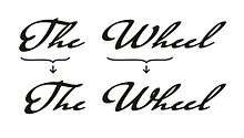
Ligatures have grown in popularity over the last 20 years due to an increasing interest in creating typesetting systems that evoke arcane designs and classical scripts. One of the first computer typesetting programs to take advantage of computer-driven typesetting (and later laser printers) was Donald Knuth's TeX program. Now the standard method of mathematical typesetting, its' default fonts are explicitly based on nineteenth-century styles. Many new fonts feature extensive ligature sets; these include FF Scala, Seria and others by Martin Majoor and Hoefler Text by Jonathan Hoefler. Mrs Eaves by Zuzana Licko contains a particularly large set to allow designers to create dramatic display text with a feel of antiquity. A parallel use of ligatures is seen in the creation of script fonts that join letterforms to simulate handwriting effectively. This trend is caused in part by the increased support for other languages and alphabets in modern computing, many of which use ligatures somewhat extensively. This has caused the development of new digital typesetting techniques such as OpenType, and the incorporation of ligature support into the text display systems of OS X, Windows and applications like Microsoft Office. An increasing modern trend is to use a 'Th' ligature which reduces spacing between these letters to make it easier to read, a trait infrequent in metal type.[6][7][8]
Today, modern font programming divides ligatures into three groups, which can be activated separately: standard, contextual and historical. Standard ligatures are needed to allow the font to display without errors such as character collision. Designers sometimes find contextual and historic ligatures desirable for creating effects or to evoke an old-fashioned print look.
Latin alphabet
Stylistic ligatures

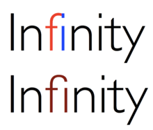
Many ligatures combine f with an adjacent letter. The most prominent example is fi (or fi, rendered with two normal letters). The tittle of the i in many typefaces collides with the hood of the f when placed beside each other in a word, and are combined into a single glyph with the tittle absorbed into the f. Other ligatures with the letter f include fj,[note 1] fl (fl), ff (ff), ffi (ffi), and ffl (ffl). Ligatures for fa, fe, fo, fr, fs, ft, fb, fh, fu, fy, and for f followed by a full stop, comma, or hyphen, as well as the equivalent set for the doubled ff and fft are also used, though are less common.
These arose because with the usual type sort for lowercase f, the end of its hood is on a kern, which would be damaged by collision with raised parts of the next letter.
Ligatures crossing the morpheme boundary of a composite word are sometimes considered incorrect, especially in official German orthography as outlined in the Duden. An English example of this would be ff in shelfful; a German example would be Schifffahrt ("boat trip").[note 2] Some computer programs (such as TeX) provide a setting to disable ligatures for German, while some users have also written macros to identify which ligatures to disable.[9][10]
Turkish distinguishes dotted and dotless "I". In a ligature with f (in words such as fırın ("oven") and fikir ("idea")), this contrast would be obscured. The fi ligature is therefore not used in Turkish typography, and neither are other ligatures like that for fl, which would be rare anyway.
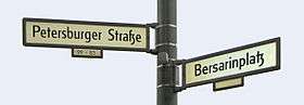
Remnants of the ligatures ſʒ/ſz ("sharp s"/"esszett") and tʒ/tz ("sharp t"/"tezett") from Fraktur, a family of German blackletter typefaces, originally mandatory in Fraktur but now employed only stylistically, can be seen to this day on street signs for city squares whose name contains Platz or ends in -platz. Instead, the "sz" ligature has merged into a single character, the German ß – see below.
Sometimes, ligatures for st (st), ſt (ſt), ch, ct, Qu and Th are used (e.g. in the typeface Linux Libertine).
German ß
The German Eszett (also called the scharfes S, meaning sharp s) ß is an official letter of the alphabet in Germany and Austria. There is no general consensus about its history. Its name Es-zett (meaning S-Z) suggests a connection of "long s and z" (ſʒ) but the Latin script also knows a ligature of "long s over round s" (ſs). The latter is used as the design principle for the character in most of today’s typefaces. Since German was mostly set in blackletter typefaces until the 1940s, and those typefaces were rarely set in uppercase, a capital version of the Eszett never came into common use, even though its creation has been discussed since the end of the 19th century. Therefore, the common replacement in uppercase typesetting was originally SZ (Maße → MASZE, different from Masse → MASSE) and later SS (Maße → MASSE). The SS replacement is currently the only valid spelling according to the official orthography (the so-called Rechtschreibreform) in Germany and Austria. For German writing in Switzerland, the ß is omitted altogether in favour of ss. Since 2008, the capital version (ẞ) of the Eszett character is part of Unicode and appears in more and more typefaces. The new character has not yet entered mainstream writing. A new standardized German keyboard layout (DIN 2137-T2) has included the capital ß since 2012. Since the end of 2010, the Ständiger Ausschuss für geographische Namen (StAGN) suggests the new upper case character for 'ß' rather than replacing it with 'SS' or 'SZ' for geographical names.[11]
Letters and diacritics originating as ligatures


As the letter W is an addition to the Latin alphabet that originated in the seventh century, the phoneme it represents was formerly written in various ways. In Old English, the Runic letter wynn (Ƿ) was used, but Norman influence forced wynn out of use. By the 14th century, the "new" letter W, originated as two Vs or Us joined together, developed into a legitimate letter with its own position in the alphabet. Because of its relative youth compared to other letters of the alphabet, only a few European languages (English, Dutch, German, Polish, Welsh, Maltese, and Walloon) use the letter in native words.
The character Æ (lower case æ; in ancient times named æsc) when used in the Danish, Norwegian, or Icelandic languages, or Old English, is not a typographic ligature. It is a distinct letter—a vowel—and when alphabetised, is given a different place in the alphabetic order. In modern English orthography Æ is not considered an independent letter but a spelling variant, for example: "encyclopædia" versus "encyclopaedia" or "encyclopedia".
Æ comes from Mediæval Latin, where it was an optional ligature in some words, for example, "Æneas". It is still found as a variant in English and French, but the trend has recently been towards printing the A and E separately.[12] Similarly, Œ and œ, while normally printed as ligatures in French, are wrongly replaced by component letters if technical restrictions require it.
In German orthography, the umlauted vowels ä, ö, and ü historically arose from ae, oe, ue ligatures (strictly, from superscript e, viz. aͤ, oͤ, uͤ). It is common practice to replace them with ae, oe, ue digraphs when the diacritics are unavailable, for example in electronic conversation. Phone books treat umlauted vowels as equivalent to the relevant digraph (so that a name Müller will appear at the same place as if it were spelled Mueller; German surnames have a strongly fixed orthography, either a name is spelled with ü or with ue); however, the alphabetic order used in other books treats them as equivalent to the simple letters a, o and u. The convention in Scandinavian languages and Finnish is different: there the umlaut vowels are treated as independent letters with positions at the end of the alphabet.
The ring diacritic used in vowels such as å likewise originated as an o-ligature.[13] Before the replacement of the older 'aa' with 'å' became a de facto practice, an 'a' with another 'a' on top (aͣ) could sometimes be used, for example in Johannes Bureus's, Runa: ABC-Boken (1611).[14] The uo ligature ů in particular saw use in Early Modern High German, but it merged in later Germanic languages with u (e.g. MHG fuosz, ENHG fuͦß, Modern German Fuß "foot"). It survives in Czech, where it is called kroužek.
The tilde diacritic, used in Spanish as part of the letter ñ, representing the palatal nasal consonant, and in Portuguese for nasalization of a vowel, originated in ligatures where n followed the base letter: Espanna → España.[15] Similarly, the circumflex in French spelling stems from the ligature of a silent s.[16] The French, Portuguese, Catalan and old Spanish letter ç represents a c over a z; the diacritic's name cedilla means 'little zed'.
The letter hwair (ƕ), used only in transliteration of the Gothic language, resembles a hw ligature. It was introduced by philologists around 1900 to replace the digraph hv formerly used to express the phoneme in question, e.g. by Migne in the 1860s (Patrologia Latina vol. 18).
The Byzantines had a unique o-u ligature (Ȣ) that, while originally based on the Greek alphabet's ο-υ, carried over into Latin alphabets as well. This ligature is still seen today on icon artwork in Greek Orthodox churches, and sometimes in graffiti or other forms of informal or decorative writing.
Gha (ƣ), a rarely used letter based on Q and G, was misconstrued by the ISO to be an O-I ligature due to its appearance, and is thus known (to the ISO and, in turn, Unicode) as "Oi".
The International Phonetic Alphabet formerly used ligatures to represent affricate consonants, of which six are encoded in Unicode: ʣ, ʤ, ʥ, ʦ, ʧ and ʨ. One fricative consonant is still represented with a ligature: ɮ, and the extensions to the IPA contain three more: ʩ, ʪ and ʫ.
Rarer ligatures also exist, such as ꜳ ; Ꜵꜵ; Ꜷꜷ; Ꜹꜹ; Ꜻꜻ (barred AV); Ꜽꜽ; Ꝏꝏ, which is used in medieval Nordic languages for /oː/ (a long close-mid back rounded vowel),[17] as well as in some orthographies of the Massachusett language to represent /uː/ (a long close back rounded vowel); ᵫ; ᵺ; Ỻỻ, which was used in Medieval Welsh to represent /ɬ/ (the voiceless lateral fricative);[17] Ꜩꜩ; ᴂ; ᴔ; ꭣ; and ꭡ.
Symbols originating as ligatures

The most common ligature is the ampersand &. This was originally a ligature of E and t, forming the Latin word "et", meaning "and". It has exactly the same use in French and in English. The ampersand comes in many different forms. Because of its ubiquity, it is generally no longer considered a ligature, but a logogram.
Like many other ligatures, it has at times been considered a letter (e.g., in early Modern English); in English it is pronounced "and", not "et", except in the case of &c, pronounced "et cetera". In most fonts, it does not immediately resemble the two letters used to form it, although certain typefaces (such as Trebuchet MS) use the design & in the form of a ligature.
Similarly, the dollar sign $ possibly originated as a ligature (for "pesos", although there are other theories as well) but is now a logogram.[18]
The Spanish peseta was sometimes symbolized by a ligature ₧ (from Pts), and the French franc was often symbolized by an F-r ligature (₣).
Alchemy used a set of mostly standardized symbols, many of which were ligatures: 🜇 (AR, for aqua regia), 🜈 (S inside a V, for aqua vitae), 🝫 (MB, for a marian bath or double boiler), 🝬 (VB, for a vapor bath), and 🝛 (aaa, for amalgam). In astronomy, the dwarf planet Pluto is symbolized by a PL ligature, ♇.
Digraphs

.svg.png)
Digraphs, such as ll in Spanish or Welsh, are not ligatures in the general case as the two letters are displayed as separate glyphs: although written together, when they are joined in handwriting or italic fonts the base form of the letters is not changed and the individual glyphs remain separate. Like some ligatures discussed above, these digraphs may or may not be considered individual letters in their respective languages. Until the 1994 spelling reform, the digraphs ch and ll were considered separate letters in Spanish for collation purposes.
The difference can be illustrated with the French digraph œu, which is composed of the ligature œ and the simplex letter u.
Dutch ij, however, is somewhat more ambiguous. Depending on the standard used, it can be considered a digraph, a ligature or a letter in itself, and its upper case and lower case forms are often available as a single glyph with a distinctive ligature in several professional fonts (e.g. Zapfino). Sans serif uppercase IJ glyphs, popular in the Netherlands, typically use a ligature resembling a U with a broken left-hand stroke. Adding to the confusion, Dutch handwriting can render y (which is not found in native Dutch words, but occurs in words borrowed from other languages) as a ij-glyph without the dots in its lowercase form and the IJ in its uppercase form looking virtually identical (only slightly bigger). When written/typed as two separate letters, both should be capitalized — or not — to form a correctly spelled word, like IJs or ijs (ice).
Latin alphabets that use special ligatures
Non-Latin alphabets

Ligatures are not limited to Latin script:
- The Brahmic abugidas make frequent use of ligatures in consonant clusters. The number of ligatures employed is language-dependent; thus many more ligatures are conventionally used in Devanagari when writing Sanskrit than when writing Hindi. Having 37 consonants in total, the total number of ligatures that can be formed in Devanagari using only two letters is 1369, though few fonts are able to render all of them. In particular, Mangal.ttf, which is included with Microsoft Windows' Indic support, does not correctly handle ligatures with consonants attached to the right of the characters द, ट, ठ, ड, and ढ, leaving the virama attached to them and displaying the following consonant in its standard form.
- The Georgian script includes უ (uni), which is a combination of ო (oni) and the former letter ჳ (vie).
- A number of ligatures have been employed in the Greek alphabet, in particular a combination of omicron (Ο) and upsilon (Υ), which later gave rise to a letter of the Cyrillic script—see Ou (letter). Among the ancient Greek acrophonic numerals, ligatures were common (in fact, the ligature of a short-legged capital pi was a key feature of the acrophonic numeral system).
- Cyrillic ligatures: Љ, Њ, Ы, Ѿ. Iotified Cyrillic letters are ligatures of the early Cyrillic decimal I and another vowel: Ꙗ (ancestor of Я), Ѥ, Ѩ, Ѭ, Ю (descended from another ligature, Оу, an early version of У). Two letters of the Macedonian and Serbian Cyrillic alphabets, lje and nje (љ, њ), were developed in the nineteenth century as ligatures of Cyrillic El and En (л, н) with the soft sign (ь). A ligature of ya (Я) and e also exists: Ԙԙ, as do some more ligatures: Ꚅꚅ and Ꚉꚉ.
- Some forms of the Glagolitic script, used from Middle Ages to the 19th century to write some Slavic languages, have a box-like shape that lends itself to more frequent use of ligatures.
- In the Hebrew alphabet, the letters aleph א and lamed ל can form a ligature (ﭏ). The ligature appears in some pre-modern texts (mainly religious), or in Judeo-Arabic texts, where that combination is very frequent, since [ʔ] [a]l- (written aleph plus lamed, in the Hebrew script) is the definite article in Arabic.
- In the Arabic alphabet, historically a cursive derived from the Nabataean alphabet, most letters' shapes depend on whether they are followed (word-initial), preceded (word-final) or both (medial) by other letters. For example, Arabic mīm, isolated م, tripled (mmm, rendering as initial, medial and final): ممم. Notable are the shapes taken by lām + ʼalif isolated: ﻻ, and lām + ʾalif medial or final: ﻼ. Unicode has a special Allah ligature at U+FDF2: ﷲ.
- Urdu (one of the main languages of South Asia), which uses a calligraphic version of the Arabic-based Nasta`liq script, requires a great number of ligatures in digital typography. InPage, a widely used desktop publishing tool for Urdu, uses Nasta`liq fonts with over 20,000 ligatures.
- In ASL, a ligature of the American manual alphabet is used to sign 'I love you', from the English initialism ILY. It consists of the little finger of the letter I plus the thumb and forefinger of the letter L. The letter Y (little finger and thumb) overlaps with the other two letters.
- The Japanese language uses two ligatures, one for hiragana, ゟ, which is a vertical writing ligature of the characters よ and り, and one for katakana, ヿ, which is a vertical writing ligature of the characters コ and ト. Both ligatures have fallen out of use in modern Japanese.
- Lao uses three ligatures, all comprising the letter ຫ (h). As a tonal language, most consonant sounds in Lao are represented by two consonants, which will govern the tone of the syllable. Five consonant sounds are only represented by a single consonant letter (ງ (ŋ), ນ (m), ມ (n), ລ (l), ວ (w)), meaning that one cannot render all the tones for words beginning with these sounds. A silent ຫ indicates that the syllable should be read with the tone rules for ຫ, rather than those of the following consonant. Three consonants can form ligatures with the letter ຫ. ຫ+ນ=ໜ (n), ຫ+ມ=ໝ (m) and ຫ+ລ=ຫຼ (l). ງ (ŋ) and ວ (w) just form clusters: ຫງ (ŋ) and ຫວ (w). ລ (l) can also be used written in a cluster rather than as a ligature: ຫລ (l).
- In many runic texts ligatures are common. Such ligatures are known as bind-runes and were optional.
Chinese ligatures

Written Chinese has a long history of creating new characters by merging parts or wholes of other Chinese characters. However, a few of these combinations do not represent morphemes but retain the original multi-character (multiple morpheme) reading and are therefore not considered true characters themselves. In Chinese, these ligatures are called héwén (合文) or héshū (合書); see polysyllabic Chinese characters for more.
One popular ligature used on chūntiē decorations used for Chinese Lunar New Year is a combination of the four characters for zhāocái jìnbǎo (招財進寶), meaning "ushering in wealth and fortune" and used as a popular New Year's greeting.


In 1924, Du Dingyou (杜定友; 1898–1967) created the ligature "圕" from two of the three characters 圖書館 (túshūguǎn), meaning "library".[19] Although it does have an assigned pronunciation of tuān and appears in many dictionaries, it is not a morpheme and cannot be used as such in Chinese. Instead, it is usually considered a graphic representation of túshūguǎn.
In recent years, a Chinese internet meme, the Grass Mud Horse, has had such a ligature associated with it combining the three relevant Chinese characters 草, 泥, and 马 (Cǎonímǎ).
Similar to the ligatures were several "two-syllable Chinese characters" (雙音節漢字) created in the 19th century as Chinese characters for SI units. In Chinese these units are disyllabic and standardly written with two characters, as 厘米 límǐ 'centimeter' (厘 centi-, 米 meter) or 千瓦 qiānwǎ 'kilowatt'. However, in the 19th century these were often written via compound characters, pronounced disyllabically, such as 瓩 for 千瓦 or 糎 for 厘米 – some of these characters were also used in Japan, where they were pronounced with borrowed European readings instead. These have now fallen out of general use, but are occasionally seen.[20]
Computer typesetting
TeX is an example of a computer typesetting system that makes use of ligatures automatically. The Computer Modern Roman typeface provided with TeX includes the five common ligatures ff, fi, fl, ffi, and ffl. When TeX finds these combinations in a text, it substitutes the appropriate ligature, unless overridden by the typesetter. Opinion is divided over whether it is the job of writers or typesetters to decide where to use ligatures.

The OpenType font format includes features for associating multiple glyphs to a single character, used for ligature substitution. Typesetting software may or may not implement this feature, even if it is explicitly present in the font's metadata. XeTeX is a TeX typesetting engine designed to make the most of such advanced features. This type of substitution used to be needed mainly for typesetting Arabic texts, but ligature lookups and substitutions are being put into all kinds of Western Latin OpenType fonts. In OpenType, there are standard liga, historical hlig, contextual clig and discretionary dlig ligatures. These can be enabled in CSS3 using font-feature-settings.[21]
CSS also supports font-variant-ligatures. common-ligatures, discretionary-ligatures, historical-ligatures and contextual are supported.[22]
This table below shows discrete letter pairs on the left, the corresponding Unicode ligature in the middle column, and the Unicode code point on the right. Provided you are using an operating system and browser that can handle Unicode, and have the correct Unicode fonts installed, some or all of these will display correctly. See also the provided graphic.
Unicode maintains that ligaturing is a presentation issue rather than a character definition issue, and that, for example, "if a modern font is asked to display 'h' followed by 'r', and the font has an 'hr' ligature in it, it can display the ligature." Accordingly, the use of the special Unicode ligature characters is "discouraged", and "no more will be encoded in any circumstances".[23] Note, however, that ligatures such as æ and œ are never used to replace arbitrary 'ae' or 'oe' sequences – 'does' can never be written 'dœs'.
Notably, Microsoft Word does not enable ligatures by default, partly for backward compatibility reasons due to its long history. This can be changed from the Advanced tab of the Font dialog box.
Ligatures in Unicode (Latin alphabets)
Non-ligature Ligature[23] Unicode HTML AA, aa Ꜳ, ꜳ U+A732, U+A733 Ꜳ ꜳ AE, ae Æ, æ U+00C6, U+00E6 Æ æ AO, ao Ꜵ, ꜵ U+A734, U+A735 Ꜵ ꜵ AU, au Ꜷ, ꜷ U+A736, U+A737 Ꜷ ꜷ AV, av Ꜹ, ꜹ U+A738, U+A739 Ꜹ ꜹ AV, av (with bar) Ꜻ, ꜻ U+A73A, U+A73B Ꜻ ꜻ AY, ay Ꜽ, ꜽ U+A73C, U+A73D Ꜽ ꜽ et 🙰 U+1F670 🙰 ff ff U+FB00 ff ffi ffi U+FB03 ffi ffl ffl U+FB04 ffl fi fi U+FB01 fi fl fl U+FB02 fl OE, oe Œ, œ U+0152, U+0153 Œ œ OO, oo Ꝏ, ꝏ U+A74E, U+A74F Ꝏ ꝏ ſs, ſz ẞ, ß U+00DF ß st st U+FB06 st ſt ſt U+FB05 ſt TZ, tz Ꜩ, ꜩ U+A728, U+A729 Ꜩ ꜩ ue ᵫ U+1D6B ᵫ ui ꭐ U+AB50 ꭐ VY, vy Ꝡ, ꝡ U+A760, U+A761 Ꝡ ꝡ
Also, there are separate code points for the digraph DZ and for the Bosnian, Croatian, Serbian digraphs DŽ, LJ, and NJ. They are not ligatures but digraphs. See Digraphs in Unicode.
- Ligatures used only in phonetic transcription
Non-ligature Ligature[23] Unicode HTML db ȸ U+0238 ȸ dz ʣ U+02A3 ʣ dʑ (or dz curl) ʥ U+02A5 ʥ dʒ (or dezh) ʤ U+02A4 ʤ fŋ (or feng) ʩ U+02A9 ʩ IJ, ij IJ, ij U+0132, U+0133 IJ ij ls ʪ U+02AA ʪ lz ʫ U+02AB ʫ lʒ (or lezh) ɮ U+026E ɮ qp ȹ U+0239 ȹ tɕ (or tc curl) ʨ U+02A8 ʨ ts ʦ U+02A6 ʦ tʃ (or tesh) ʧ U+02A7 ʧ
U+0238 and U+0239 are called digraphs, but are actually ligatures.[24]
Modern art
Typographic ligatures can be used as a form of modern art,[25] as can be illustrated by Chinese artist Xu Bing's work in which he combines Latin letters to form characters that resembles Chinese.[26]
See also
Notes
- ↑ The combination fj is represented in English only in "fjord" and "fjeld", but is encountered in languages where j represents a vocalic or semi-vocalic sound (Norwegian, occasionally in Esperanto) or an affix (Hungarian), or where word-compounding results such ligatures (Hungarian)
- ↑ "Schifffahrt" is written with fff only if the writer follows the spelling reform of 1996.
References
- ↑ "The Ampersand & More" with Kory Stamper, part of the "Ask the Editor" video series at Merriam-Webster.com
- ↑ Capelli – Dizionario di abbreviature latine ed italiane
- ↑ Medieval Unicode Font Initiative
- ↑ Johannes Gutenberg and the Printing Press
- ↑ Frere-Jones, Tobias. "Hoefler Text". Hoefler & Frere-Jones. Retrieved 29 November 2014.
- ↑ Shaw, Paul. "Flawed Typefaces". Print magazine. Retrieved 30 June 2015.
- ↑ Ulrich, Ferdinand. "Hunt Roman". Typographica. Retrieved 21 September 2015.
- ↑ Shaw, Paul. "The Kerning Game". Print. Retrieved 21 September 2015.
- ↑ Helmut Kopka; Patrick W. Daly (1999). A Guide to LaTeX, 3rd Ed. Addison-Wesley. p. 22. ISBN 0-201-39825-7.
- ↑ Loretan, Mico. "Selnolig". CTAN. Retrieved 17 November 2014.
- ↑ Ständiger Ausschuss für geographische Namen (StAGN) Empfehlungen und Hinweise für die Schreibweise geographischer Namen für Herausgeber von Kartenwerken und anderen Veröffentlichungen für den internationalen Gebrauch Bundesrepublik Deutschland 5. überarbeitete Ausgabe
- ↑ The Chicago Manual of Style, 14th Ed. Chicago: The University of Chicago Press. 1993. p. 6.61.
- ↑ Nordisk familjebok / Uggleupplagan. 33. Väderlek – Äänekoski / 905–906
- ↑ Bureus, J., Runa ABC boken
- ↑ "Origen de la 'Ñ'", Aula Hispanica.
- ↑ Teach Yourself French. Collier's Cyclopedia, 1901.
- 1 2 Michael Everson (éd.) et al., N3027 Proposal to add medievalist characters to the UCS (http://std.dkuug.dk/jtc1/sc2/wg2/docs/n3027.pdf)
- ↑ Cajori, Florian (1993). A History of Mathematical Notations. New York: Dover (reprint). ISBN 0-486-67766-4. – contains section on the history of the dollar sign, with much documentary evidence supporting the theory that $ began as a ligature for "pesos".
- ↑ "'圕'字怎麼念?什麼意思?誰造的?" Sing Tao Daily online. 21 April 2006. Retrieved 15 January 2011.(Chinese)
- ↑ Victor Mair, "Polysyllabic characters in Chinese writing", Language Log, 2011 August 2
- ↑ "font-feature-settings property". MSDN. MSDN. Retrieved 24 November 2014.
- ↑ "CSS font-variant-ligatures Property". CSS Portal.
- 1 2 3 "Unicode FAQ: Ligatures, Digraphs, Presentation Forms vs. Plain Text". Unicode Consortium. 2015-07-06.
- ↑ Freytag, Asmus; McGowan, Rick; Whistler, Ken (2006-05-08). "Known Anomalies in Unicode Character Names". Unicode Technical Note #27. Unicode Inc. Retrieved 2009-05-29.
- ↑ "The art of typography in the digital age ligatures". Retrieved November 14, 2014.
- ↑ Erickson, Britta (2001). The Art of Xu Bing: Words Without Meaning, Meaning Without Words (Asian Art & Culture). Freer Gallery of Art and Arthur M. Sackler Ga. ISBN 9780295981437.
External links
- Typedesk.com, Type Desk on ligatures
- Ilovetypography.com, Decline and Fall of the Ligature
- Live example of Ligature Substitutions, Test your browser support for Ligature Substitutions (works on all modern browsers except Safari)
- http://blogs.msdn.com/b/fontblog/archive/2006/08/10/missed-opportunity-for-ligatures.aspx
Typography terminology | |||||||||||||||
|---|---|---|---|---|---|---|---|---|---|---|---|---|---|---|---|
| Page | |||||||||||||||
| Paragraph | |||||||||||||||
| Character |
| ||||||||||||||
| Classifications |
| ||||||||||||||
| Punctuation | |||||||||||||||
| Typesetting | |||||||||||||||
| Typographic units | |||||||||||||||
| Digital typography |
| ||||||||||||||
| Related | |||||||||||||||
| |||||||||||||||