Adrian Frutiger
| Adrian Frutiger | |
|---|---|
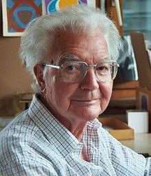 Frutiger in 2002 | |
| Born |
24 May 1928 Unterseen, Bern, Switzerland |
| Died |
10 September 2015 (aged 87) Bremgarten bei Bern, Switzerland |
| Nationality | Swiss |
| Alma mater | Kunstgewerbeschule, Zürich |
| Occupation | Typographer & designer |
| Notable work | Univers, Frutiger and Avenir |
| Religion | Calvinist[1] |
Adrian Frutiger (24 May 1928 – 10 September 2015) was a Swiss typeface designer who influenced the direction of type design in the second half of the 20th century and into the 21st. His career spanned the hot metal, phototypesetting and digital typesetting eras. Until his death, he lived in Bremgarten bei Bern.[2][3][4]
Frutiger's most famous designs, Univers, Frutiger and Avenir, are landmark sans-serif families spanning the three main genres of sans-serif typefaces: neogrotesque, humanist and geometric.[5] Univers was notable for being one of the first sans-serif faces to form a consistent but wide-ranging family, across a range of widths and weights.[6] Frutiger described creating sans-serif types as his "main life's work,"[1] partially due to the difficulty in designing them compared to serif fonts.[1]
Early life
Adrian Frutiger was born in Unterseen, Canton of Bern, the son of a weaver.[7] As a boy, he experimented with invented scripts and stylized handwriting in a negative reaction to the formal, cursive penmanship then required by Swiss schools. His father and his secondary school teachers encouraged him to pursue an apprenticeship rather than pure art. After initially planning to train as a pastry chef, Frutiger secured an apprenticeship at the Otto Schlaefli printing house in Interlaken.[8]
Formative years and personal life
At the age of sixteen, he was apprenticed for four years, as a compositor, to the printer Otto Schlaeffli in Interlaken, also taking classes in woodcuts and drawing at the Gewerbeschule in Bern under Walter Zerbe, followed by employment as a compositor at Gebr. Fretz in Zürich, Switzerland. In 1949 he transferred to the Kunstgewerbeschule (School of Applied Arts) in Zürich, where he studied under Walter Käch, Karl Schmid and Alfred Willimann until 1951.[9] Students there studied monumental inscriptions from Roman forum rubbings. At the Kunstgewerbeschule, Frutiger concentrated on calligraphy — a craft favouring the nib and the brush, instead of drafting tools, but also began sketches for what would become Univers, influenced by the sans-serif types popular in contemporary graphic design.[1]
Frutiger married Paulette Flückiger in 1952, who died in 1954 after the birth of their son Stéphane.[10][11] He remarried the theologian Simone Bickel in 1955.[12][13] They had two daughters, who both experienced mental health problems and committed suicide as adolescents. Disappointed by the standard of mental health care at the time, Frutiger and his wife founded the Fondation Adrian et Simone Frutiger to fund psychology and neuroscience research and developments in mental health support.[14][15][16]
In an interview, Frutiger described himself as a Calvinist.[1]
Frutiger spent most of his professional career working in Paris and living in France, returning to Switzerland later in life.[16][17]
Career
Charles Peignot, of the Paris foundry Deberny et Peignot, recruited Frutiger based upon the quality of the illustrated essay Schrift / Écriture / Lettering: the development of European letter types carved in wood, Frutiger's final project at the Kunstgewerbeschule. Frutiger's wood-engraved illustrations of the essay demonstrated his skill, meticulousness, and knowledge of letter forms.[18] At Deberny & Peignot foundry, Frutiger designed the typefaces Président, Méridien, and Ondine. In addition, Charles Peignot set Frutiger to work upon converting extant typefaces for the new phototypesetting Linotype equipment.[6][19]
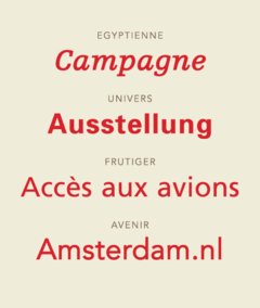
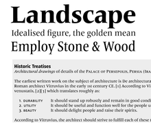
Adrian Frutiger's first commercial typeface was Président — a set of titling capital letters with small, bracketed serifs, released in 1954. A calligraphic, informal, script face, Ondine ("wave" in French), also was released in 1954. In 1955, Méridien, a glyphic, old-style, serif text face was released. The typeface shows inspiration by Nicolas Jenson, and, in the Méridien type, Frutiger's ideas of letter construction, unity, and organic form, are first expressed together. Raph Levien described as a "Frutiger trademark" his common use of an "a" where the loop makes a horizontal line at the top on meeting the vertical.[20] It makes use of narrow wedge serifs, a style sometimes known as Latin which Frutiger would often use in his future serif designs. In 1956, he designed his first-of-three, slab-serif typefaces — Egyptienne, on the Clarendon model; after Univers, it was the second, new text face to be commissioned for photo-composition.
Univers

Charles Peignot envisioned a large, unified font family, that might be set in both the metal and the photo-composition systems. Impressed by the success of the Bauer foundry's Futura typeface, Peignot encouraged a new, geometric sans-serif type in competition. Frutiger disliked the regimentation of Futura, and persuaded Peignot that the new sans-serif should be based on the realist (neo-grotesque) model.[1] The 1896 face, Akzidenz-Grotesk, is cited as the primary model. To maintain unity across the 21 variants, each weight and width, in roman (upright) and oblique (slanted), was drawn and approved before any matrices were cut. In the Univers font, Frutiger introduced his two-digit numeration; the first digit (3 though 8) indicates the weight, "3" the lightest, "8" the heaviest. The second digit indicates the face-width and either roman or oblique. It was marketed with a design inspired by the periodic table.[21] The response to Univers was immediate and positive; he claimed it became the model for his future typefaces. His slab serif designs Serifa (1967) and Glypha (1977) are directly based upon it.[22][23]
Univers attracted attention to Frutiger's work outside continental Europe, and he was commissioned by Monotype to create Apollo, their first typeface specifically created for phototypesetting, which was released in 1964.[6][24]
Frutiger

In 1961–64, Frutiger created with André Gürtler a sans-serif font named Concorde for news use in regular and bold styles for Parisian printing company Sofratype. Required to create a design clearly different to Univers, the design based on classical capitals with a greater classical influence than Univers, partially influenced by a serif design Opéra he had worked on in the interim. The design failed to attract attention and was withdrawn from sale after a few years.
In 1970, Frutiger was asked to design signage at the new Charles de Gaulle Airport in the Roissy suburb of Paris. The "way-finding-signage" commission brief required a typeface both legible from afar and from an angle. Frutiger decided to adapt Concorde using legibility research as a guide, and titled the new design Roissy.[25][26]
In 1974, the Mergenthaler Linotype Company commissioned Frutiger to develop a print version of Roissy with improvements such as better spacing, which was released for public use under the name of Frutiger in 1976. Extremely legible at a distance or at small size, Frutiger became hugely influential on the development of future humanist sans-serif typefaces; font designer Erik Spiekermann described it as "the best general typeface ever" while Steve Matteson described it as "the best choice for legibility in pretty much any situation" at small text sizes.[27][28]
Frutiger is an amalgamation of Univers tempered with organic influences of the Gill Sans, a humanist sans-serif typeface by Eric Gill, Edward Johnston's type for the London Transport, and Roger Excoffon's Antique Olive: like Univers it uses a single-story 'g', unlike the double of Gill Sans, and has square dots on the letters, but has a generally humanist design with wide apertures to increase legibility, decided on after legibility research.[29][30]
In the 1970s, Frutiger designed Icone, a wedge-serif design with mild stroke modulation, which has many similarities in basic letter structure to Frutiger, and in overall effect to Albertus.[31][32] Frutiger's intention was more unusual: to create a design that could be modified by computer, through extreme slanting, morphing or changing stroke width, without seeming as if it had been distorted.[33]
Frutiger designed a number of other signage projects in the 1970s. These included an adaptation of Univers for the Paris Métro, after the RATP, the public transport authority of Paris, asked Frutiger to examine the Paris Métro signage.[34] He created a Univers font variation — a set of capitals and numbers specifically for white-on-dark-blue backgrounds in poor light.[35] He also designed a slab serif font for the Centre Georges Pompidou.[36]
Frutiger's 1984 typeface Versailles is an old-style serif text with capitals like those in the earlier Président. Versailles is a Latin design with sharp wedge serifs, based on a popular genre in 19th-century printing.[37]
Avenir
.jpg)
In 1988, Frutiger completed the family Avenir. Frutiger intended the design to be a more human version of geometric sans-serif types popular in the 1930s such as Erbar and Futura, and it is named Avenir ("future" in French) as a reference to the latter.[38]
In a complete reverse, his next design Westside was a wild-west themed slab serif, inspired by reverse-contrast French Clarendons of the late 19th century.
Late designs
In 1991, Frutiger finished Vectora, a design influenced by Morris Fuller Benton's type faces Franklin Gothic and News Gothic. The resultant face has a tall x-height and is legible in small-point sizes.[39] Frutiger's 1991 release Linotype Didot was an elegant revival of the Didot typeface adapted to display use, which remains popular; it is the version of Didot bundled with OS X, for example.[40] While Frutiger continued to be involved in adaptations and expansions of pre-existing families and smaller projects, he described Didot in 1998 as his "last typeface design".[1]
The roots of letters
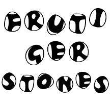
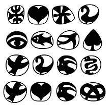
Linotype launched a font series named Type Before Gutenberg in 1989 and in the 1990s, Frutiger released as part of it a series of designs inspired by pre-printing alphabets, such as Herculanum and Pompeijana, inspired by Roman brush lettering, Rusticana, inspired by capitalis rustica Roman carving. He later also created Frutiger Stones (no connection to Frutiger), a playful design inspired by the shapes of pebbles. Parts of this design were finalised by Linotype's team; it was based on an alphabet drawn by Frutiger on a 1992 Christmas card.[41][42][43] He also created Capitalis, inspired by brush lettering but without a specific historical source.[44] Nami, an uncial design Frutiger had been considering since 1992, followed in 2007.
Remastered releases
In the late 1990s, Frutiger began collaborating on refining and expanding his most famous Univers, Frutiger, and Avenir families. The new projects took advantage of improved digital production methods to create a wider range of styles and improved hinting for onscreen display. Univers was reissued as Linotype Univers with sixty-three variants; Frutiger was reissued as Frutiger Next with additional weights. Collaborating with Linotype designer Akira Kobayashi, Frutiger expanded the Avenir font family with light weights, heavy weights, and a condensed version that were released as the Avenir Next font.[45][46] Frutiger described the process of restoring Univers as a "personal gift."[47]
These modifications were not universally considered improvements: Frutiger regretted allowing Linotype to substitute a modish 1990s true italic (not drawn by Frutiger) onto Frutiger Next instead of the sharper oblique Frutiger preferred throughout his career. In his autobiography, Frutiger commented that in resigning himself to it "Maybe I was too soft to say what I really felt... I didn't have the strength and patience anymore."[48] From a different perspective, type designer Martin Majoor commented that he preferred the italic but described Linotype Univers as "staggering" and "not an improvement" for its return to the very aggressively slanted italic of Frutiger's original drawings: "Redesigning an old successful typeface is something a type designer should maybe never consider."[49] Frutiger commented on the italic that he felt Univers needed to be "snappy" and that it added character.[26]
In 2009, Frutiger collaborated with Akira Kobayashi on a second re-release of Frutiger, Frutiger Neue, which moved back towards the original 1970s release.[50]
Through his later years, Frutiger collaborated with co-authors Heidrun Osterer and Philipp Stamm on an extensive autobiography, Typefaces: the Complete Works (2008, republished 2014). In this book, Frutiger discussed his entire career and his completed and abandoned projects.
Death
Adrian Frutiger died on 10 September 2015 in Bremgarten bei Bern at the age of 87.[51][52]
Typefaces
Frutiger's typefaces include:[53]
- Ondine (1954): a display design inspired by Arabic calligraphy.[54]
- Président (1954): a wedge-serif titling face in capitals and small capitals; somewhat similar to Copperplate Gothic.[55]
- Méridien (1955): a text face, again with a crisp wedge-serif design and a gradual flare on ascenders.[56] Frutiger Serif (below) is an update and expansion.[57]
- Egyptienne (1956): a humanist slab-serif design.[58]
- Univers (1957)
- Apollo (1962): created for Monotype, somewhat similar to Méridien.[24][56]
- Serifa (1967): a slab serif based on the Univers family.
- OCR-B (1968)
- Iridium (1975): a Didone serif text face. Its flared style suggests the irregularity of metal type, an approach that would become very popular in the 1990s.[59][60]
- Frutiger (1976)
- Glypha (1977): similar to Serifa.[23]
- Icone (1980): a wedge serif design. Almost monoline, but with a gentle flare of strokes.[31][32]
- Breughel (1982): an old-style serif inspired by the Renaissance.[61]
- Versailles (1982)
- Linotype Centennial (1986)
- Avenir (1988)
- Westside (1989): a complete departure, a Wild West-themed slab serif on the French Clarendon model. Frutiger had been considering creating such a design for many years before its release.[62]
- Herculanum (1990)
- Vectora (1990)[39]
- Linotype Didot (1991)
- Pompeijana (1992)
- Rusticana (1993)
- Frutiger Stones (1998)
- Frutiger Symbols (1998)
- Linotype Univers (1999)[47]
- Frutiger Next (2000)
- Nami (2006): a playful unicase sans. Based on sketches from the 1980s and developed in collaboration with Akira Kobayashi.[63]
- Frutiger Arabic (2007): designed by Lebanese designer Nadine Chahine in consultation with Frutiger. It is based on the Kufi style.
- Frutiger Serif (2008)[57]
- Neue Frutiger (2009)
- Univers Next (2010)
Prizes and awards
- 1950 — Federal department of the Interior Prize, Bern, Switzerland[9]
- 1960 — Advertising campaign award, De Arbeiderspers Amsterdam, The Netherlands[9]
- 1970 — Chevalier dans l'ordre des Arts et des Lettres, Ministère de la Culture et de la Communication, Paris, France[9]
- 1971 — Silver medal in competition for "Most Beautiful Swiss Books" with Bruno Pfäffli for Das Hohe Lied Salomos, International Book Art Exhibition, Leipzig, Germany[9]
- 1974 — Honoured with a coat of arms by the city of Interlaken, Switzerland[9]
- 1984 — Paul-Haupt Prize from the city of Bern, Switzerland[9]
- 1986 — The Gutenberg Prize of the City of Mainz (Germany)[64]
- 1987 — Gold Medal of the Type Directors Club of New York[65]
- 1990 — Officier de l'Ordre des Arts et des Lettres (Order of Arts and Letters), Ministère de la Culture et de la Communication, Paris, France[9]
- 1993 — Grand Prix National des Arts Graphiques (France).[9]
- 2006 — Typography Award from The Society of Typographic Aficionados (SOTA)[66]
- 2006 — TDC2 award in the Type System / Superfamily category[67]
- 2007 — Prix Designer 2007, Federal Office of Culture, Bern, Switzerland[9]
- 2009 — European Design Hall of Fame[68]
- 2013 — Kulturpreis Berner Oberland 2013[69]
Users of Frutiger's typefaces
Prominent users of Frutiger's typefaces include:
- Univers: Deutsche Bank, Swiss International Air Lines, the Paris Métro, Ordnance Survey, ICICI and CNN
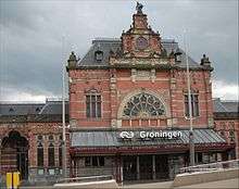
- Frutiger: the Swiss government, NHS, Dutch rail network, Dutch emergency services, UBS and the universities of Ohio, Lausanne, Iceland, Cornell and the London School of Economics
- Avenir: Apple Maps, the BBC, François Hollande and Best Buy
Other work
In 2003, the Swiss watchmaker Ventura commissioned him to design a new watch face for a limited-edition line of wristwatches.[70]
To celebrate Swiss graphic design he designed three stamps for the Swiss post office.[71]
He also designed a word mark for the National Institute of Design in Ahmedabad, India. Originally, the institute was named National Design Institute, however, the institute renamed itself to match Adrian Frutiger's stylized NID logotype alongside the name "National Institute of Design."
For the Fondation Frutiger he created a set of symbols as an abstract presentation of the Foundation's work.[72]
Select bibliography
- Erich Alb (Ed.): Adrian Frutiger — Formen und Gegenformen/Forms and Counterforms, Syndor Press 1998; Niggli: ISBN 3-7212-0440-9
- Adrian Frutiger: Ein Leben für die Schrift, Schlaefli & Maurer 2003, ISBN 3-85884-015-7
- Adrian Frutiger, Horst Heiderhoff: Der Mensch und seine Zeichen, Marixverlag 2004, ISBN 3-937715-63-0
- Adrian Frutiger: Nachdenken über Zeichen und Schrift, Haupt 2005, ISBN 3-258-06811-9
- Anne Cuneo: Adrian Frutiger — Schriftengestalter, DVD 2005, EAN 7611372200269, ISAN 0000-0000-D4FB-0000-F
- Adrian Frutiger: Symbole. Geheimnisvolle Bilder-Schriften, Zeichen, Signale, Labyrinthe, Heraldik, Haupt 2008, ISBN 3-258-07323-6
- Schweiz. Stiftung Schrift und Typographie, Heidrun Osterer, Philipp Stamm (Eds.): Adrian Frutiger — Typefaces. The Complete Works, Birkhäuser 2009, ISBN 978-3-7643-8581-1
- Adrian Frutiger — Der Mann von Schwarz und Weiss, DVD Artfilm 2005, ISBN 3-7225-0049-4, EAN 9783722500492, ISAN 0000-0001-83B9-0000-W
- Anja Bodmer und Jürg Brühlmann: Read Me — mit Adrian Frutiger durch die Welt der Zeichen und Buchstaben, Hochparterre Bücher AG, 2008, ISBN 978-3-909928-09-5
- Adrian Frutiger: Typefaces. The Complete Works., Birkhäuser 2008, ISBN 978-3-7643-8581-1
Notes
- 1 2 3 4 5 6 7 Schwemer-Scheddin, Yvonne. "Reputations: Adrian Frutiger". Eye. Retrieved 12 September 2015.
- ↑ "Schweizer Typograf Adrian Frutiger ist tot". Neue Luzerner Zeitung. 12 September 2015. Retrieved 2015-09-12.
- ↑ Twardoch, Adam. "Adrian Frutiger (24 May 1928 – 12 September 2015)". TypeDrawers. Retrieved 12 September 2015.
- ↑ Spiekermann, Erik (13 September 2015). "Nachruf: Eine Epoche in Buchstaben". Süddeutsche Zeitung (in German). ISSN 0174-4917. Retrieved 2015-09-13.
- ↑ Fox, Margalit (20 September 2015). "Adrian Frutiger Dies at 87; His Type Designs Show You the Way". The New York Times. Retrieved 20 September 2015.
- 1 2 3 Moran, James (1968). "Stanley Morison" (PDF). Monotype Recorder. 43 (3): 28. Retrieved 13 September 2015.
- ↑ "Biography of Adrian Frutiger". Linotype. Retrieved 12 September 2015.
- ↑ Frutiger, Adrian. Typefaces — the complete works. p. 12. ISBN 9783038212607.
- 1 2 3 4 5 6 7 8 9 10 Frutiger, Adrian (2008). Typefaces. The Complete Works. Basel: Birkhäuser Verlag. p. 442.
- ↑ Simon, Sophie. "Rois de la restauration" (PDF). Tribune de Genève. Retrieved 19 September 2015.
- ↑ "Wedding announcement (collectables listing)". Buch-Antiquariat. Retrieved 12 September 2015.
- ↑ Frutiger, Adrian. Schriften: Das Gesamtwerk. p. 450. ISBN 3038212636.
- ↑ "Fondation Frutiger - Simone Frutiger". Fondation Frutiger. Retrieved 18 September 2015.
- ↑ "Adrian & Simone Frutiger Prize". Friedrich Miescher Institute for Biomedical Research. Retrieved 12 September 2015.
- ↑ "Fondation Frutiger". http://www.fondationfrutiger.ch/. Retrieved 12 September 2015. External link in
|publisher=(help) - 1 2 "Historique (French)". Fondation Frutiger. Retrieved 12 September 2015.
- ↑ "Frutiger at 80". Linotype. Retrieved 13 September 2015.
- ↑ Frutiger, Adrian. Typefaces — the complete works. p. 22. ISBN 3038212601.
- ↑ "Font designer Adrian Frutiger". Linotype. Retrieved 13 September 2015.
- ↑ Levien, Raph. "Microsoft's ClearType Font Collection: A Fair and Balanced Review". Typographica. Retrieved 24 November 2014.
- ↑ Univers specimen book. American Type Founders. 1968. Retrieved 18 September 2015.
- ↑ "Serifa". MyFonts. Retrieved 12 September 2015.
- 1 2 "Glypha". MyFonts. Retrieved 12 September 2015.
- 1 2 "Apollo MT". MyFonts. Retrieved 12 September 2015.
- ↑ "Adrian Frutiger Remembered". Linotype. Retrieved 18 September 2015.
- 1 2 Frutiger, Adrian. Typefaces — the complete works. pp. 224–229.
- ↑ Spiekermann, Erik. "Twitter post". Twitter. Retrieved 11 July 2015.
- ↑ Matteson, Steve. "Type Q&A: Steve Matteson from Monotype". Typecast. Retrieved 12 September 2015.
- ↑ Frutiger, Adrian. Typefaces — the complete works. p. 183. ISBN 9783038212607.
- ↑ Bigelow, Charles (October 1988). "Philosophies of Form in Seriffed Typefaces of Adrian Frutiger". Fine Print: The Review For The Arts of The Book. Retrieved 18 September 2015.
- 1 2 Shaw, Paul. "Overlooked Typefaces". Print magazine. Retrieved 2 July 2015.
- 1 2 Frutiger, Adrian. "Icone". MyFonts. Linotype. Retrieved 10 September 2015.
- ↑ Frutiger, Adrian. Typefaces — the complete works. pp. 276–285. ISBN 9783038212607.
- ↑ "Parisine". St Bride Foundation. Retrieved 18 September 2015.
- ↑ Frutiger, Adrian. Typefaces — the complete works. pp. 244–49. ISBN 9783038212607.
- ↑ Frutiger, Adrian. Typefaces — the complete works. pp. 248–9.
- ↑ Frutiger, Adrian. Typefaces — the complete works. pp. 308–315. ISBN 9783038212607.
- ↑ "Adobe Avenir". MyFonts. Retrieved 12 September 2015.
- 1 2 "Vectora". MyFonts. Adobe. Retrieved 12 September 2015.
- ↑ "Didot LT". MyFonts. Retrieved 12 September 2015.
- ↑ "Herculanum LT". MyFonts. Linotype. Retrieved 12 September 2015.
- ↑ "Frutiger Stones". MyFonts. Linotype. Retrieved 12 September 2015.
- ↑ "Pompeijana LT". MyFonts. Linotype. Retrieved 12 September 2015.
- ↑ "Frutiger Capitalis". MyFonts. Retrieved 12 September 2015.
- ↑ "Custom Fonts and Custom Typeface Engine". Monotype. Retrieved 18 September 2015.
- ↑ "Akira Kobayashi, Linotype type director". Retrieved 18 September 2015.
- 1 2 "Traces: Adrian Frutiger on Univers". Linotype. Retrieved 12 September 2015.
- ↑ Frutiger, Adrian. Typefaces: The Complete Works (2 ed.). Walter de Gruyter. p. 260. ISBN 3038212601.
- ↑ Majoor, Martin. "My type design philosophy". Retrieved 12 September 2014.
- ↑ "Frutiger Neue". MyFonts. Linotype. Retrieved 12 September 2015.
- ↑ Adrian Frutiger Dies at 87; His Type Designs Show You the Way
- ↑ Font Designer - Adrian Frutiger - Adrian Frutiger Remembered
- ↑ "77 font families by Adrian Frutiger". MyFonts. Retrieved 13 September 2015.
- ↑ "Ondine". Linotype. Retrieved 12 September 2015.
- ↑ "President". Linotype. Retrieved 12 September 2015.
- 1 2 "Adobe Meridien". MyFonts. Retrieved 12 September 2015.
- 1 2 "Frutiger Serif". Linotype. Retrieved 12 September 2015.
- ↑ "Egyptienne". Linotype. Retrieved 12 September 2015.
- ↑ "Iridium". Linotype. Retrieved 12 September 2015.
- ↑ "Linotype: notes on Iridium font family". Linotype. Retrieved 12 September 2015.
- ↑ "Breughel". Linotype. Retrieved 12 September 2015.
- ↑ "Westside". Linotype. Retrieved 12 September 2015.
- ↑ "Nami". Linotype. Retrieved 12 September 2015.
- ↑ "Adrian Frutiger". Identifont. Retrieved 18 September 2015.
- ↑ "Adrian Frutiger « MyFonts". Retrieved 18 September 2015.
- ↑ "Frutiger honored with prestigious typography award". Linotype News. 1 November 2006. Retrieved 18 September 2015.
- ↑ TDC2 2006 : Winning Entries TDC2 awards page
- ↑ "2009: Adrian Frutiger". European Design. Retrieved 18 September 2015.
- ↑ "Kulturpreisverleihung Berner Oberland". Volkswirtschaft Berner Oberland. Retrieved 18 September 2015.
- ↑ "Adrian Frutiger develops watch dials for Ventura". Timezone. Retrieved 12 September 2015.
- ↑ "Frutiger Stamps". Katran Press. Retrieved 12 September 2015.
- ↑ "Symboles: Formes et Contreformes". Fondation Frutiger. Retrieved 12 September 2015.
References
- Carter, Sebsatian. 20th Century Type Designers. Lund Humphries Publishers: 2002. ISBN 978-0-85331-851-4.
- Eye, No. 31, Vol. 8, Spring 1999.
- Friedl, Frederich, Nicholas Ott and Bernard Stein. Typography: An Encyclopedic Survey of Type Design and Techniques Through History. Black Dog & Leventhal: 1998. ISBN 1-57912-023-7.
- Frutiger, Adrian. Signs and Symbols: Their Design and Meaning. Ebury Press: 1998. ISBN 978-0091864828.
- Frutiger, Adrian. Forms and Counterforms. ISBN 978-3721204407.
- Jaspert, Berry and Johnson. Encyclopædia of Type Faces. Cassell Paperback, London; 2001. ISBN 1-84188-139-2
- Macmillan, Neil. An A–Z of Type Designers. Yale University Press: 2006. ISBN 0-300-11151-7.
- McLean, Ruari. Typographers on Type. Lund Humphries: 1995. ISBN 978-0-85331-657-2.
- Ovenden, Mark Paris Metro Style in map and station design, Capital Transport, London, November 2008. ISBN 978-1-85414-322-8
External links
| Wikimedia Commons has media related to Adrian Frutiger. |
- Publications by and about Adrian Frutiger in the catalogue Helveticat of the Swiss National Library
- Monotype Imaging: Adrian Frutiger
- Font Designer — Adrian Frutiger
- Adrian Frutiger
- Typophile: Adrian Frutiger
- Univers specimen book, 1968, published by ATF for the American market
- Adrian Frutiger's 80th Birthday
- Postage stamp designed by Adrian Frutiger
- 'Portrait with word' of Adrian Frutiger by Mark-Steffen Goewecke
- Type adapted to everyday life (interview)
- Fondation Frutiger
- Fondation Frutiger biography
- Obituary, Adam Twardoch
- Obituary, Jürgen Siebert
- Philosophies of Form in Seriffed Typefaces of Adrian Frutiger - Charles Bigelow
- Adrian Frutiger: a tribute (2016 presentation by Matthew Carter)