Slab serif

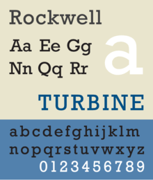
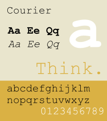
In typography, a slab serif (also called mechanistic, square serif, antique or Egyptian) typeface is a type of serif typeface characterized by thick, block-like serifs. Serif terminals may be either blunt and angular (Rockwell), or rounded (Courier). Slab serifs were invented in and most popular during the nineteenth century.
Slab serifs form a large and varied genre. Some such as Memphis and Rockwell have a geometric design with minimal variation in stroke width: they are sometimes described as sans-serif fonts with added serifs. Others such as those of the Clarendon genre have a structure more like most other serif fonts, though with larger and more obvious serifs.[1][2] These designs may have bracketed serifs which increase width along their length before merging with the main strokes of the letters, while on geometrics the serifs have a constant width.
Display-oriented slab serifs are often extremely bold, intended to grab the reader's attention on a poster, while slab serifs oriented towards legibility at small sizes show less extreme characteristics. Some fonts oriented towards small print use and printing on poor-quality newsprint paper may have slab serifs to increase legibility, while their other features are closer to conventional book type fonts.
Slab serif fonts were also often used in typewriters, most famously Courier, and this tradition has meant many monospaced text fonts intended for computer and programming use are slab serif designs.
History

Slab serif typefaces appeared rapidly in the early nineteenth century, having little in common with previous typefaces. As the printing of advertising material began to expand in the early nineteenth century, new and notionally more attention-grabbing typefaces were needed. Poster-size types began to be developed that were not merely magnified forms of book type, but very different and bolder. Some were developments of designs of the previous fifty years, such as bold and ultra-bold types such as fat faces, which were related to Didone types but much bolder. Others had completely new structures: reverse-contrast letterforms, sans-serif and slab-serif were new departures at this period. Some of the designs appearing around this time may be based on signpainting traditions, or vice versa.[lower-alpha 1]
Slab-serif type was perhaps first commercially introduced by Vincent Figgins under the name "Antique", appearing in a type-specimen dated 1815 (but probably issued in 1817).[3]
Writing in 1825, the printer and social reformer Thomas Curson Hansard wrote with amusement that slab-serif and other such display types were 'the outrageous kind of face only adapted for placards, posting-bills, invitations to the wheel of Fortune...Fashion and Fancy commonly frolic from one extreme to another.'[4]
Slab serifs declined following the growing popularity of sans-serif faces, with which they always competed, and the revival of interest in old-style serif fonts as part of the Arts and Crafts movement. However, they have been regularly revived and redesigned since the nineteenth century both in modernised forms and in retro use inspired by the exuberance of Victorian design, a style of design known as Victoriana.[5] Notable collections of original wood type are held by the Hamilton in Wisconsin and the University of Texas at Austin, collected by Rob Roy Kelly, writer of a well-known book on American poster types.[6] Adobe Systems has released a large collection of digitisations inspired by nineteenth-century wood type.
At first in Britain 'Egyptian' was used for sans-serifs and 'Antique' for slab-serifs; the two names later somewhat blurred or swapped.[7][8]
Following Napoleon's Egyptian campaign and dissemination of images and descriptions via publications like Description de l'Égypte (1809) an intense cultural fascination with all things Egyptian followed. Suites of contemporary parlor furniture were produced resembling furniture found in tombs. Multicolored woodblock printed wallpaper could make a dining room in Edinburgh or Chicago feel like Luxor. While there was no relationship between Egyptian writing systems and slab serif types, either shrewd marketing or honest confusion led to slab serifs often being called Egyptians.[9] Historian James Mosley has shown that the first typefaces and letters called 'Egyptian' were apparently all sans-serifs.[10] However, Egyptian came to refer to slab serifs by the mid and late nineteenth century. Some twentieth-century slab serifs (ones designed after the modern system of names for fonts had taken hold[8]), have 'Egyptian' names as a reminder of this: Cairo, Karnak, and Memphis are examples of this.
The term Egyptian was adopted by French and German foundries, where it became Egyptienne. A lighter style of slab serif with a single width of strokes was called 'engravers face' since it resembled the monoline structure of metal engravings. The term 'slab-serif' itself is relatively recent, possibly twentieth-century.[11]
A second aspect in the development of slab-serifs was the influence of geometric design of the 1920s, and many slab-serifs were produced that had a more monoline structure similar to geometric sans-serifs also popular around this time, such as Futura. These are called "geometric" designs.
Because of the clear, bold nature of the large serifs, slab serif designs are also often used for small print, for example in printing with typewriters and on newsprint paper. Joanna, Excelsior, TheSerif, FF Meta Serif and Guardian Egyptian are examples of newspaper and small print-orientated typefaces that have at least some slab serif characteristics, often most visible in the bold weights.
Describing the genre's structure, modern font designers Jonathan Hoefler and Tobias Frere-Jones note that the structure of the letter imposes compromises on structure, with purely geometric designs harder to create in ultra-bold sizes where it becomes impossible to create a strictly monoline lower-case alphabet, and Clarendon-style designs harder to create in a lighter style.[1]
Sub-classifications of slab-serif
There are several main subgroups of slab serif typefaces:
Antique model
The earliest slab-serifs were often called "antiques" or "Egyptians". They were often quite monoline in construction and had similarities to nineteenth-century serif fonts, such as ball terminals.[1]
Clarendon model
Clarendon typefaces, unlike other slab serifs, actually have some bracketing and some contrast in size in the actual serif: the serifs often have curves so they change width and become wider as they approach the main stroke of the letter. Many again have similarity to 19th century serif font designs, with considerable variation in stroke width between vertical and horizontal strokes.[12] Examples include Clarendon and Egyptienne.
Italienne model

In the Italienne model, also known as French Clarendon type, the serifs are even heavier than the stems, forging a dramatic, attention-drawing effect. This is known as reverse-contrast type. It is traditionally associated with use in circus and other posters, and is commonly seen in Western movies or to create a nineteenth-century atmosphere. It was most popular from the 1860s until the early twentieth century, particularly in the United States, although the basic concept originates from London printing of the 1820s and it was used outside the United States. It has often been revived since, for example by Robert Harling as Playbill and more recently by Adrian Frutiger as Westside.
Typewriter typefaces
Typewriter slab serif typefaces are named for their use in strike-on typewriting. These faces originated in monospaced format with fixed-width, meaning that every character takes up exactly the same amount of horizontal space. This feature is necessitated by the nature of the typewriter apparatus. Examples include Courier (on the geometric model) and Prestige Elite ( on the Clarendon model).
A considerable variety of other names have been used, particularly in the 19th century: at the time the separation between typeface name and genre had yet to become established, so it is not clear if a name describes a specific typeface or is meant to refer to a subgenre.[8] For example, slab serifs on the French Clarendon model were also called 'Celtic', 'Belgian', 'Aldine' and 'Teutonic' by American printers, as well as 'Tuscan', a name which refers to slab serifs with diamond-shaped points on the sides of the letterform.[13][14]
Geometric model
Geometric designs have no bracketing and evenly weighted stems and serifs. Early examples include Memphis, Rockwell, Karnak, Beton, Rosmini, City and Tower, several of which were influenced by geometric sans-serifs of the 1920s and 30s, especially Futura.[1] Recent well-known geometric sans-serifs include ITC Lubalin, Neutraface Slab and Archer.
Some monoline slab serifs such as Serifa, Helserif and Roboto Slab have been designed under the influence of neo-grotesque or realist sans-serif fonts of the 1950s and 60s onwards, and these may be called "neo-grotesque" slab serifs.[15][16][17][18]
See also
- List of slab-serif typefaces
References
- 1 2 3 4 "Sentinel: historical background". Hoefler & Frere-Jones. Retrieved 15 July 2015.
- ↑ Challand, Skylar. "Know your type: Clarendon". IDSGN. Retrieved 13 August 2015.
- ↑ James Mosley, The Nymph and the Grot: the revival of the sanserif letter. London: Friends of the St Bride Printing Library, 1999.
- ↑ Hansard, Thomas Curson (1825). Typographia, an Historical Sketch of the Origin and Progress of the Art of Printing. p. 618. Retrieved 12 August 2015.
- ↑ Tam, Keith. "The revival of slab-serif typefaces in the 20th century" (PDF). University of Reading (MA thesis). Retrieved 3 March 2016.
- ↑ "Rob Roy Kelly Wood Type Collection". University of Texas. Retrieved 23 October 2015.
- ↑ Mosley, James (6 January 2007). The Nymph and the Grot, an Update.
It became clear that in 1805 'Egyptian' letters [early sans-serif or, less likely slab serif letters] were 'happening' in the streets of London, being plastered over shops and on walls by signwriters, and they were astonishing the public, who had never seen letters like them and were not sure they wanted to.
- 1 2 3 Frere-Jones, Tobias. "Scrambled Eggs & Serifs". Frere-Jones Type. Retrieved 23 October 2015.
- ↑ Carter, E., Day. B, Meggs P.: “Typographic Design: Form and Communication, Third Edition”, page 35. John Wiley & Sons, 2002.
- ↑ James Mosley, The Nymph and the Grot: the revival of the sanserif letter. London: Friends of the St Bride Printing Library, 1999.
- ↑ Biggs, John (1954). The Use of Type: The Practice of Typography. Blandford Press.
- ↑ "Sentinel's Ancestors". Hoefler & Frere-Jones. Retrieved 14 August 2015.
- ↑ "Tuscan no. 132". Rob Roy Kelly American Wood Type Collection. University of Texas at Austin. Retrieved 23 October 2015.
- ↑ "Teutonic". TTKWTC. UTA. Retrieved 23 October 2015.
- ↑ "Helserif". MyFonts. URW++. Retrieved 19 March 2016.
- ↑ Loxley, Simon. "Font Wars: A Story On Rivalry Between Type Foundries". Smashing Magazine. Retrieved 20 March 2016.
- ↑ Coles, Stephen. "Twitter post". Twitter. Retrieved 20 March 2016.
[From a Helserif ad:] "Look what happened to Helvetica. It grew wings."
- ↑ Budrick, Callie. "Vintage Fonts: 35 Adverts From the Past". Print. Retrieved 20 March 2016.
- ↑ This can make tracing the descent of sans and slab-serif styles hard, since a trend can arrive in print directly and without apparent precedent from a signpainting tradition which has left less of a record.
External links
| Wikimedia Commons has media related to Egyptienne. |
- George Bruce & Co. of New York, 1828 (& other) specimen books. Many examples of early slab serif type alongside other period display types.
- From the company of Vincent Figgins: Specimen book, 1845. Many notable ornamented designs. Earlier books from the early 1800s survive and have been reprinted.
Typography terminology | |||||||||||||||
|---|---|---|---|---|---|---|---|---|---|---|---|---|---|---|---|
| Page | |||||||||||||||
| Paragraph | |||||||||||||||
| Character |
| ||||||||||||||
| Classifications |
| ||||||||||||||
| Punctuation | |||||||||||||||
| Typesetting | |||||||||||||||
| Typographic units | |||||||||||||||
| Digital typography |
| ||||||||||||||
| Related | |||||||||||||||
| |||||||||||||||