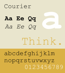
Courier (typeface)
 | |
| Category | Monospaced |
|---|---|
| Classification | Slab serif |
| Designer(s) | Howard "Bud" Kettler |
| Date released | 1955 |
Courier is a monospaced slab serif typeface designed to resemble the output from a strike-on typewriter. The typeface was designed by Howard "Bud" Kettler in 1955, and it was later redrawn by Adrian Frutiger for the IBM Selectric Composer series of electric typewriters.
Although the design of the original Courier typeface was commissioned by IBM, the company deliberately chose not to secure legal exclusivity to the typeface and it soon became a standard font used throughout the typewriter industry. Because IBM deliberately chose not to seek any copyright, trademark, or design patent protection, the Courier typeface cannot be trademarked or copyrighted and is completely royalty free.
As a monospaced font, in the 1990s, it found renewed use in the electronic world in situations where columns of characters must be consistently aligned. It has also become an industry standard for all screenplays to be written in 12-point Courier or a close variant. 12-point Courier New was also the U.S. State Department's standard typeface until January 2004, when it was replaced with 14-point Times New Roman. Reasons for the change included the desire for a more "modern" and "legible" font.[1][2][3]
Kettler was once quoted about how the name was chosen. The font was nearly released with the name "Messenger." After giving it some thought, Kettler said, "A letter can be just an ordinary messenger, or it can be the courier, which radiates dignity, prestige, and stability."[2]
Availability

IBM made Courier freely available in Postscript Type 1 format. Known as IBM Courier or simply Courier, it is available under the IBM/MIT X Consortium Courier Typefont agreement.[4]
Variants
Proprietary
Courier New
"Courier New" is a version produced by Monotype. Courier New was "digitized directly from the golf ball of the IBM Selectric"; this process resulted in some very thin outlines, because the typewriter's ball was designed deliberately thinner than the intended character stroke width since these expand as ink soaks into the paper.[5] It is unpopular and many programmers recommend avoiding it: programmer and blogger John Gruber described it as "a wretched variant of Courier; anemic and spindly."[6]
The font family includes Courier New, Courier New Bold, Courier New Italic, Courier New Bold Italic. Courier New features higher line space than Courier. Punctuation marks are reworked to make the dots and commas heavier.
Courier New was introduced with Windows 3.1, which also included raster Courier fonts. The fonts were also sold commercially by Ascender Corporation. The Ascender fonts have 'WGL' at the end of the font name, and cover only the WGL characters.
Courier New is used as the default font for monospace/modern generic font family in MS Windows (since Windows 3.1). It is commonly used as the font for plain text email messages. Version 2.76 or later includes Hebrew and Arabic glyphs, with most of Arabic added on non-italic fonts. The styling of Arabic glyphs is similar to those found in Times New Roman, but is adjusted to be monospaced. Courier New has been updated to version 5.00, which includes over 3100 glyphs, covering over 2700 characters per font.
Because the outlines of Courier New were so thin, a special hack was added for them in ClearType, thickening them in order to make them readable using the new rendering technology.[5]
Code variants
Courier New Baltic, Courier New CE, Courier New Cyr, Courier New Greek, Courier New Tur are aliases created in the FontSubstitutes section of WIN.INI. These entries all point to the master font. When an alias YEW font is specified, the font's character map contains a different character set from the master font and the other alias fonts.
Courier Final Draft
Courier Final Draft is a version of the typeface with a slightly altered pitch (spacing of characters) and slightly heavier stroke than Courier New, in order to approximate the output of an ink typewriter. Courier Final Draft is supplied with screenwriting program Final Draft for use in writing screenplays, as it provides 55 lines per page which coincides with the rule that a screenplay page is approximately one minute of screen time.[7]
Dark Courier
Dark Courier is a TrueType font from HP that is distributed freely (in the form of a Microsoft Windows-only installer, though the font will work on other systems), for those who feel the appearance of Courier New is too thin.
Courier Standard
Courier Standard, Courier Standard Bold, Courier Standard Bold Italic, Courier Standard Italic are fonts distributed with Adobe Reader 6, as a replacement for the PostScript Courier fonts. The stroke terminators are flat instead of round. It contains code pages 1252, Windows OEM Character Set. The font is Hinted and Smoothed for all point sizes. It contains OpenType layout tables aalt, dlig, frac, ordn, sups for Default Language in Latin script; dlig for TUR language in Latin script. Each font contains 374 glyphs.
Free/open source
Courier 10 Pitch BT

This is Bitstream's version of the classic typeface, available in Type 1 format. It has been donated to the X Consortium by Bitstream (along with Bitstream Charter) and is thus freely available. It is the default Courier font on most Linux distributions.
Courier Code is a variant of Courier 10 Pitch more suited for programming. The zero is dotted to better distinguish it from the capital O. The lowercase L has been altered to better distinguish it from the number one. The leading has been increased slightly as well.
Courier Prime
Courier Prime matches the metrics of Courier and Courier Final Draft, with some design changes and improvements aimed at greater legibility and beauty. It was designed by Alan Dague-Greene with funding from John August, and released in January 2013 under the SIL Open Font License.[8] The family was extended with sans-serif and code versions in 2016.
Nimbus Mono L
URW++ produced a version of Courier called Nimbus Mono L in 1984, and eventually released under the GPL and AFPL (as Type 1 font for Ghostscript) in 1996.[9][10][11] It is one of the Ghostscript fonts, a free alternatives to 35 basic PostScript fonts (which include Courier). It is available in major free and open source operating systems.
- TexGyreCursor, developed by GUST ("the Polish TeX Users Group"), is based on the URW Nimbus Mono L typeface.
- FreeMono, a free font descending from URW++ Nimbus Mono L, which in turn descends from Courier.[12][13] It is one of free fonts developed in GNU FreeFont project, first published in 2002. It is used in some free software as Courier replacement or for Courier font substitution.
Alternatives and derivatives
- Liberation Mono is a metrically equivalent font to Courier New developed by Ascender Corp. and published by Red Hat in 2007 under the GPL license with some exceptions.[14] It is used in some GNU/Linux distributions as default font replacement for Courier New.[15]
Applications
In Latin 1 text
Courier is commonly used in ASCII art because it is a monospaced font and is available almost universally. "Solid-style" ASCII art uses the darkness/lightness of each character to portray an object, which can be quantified in pixels (here in pt. 12):
| a | b | c | d | e | f | g | h | i | j | k | l | m | n | o | p | q | r | s | t | u | v | w | x | y | z |
| 21 | 25 | 18 | 25 | 24 | 19 | 28 | 24 | 14 | 15 | 25 | 16 | 30 | 21 | 20 | 27 | 27 | 18 | 21 | 17 | 19 | 17 | 25 | 20 | 21 | 21 |
| A | B | C | D | E | F | G | H | I | J | K | L | M | N | O | P | Q | R | S | T | U | V | W | X | Y | Z |
| 25 | 29 | 21 | 26 | 29 | 25 | 27 | 31 | 18 | 19 | 28 | 20 | 36 | 24 | 20 | 25 | 28 | 30 | 28 | 24 | 27 | 22 | 30 | 26 | 23 | 24 |
| ` | 1 | 2 | 3 | 4 | 5 | 6 | 7 | 8 | 9 | 0 | - | = | ~ | ! | @ | # | $ | % | ^ | & | * | ( | ) | _ | + |
| 2 | 16 | 19 | 20 | 23 | 23 | 23 | 16 | 26 | 23 | 24 | 6 | 12 | 9 | 9 | 36 | 30 | 26 | 20 | 7 | 24 | 21 | 13 | 13 | 9 | 13 |
| [ | ] | \ | ; | ' | , | . | / | { | } | | | : | " | < | > | ? |
| 17 | 17 | 8 | 11 | 4 | 7 | 4 | 8 | 16 | 16 | 13 | 8 | 8 | 9 | 9 | 13 |
In computer programming
Courier, as a common monospaced font, is often used to signify source code.[16]
See also
References
- ↑ US bans time-honoured typeface
- 1 2 Goodbye to the Courier font? - Tom Vanderbilt, Slate.com, 20 February 2004.
- ↑ Paul Shaw (10 March 2004). "State Department bans Courier New 12, except for treaties". Retrieved 2010-04-15.
- ↑ http://www.ctan.org/tex-archive/fonts/psfonts/courier
- 1 2 Why is Courier New so Thin?
- ↑ Gruber, John. "iPhone Fonts". Daring Fireball. Retrieved 15 July 2015.
- ↑ Courier Fonts: Everything You Ever Wanted To Know About Courier…And Then Some (PDF)
- ↑ August, John. "About John August". Retrieved 17 November 2014.
- ↑ Finally! Good-quality free (GPL) basic-35 PostScript Type 1 fonts., archived from the original on 23 October 2002, retrieved 2010-05-06
- ↑ Finally! Good-quality free (GPL) basic-35 PostScript Type 1 fonts. (TXT), retrieved 2010-05-06
- ↑ "Fonts and TeX". 19 December 2009. Retrieved 2010-05-06.
- ↑ "GNU FreeFont - Why do we need free outline UCS fonts?". 4 October 2009. Retrieved 2010-07-02.
- ↑ "GNU FreeFont - Design notes". 4 October 2009. Retrieved 2010-07-02.
- ↑ License.txt - License Agreement and Limited Product Warranty, Liberation Font Software, archived from the original on 16 July 2011, retrieved 2010-01-15
- ↑ Mandriva Linux 2008 Release Tour, archived from the original on 19 June 2010, retrieved 2010-04-04,
integrated into Mandriva Linux 2008
- ↑ http://hivelogic.com/articles/top-10-programming-fonts/
- Macmillan, Neil. An A–Z of Type Designers. Yale University Press: 2006. ISBN 0-300-11151-7.
External links
- Courier New font information (Microsoft typography)
- Downloadable version of Courier New (Core fonts for the Web)
- Designer of Courier: the Bud Kettler Page
- Courier designer dies, aged 80
- Typeart history: Courier
- Digital Media Typography, layout and concept covers history of courier and Kettler