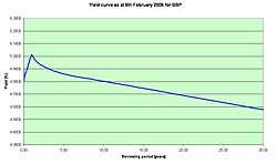
Yield curve
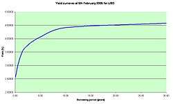
In finance, the yield curve is a curve showing several yields or interest rates across different contract lengths (2 month, 2 year, 20 year, etc...) for a similar debt contract. The curve shows the relation between the (level of) interest rate (or cost of borrowing) and the time to maturity, known as the "term", of the debt for a given borrower in a given currency.[1] For example, the U.S. dollar interest rates paid on U.S. Treasury securities for various maturities are closely watched by many traders, and are commonly plotted on a graph such as the one on the right which is informally called "the yield curve". More formal mathematical descriptions of this relation are often called the term structure of interest rates.
The shape of the yield curve indicates the cumulative priorities of all lenders relative to a particular borrower, (such as the US Treasury or the Treasury of Japan) or the priorities of a single lender relative to all possible borrowers. With other factors held equal, lenders will prefer to have funds at their disposal, rather than at the disposal of a third party. The interest rate is the "price" paid to convince them to lend. As the term of the loan increases, lenders demand an increase in the interest received. In addition, lenders may be concerned about future circumstances, e.g. a potential default (or rising rates of inflation), so they demand higher interest rates on long-term loans than they demand on shorter-term loans to compensate for the increased risk. Occasionally, when lenders are seeking long-term debt contracts more aggressively than short-term debt contracts, the yield curve "inverts", with interest rates (yields) being lower for the longer periods of repayment so that lenders can attract long-term borrowing.
The yield of a debt instrument is the overall rate of return available on the investment. In general the percentage per year that can be earned is dependent on the length of time that the money is invested. For example, a bank may offer a "savings rate" higher than the normal checking account rate if the customer is prepared to leave money untouched for five years. Investing for a period of time t gives a yield Y(t).
This function Y is called the yield curve, and it is often, but not always, an increasing function of t. Yield curves are used by fixed income analysts, who analyze bonds and related securities, to understand conditions in financial markets and to seek trading opportunities. Economists use the curves to understand economic conditions.
The yield curve function Y is actually only known with certainty for a few specific maturity dates, while the other maturities are calculated by interpolation (see Construction of the full yield curve from market data below).
The typical shape of the yield curve
Yield curves are usually upward sloping asymptotically: the longer the maturity, the higher the yield, with diminishing marginal increases (that is, as one moves to the right, the curve flattens out). There are two common explanations for upward sloping yield curves. First, it may be that the market is anticipating a rise in the risk-free rate. If investors hold off investing now, they may receive a better rate in the future. Therefore, under the arbitrage pricing theory, investors who are willing to lock their money in now need to be compensated for the anticipated rise in rates—thus the higher interest rate on long-term investments.
Another explanation is that longer maturities entail greater risks for the investor (i.e. the lender). A risk premium is needed by the market, since at longer durations there is more uncertainty and a greater chance of catastrophic events that impact the investment. This explanation depends on the notion that the economy faces more uncertainties in the distant future than in the near term. This effect is referred to as the liquidity spread. If the market expects more volatility in the future, even if interest rates are anticipated to decline, the increase in the risk premium can influence the spread and cause an increasing yield.
The opposite position (short-term interest rates higher than long-term) can also occur. For instance, in November 2004, the yield curve for UK Government bonds was partially inverted. The yield for the 10-year bond stood at 4.68%, but was only 4.45% for the 30-year bond. The market's anticipation of falling interest rates causes such incidents. Negative liquidity premiums can also exist if long-term investors dominate the market, but the prevailing view is that a positive liquidity premium dominates, so only the anticipation of falling interest rates will cause an inverted yield curve. Strongly inverted yield curves have historically preceded economic depressions.
The shape of the yield curve is influenced by supply and demand: for instance, if there is a large demand for long bonds, for instance from pension funds to match their fixed liabilities to pensioners, and not enough bonds in existence to meet this demand, then the yields on long bonds can be expected to be low, irrespective of market participants' views about future events.
The yield curve may also be flat or hump-shaped, due to anticipated interest rates being steady, or short-term volatility outweighing long-term volatility.
Yield curves continually move all the time that the markets are open, reflecting the market's reaction to news. A further "stylized fact" is that yield curves tend to move in parallel (i.e., the yield curve shifts up and down as interest rate levels rise and fall).
Types of yield curve
There is no single yield curve describing the cost of money for everybody. The most important factor in determining a yield curve is the currency in which the securities are denominated. The economic position of the countries and companies using each currency is a primary factor in determining the yield curve. Different institutions borrow money at different rates, depending on their creditworthiness. The yield curves corresponding to the bonds issued by governments in their own currency are called the government bond yield curve (government curve). Banks with high credit ratings (Aa/AA or above) borrow money from each other at the LIBOR rates. These yield curves are typically a little higher than government curves. They are the most important and widely used in the financial markets, and are known variously as the LIBOR curve or the swap curve. The construction of the swap curve is described below.
Besides the government curve and the LIBOR curve, there are corporate (company) curves. These are constructed from the yields of bonds issued by corporations. Since corporations have less creditworthiness than most governments and most large banks, these yields are typically higher. Corporate yield curves are often quoted in terms of a "credit spread" over the relevant swap curve. For instance the five-year yield curve point for Vodafone might be quoted as LIBOR +0.25%, where 0.25% (often written as 25 basis points or 25bps) is the credit spread.
Normal yield curve
From the post-Great Depression era to the present, the yield curve has usually been "normal" meaning that yields rise as maturity lengthens (i.e., the slope of the yield curve is positive). This positive slope reflects investor expectations for the economy to grow in the future and, importantly, for this growth to be associated with a greater expectation that inflation will rise in the future rather than fall. This expectation of higher inflation leads to expectations that the central bank will tighten monetary policy by raising short-term interest rates in the future to slow economic growth and dampen inflationary pressure. It also creates a need for a risk premium associated with the uncertainty about the future rate of inflation and the risk this poses to the future value of cash flows. Investors price these risks into the yield curve by demanding higher yields for maturities further into the future. In a positively sloped yield curve, lenders profit from the passage of time since yields decrease as bonds get closer to maturity (as yield decreases, price increases); this is known as rolldown and is a significant component of profit in fixed-income investing (i.e., buying and selling, not necessarily holding to maturity), particularly if the investing is leveraged.[2]
However, a positively sloped yield curve has not always been the norm. Through much of the 19th century and early 20th century the US economy experienced trend growth with persistent deflation, not inflation. During this period the yield curve was typically inverted, reflecting the fact that deflation made current cash flows less valuable than future cash flows. During this period of persistent deflation, a 'normal' yield curve was negatively sloped.
Steep yield curve
Historically, the 20-year Treasury bond yield has averaged approximately two percentage points above that of three-month Treasury bills. In situations when this gap increases (e.g. 20-year Treasury yield rises higher than the three-month Treasury yield), the economy is expected to improve quickly in the future. This type of curve can be seen at the beginning of an economic expansion (or after the end of a recession). Here, economic stagnation will have depressed short-term interest rates; however, rates begin to rise once the demand for capital is re-established by growing economic activity.
In January 2010, the gap between yields on two-year Treasury notes and 10-year notes widened to 2.92 percentage points, its highest ever.
Flat or humped yield curve
A flat yield curve is observed when all maturities have similar yields, whereas a humped curve results when short-term and long-term yields are equal and medium-term yields are higher than those of the short-term and long-term. A flat curve sends signals of uncertainty in the economy. This mixed signal can revert to a normal curve or could later result into an inverted curve. It cannot be explained by the Segmented Market theory discussed below.
Inverted yield curve
An inverted yield curve occurs when long-term yields fall below short-term yields.
Under unusual circumstances, long-term investors will settle for lower yields now if they think the economy will slow or even decline in the future. Campbell R. Harvey's 1986 dissertation[3] showed that an inverted yield curve accurately forecasts U.S. recessions. An inverted curve has indicated a worsening economic situation in the future 7 times since 1970.[4] The New York Federal Reserve regards it as a valuable forecasting tool in predicting recessions two to six quarters ahead. In addition to potentially signaling an economic decline, inverted yield curves also imply that the market believes inflation will remain low. This is because, even if there is a recession, a low bond yield will still be offset by low inflation. However, technical factors, such as a flight to quality or global economic or currency situations, may cause an increase in demand for bonds on the long end of the yield curve, causing long-term rates to fall. Falling long-term rates in the presence of rising short-term rates is known as "Greenspan's Conundrum"[5]
Relationship to the business cycle
The slope of the yield curve is one of the most powerful predictors of future economic growth, inflation, and recessions.[6] One measure of the yield curve slope (i.e. the difference between 10-year Treasury bond rate and the 3-month Treasury bond rate) is included in the Financial Stress Index published by the St. Louis Fed.[7] A different measure of the slope (i.e. the difference between 10-year Treasury bond rates and the federal funds rate) is incorporated into the Index of Leading Economic Indicators published by The Conference Board.[8]
An inverted yield curve is often a harbinger of recession. A positively sloped yield curve is often a harbinger of inflationary growth. Work by Dr. Arturo Estrella & Dr. Tobias Adrian has established the predictive power of an inverted yield curve to signal a recession. Their models show that when the difference between short-term interest rates (he uses 3-month T-bills) and long-term interest rates (10-year Treasury bonds) at the end of a federal reserve tightening cycle is negative or less than 93 basis points positive that a rise in unemployment usually occurs.[9] The New York Fed publishes a monthly recession probability prediction derived from the yield curve and based on Dr. Estrella's work.
All the recessions in the US since 1970 (up through 2015) have been preceded by an inverted yield curve (10-year vs 3-month). Over the same time frame, every occurrence of an inverted yield curve has been followed by recession as declared by the NBER business cycle dating committee.[10]
| Event | Date of Inversion Start | Date of the Recession Start | Time from Inversion to Recession Start | Duration of Inversion | Time from Recession Start to NBER Announcement | Time from Disinversion to Recession End | Duration of Recession | Time from Recession End to NBER Announcement | Max Inversion |
|---|---|---|---|---|---|---|---|---|---|
| Months | Months | Months | Months | Months | Months | Basis Points | |||
| 1970 Recession | Dec-68 | Jan-70 | 13 | 15 | NA | 8 | 11 | NA | −52 |
| 1974 Recession | Jun-73 | Dec-73 | 6 | 18 | NA | 3 | 16 | NA | −159 |
| 1980 Recession | Nov-78 | Feb-80 | 15 | 18 | 4 | 2 | 6 | 12 | −328 |
| 1981–1982 Recession | Oct-80 | Aug-81 | 10 | 12 | 5 | 13 | 16 | 8 | −351 |
| 1990 Recession | Jun-89 | Aug-90 | 14 | 7 | 8 | 14 | 8 | 21 | −16 |
| 2001 Recession | Jul-00 | Apr-01 | 9 | 7 | 7 | 9 | 8 | 20 | −70 |
| 2008–2009 Recession | Aug-06 | Jan-08 | 17 | 10 | 11 | 24 | 18 | 15 | −51 |
| Average since 1969 | 12 | 12 | 7 | 10 | 12 | 15 | −147 | ||
| Std Dev since 1969 | 3.83 | 4.72 | 2.74 | 7.50 | 4.78 | 5.45 | 138.96 |
Dr. Estrella has postulated that the yield curve affects the business cycle via the balance sheet of banks.[11] When the yield curve is inverted banks are often caught paying more on short-term deposits than they are making on long-term loans leading to a loss of profitability and reluctance to lend resulting in a credit crunch. When the yield curve is upward sloping, banks can profitably take-in short term deposits and make long-term loans so they are eager to supply credit to borrowers. This eventually leads to a credit bubble. In other words, an inverted yield curve harms the Net Interest Margin (NIM) of banks (or bank-like financial institutions) whereas a positively sloped yield curve benefits the NIM of banks.
Theory
There are three main economic theories attempting to explain how yields vary with maturity. Two of the theories are extreme positions, while the third attempts to find a middle ground between the former two.
Market expectations (pure expectations) hypothesis
This hypothesis assumes that the various maturities are perfect substitutes and suggests that the shape of the yield curve depends on market participants' expectations of future interest rates. It assumes that market forces will cause the interest rates on various terms of bonds to be such that the expected final value of a sequence of short-term investments will equal the known final value of a single long-term investment.
Using this, futures rates, along with the assumption that arbitrage opportunities will be minimal in future markets, and that futures rates are unbiased estimates of forthcoming spot rates, provide enough information to construct a complete expected yield curve. For example, if investors have an expectation of what 1-year interest rates will be next year, the current 2-year interest rate can be calculated as the compounding of this year's 1-year interest rate by next year's expected 1-year interest rate. More generally, returns (1+ yield) on a long-term instrument are assumed to equal the geometric mean of the expected returns on a series of short-term instruments:

where ist and ilt are the expected short-term and actual long-term interest rates.
This theory is consistent with the observation that yields usually move together. However, it fails to explain the persistence in the shape of the yield curve.
Shortcomings of expectations theory include that it neglects the interest rate risk inherent in investing in bonds.
Liquidity premium theory
The Liquidity Premium Theory is an offshoot of the Pure Expectations Theory. The Liquidity Premium Theory asserts that long-term interest rates not only reflect investors’ assumptions about future interest rates but also include a premium for holding long-term bonds (investors prefer short term bonds to long term bonds), called the term premium or the liquidity premium. This premium compensates investors for the added risk of having their money tied up for a longer period, including the greater price uncertainty. Because of the term premium, long-term bond yields tend to be higher than short-term yields and the yield curve slopes upward. Long term yields are also higher not just because of the liquidity premium, but also because of the risk premium added by the risk of default from holding a security over the long term. The market expectations hypothesis is combined with the liquidity premium theory:

Where is the risk premium associated with an year bond.


Market segmentation theory
This theory is also called the segmented market hypothesis. In this theory, financial instruments of different terms are not substitutable. As a result, the supply and demand in the markets for short-term and long-term instruments is determined largely independently. Prospective investors decide in advance whether they need short-term or long-term instruments. If investors prefer their portfolio to be liquid, they will prefer short-term instruments to long-term instruments. Therefore, the market for short-term instruments will receive a higher demand. Higher demand for the instrument implies higher prices and lower yield. This explains the stylized fact that short-term yields are usually lower than long-term yields. This theory explains the predominance of the normal yield curve shape. However, because the supply and demand of the two markets are independent, this theory fails to explain the observed fact that yields tend to move together (i.e., upward and downward shifts in the curve).
Preferred habitat theory
The preferred habitat theory is another guide of the liquidity premium theory, and states that in addition to interest rate expectations, investors have distinct investment horizons and require a meaningful premium to buy bonds with maturities outside their "preferred" maturity, or habitat. Proponents of this theory believe that short-term investors are more prevalent in the fixed-income market, and therefore longer-term rates tend to be higher than short-term rates, for the most part, but short-term rates can be higher than long-term rates occasionally. This theory is consistent with both the persistence of the normal yield curve shape and the tendency of the yield curve to shift up and down while retaining its shape.
Historical development of yield curve theory
On 15 August 1971, U.S. President Richard Nixon announced that the U.S. dollar would no longer be based on the gold standard, thereby ending the Bretton Woods system and initiating the era of floating exchange rates.
Floating exchange rates made life more complicated for bond traders, including those at Salomon Brothers in New York City. By the middle of the 1970s, encouraged by the head of bond research at Salomon, Marty Liebowitz, traders began thinking about bond yields in new ways. Rather than think of each maturity (a ten-year bond, a five-year, etc.) as a separate marketplace, they began drawing a curve through all their yields. The bit nearest the present time became known as the short end—yields of bonds further out became, naturally, the long end.
Academics had to play catch up with practitioners in this matter. One important theoretic development came from a Czech mathematician, Oldrich Vasicek, who argued in a 1977 paper that bond prices all along the curve are driven by the short end (under risk neutral equivalent martingale measure) and accordingly by short-term interest rates. The mathematical model for Vasicek's work was given by an Ornstein–Uhlenbeck process, but has since been discredited because the model predicts a positive probability that the short rate becomes negative and is inflexible in creating yield curves of different shapes. Vasicek's model has been superseded by many different models including the Hull–White model (which allows for time varying parameters in the Ornstein–Uhlenbeck process), the Cox–Ingersoll–Ross model, which is a modified Bessel process, and the Heath–Jarrow–Morton framework. There are also many modifications to each of these models, but see the article on short rate model. Another modern approach is the LIBOR market model, introduced by Brace, Gatarek and Musiela in 1997 and advanced by others later. In 1996 a group of derivatives traders led by Olivier Doria (then head of swaps at Deutsche Bank) and Michele Faissola, contributed to an extension of the swap yield curves in all the major European currencies. Until then the market would give prices until 15 years maturities. The team extended the maturity of European yield curves up to 50 years (for the lira, French franc, Deutsche mark, Danish krone and many other currencies including the ecu). This innovation was a major contribution towards the issuance of long dated zero coupon bonds and the creation of long dated mortgages.
Construction of the full yield curve from market data
| Type | Settlement date | Rate (%) |
| Cash | Overnight rate | 5.58675 |
| Cash | Tomorrow next rate | 5.59375 |
| Cash | 1m | 5.625 |
| Cash | 3m | 5.71875 |
| Future | Dec-97 | 5.76 |
| Future | Mar-98 | 5.77 |
| Future | Jun-98 | 5.82 |
| Future | Sep-98 | 5.88 |
| Future | Dec-98 | 6.00 |
| Swap | 2y | 6.01253 |
| Swap | 3y | 6.10823 |
| Swap | 4y | 6.16 |
| Swap | 5y | 6.22 |
| Swap | 7y | 6.32 |
| Swap | 10y | 6.42 |
| Swap | 15y | 6.56 |
| Swap | 20y | 6.56 |
| Swap | 30y | 6.56 |
|
A list of standard instruments used to build a money market yield curve. | ||
|
The data is for lending in US dollar, taken from October 6, 1997 | ||
The usual representation of the yield curve is a function P, defined on all future times t, such that P(t) represents the value today of receiving one unit of currency t years in the future. If P is defined for all future t then we can easily recover the yield (i.e. the annualized interest rate) for borrowing money for that period of time via the formula

The significant difficulty in defining a yield curve therefore is to determine the function P(t). P is called the discount factor function or the zero coupon bond.
Yield curves are built from either prices available in the bond market or the money market. Whilst the yield curves built from the bond market use prices only from a specific class of bonds (for instance bonds issued by the UK government) yield curves built from the money market use prices of "cash" from today's LIBOR rates, which determine the "short end" of the curve i.e. for t ≤ 3m, interest rate futures which determine the midsection of the curve (3m ≤ t ≤ 15m) and interest rate swaps which determine the "long end" (1y ≤ t ≤ 60y).
The example given in the table at the right is known as a LIBOR curve because it is constructed using either LIBOR rates or swap rates. A LIBOR curve is the most widely used interest rate curve as it represents the credit worth of private entities at about A+ rating, roughly the equivalent of commercial banks. If one substitutes the LIBOR and swap rates with government bond yields, one arrives at what is known as a government curve, usually considered the risk free interest rate curve for the underlying currency. The spread between the LIBOR or swap rate and the government bond yield, usually positive, meaning private borrowing is at a premium above government borrowing, of similar maturity is a measure of risk tolerance of the lenders. For the U. S. market, a common benchmark for such a spread is given by the so-called TED spread.
In either case the available market data provides a matrix A of cash flows, each row representing a particular financial instrument and each column representing a point in time. The (i,j)-th element of the matrix represents the amount that instrument i will pay out on day j. Let the vector F represent today's prices of the instrument (so that the i-th instrument has value F(i)), then by definition of our discount factor function P we should have that F = AP (this is a matrix multiplication). Actually, noise in the financial markets means it is not possible to find a P that solves this equation exactly, and our goal becomes to find a vector P such that

where is as small a vector as possible (where the size of a vector might be measured by taking its norm, for example).

Note that even if we can solve this equation, we will only have determined P(t) for those t which have a cash flow from one or more of the original instruments we are creating the curve from. Values for other t are typically determined using some sort of interpolation scheme.
Practitioners and researchers have suggested many ways of solving the A*P = F equation. It transpires that the most natural method – that of minimizing by least squares regression – leads to unsatisfactory results. The large number of zeroes in the matrix A mean that function P turns out to be "bumpy".

In their comprehensive book on interest rate modelling James and Webber note that the following techniques have been suggested to solve the problem of finding P:
- Approximation using Lagrange polynomials
- Fitting using parameterised curves (such as splines, the Nelson-Siegel family, the Svensson family, or the Cairns restricted-exponential family of curves). Van Deventer, Imai and Mesler summarize three different techniques for curve fitting that satisfy the maximum smoothness of either forward interest rates, zero coupon bond prices, or zero coupon bond yields
- Local regression using kernels
- Linear programming
In the money market practitioners might use different techniques to solve for different areas of the curve. For example, at the short end of the curve, where there are few cashflows, the first few elements of P may be found by bootstrapping from one to the next. At the long end, a regression technique with a cost function that values smoothness might be used.
How the yield curve affects bond prices
There is a time dimension to the analysis of bond values. A 10-year bond at purchase becomes a 9-year bond a year later, and the year after it becomes an 8-year bond, etc. Each year the bond moves incrementally closer to maturity, resulting in lower volatility and shorter duration and demanding a lower interest rate when the yield curve is rising. Since falling rates create increasing prices, the value of a bond initially will rise as the lower rates of the shorter maturity become its new market rate. Because a bond is always anchored by its final maturity, the price at some point must change direction and fall to par value at redemption.
A bond's market value at different times in its life can be calculated. When the yield curve is steep, the bond is predicted to have a large capital gain in the first years before falling in price later. When the yield curve is flat, the capital gain is predicted to be much less, and there is little variability in the bond's total returns over time.
Rising (or falling) interest rates rarely rise by the same amount all along the yield curve—the curve rarely moves up in parallel. Because longer-term bonds have a larger duration, a rise in rates will cause a larger capital loss for them, than for short-term bonds. But almost always, the long maturity's rate will change much less, flattening the yield curve. The greater change in rates at the short end will offset to some extent the advantage provided by the shorter bond's lower duration.
Long duration bonds tend to be mean reverting, meaning that they readily gravitate to a long-run average. The middle of the curve (5-10 years) will see the greatest percentage gain in yields if there is anticipated inflation even if interest rates have not changed. The long-end does not move quite as much percentage-wise because of the mean reverting properties.
The yearly 'total return' from the bond is a) the sum of the coupon's yield plus b) the capital gain from the changing valuation as it slides down the yield curve and c) any capital gain or loss from changing interest rates at that point in the yield curve.[12]
See also
Notes
- ↑ Yield Curve 101: The Ultimate Guide for ETF Investors - Yahoo Finance Yahoo Finance
- ↑ ‘Helicopter Ben’ risks destroying credit creation, September 6, 2011, Financial Times, by Bill Gross
- ↑ Campbell Harvey, 1986. University of Chicago Dissertation.
- ↑ Campbell R. Harvey, 2010. The Yield Curve: An update.
- ↑ Daniel L. Thornton (September 2012). "Greenspan's Conundrum and the Fed's Ability to Affect Long-Term Yields" (PDF). Working Paper 2012-036A. FEDERAL RESERVE BANK OF ST. LOUIS. Retrieved 3 December 2015.
- ↑ Arturo Estrella & Frederic S. Mishkin, The Review of Economics & Statistics, Predicting U.S. Recessions: Financial Variables as Leading Indicators, 1998
- ↑ "List of Data Series Used to Construct the St. Louis Fed Financial Stress Index". The Federal Reserve Bank of St. Louis. Retrieved 2 March 2015.
- ↑ "Description of Components". Business Cycle Indicators. The Conference Board. Retrieved 2 March 2015.
- ↑ Arturo Estrella & Tobias Adrian , FRB of New York Staff Report No. 397, 2009
- ↑ "Announcement Dates". US Business Cycle Expansions and Contractions. NBER Business Cycle Dating Committee. Retrieved 1 March 2015.
- ↑ Arturo Estrella, FRB of New York Staff Report No. 421, 2010
- ↑ Changes to a Bond's Value Over Time as Rates Change
References
Books
- Leif B.G. Andersen & Vladimir V. Piterbarg (2010). Interest Rate Modeling. Atlantic Financial Press. ISBN 0-984-42210-2.
- Jessica James & Nick Webber (2001). Interest Rate Modelling. John Wiley & Sons. ISBN 0-471-97523-0.
- Riccardo Rebonato (1998). Interest-Rate Option Models. John Wiley & Sons. ISBN 0-471-97958-9.
- Nicholas Dunbar (2000). Inventing Money. John Wiley & Sons. ISBN 0-471-89999-2.
- N. Anderson, F. Breedon, M. Deacon, A. Derry and M. Murphy (1996). Estimating and Interpreting the Yield Curve. John Wiley & Sons. ISBN 0-471-96207-4.
- Andrew J.G. Cairns (2004). Interest Rate Models – An Introduction. Princeton University Press. ISBN 0-691-11894-9.
- John C. Hull (1989). Options, Futures and Other Derivatives. Prentice Hall. ISBN 0-13-015822-4. See in particular the section Theories of the term structure (section 4.7 in the fourth edition).
- Damiano Brigo; Fabio Mercurio (2001). Interest Rate Models – Theory and Practice. Springer. ISBN 3-540-41772-9.
- Donald R. van Deventer; Kenji Imai; Mark Mesler (2004). Advanced Financial Risk Management, An Integrated Approach to Credit Risk and Interest Rate Risk Management. John Wiley & Sons. ISBN 978-0-470-82126-8.
Articles
- Ruben D Cohen (2006) "A VaR-Based Model for the Yield Curve [download]" Wilmott Magazine, May Issue.
- Lin Chen (1996). Stochastic Mean and Stochastic Volatility – A Three-Factor Model of the Term Structure of Interest Rates and Its Application to the Pricing of Interest Rate Derivatives. Blackwell Publishers.
- Paul F. Cwik (2005) "The Inverted Yield Curve and the Economic Downturn [download]" New Perspectives on Political Economy, Volume 1, Number 1, 2005, pp. 1–37.
- Roger J.-B. Wets, Stephen W. Bianchi, "Term and Volatility Structures" in Stavros A. Zenios & William T. Ziemba (2006). Handbook of Asset and Liability Management, Volume 1. North-Holland. ISBN 0-444-50875-9.
- Hagan, P.; West, G. (June 2006). "Interpolation Methods for Curve Construction" (PDF). Applied Mathematical Finance. 13 (2): 89–129. doi:10.1080/13504860500396032.
- Rise in Rates Jolts Markets – Fed's Effort to Revive Economy Is Complicated by Fresh Jump in Borrowing Costs author = Liz Rappaport. Wall Street Journal. May 28, 2009. p. A.1
External links
| Wikimedia Commons has media related to Yield curves (economics). |
- Euro area yield curves – European Central Bank website
- Dynamic Yield Curve – This chart shows the relationship between interest rates and stocks over time.
- NYFed Current Issue – Current Issue of New York Federal Reserve outlining their view of inverted yield curve