Minion (typeface)
 | |
| Category | Serif |
|---|---|
| Classification | Garalde old-style |
| Designer(s) | Robert Slimbach |
| Date released | 1990 |
| Shown here | Adobe Minion Pro |
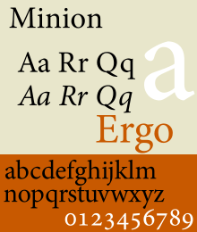
Minion is a serif typeface designed by Robert Slimbach in 1990 for Adobe Systems and inspired by late Renaissance-era type. The name comes from the traditional naming system for type sizes, in which minion is between nonpareil and brevier, with the type body 7pt in height.[1] As the name suggests, it is particularly intended as a font for body text in a classical style, neutral and practical while also slightly condensed to save space.[2] Slimbach described the design as having "a simplified structure and moderate proportions."[3][4]
Minion was developed using sophisticated interpolation or multiple master technology to create a range of weights and optical sizes suitable for different text sizes.[5] This automation of font creation was intended to allow a gradual trend in styles from solid, chunky designs for caption-size small print to more graceful and slender designs for headings.[6][lower-alpha 1] It is an early member of what became Adobe's Originals program, which created a set of type families primarily for book and print use, many like Minion in a deliberately classical style.[lower-alpha 2] Minion is a very large family of fonts, including Greek and Cyrillic alphabets, optical sizes, condensed styles and stylistic alternates such as swash capitals.[9] It is one of the most popular typefaces used in books, one of the most famous being The Elements of Typographic Style, Robert Bringhurst's book about fine printing and page layout.[10][11]
Minion
Modern Minion releases are in the OpenType (otf) format, allowing a variety of stylistic alternates such as small caps and ligatures to be encoded in the same font. The original release used additional 'expert set' fonts for these features, and may remain used by designers using more primitive software such as Microsoft Office that have limited OpenType support. (Like many Slimbach (and other Adobe) fonts, Minion features a 'Th' ligature, a tradition derived from calligraphy.[12])
Minion
The original release. Minion Black does not have italic counterpart. Minion Expert is a separate font package that include fonts containing small caps, ligatures, old style figures, and swash glyphs. There are also fonts for dingbats (Minion Ornaments), and a Black-weighted font (Minion Black Expert). Swash fonts are included for only the 2 lightest font weights. An 'expert set' font is used for older and simpler applications that cannot handle multiple text styles for the same letter (such as both lower-case letters and small caps) in the same font. Slimbach stated, "I saw it as being useful in text applications like newspapers, textbooks, and manuals, as well as signage and titles."[13]
Minion Cyrillic
Minion Cyrillic was designed in 1992 by Robert Slimbach and was conceived as a non-Latin counterpart to Slimbach’s Minion typeface family. There were no Display-sized fonts, expert fonts, or Black-weighted fonts in this family.
Minion MM
The Multi Master version of the original Minion family, released in 1992. Commonly used in Adobe Acrobat to replace unknown fonts.
Minion Std Black
An OpenType version of the Minion Black font, but includes features found in Expert versions of PostScript Minion Black fonts. In addition, character set was updated to support Adobe Western 2.
Minion Pro
An OpenType update of the original family, released in 2000. The update is based on Minion MM but features slight changes to the selection of instances and modifications of the font metrics.[14]
The family comes with 3 (later 4, which adds Medium) weights, each in roman and italic, 2 widths, and 4 optical sizes (not sold in all packages). The Black weight from Minion Black Expert was not included. Each font includes the expert glyphs and dingbats that were previously found in Minion Expert package (swashes available in italic fonts only), Cyrillic Glyphs from Minion Cyrillic. In addition, the font family supports Adobe CE, Adobe Western 2, Greek, Latin Extended, Vietnamese character sets.
| Optical sizes | Caption | Regular | Subhead | Display |
|---|---|---|---|---|
| Intended point sizes | 6–8.4 | 8.4–13.0 | 13.0–19.9 | 19.9–72 |
Minion Web
A TrueType version of Minion, designed for screen use. It supports ISO-Adobe character set. Version 1.00 of the font was distributed with Internet Explorer 4.0.
Minion Web Pro
An updated version of Minion Web, which supports Adobe CE and Adobe Western 2 character sets.
Minion Math and MnSymbol
Minion Math is a variant designed by Johannes Küster from typoma GmbH, for mathematical applications.[15][16] Minion Math family includes 20 fonts in 4 weights and 5 optical sizes each. An additional optical size 'Tiny' is added. The October 2011 version (1.020) contains about 2900 glyphs per font; it also added OpenType math features. Minion Math had a working title, typoma MnMath. The final form is expected to include all Unicode mathematical symbols and many additional symbols.
An older companion to Adobe's Minion Pro (rather than replacement) is Achim Blumensath's MnSymbol, typically (but not necessarily) used from TeX.[17] Although MnSymbol has a packaging as OpenType, it only provides TeX font metrics for math.
Minion in other font families
The Latin Minion glyphs are also used in other Adobe font families, including Adobe Arabic (Arabic), Adobe Hebrew (Hebrew), Adobe Thai (Thai), and Adobe Song (simplified Chinese).
Reception
Minion has generally received praise for its effectiveness as a clean, neutral book face with a very comprehensive range of features and styles. Slimbach himself has described it as "an exercise in restraint," noting that his other serif designs have tended to be more eccentric, such as Arno and Jenson.[4]
Designer Matthew Butterick, however, mildly criticised it for being too neutral. "Minion is beautifully made—it’s balanced, it’s clean, it’s handsome, it’s conservative. It’s easy to like. And it’s been hugely successful as a book font, meaning you will not get fired for using Minion...[but] Minion succeeds so well in being noncontroversially good-looking that I find it sort of dull."[18]
Usage
- In 2003, Brown University adopted Minion as the typeface for the University logo.[19]
- In 2008, Wake Forest University adopted Minion Pro as its primary serif typeface as part of its project to update the university's visual identity, noting that the font "… exhibits warmth and balance …".[20]
- Trinity College Dublin uses the Minion typeface in its logo.
- Robert Bringhurst's The Elements of Typographic Style (Hartley & Marks, 2008) uses Minion as its body face.
- Purdue University currently uses the typeface for the body text of all University Business.
- University of Otago uses Minion as its serif typeface, including in its logo.[21]
- Leiden University uses Minion for its corporate style - including most presentation slides in class.
- The Technical University of Denmark use Minion Pro as its main serif font for all its professional communication.
- Stieg Larsson's Millennium Trilogy was set in this typeface.
- Scott Lynch's The Republic of Thieves used this typeface.
- The sociologist Kieran Healy uses Minion for his papers and has written on using it with LaTeX.[22][23]
- ABS-CBN Publishing's Working Mom was set in this typeface from February 2010 – present.
- Wolfram Research's Mathematica software logo uses the Minion Pro Italic face.
- John Benjamins Publishing Company sets its journals and books in Minion.
- The trailer for Terrence Malick's The Tree of Life uses this typeface for its credits.
- Haruki Murakami's 1Q84 uses this typeface.
- Richard Dawkins' The Greatest Show on Earth: The Evidence for Evolution is set in this typeface.
- The Ron Paul presidential campaign, 2012 uses a font in the Minion family for its logo.
- Red Lobster uses Minion Bold as their new logo font.
- The logo of the Ateneo Junior Marketing Association uses this font.
- Jack Hart's A Writer's Coach: An Editor's Guide to Words that Work is set in this font.
- The logo of the Smithsonian is set in Minion Pro.[24]
- Jeannette Walls's The Glass Castle is set in Minion.
- Both DreamWorks Pictures & DreamWorks Animation logo typeface is set in Minion Pro Black.
- The logo of Skydance Media uses this font.
- Shirley Robin Letwin's The Pursuit of Certainty (Liberty Fund, 1998) is set in Minion.
- The Cambridge Grammar of the English Language is set in Adobe Minion.[25]
- Many Adobe Systems reference manuals are set in Minion: PDF Reference third edition, InDesign 2.0 User Guide, FrameMaker 7.0 User Guide, etc. and Adobe ships the typeface with a number of their applications, including Adobe Reader. It is technically possible to extract the font files from Adobe Reader (which is freeware) to install on a computer, but this activity is prohibited by the EULA.
- The official journal of the Korean Society of Anesthesiologists, The Korean Journal of Anesthesiology is set in Minion Pro for its body text.
Awards
Minion Pro won bukva:raz! 2001 award under Greek category.[26]
References
- ↑ Phinney, Thomas. "Point Size and the Em Square: Not What People Think". Phinney on Fonts.
- ↑ "Minion". Typekit. Adobe. Retrieved 2 July 2015.
- ↑ Slye, Christopher. "Coming to your desktop: fonts from Adobe". Typekit Blog. Adobe.
- 1 2 Twardoch, Slimbach, Sousa, Slye (2007). Arno Pro (PDF). San Jose: Adobe Systems. Retrieved 14 August 2015.
- ↑ "DesigningMultiple Master Typefaces" (PDF). Adobe. Retrieved 2 July 2015.
- ↑ Riggs, Tamye. "The Adobe Originals Silver Anniversary Story". Typekit blog. Adobe. Retrieved 2 July 2015.
- ↑ Phinney, Thomas. "Font Remix Tools (RMX) and Multiple Master Fonts in type design". Phinney. Retrieved 4 July 2015.
- ↑ Phinney, Thomas. "TrueType, PostScript Type 1, & OpenType: What's the Difference?" (PDF). Adobe. Retrieved 4 July 2015.
- ↑ "Adobe Typography Primer" (PDF). Adobe. Retrieved 2 July 2015.
- ↑ Coles, Stephen. "Top Ten Typefaces Used by Book Design Winners". FontFeed. Retrieved 2 July 2015.
- ↑ Bringhurst, Robert (1996). The elements of typographic style (2. ed.). Point Roberts: Hartley & Marks. p. 49. ISBN 0881791334.
- ↑ Shaw, Paul. "Flawed Typefaces". Print magazine. Retrieved 2 July 2015.
- ↑ Shaw, Paul. "Classic study: the type faces of Robert Slimbach". Print. 54 (5): 46.
- ↑ Type 1 ("PostScript") to OpenType font conversion
- ↑ Minion Math: the design of a new math font family
- ↑ Notes from TUG2008 in Cork: Day 2
- ↑ ftp://ftp.dante.de/tex-archive/fonts/mnsymbol/MnSymbol.pdf
- ↑ Butterick, Matthew. "Minion". Typography for Lawyers. Retrieved 15 August 2015.
- ↑ "Brown University: Visual Identity and Graphic Standards - The New Logo". Retrieved 2009-12-15.
- ↑ "Section 4: Typography" (PDF). Identity Standards, Standards Guide. Wake Forest University. p. 2. Retrieved 2008-09-03.
- ↑ University of Otago Brand Guide
- ↑ "Installing Minion Pro". kieranhealy.org. Retrieved 15 August 2015.
- ↑ Healy, Kieran. "Oppressed by Social Forces". Retrieved 15 August 2015.
- ↑ "Smithsonian Visual Identity Program - Logo Specifications". Retrieved 2012-12-13.
- ↑ The Cambridge Grammar of the English Language (CUP, 2002), p. iv.
- ↑ Type Directors Club : News : bukva:raz! Results
- ↑ The original goal was that this would be controllable from inside applications using text, so a user could fine-tune the font to the exact form they needed (thickness, optical size, level of condensation, etc.)[7] Making apps support this proved impractical, and so instead multiple master fonts have been released in a set of styles likely to be useful.[8]
- ↑ This describes their original design goal: with the growth of webfonts and higher-resolution displays it has become more practical to use them for onscreen use as well.
External links
- Minion Pro at Fontspring - Adobe's preferred reseller
- TUG2008 contains info on Minion Math
- MinionPro – LaTeX package
- Using Minion Pro with LaTeX
- Minion - MyFonts
- Minion® Math