Adobe Originals
The Adobe Originals program is a series of digital typefaces created by Adobe Systems from 1989 for professional use, intended to be of extremely high design quality while offering a large feature set across many languages. Many are strongly influenced by research into classic designs from the past and calligraphy. Adobe Originals fonts are sold separately or with Adobe products such as InDesign.
Adobe Originals fonts tend to offer an extensive feature set through the OpenType font format, such as optical sizes, automatic ligature insertion, small capitals, swashes, text and lining figures and kerning pair sets to fine-tune character spacing. They are accordingly common choices in fine printing and book design.[1]
History
The Originals program was established in 1989, when Sumner Stone hired font designers Carol Twombly and Robert Slimbach. This period saw the growth of desktop publishing, at a point when printing and design was becoming more accessible. Adobe already had contracts to digitise and sell fonts by companies such as ITC, but felt that many of these designs had a somewhat dated appearance.[2][3]
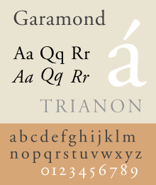
Early typefaces released included Utopia and Adobe Garamond, a reinterpretation of the Roman types of Claude Garamond and the italics of Robert Granjon. Slimbach developed the design to have a timeless, accurate appearance through visiting the Plantin-Moretus Museum in Antwerp and seeing books and original printing equipment from the 16th century.[4][5] A parallel Adobe Originals program was developed to provide Japanese-language fonts, including the works of such designers as Masahiko Kozuka and Ryoko Nishizuka.[6]
Groups of fonts
A particularly large group of Adobe designs was inspired by the decorative wood types of the nineteenth century. These were given names after types of wood and tree.[7][8]
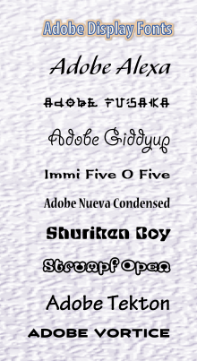
The series also includes a large number of eccentric display designs, some resembling the grunge typography movement of the 1990s, which used awkward letterforms and science-fiction style letterforms.[9][10]
Recent activity
Adobe has published fewer original designs since around 2000, publishing other companies' designs through its Typekit online sales program for Web publishing. However, the company still does publish original designs, including Thomas Phinney's Hypatia and Slimbach's recent Trajan Sans, Adobe Text, Arno and Acumin.[11] Several of these are very large designs with complex character sets, Acumin reportedly having been in development for eight years and expanded in conception from four fonts to ninety.[12][13][12][14]
Adobe has also released a large group of fonts, the Source family, as an open-source project that can be freely redistributed.
List of Adobe Originals families
| Year of first release | Family name | Type designer(s) | Comments |
|---|---|---|---|
| 1986 | Carta | Lynne Garell | This family was "grandfathered" by the program |
| 1986 | Sonata | Cleo Huggins | This family was "grandfathered" by the program |
| 1989 | Charlemagne | Carol Twombly | Classical all-caps design with spiky serifs. |
| 1989 | Cottonwood | Barbara Lind, Kim Buker Chansler and Joy Redick | 19th century wood display type design. |
| 1989 | Adobe Garamond | Robert Slimbach | |
| 1989 | Ironwood | Joy Redick | 19th century wood display type design. |
| 1989 | Juniper | Joy Redick | 19th century wood display type design. |
| 1989 | Lithos | Carol Twombly | |
| 1989 | Mesquite | Joy Redick | 19th century wood display type design. |
| 1989 | Ponderosa | Kim Buker Chansler | Ultracompact French Clarendon. 19th century wood display type design. |
| 1989 | Tekton | David Siegel | Based on the hand lettering style of architect Frank Ching.
1993 Multiple Master, 2000 OpenType; Bold version was created by Jim Wasco in 1990; Glyphset expanded by Christopher Slye |
| 1989 | Trajan | Carol Twombly | Pro 3 extension by Robert Slimbach in 2011 which added more weights and support for Greek and Cyrillic |
| 1989 | Utopia | Robert Slimbach | Transitional design influenced by Baskerville and Walbaum. Four optical sizes added for OpenType version. A basic group of Utopia's styles (regular, italic, bold and bold italic styles of the regular size) was open-sourced in 2006. |
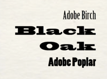
| 1990 | Birch | Kim Buker Chansler | 19th century wood display type design. Standard release included with Adobe's free Typekit plan. |
| 1990 | Blackoak | Joy Redick | 19th century wood display type design. Standard release included with Adobe's free Typekit plan. |
| 1990 | Adobe Caslon | Carol Twombly | Revival of Caslon. Three weights. Semibold weight included with Adobe's free Typekit plan. |
| 1990 | Madrone | Barbara Lind | 19th century wood display type design. Fat face Didone. |
| 1990 | Minion | Robert Slimbach | 1991 Multiple Master, 1992 Cyrillic, 2000 OpenType |
| 1990 | Poplar | Barbara Lind | 19th century wood display type design. Standard release included with Adobe's free Typekit plan. |
| 1990 | Willow | Joy Redick | 19th century wood display type design. |
| 1990, 1991 | Adobe Wood Type Ornaments | Barbara Lind and Joy Redick | 19th century wood display type design. Decorative elements and catchwords. |
| 1992 | Myriad | Carol Twombly and Robert Slimbach | Humanist sans. Glyphset expanded for OpenType by Fred Brady and Christopher Slye. |
| 1992 | Poetica | Robert Slimbach | Script font inspired by chancery cursive designs. One weight, many stylistic alternates. |
| 1993 | Caflisch Script | Robert Slimbach | Based on the calligraphic handwriting of Max Caflisch. |
| 1993 | Critter | Craig Frazier | Zoomorphic alphabet (A=ape, etc.). Caps only. |
| 1993 | Cutout | Gail Blumberg | Inspired by Matisse paper cuts. |
| 1993 | Giddyup | Laurie Szujewska | Standard release included with Adobe's free Typekit plan. |
| 1993 | Mezz | Michael Harvey | Wedge serif slanted design, somewhat similar to Albertus. |
| 1993 | Mythos | Min Wang and Jim Wasco | Based on illustrations of legendary monsters. Caps-only. |
| 1993 | Pepperwood | Kim Buker Chansler, Carl Crossgrove and Carol Twombly | Decorative 19th century display type design. Chromatic font. |
| 1993 | Quake | Fryda Berd (a.k.a. Fred Brady) | Distressed serif design, reminiscent of grunge typography. |
| 1993 | Rad | John Ritter | Anthropomorphic alphabet (letters formed by skateboarders). Caps only. |
| 1993 | Rosewood | Kim Buker Chansler, Carl Crossgrove and Carol Twombly | Decorative 19th century display type design. Chromatic font. |
| 1993 | Sanvito | Robert Slimbach | Nearly-upright italic script font. 4 optical sizes, weights from light to bold. Creative Suite 4 registration incentive[15] Some styles included with Adobe's free Typekit plan. |
| 1993 | Studz | Michael Harvey | Based on 8th century manuscript hand and riveting. |
| 1993 | Toolbox | Brian Strysko | Letters formed by images of hand tools. Caps only. |
| 1993 | Viva | Carol Twombly | Inline serif design somewhat resembling Colonna. Many weights from light to black, three widths from condensed to extended. |
| 1993 | Zebrawood | Kim Buker Chansler, Carl Crossgrove and Carol Twombly | Decorative 19th century display type design. Chromatic font. |
| 1994 | Nueva | Carol Twombly | Quirky serif design with fine, almost slab serifs, more for display than for text use. Considered as a lowercase companion to Charlemagne. Condensed style also created. |
| 1994 | Penumbra | Lance Hidy | All-cap design based on Lance Hidy's poster lettering. Four styles ranging from sans to serif. |
| 1995 | Alexa | John Benson | Included with Adobe's free Typekit plan. |
| 1995 | Balzano | John Benson | |
| 1995 | Caliban | John Benson | |
| 1995 | Galahad | Alan Blackman | Modulated-stroke sans-serif display face, inspired by Optima and the flat-pen writing of Friedrich Neugebauer. |
| 1995 | Adobe Jenson | Robert Slimbach | Venetian old-style serif design. Four optical sizes. |
| 1995 | Jimbo | Jim Parkinson | Chunky serif display face without italic. Parkinson described it as a ‘happy Bodoni’. |
| 1996 | Andreas | Michael Harvey | Outline capitals inspired by Art Nouveau lettering. |
| 1996 | Conga Brava | Michael Harvey | |
| 1996 | Cronos | Robert Slimbach | Humanist sans-serif design with stroke modulation, inspired by calligraphy. 4 optical sizes, weights from light to bold. |
| 1996 | Kepler | Robert Slimbach | Didone or Modern serif font. 4 optical sizes, weights from light to black, condensed/extended styles. Semicondensed Display Bold is included for free in Adobe's entry-level Typekit plan. |
| 1996 | Mojo | Jim Parkinson | Inspired by psychedelic lettering used for rock concert posters. |
| 1996 | Ouch! | Joachim Müller-Lancé | Letters inspired by hospital equipment. All caps. |
| 1996 | Shuriken Boy | Joachim Müller-Lancé | Science fiction-inspired techno-geometric sans, in which all interior spaces inside letters are triangular. Standard release included with Adobe's free Typekit plan. |
| 1997 | Banshee | Tim Donaldson | |
| 1997 | Bickham Script | Richard Lipton | Based on George Bickham's English Roundhand specimens in The Universal Penman. |
| 1997 | Chaparral | Carol Twombly | Old-style font with slab serif influences. 4 optical sizes, weights from light to bold. |
| 1997 | Ex Ponto | Jovica Veljović | Rough-edged font based on Veljović's calligraphy. |
| 1997 | Flood | Joachim Müller-Lancé | Italic capitals, originally written with a dried-out felt tip marker. |
| 1997 | Kinesis | Mark Jamra | Irregular slab serif with a near-upright italic. Resembles Joanna but more lively. |
| 1997 | Kozuka Mincho 小塚明朝 | Masahiko Kozuka 小塚昌彦 | |
| 1997 | Nyx | Rick Cusick | Stencil serif titling capitals with sharp wedge serifs and an irregular design. |
| 1997 | Waters Titling | Julian Waters | Titling capitals inspired by Greek monuments with fine, almost unbracketed serifs. Bold and a bold condensed style. No italics. |
| 1998 | Fusaka | Michael Want | Latin letters that mimic Japanese writing. Standard release included with Adobe's free Typekit plan. |
| 1998 | Immi 505 | Tim Donaldson | Standard release included with Adobe's free Typekit plan. |
| 1998 | Postino | Timothy Donaldson | Slab serif, loosely based on Courier but with a chunky, wacky design. |
| 1998 | Reliq | Carl Crossgrove | Letters that look like ancient inscriptions. Four styles ranging from Calm to Extra Active. |
| 1998 | Voluta Script | Viktor Solt | Script font based on 18th century writing. |
| 1999 | Blue Island | Jeremy Tankard | Letters connect in unusual ways for futuristic look. |
| 1999 | Strumpf | Mário Feliciano | Standard release included with Adobe's free Typekit plan. |
| 2000 | Calcite | Akira Kobayashi | |
| 2000 | Moonglow | Michael Harvey | Outline sans-serif with stroke modulation, reminiscent of Optima. Caps-only, wide range of widths and weights. |
| 2000 | Silentium | Jovica Veljović | Slanted type. Includes inline titling capitals. |
| 2000 | Warnock | Robert Slimbach | Named after John Warnock, co-founder of Adobe. Wedge-serif design. 4 optical sizes, weights from light to bold. |
| 2001 | Kozuka Gothic 小塚ゴシック | Masahiko Kozuka 小塚昌彦 | |
| 2001 | Montara | Jim Parkinson | Irregular design somewhat suggesting planks nailed together. |
| 2002 | Brioso | Robert Slimbach | Calligraphic old-style serif design. 4 optical sizes, weights from light to bold. |
| 2003 | Ryo Display りょう Display | Ryoko Nishizuka 西塚涼子 | |
| 2003 | Ryo Text りょう Text | Ryoko Nishizuka 西塚涼子 | |
| 2003 | Sava | Jovica Veljović | Calligraphic capitals and small capitals design, weights from light to black. |
| 2004 | Adobe Arabic | Tim Holloway | |
| 2004 | Adobe Hebrew | John Hudson | |
| 2004 | Adobe Thai | Fiona Ross, John Hudson and Tim Holloway | |
| 2004 | Ryo Gothic りょうゴシック | Ryoko Nishizuka 西塚涼子 | |
| 2005 | Garamond Premier | Robert Slimbach | An adaptation of Adobe Garamond in five optical sizes. Creative Suite 2 registration incentive. |
| 2006, 2009, 2010 | Kazuraki かづらき | Ryoko Nishizuka 西塚涼子 | The Std version was first developed in 2006 but it was never released. The SPN version was released in 2009. The SP2N version, which is the latest, was released in 2010. |
| 2007 | Arno | Robert Slimbach | Old-style serif. One of Adobe's most complex releases, in five optical sizes with support for polytonic Greek and Cyrillic. |
| 2007, 2010 | Hypatia Sans | Thomas Phinney | Humanist sans-serif. Creative Suite 3 registration incentive. Roman fonts 2007, kerned by Robert Slimbach & Miguel Sousa; italic fonts 2010 finalized by Paul Hunt. |
| 2010 | Adobe Devanagari | Fiona Ross and Tim Holloway | |
| 2010 | Adobe Text | Robert Slimbach | Creative Suite 5 registration incentive[16] |
| 2011 | Adobe Naskh | Muhammad Zuhair Ruhani Bazi, Robert Slimbach | Arabic design in the Naskh style. |
| 2011 | Myriad Arabic | Robert Slimbach | |
| 2011 | Myriad Hebrew | Robert Slimbach | |
| 2011 | Trajan Sans | Robert Slimbach | |
| 2012 | Leander Script | Viktor Solt-Bittner | |
| 2012 | Source Sans | Paul D. Hunt | Adobe’s first open source type family. |
| 2012 | Source Code | Paul D. Hunt | Monospaced companion to Source Sans, also open source. |
| 2013 | Adobe Gujarati | David Březina | |
| 2013 | Adobe Tamil | Fernando Mello | |
| 2014 | Source Serif | Frank Grießhammer | Adobe’s 100th typeface family, companion to Source Sans. Transitional serif inspired by Fournier, weights from extra-light to black. No italics currently. |
| 2014 | Source Han Sans, 思源黑体 (Simplified Chinese), 思源黑體 (Traditional Chinese), 源ノ角ゴシック (Japanese), 본고딕 (Korean) | Ryoko Nishizuka 西塚涼子 | Adobe’s first open source Pan-CJK type family |
| 2015 | Acumin | Robert Slimbach | Neo-grotesque sans-serif, similar to Helvetica and Univers |
| 2015 | Adobe Kannada | Erin McLaughlin | |
| 2015 | Bickham Script Pro 3 | Richard Lipton | Extension to Bickham Script. Includes Cyrillic, Greek, and a broader Latin character set (incl. Vietnamese). |
OpenType conversion
When Adobe converted PostScript Type 1 and multiple master fonts to OpenType Compact Font Format (CFF), they were based on the last Type 1/MM versions from the Adobe Type Library. In addition to file format change, there were numerous other changes:
- For fonts designed by Robert Slimbach for Adobe, some received major redesigns (notably Cronos), while most were re-spaced and re-kerned.
- Some formerly all-capitals fonts such as Lithos Pro and Trajan Pro, received previously non-existent small-caps glyphs in the slots for lowercase characters.
- All alphabetic fonts which did not already have it had the euro added.
- All alphabetic fonts added 16 extra characters, including 14 Mac "symbol substitution" characters, the litre and estimated symbols. Symbol substitution was a scheme used on Mac OS, wherein for certain characters input using a Type 1 font with standard encoding, both screen and print would pull a generic version of the glyph in the Times style from the Symbol font. In OpenType, Adobe put customized versions of the formerly generic symbol substitution glyphs in every font, with a different appearance and metric in each font. The new glyphs include partialdiff, Delta (math), integral, pi (math), product (capital math pi), root, infinity, lozenge (diamond), summation (cap math Sigma), approxequal, ohm (capital math Omega), lessequal, greaterequal.
- Unkerned accented characters received additional kerning to deal with accented characters.
- Font families that formerly included separate Type 1 "Expert" fonts or Cyrillic fonts had these glyphs included in the base fonts in their OpenType versions.
- Multiple master fonts were converted to individual OpenType fonts; each font consists of a former multiple master instance.
As a result of the changes, Adobe does not guarantees metric compatibility between Type 1 and OpenType fonts.[17]
References
- ↑ Coles, Stephen. "Top Ten Typefaces Used by Book Design Winners". FontFeed. Retrieved 2 July 2015.
- ↑ Coles, Stephen. "Adobe ad in U&lc, 1987". Fonts In Use. Retrieved 9 July 2015.
- ↑ Riggs, Tamye. "A typographic revolution begins". Typekit blog. Adobe. Retrieved 9 July 2015.
- ↑ Riggs, Tamye. "Stone, Slimbach, and Twombly launch the first Originals". Typekit blog. Adobe. Retrieved 4 July 2015.
- ↑ Slye, Christopher. "Coming to your desktop: fonts from Adobe". Typekit Blog. Adobe.
- ↑ Riggs, Tamye. "Typographic Tales from Japan". Typekit blog. Adobe. Retrieved 4 July 2015.
- ↑ Heller, Stephen. "Digital Wood at 25". Print. Retrieved 8 January 2016.
- ↑ King, Emily. "West Coast (PhD thesis chapter)". Typotheque. Retrieved 8 January 2016.
- ↑ Shetty, Sharan. "The Rise And Fall Of Grunge Typography". The Awl. Retrieved 18 September 2015.
- ↑ Palladio, Valentina. "Angst, imagination, and the Ray Gun Effect: a history of grunge typography". The Verge. Vox Media. Retrieved 18 September 2015.
- ↑ Twardoch, Slimbach, Sousa, Slye (2007). Arno Pro (PDF). San Jose: Adobe Systems. Retrieved 14 August 2015.
- 1 2 Slimbach, Robert. "Using Acumin". Acumin microsite. Adobe Systems. Retrieved 6 January 2016.
- ↑ Coles, Stephen. "New Additions: November 2015". Identifont. Retrieved 8 January 2016.
- ↑ Berry, John. "Acumin - design". Adobe Typekit. Retrieved 8 January 2016.
- ↑ "The Typekit Blog - Creative Suite 4 (CS4) fonts". The Typekit Blog.
- ↑ "The Typekit Blog - Useful Details About Creative Suite 5 (CS5) Fonts". The Typekit Blog.
- ↑ "Type 1 to OpenType font conversion FAQ". adobe.com.