Font
In metal typesetting, a font is a particular size, weight and style of a typeface. Each font was a matched set of type, one piece (called a "sort") for each glyph, and a typeface consisting of a range of fonts that shared an overall design.
In modern usage, with the advent of digital typography, "font" is frequently synonymous with "typeface", although the two terms do not necessarily mean the same thing. In particular, the use of "vector" or "outline" fonts means that different sizes of a typeface can be dynamically generated from one design. Each style may still be in a separate "font file"—for instance, the typeface "Bulmer" may include the fonts "Bulmer roman", "Bulmer italic", "Bulmer bold" and "Bulmer extended"—but the term "font" might be applied either to one of these alone or to the whole typeface.
Etymology
| Look up font in Wiktionary, the free dictionary. |
The word font (traditionally spelled fount in British English, but in any case pronounced /fɒnt/) derives from Middle French fonte "[something that has been] melted; a casting".[1] The term refers to the process of casting metal type at a type foundry.
Metal type
In a manual printing (letterpress) house the word "font" would refer to a complete set of metal type that would be used to typeset an entire page. Unlike a digital typeface it would not include a single definition of each character, but commonly used characters (such as vowels and periods) would have more physical type-pieces included. A font when bought new would often be sold as (for example in a Roman alphabet) 12pt 14A 34a, meaning that it would be a size 12-point font containing 14 uppercase "A"s, and 34 lowercase "A"s.
Given the name upper and lowercase because of which case the metal type was located in, otherwise known as majuscule and minuscule. The rest of the characters would be provided in quantities appropriate for the distribution of letters in that language. Some metal type characters required in typesetting, such as dashes, spaces and line-height spacers, were not part of a specific font, but were generic pieces which could be used with any font.[2] Line spacing is still often called "leading", because the strips used for line spacing were made of lead (rather than the harder alloy used for other pieces). The reason for this spacing strip being made from "lead" was because lead was a softer metal than the traditional forged metal type pieces (which was part lead, antimony and tin) and would compress more easily when "locked-up" in the printing "chase" (i.e. a carrier for holding all the type together).
In the 1880s–90s, "hot lead" typesetting was invented, in which type was cast as it was set, either piece by piece (as in the Monotype technology) or in entire lines of type at one time (as in the Linotype technology).
Font characteristics
In addition to the character height, when using the mechanical sense of the term, there are several characteristics which may distinguish fonts, though they would also depend on the script(s) that the typeface supports. In European alphabetic scripts, i.e. Latin, Cyrillic and Greek, the main such properties are the stroke width, called weight, the style or angle and the character width.
The regular or standard font is sometimes labeled roman, both to distinguish it from bold or thin and from italic or oblique. The keyword for the default, regular case is often omitted for variants and never repeated, otherwise it would be Bulmer regular italic, Bulmer bold regular and even Bulmer regular regular. Roman can also refer to the language coverage of a font, acting as a shorthand for "Western European".
Different fonts of the same typeface may be used in the same work for various degrees of readability and emphasis, or in a specific design to make it be of more visual interest.
Weight
The weight of a particular font is the thickness of the character outlines relative to their height.

A typeface may come in fonts of many weights, from ultra-light to extra-bold or black; four to six weights are not unusual, and a few typefaces have as many as a dozen. Many typefaces for office, web and non-professional use come with just a normal and a bold weight which are linked together. If no bold weight is provided, many renderers (browsers, word processors, graphic and DTP programs) support faking a bolder font by rendering the outline a second time at an offset, or just smearing it slightly at a diagonal angle.
The base weight differs among typefaces; that means one normal font may appear bolder than some other normal font. For example, fonts intended to be used in posters are often quite bold by default while fonts for long runs of text are rather light. Therefore, weight designations in font names may differ in regard to the actual absolute stroke weight or density of glyphs in the font.
Attempts to systematize a range of weights led to a numerical classification first used by Adrian Frutiger with the Univers typeface: 35 Extra Light, 45 Light, 55 Medium or Regular, 65 Bold, 75 Extra Bold, 85 Extra Bold, 95 Ultra Bold or Black. Deviants of these were the "6 series" (italics), e.g. 46 Light Italics etc., the "7 series" (condensed versions), e.g. 57 Medium Condensed etc., and the "8 series" (condensed italics), e.g. 68 Bold Condensed Italics. From this brief numerical system it is easier to determine exactly what a font's characteristics are, for instance "Helvetica 67" (HE67) translates to "Helvetica Bold Condensed".
The TrueType font format introduced a scale from 100 through 900, which is also used in CSS and OpenType, where 400 is regular (roman or plain). The first algorithmic description of fonts was perhaps made by Donald Knuth in his Metafont and TeX system of programs.

There are many names used to describe the weight of a font in its name, differing among type foundries and designers, but their relative order is usually fixed, something like this:
- Hairline
- Thin
- Ultra-light
- Extra-light
- Light
- Book
- Normal / regular / plain
- Medium
- Demi-bold / semi-bold
- Bold
- Extra-bold / extra
- Heavy
- Black
- Extra-black
- Ultra-black / ultra
The terms normal, regular and plain, sometimes also book, are being used for the standard weight font of a typeface. Where both appear and differ, book is often lighter than regular, but in some typefaces it is bolder.
Before the arrival of computers, each weight had to be drawn manually. As a result, many older multi-weight families such as Gill Sans and Monotype Grotesque have considerable differences in styles from light to extra-bold. Since the 1980s, it has become increasingly common to use automation to construct a range of weights as points along a trend, multiple master or other parameterized font design. This means that many modern digital fonts such as Myriad and TheSans are offered in a large range of weights which offer a smooth and continuous transition from one weight to the next, although some digital fonts are created with extensive manual corrections.[3]
As digital font design allows more variants to be created faster, an increasingly common development in professional font design is the use of “grades”: slightly different weights intended for different types of paper and ink, or printing in a different region with different ambient temperature and humidity.[4][5] For example, a thin design printed on book paper and a thicker design printed on high-gloss magazine paper may come out looking identical, since in the former case the ink will soak and spread out more. Grades are typically offered with characters having the same width on all grades, so that a change of printing materials does not affect copyfit.[6] Grades are especially common on serif fonts with their finer details.
Slope
In European typefaces, especially Roman ones, a slope or slanted style is used to emphasise important words. This is called italic type or oblique type. These designs normally slant to the right in left-to-right scripts. Oblique styles are often called italic, but differ from 'true italic' styles.
Italic styles are more flowing than the normal typeface, approaching a more handwritten, cursive style, possibly using ligatures more commonly or gaining swashes. Although rarely encountered, a typographic face may be accompanied by a matching calligraphic face (cursive, script), giving an exaggeratedly italic style.
In many sans-serif and some serif typefaces, especially in those with strokes of even thickness the characters of the italic fonts are only slanted, which is often done algorithmically, without otherwise changing their appearance. Such oblique fonts are not true italics, because lower-case letter-shapes do not change, but are often marketed as such. Fonts normally do not include both oblique and italic styles: the designer chooses to supply one or the other.
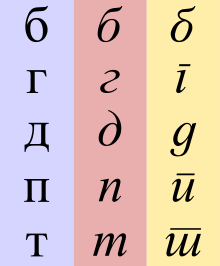
Since italic styles clearly look different to regular (roman) styles, it is possible to have "upright italic" designs that take a more cursive form but remain upright; Computer Modern is an example of a font that offers this style. In Latin-script countries, upright italics are rare but are sometimes used in mathematics or in complex documents where a section of text already in italics needs a "double italic" style to add emphasis to it. For example, the Cyrillic minuscule "т" may look like a smaller form of its majuscule "Т" or more like a roman small "m" as in its standard italic appearance; in this case the distinction between styles is also a matter of local preference.
In Frutiger’s nomenclature the second digit for upright fonts is a 5, for italic fonts a 6 and for condensed italic fonts an 8.
The two Japanese syllabaries, katakana and hiragana, are sometimes seen as two styles or typographic variants of each other, but usually are considered separate character sets as a few of the characters have separate kanji origins. The gothic style of the roman script with broken letter forms, on the other hand, is usually considered a mere typographic variant.
Cursive-only scripts such as Arabic also have different styles, in this case for example Naskh and Kufic, although these often depend on application, area or era.
There are other aspects that can differ among font styles, but more often these are considered immanent features of the typeface. These include the look of digits (text figures) and the minuscules, which may be smaller versions of the capital letters (small caps) although the script has developed characteristic shapes for them. Some typefaces do not include separate glyphs for the cases at all, thereby abolishing the bicamerality. While most of these use uppercase characters only, some labeled unicase exist which choose either the majuscule or the minuscule glyph at a common height for both characters.

Width
Some typefaces include fonts that vary the width of the characters (stretch), although this feature is usually rarer than weight or stroke.
Narrower fonts are usually labeled compressed, condensed or narrow. In Frutiger's system, the second digit of condensed fonts is a 7. Wider fonts may be called wide, extended or expanded. Both can be further classified by prepending extra, ultra or the like.
These separate fonts have to be distinguished from techniques that alter the letter-spacing to achieve narrower or smaller words, especially for justified text alignment.
Most typefaces either have proportional or monospaced (i.e. typewriter-style) letter widths, if the script provides the possibility. There are, however, superfamilies covering both styles.
Some fonts provide both proportional and fixed-width (tabular) digits, where the former usually coincide with lowercase text figures and the latter with uppercase lining figures.
The width of a font will depend on its intended use. Times New Roman was designed with the goal of having small width, to fit more text into a newspaper. On the other hand, Palatino has large width to increase readability.
Optical size
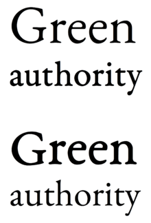
Some professional digital typefaces include fonts that are optimised for certain sizes, for instance by using a thinner stroke weight if they are intended to be printed larger, or by using ink traps if they are to be printed at small size on poor-quality paper.[7] This was a natural feature in the metal type period for most typefaces, since each size would be cut separately and made to its own slightly different design.[8][9] However, it declined in use as the pantograph, phototypesetting and digital fonts made printing the same font at any size simpler; a revival has taken place in recent years as the range of competition in the font market has increased.[10][11][12][13] Optical sizes are particularly common for serif fonts, since their finer detail will particularly need to be bulked up for smaller sizes and made less overpowering at larger ones.[8]
There are several naming schemes for such variant designs.[14] One such scheme, invented and popularized by Adobe Systems, refers to the variant fonts by the applications they are typically used for, with the exact point sizes intended varying slightly by typeface:
- Poster
- extremely large sizes, usually larger than 72 point
- Display
- large sizes, typically 19–72 point
- Subhead
- large text, typically about 14–18 point
- (Regular)
- usually left unnamed, typically about 10–13 point
- Small Text (SmText)
- typically about 8–10 point
- Caption
- very small, typically about 6–8 point
Metrics
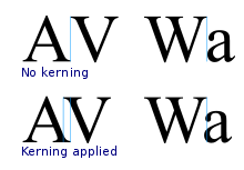
Font metrics refers to metadata consisting of numeric values relating to size and space in the font overall, or in its individual glyphs. Font-wide metrics include cap height (the height of the capitals), x-height (the height of the lower-case letters) and ascender height, descender depth, and the font bounding box. Glyph-level metrics include the glyph bounding box, the advance width (the proper distance between the glyph's initial pen position and the next glyph's initial pen position), and sidebearings (space that pads the glyph outline on either side). Many digital (and some metal type) fonts are able to be kerned so that characters can be fitted more closely; the pair 'Wa' is a common example of this.
Some fonts, especially those intended for professional use, are duplexed: made with multiple weights having the same character width so that (for example) changing from regular to bold or italic does not affect word wrap.[15] Sabon as originally designed was a notable example of this.
Early fonts used in digital printing were often very expensive, and featured extremely tight licensing restrictions; in particular, a basic set of fonts used by Apple and Adobe in the PostScript printing system rapidly became a standard in printing. To avoid paying licensing fees for this set or other fonts, many computer companies commissioned "metrically-compatible" clone fonts with the same spacing, which could be used to display the same document without it seeming clearly different. Arial and Century Gothic are notable examples of this, being almost indistinguishable from the PostScript standard fonts Helvetica and ITC Avant Garde respectively.[16][17][18][19][20] Some of these were created in order to be freely redistributable, for example Google's open-source Croscore fonts and Red Hat's Liberation fonts duplicating common fonts used in Microsoft software.[21] It is not a requirement that the design be exactly the same.[22]

Serifs
Although most typefaces are characterised by their use of serifs, there are superfamilies that incorporate serif (antiqua) and sans-serif (grotesque) or even intermediate slab serif (Egyptian) or semi-serif fonts with the same base outlines.
A more common font variant, especially of serif typefaces, is that of alternate capitals. They can have swashes to go with italic minuscules or they can be of a flourish design for use as initials (drop caps).
Character variants
Typefaces may be made in variants for different uses. These may be issued as separate font files, or the different characters may be included in the same font file if the font is a modern format such as OpenType and the application used can support this.[23][24]
Alternative characters are often called stylistic alternates. These may be switched on to allow users more flexibility to customise the font to suit their needs. The practice is not new: in the 1930s, Gill Sans, a British design, was sold abroad with alternative characters to make it resemble fonts such as Futura popular in other countries, while Bembo from the same period has two styles of 'R': one with a stretched-out leg for widely spaced all caps text, one that blends better into body text.[25] With modern digital fonts, it is possible to group related alternative characters into stylistic sets, which may be turned on and off together. For example, in Williams Caslon Text, a revival of the 18th century font Caslon, the default italic forms have many swashes matching the original design. For a more spare appearance, these can all be turned off at once by engaging stylistic set 4.[26] Junicode, intended for academic publishing, uses ss15 to enable a variant form of 'e' used in medieval Latin. A corporation commissioning a modified version of a commercial font for their own use, meanwhile, might request that their preferred alternates be set to default.
It is common for fonts intended for use in books and school textbooks for young children to have simplified, single-story forms of the lowercase letters a, y, and g; these may be called infant or schoolbook alternates. They are traditionally believed to be easier for children to read and less confusing as they resemble the forms used in handwriting.[27] Often popular fonts such as Akzidenz-Grotesk, Gill Sans and Bembo are released in schoolbook varieties; a well-known font intended specifically for school use is Sassoon Sans.[28][29]
Numerals

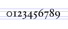
Fonts can have different kinds of numerals, including, as described above, proportional (variable width) and tabular (fixed width) as well as lining (upper-case height) and text (lower-case height) figures. They may also include separate styles for superscript and subscript digits. Professional fonts may include even more complex settings for typesetting numerals, such as numerals intended to match the height of small caps.[30][31] In addition, some fonts such as Adobe’s Acumin and Christian Schwartz’s Neue Haas Grotesk digitisation offer two heights of lining (upper-case height) figures: one slightly lower than cap height, intended to blend better into continuous text, and one at exactly the cap height to look better in combination with capitals for uses such as UK postcodes.[32][33][34][35] With the OpenType format, it is possible to bundle all these into a single digital font file, but earlier font releases may have only one type per file.
Subsetting
A typical font may contain hundreds or even thousands of glyphs, often representing characters from many different languages. Oftentimes, users may only need a small subset of the glyphs that are available to them. Subsetting is the process of removing unnecessary glyphs from a font file, usually with the goal of reducing file size. This is particularly important for web fonts, since reducing file size often means reducing page load time and server load. Alternatively, fonts may be issued in different files for different regions of the world, though with the spread of the OpenType format this is now increasingly uncommon.
See also
Notes
- ↑ Douglas Harper (2001). "font". Online Etymology Dictionary. Retrieved 2013-07-19.
- ↑ "Basic Letterpress Tools". Retrieved 2008-12-07.
- ↑ Phinney, Thomas. "Comments on Quora thread". Quora. Retrieved 11 August 2015.
- ↑ Butterick, Matthew. "Equity: specimen & manual" (PDF). MBType. Retrieved 7 August 2015.
- ↑ "Benton Modern". Font Bureau. Retrieved 7 August 2015.
- ↑ Porchez, Jean François. "Equity review". Typographica. Retrieved 13 July 2015.
- ↑ Reynolds, Dan. "How To Choose The Right Face For A Beautiful Body". Smashing. Retrieved 13 September 2015.
- 1 2 Frere-Jones, Tobias. "MicroPlus". Frere-Jones Type. Retrieved 1 December 2015.
- ↑ "Requiem features". Hoefler & Frere-Jones. Retrieved 2 July 2015.
- ↑ Ahrens and Mugikura. "Size-specific Adjustments to Type Designs". Just Another Foundry. Retrieved 21 November 2014.
- ↑ Coles, Stephen. "Book Review: Size-specific Adjustments to Type Designs". Typographica. Retrieved 21 November 2014.
- ↑ Kupferschmid, Indra. "Multi-axes type families". kupferschrift. Retrieved 8 December 2014.
- ↑ "Trianon". Production Type. Retrieved 2 July 2015.
- ↑ Slimbach, Souser, Slye, Twardoch. "Arno Pro specimen" (PDF). Adobe. Retrieved 3 July 2015.
- ↑ Butterick, Matthew. "Concourse specimen pdf". MBType. Retrieved 7 August 2015.
- ↑ Shaw, Paul. "Arial Addendum no. 3". Blue Pencil. Retrieved 1 July 2015.
- ↑ Shaw (& Nicholas). "Arial addendum no. 4". Blue Pencil. Retrieved 1 July 2015.
- ↑ McDonald, Rob. "Some history about Arial". Paul Shaw Letter Design. Retrieved 22 May 2015.
- ↑ Haley, Allan (May–June 2007). "Is Arial Dead Yet?". Step Inside Design. Archived from the original on July 19, 2011. Retrieved 2011-05-11.
- ↑ "Type Designer Showcase: Robin Nicholas – Arial". Monotype Imaging. Retrieved 2011-05-10.
- ↑ Liberation Fonts, Fedora
- ↑ Schwartz, Christian. "DB". Schwartzco. Retrieved 16 July 2015.
- ↑ "What's OpenType?". Hoefler & Frere-Jones. Retrieved 7 August 2015.
- ↑ Peters, Yves. "Why a better OpenType UI matters". i love typography. Retrieved 14 August 2015.
- ↑ "Specimen Book of Monotype Printing Types (photograph)". Flickr. Retrieved 3 May 2015.
- ↑ Berkson, William. "Williams Caslon Text features manual" (PDF). Font Bureau. Retrieved 7 August 2015.
- ↑ Walker, Sue; Reynolds, Linda (1 January 2003). "Serifs, sans serifs and infant characters in children's reading books". Information Design Journal. 11 (3): 106–122. doi:10.1075/idj.11.2.04wal.
- ↑ "Akzidenz Grotesk Schoolbook". Berthold. Retrieved 1 May 2016.
- ↑ "Bembo Infant". MyFonts. Retrieved 1 May 2016.
- ↑ Shinn, Nick. "Shinntype Modern Suite specification" (PDF). Shinntype. Retrieved 16 October 2015.
- ↑ "Paciencias specification". Typographias. Retrieved 16 October 2015.
- ↑ "Neue Haas Grotesk". The Font Bureau, Inc. p. Introduction.
- ↑ "Neue Haas Grotesk - Font News". Linotype.com. Retrieved 2013-09-21.
- ↑ "Schwartzco Inc". Christianschwartz.com. Retrieved 2013-09-21.
- ↑ Slimbach, Robert. "Acumin - usage". Typekit. Adobe Systems. Retrieved 16 October 2015.
References
- Blackwell, Lewis. 20th Century Type. Yale University Press: 2004. ISBN 0-300-10073-6.
- Fiedl, Frederich, Nicholas Ott and Bernard Stein. Typography: An Encyclopedic Survey of Type Design and Techniques Through History. Black Dog & Leventhal: 1998. ISBN 1-57912-023-7.
- Lupton, Ellen. Thinking with Type: A Critical Guide for Designers, Writers, Editors, & Students, Princeton Architectural Press: 2004. ISBN 1-56898-448-0.
- Headley, Gwyn. The Encyclopaedia of Fonts. Cassell Illustrated: 2005. ISBN 1-84403-206-X.
- Macmillan, Neil. An A–Z of Type Designers. Yale University Press: 2006. ISBN 0-300-11151-7.
Typography terminology | |||||||||||||||
|---|---|---|---|---|---|---|---|---|---|---|---|---|---|---|---|
| Page | |||||||||||||||
| Paragraph | |||||||||||||||
| Character |
| ||||||||||||||
| Classifications |
| ||||||||||||||
| Punctuation | |||||||||||||||
| Typesetting | |||||||||||||||
| Typographic units | |||||||||||||||
| Digital typography |
| ||||||||||||||
| Related | |||||||||||||||
| |||||||||||||||