Chart
A chart, also called a graph, is a graphical representation of data, in which "the data is represented by symbols, such as bars in a bar chart, lines in a line chart, or slices in a pie chart".[1] A chart can represent tabular numeric data, functions or some kinds of qualitative structure and provides different info.
The term "chart" as a graphical representation of data has multiple meanings:
- A data chart is a type of diagram or graph, that organizes and represents a set of numerical or qualitative data.
- Maps that are adorned with extra information (map surround) for a specific purpose are often known as charts, such as a nautical chart or aeronautical chart, typically spread over several map sheets.
- Other domain specific constructs are sometimes called charts, such as the chord chart in music notation or a record chart for album popularity.
Charts are often used to ease understanding of large quantities of data and the relationships between parts of the data. Charts can usually be read more quickly than the raw data. They are used in a wide variety of fields, and can be created by hand (often on graph paper) or by computer using a charting application. Certain types of charts are more useful for presenting a given data set than others. For example, data that presents percentages in different groups (such as "satisfied, not satisfied, unsure") are often displayed in a pie chart, but may be more easily understood when presented in a horizontal bar chart.[2] On the other hand, data that represents numbers that change over a period of time (such as "annual revenue from 1990 to 2000") might be best shown as a line chart.
Features of a chart
A chart can take a large variety of forms, however there are common features that provide the chart with its ability to extract meaning from data.
Typically the data in a chart is represented graphically, since humans are generally able to infer meaning from pictures quicker than from text. Text is generally used only to annotate the data.
One of the most important uses of text in a graph is the title. A graph's title usually appears above the main graphic and provides a succinct description of what the data in the graph refers to.
Dimensions in the data are often displayed on axes. If a horizontal and a vertical axis are used, they are usually referred to as the x-axis and y-axis respectively. Each axis will have a scale, denoted by periodic graduations and usually accompanied by numerical or categorical indications. Each axis will typically also have a label displayed outside or beside it, briefly describing the dimension represented. If the scale is numerical, the label will often be suffixed with the unit of that scale in parentheses. For example, "Distance traveled (m)" is a typical x-axis label and would mean that the distance traveled, in units of meters, is related to the horizontal position of the data within the chart.
Within the graph a grid of lines may appear to aid in the visual alignment of data. The grid can be enhanced by visually emphasizing the lines at regular or significant graduations. The emphasized lines are then called major grid lines and the remainder are minor grid lines.
The data of a chart can appear in all manner of formats, and may include individual textual labels describing the datum associated with the indicated position in the chart. The data may appear as dots or shapes, connected or unconnected, and in any combination of colors and patterns. Inferences or points of interest can be overlaid directly on the graph to further aid information extraction.
When the data appearing in a chart contains multiple variables, the chart may include a legend (also known as a key). A legend contains a list of the variables appearing in the chart and an example of their appearance. This information allows the data from each variable to be identified in the chart.
Types of charts
Common charts
Four of the most common charts are:

This gallery shows:
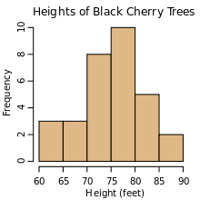
- A histogram consists of tabular frequencies, shown as adjacent rectangles, erected over discrete intervals (bins), with an area equal to the frequency of the observations in the interval; first introduced by Karl Pearson.[3]
- A bar chart is a chart with rectangular bars with lengths proportional to the values that they represent. The bars can be plotted vertically or horizontally. The first known bar charts are usually attributed to Nicole Oresme, Joseph Priestley, and William Playfair.[4]
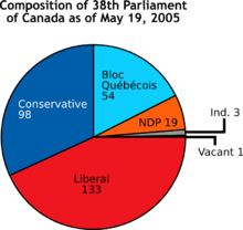
- A pie chart shows percentage values as a slice of a pie; first introduced by William Playfair.[5]
- A line chart is a two-dimensional scatterplot of ordered observations where the observations are connected following their order. The first known line charts are usually credited to Francis Hauksbee, Nicolaus Samuel Cruquius, Johann Heinrich Lambert and William Playfair.[6]
Other common charts are:
 Timeline chart
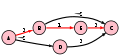
 Tree chart
.png)


Less-common charts
Examples of less common charts are:
.svg.png)

This gallery shows:
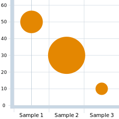
- A bubble chart is a two-dimensional scatterplot where a third variable is represented by the size of the points.
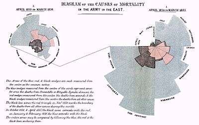
- A polar area diagram, sometimes called a Coxcomb chart, is an enhanced form of pie chart developed by Florence Nightingale.
- A radar chart or "spider chart" or "doi" is a two-dimensional chart of three or more quantitative variables represented on axes starting from the same point.
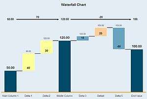
- A waterfall chart also known as a "Walk" chart, is a special type of floating-column chart.
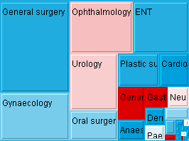
- A tree map where the areas of the rectangles correspond to values. Other dimensions can be represented with colour or hue.
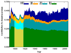
- A streamgraph, a stacked, curvilinear area graph displaced around a central axis
- A GapChart, a time series chart showing evolving gaps and equalities between series. Other dimensions can be represented with colour or hue.
Field-specific charts
Some types of charts have specific uses in a certain field
This gallery shows:
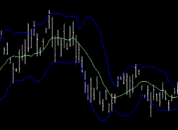
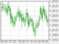
- Stock market prices are often depicted with an open-high-low-close chart with a traditional bar chart of volume at the bottom.
- Candlestick charts are another type of bar chart used to describe price movements of an equity over time.
- A Kagi chart is a time-independent stock tracking chart that attempts to minimise noise.
- Alternatively, where less detail is required, and chart size is paramount, a Sparkline may be used.
Other examples:
- Interest rates, temperatures, etc., at the close of the period are plotted with a line chart.
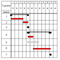
- Project planners use a Gantt chart to show the timing of tasks as they occur over time.
Well-known named charts
Some of the better-known named charts are:

 PERT chart
Some specific charts have become well known by effectively explaining a phenomenon or idea.
- An Allele chart is a chart originating from the study of genetics to show the interaction of two data points in a grid.
- A Gantt chart helps in scheduling complex projects.
- The Nolan chart and the Pournelle chart classify political philosophies according to two axes of variation.
- A PERT chart is often used in project management.
- The Smith chart serves in radio electronics.
Other charts
There are dozens of other types of charts. Here are some of them:


 Strip chart

More example: Bernal chart ...
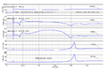
Common plots


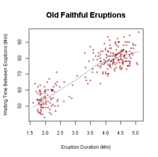
Chart software
While charts can be drawn by hand, computer software is often used to automatically produce a chart based on entered data. For examples of commonly used software tools, see List of charting software.
See also
| Wikimedia Commons has media related to Chart. |
- Comparison of Adobe Flex charts
- Diagram
- Drakon-chart
- Exploratory data analysis
- Graphic organizer
- Information graphics
- Mathematical diagram
- Official statistics
- Plot (graphics)
- Edward Tufte
References
- ↑ Cary Jensen, Loy Anderson (1992). Harvard graphics 3: the complete reference. Osborne McGraw-Hill ISBN 0-07-881749-8 p.413
- ↑ Howard Wainer (1997) 'Visual revelations: graphical tales of fate and deception from Napoleon Bonaparte to Ross Perot,Lawrence Erlbaum Associates, Inc. ISBN 0-8058-3878-3 p.87-90
- ↑ Pearson, K. (1895). "Contributions to the Mathematical Theory of Evolution. II. Skew Variation in Homogeneous Material". Philosophical Transactions of the Royal Society A: Mathematical, Physical and Engineering Sciences. 186: 343–414. Bibcode:1895RSPTA.186..343P. doi:10.1098/rsta.1895.0010.
- ↑ "First Ever Bar Charts Created in 14th Century". AnyChart. Retrieved 9 February 2016.
- ↑ "History of Pie Charts". JPowered. Retrieved 9 February 2016.
- ↑ Michael Friendly (2008). "Milestones in the history of thematic cartography, statistical graphics, and data visualization" (PDF). p. 13–14.
Further reading
- Brinton, Willard Cope. Graphic methods for presenting facts. The Engineering magazine company, 1914.
- Karsten, Karl G. Charts and graphs: An introduction to graphic methods in the control and analysis of statistics. Prentice-Hall, 1923, 1925.