Radar chart
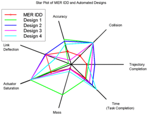
A radar chart is a graphical method of displaying multivariate data in the form of a two-dimensional chart of three or more quantitative variables represented on axes starting from the same point. The relative position and angle of the axes is typically uninformative.
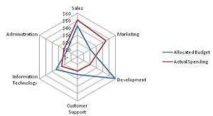
The radar chart is also known as web chart, spider chart, star chart,[1] star plot, cobweb chart, irregular polygon, polar chart, or Kiviat diagram.[2][3] It is equivalent to a parallel coordinates plot in polar coordinates.
Overview
The radar chart is a chart and/or plot that consists of a sequence of equi-angular spokes, called radii, with each spoke representing one of the variables. The data length of a spoke is proportional to the magnitude of the variable for the data point relative to the maximum magnitude of the variable across all data points. A line is drawn connecting the data values for each spoke. This gives the plot a star-like appearance and the origin of one of the popular names for this plot. The star plot can be used to answer the following questions:[4]
- Which observations are most similar, i.e., are there clusters of observations? (Radar charts are used to examine the relative values for a single data point (e.g., point 3 is large for variables 2 and 4, small for variables 1, 3, 5, and 6) and to locate similar points or dissimilar points.)[4]
- Are there outliers?
Radar charts are a useful way to display multivariate observations with an arbitrary number of variables.[5] Each star represents a single observation. Typically, radar charts are generated in a multi-plot format with many stars on each page and each star representing one observation.[4] The star plot was first used by Georg von Mayr in 1877.[6][7] Radar charts differ from glyph plots in that all variables are used to construct the plotted star figure. There is no separation into foreground and background variables. Instead, the star-shaped figures are usually arranged in a rectangular array on the page. It is somewhat easier to see patterns in the data if the observations are arranged in some non-arbitrary order (if the variables are assigned to the rays of the star in some meaningful order).[8]
Applications
One application of radar charts is the control of quality improvement to display the performance metrics of any ongoing program.[9]
They are also used in sports to chart players' strengths and weaknesses, where they are usually called spider charts.[10]
Limitations
Radar charts are primarily suited for strikingly showing outliers and commonality, or when one chart is greater in every variable than another, and primarily used for ordinal measurements – where each variable corresponds to "better" in some respect, and all variables on the same scale.
Conversely, radar charts have been criticized as poorly suited for making trade-off decisions – when one chart is greater than another on some variables, but less on others.[11]
Further, it is hard to visually compare lengths of different spokes, because radial distances are hard to judge, though concentric circles help as grid lines. Instead, one may use a simple line graph, particularly for time series.[12]
Artificial structure
Radar charts impose several structures on data, which are often artificial:
- Relatedness of neighbors – radar charts are often used when neighboring variables are unrelated, creating spurious connections.
- Cyclic structure – the first and last variables are placed next to each other.
- Length – variables are often most naturally ordinal: better or worse, though the degree of difference may be artificial.
- Area – area scales as the square of values, exaggerating the effect of large numbers. For example, 2, 2 takes up 4 times the area of 1, 1. This is a general issue with area graphs, and area is hard to judge – see "Cleveland's hierarchy".[13]
For example, the alternating data 9, 1, 9, 1, 9, 1 yields a spiking radar chart (which goes in and out), while reordering the data as 9, 9, 9, 1, 1, 1 instead yields two distinct wedges (sectors).
In some cases there is a natural structure, and radar charts can be well-suited. For example, for diagrams of data that vary over a 24-hour cycle, the hourly data is naturally related to its neighbor, and has a cyclic structure, so it can naturally be displayed as a radar chart.[12][14][15]
One set of guidelines on the use of radar charts (or rather the closely related "polar area graph") is:[15]
- you don't mind reading stacked areas instead of position along a common scale (see Cleveland's Hierarchy),
- the data set is truly cyclic, not linear, and
- there are two series to compare, one much smaller than the other
Data set size
Radar charts are helpful for small-to-moderate-sized multivariate data sets. Their primary weakness is that their effectiveness is limited to data sets with less than a few hundred points. After that, they tend to be overwhelming.[4]
Example


The chart on the right[4] contains the star plots of 15 cars. The variable list for the sample star plot is:
- Price
- Mileage (MPG)
- 1978 Repair Record (1 = Worst, 5 = Best)
- 1977 Repair Record (1 = Worst, 5 = Best)
- Headroom
- Rear Seat Room
- Trunk Space
- Weight
- Length
We can look at these plots individually or we can use them to identify clusters of cars with similar features. For example, we can look at the star plot of the Cadillac Seville (the last one on the image) and see that it is one of the most expensive cars, gets below average (but not among the worst) gas mileage, has an average repair record, and has average-to-above-average roominess and size. We can then compare the Cadillac models (the last three plots) with the AMC models (the first three plots). This comparison shows distinct patterns. The AMC models tend to be inexpensive, have below average gas mileage, and are small in both height and weight and in roominess. The Cadillac models are expensive, have poor gas mileage, and are large in both size and roominess.[4]
Alternatives
Most simply, one may use a simple line graph, particularly for time series.[12]
For graphical qualitative comparison of 2-dimensional tabular data in several variables, a common alternative are Harvey Balls, which are used extensively by Consumer Reports.[16] Comparison in Harvey Balls (and radar charts) may be significantly aided by ordering the variables algorithmically to add order.[17]
An excellent way for visualising structures within multivariate data is offered by principal component analysis (PCA).
Another alternative is to use small, inline bar charts, which may be compared to sparklines.[17]
Although radar and polar charts are often described as the same chart types,[3] some sources make a difference between them and even consider the radar chart to be a polar chart's variation that does not display data in terms of polar coordinate.[18]
See also
References
![]() This article incorporates public domain material from the National Institute of Standards and Technology website http://www.nist.gov.
This article incorporates public domain material from the National Institute of Standards and Technology website http://www.nist.gov.
- ↑ Nancy R. Tague (2005) The quality toolbox. page 437.
- ↑ Star Plots - Statistical Graphics for Multivariate Data
- 1 2 "Find Content Gaps Using Radar Charts". Content Strategy Workshops. March 3, 2015. Retrieved December 17, 2015.
- 1 2 3 4 5 6 NIST/SEMATECH (2003). Star Plot in: e-Handbook of Statistical Methods. 6/01/2003 (Date created)
- ↑ Chambers, John, William Cleveland, Beat Kleiner, and Paul Tukey, (1983). Graphical Methods for Data Analysis. Wadsworth. pp. 158-162
- ↑ Mayr, Georg von (1877), Die Gesetzmäßigkeit im Gesellschaftsleben (in German), Munich: Oldenbourg, p.78. Linien-Diagramme im Kreise: Line charts in circles.
- ↑ Michael Friendly (2008). "Milestones in the history of thematic cartography, statistical graphics, and data visualization".
- ↑ Michael Friendly (1991). "Statistical Graphics for Multivariate Data". Paper presented at the SAS SUGI 16 Conference, Apr, 1991.
- ↑ Ron Basu (2004). Implementing Quality: A Practical Guide to Tools and Techniques. p.131.
- ↑ Spider Graphs: Charting Basketball Statistics
- ↑ You are NOT spider man, so why do you use radar charts?, by Chandoo, September 18th, 2008
- 1 2 3 Peltier, Jon (2008-08-14). "Rock Around The Clock - Peltier Tech Blog". Peltiertech.com. Retrieved 2013-09-11.
- ↑ (Cleveland 1984), summarized at http://processtrends.com/toc_data_visualization.htm Archived March 25, 2010, at the Wayback Machine.
- ↑ "Charting around the clock The Excel Charts Blog". Excelcharts.com. 2008-08-15. Retrieved 2013-09-11.
- 1 2 Clock This
- ↑ "Qualitative Comparison". Support Analytics Blog. 11 December 2007. Archived from the original on 2012-04-08.
- 1 2 "Information Ocean: Reorderable tables II: Bertin versus the Spiders". I-ocean.blogspot.com. 2008-09-24. Retrieved 2013-09-11.
- ↑ "Polar Charts (Report Builder and SSRS)". Microsoft Developer Network. Retrieved December 17, 2015.
External links
| Wikimedia Commons has media related to Radar charts. |
| |||||||||||||||||||||||||||||||||||||||||||||
| |||||||||||||||||||||||||||||||||||||||||||||
| |||||||||||||||||||||||||||||||||||||||||||||
| |||||||||||||||||||||||||||||||||||||||||||||
| |||||||||||||||||||||||||||||||||||||||||||||
| |||||||||||||||||||||||||||||||||||||||||||||
| |||||||||||||||||||||||||||||||||||||||||||||