Font rasterization
Font rasterization is the process of converting text from a vector description (as found in scalable fonts such as TrueType fonts) to a raster or bitmap description. This often involves some anti-aliasing on screen text to make it smoother and easier to read. It may also involve hinting—information embedded in the font data that optimizes rendering details for particular character sizes.
Types of rasterization

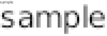
The simplest form of rasterization is simple line-drawing with no anti-aliasing of any sort. In Microsoft's terminology, this is called bi-level (and more popularly "black and white") rendering because no intermediate shades (of gray) are used to draw the glyphs. (In fact, any two colors can be used as foreground and background.)[1] This form of rendering is also called aliased or "jagged".[2] This is the fastest rendering method in the sense that it requires the least computational effort. However, it has the disadvantage that rendered glyphs may lose definition and become hard to recognize at small sizes. Therefore, many font data files (such as TrueType) contain hints that help the rasterizer decide where to render pixels for particularly troublesome areas in the glyphs, or sets of hand-tweaked bitmaps to use at specific pixel sizes.[1] As prototypical example, all versions of Microsoft Windows prior to Windows 95 (e.g. Windows 3.1) only provided this type of built-in rasterizer.[2]
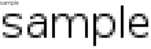
A more complicated approach is to use standard anti-aliasing techniques from computer graphics. This can be thought of as determining, for each pixel at the edges of the character, how much of that pixel the character occupies, and drawing that pixel with that degree of opacity. For example, when drawing a black letter on a white background, if a pixel ideally should be half filled (perhaps by a diagonal line from corner to corner) it is drawn 50% gray. Over-simple application of this procedure can produce blurry glyphs. For example, if the letter includes a vertical line that should be one pixel wide but falls exactly between two pixels, it appears on screen as a two-pixel-wide gray line. This blurriness trades clarity for accuracy. However, modern systems often force lines to fall within integral pixel coordinates, which makes glyphs look sharper, but also makes lines slightly wider or thinner than they would have looked on a printed sheet of paper.
Most computer displays have pixels made up of multiple subpixels (typically one each for red, green, and blue, which are combined to produce the full range of colours). In some cases, particularly with flat panel displays, it is possible to exploit this by rendering at the subpixel resolution rather than using whole pixels, which can increase the effective resolution of the screen. This is generally known as subpixel rendering. One proprietary implementation of subpixel rendering is Microsoft's ClearType.
Currently used rasterization systems
In modern operating systems, rasterization is normally provided by a shared library common to many applications. Such a shared library may be built into the operating system or the desktop environment, or may be added later. In principle, each application may use a different font rasterization library, but in practice most systems attempt to standardize on a single library.
Microsoft Windows has supported subpixel rendering since Windows XP. The Windows rasterizer is an example of one that prioritizes clarity; by forcing text into integral coordinate positions (and not even antialiasing certain fonts at certain sizes), it becomes easier to read on the screen, but may appear somewhat different when printed. This has changed with Direct2D/DirectWrite shipping on Windows 7 and Windows Vista platform update.
Mac OS X's Quartz is distinguished by the use of floating-point positioning ; it does not force glyphs into exact pixel locations, instead using various antialiasing techniques, including subpixel rendering, to position characters and lines to appear closer to the type designer's intent. The result is that the on-screen display looks extremely similar to printed output, but can occasionally be difficult to read at smaller point sizes. Contrary to other rasterizers, Quartz ignores any Postscript or TrueType hints in the font and solely relies on its own algorithm. A simpler type of font antialiasing was introduced in Mac OS 8.5, in 1998. Apple's technique can be seen on Windows in older versions of Safari for Windows. In more recent versions, however, Apple has switched to using system settings by default.[3]
RISC OS includes font anti-aliasing, first introduced before January 1989.[4] It uses its own font rendering system, which favours accurate shapes over readability, with features such as scaffolding and hinting, sub-pixel positioning and background blending.[5]
PDF documents are usually rendered with Adobe CoolType.
Most other systems use the FreeType library, which falls somewhere between Microsoft's and Apple's implementations; it supports hinting and anti-aliasing, and optionally performs subpixel rendering. The Free fonts included with most Linux distributions look better with FreeType's "auto-hinting" mode, which is high-quality and can be used without the encumbrance of licensing.
D-Type Font Engine is an independent, proprietary and portable font rasterization library.[6] It provides anti-aliasing, subpixel precision, automatic hinting, bitmap filtering and other techniques that can improve the appearance and legibility of text on screen. According to the authors, the display quality of D-Type Font Engine can be configured to match or exceed the quality of Windows and Mac OS X font rasterizers while using only non-hinted TrueType, OpenType or Type 1 fonts.[7]
References
- 1 2 Greg Hitchcock (with introduction by Steven Sinofsky) "Engineering Changes to ClearType in Windows 7", MSDN blogs, 23 Jun 2009
- 1 2 About Text Rendering in Windows Internet Explorer 9
- ↑ "A Treatise on Font Rasterisation With an Emphasis on Free Software". freddie.witherden.org. 2009-12-29. Retrieved 2010-09-12.
- ↑ Pountain, Dick (December 1988). "Screentest: Archie RISC OS" (PDF). Personal Computer World. p. 154. Retrieved 2011-01-14.
[ArcDraw] can also add text in multiple sizes and fonts to a drawing (including anti-aliased fonts)
- ↑ "Mike's Homepage - Words - Thoughts - RISC OS". Mikejs.com. 2006-12-07. Retrieved 2009-11-10.
- ↑ "D-Type - Font Engine and Rasterizer". d-type.com. 2003-12-24. Retrieved 2009-11-30.
- ↑ "D-Type - Font Engine and Rasterizer - Examples". d-type.com. 2003-12-24. Retrieved 2009-11-30.
External links
| Wikimedia Commons has media related to Font rasterization. |
- The Raster Tragedy at Low-Resolution Revisited – Beat Stamm's online book about rasterization, with an emphasis on ClearType
- http://www.slideshare.net/Mark_Kilgard/23typography-12534604
Typography terminology | |||||||||||||||
|---|---|---|---|---|---|---|---|---|---|---|---|---|---|---|---|
| Page | |||||||||||||||
| Paragraph | |||||||||||||||
| Character |
| ||||||||||||||
| Classifications |
| ||||||||||||||
| Punctuation | |||||||||||||||
| Typesetting | |||||||||||||||
| Typographic units | |||||||||||||||
| Digital typography |
| ||||||||||||||
| Related | |||||||||||||||
| |||||||||||||||