Schwabacher

The German word Schwabacher (pronounced [ˈʃvaːˌbaxɐ]) refers to a specific blackletter typeface which evolved from Gothic Textualis (Textura) under the influence of Humanist type design in Italy during the 15th century. Schwabacher typesetting was the most common typeface in Germany, until it was replaced by Fraktur from the mid 16th century onwards.
Etymology
The term derives from the Franconian town of Schwabach, where in 1529 the Articles of Schwabach, a Lutheran creed, were adopted. They became the basis of the 1530 Confessio Augustana and possibly also promoted the use of Schwabacher types.
Characteristics

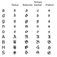
Similar to Rotunda, the rounded Schwabacher type was nearer to handwriting than the former Textualis style, though it also includes sharp edges. The lower case g and the upper case H have particularly distinctive forms. In the context of German language texts, Schwabacher appeared vibrant and popular.
History
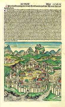
While the Latin Gutenberg Bible was still set in Textualis type, the oldest preserved Schwabacher incunable dates from 1472 and was printed in Augsburg. Schwabacher types appeared in the Free Imperial City of Nuremberg from about 1485: Anton Koberger (c. 1440–1513) used them for the publication of the Nuremberg Chronicle (in both Latin and German) in 1493 and Albrecht Dürer (1471–1528) for his Apocalypse series in 1498. Schwabacher became widely known with the spread of Luther Bibles from 1522.
After Schwabacher was displaced by Fraktur as the most-used German language typeface from about 1530, it was in use as a secondary typeface for emphasis in a similar way to italic.[1] It was still used occasionally until the mid 20th century.
When the Nazis officially abandoned the widely used Fraktur type by Martin Bormann's Normalschrifterlass of 3 January 1941, it was called Schwabacher Judenlettern ("Jew-letters of Schwabach"):[2]

Circular
(Not for publication).On behalf of the Führer I notify for common attention that:
Regarding and calling the so called gothic typeface as a German typeface is wrong. In fact, the gothic typeface consists of Jew-letters from Schwabach. Like they later gained control of the newspapers, the Jews living in Germany had seized control over the printing shops at introduction of the printing press, so that the Schwabacher Jew-letters were heavily introduced in Germany.
Today the Führer decided in a meeting with Reichsleiter Max Amann and book printing shop owner Adolf Müller, that the Antiqua typeface is to be called the normal typeface in future. Step by step all printing products have to be changed to this normal typeface. As soon as this is possible for school books, in schools only the normal typeface will be taught.
Authorities will refrain from using the Schwabacher Jew-letters in future; certificates of appointment, road signs and similar will only be produced in normal typeface in future. On behalf of the Führer, Mr. Amann will first change those papers and magazines to normal typeface, that are already spread abroad or are wanted to be.
Signed M. Bormann
The statement ignores the fact that Schwabacher originated from the earlier Rotunda blackletter script and late medieval Bastarda types. Actually, there is no evidence of any connection between Jews and the Schwabacher typeface. At the time of its origin the ownership of printing houses was reserved for Christian citizens.
Samples

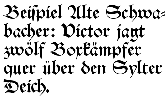
The German sentence in the figures reads: "Beispiel Alte Schwabacher [Example of Old Schwabacher]: Victor jagt zwölf Boxkämpfer quer über den Sylter Deich". This is a nonsense sentence meaning "Victor chases twelve boxers across the great dam of Sylt", but contains all 26 letters of the alphabet plus the German umlauts and is thus an example of a pangram.
Notes and references
- ↑ Steinberg, S. H. (1961) Five Hundred Years of Printing; 2nd ed. Penguin Books; p. 41
- ↑ Burke, Christopher (1998), Paul Renner: the Art of Typography, New York: Princeton Architectural Press, pp. 165–167, ISBN 978-1-56898-158-1
Further reading
- Friedrich Beck: „Schwabacher Judenlettern“ - Schriftverruf im Dritten Reich. in: Die Kunst des Vernetzens, Verlag für Berlin-Brandenburg, 2006, ISBN 3-86650-344-X (pdf)
- Philipp Luidl: Die Schwabacher – Die ungewöhnlichen Wege der Schwabacher Judenletter. Maro Verlag, Augsburg 2004. ISBN 3-87512-415-4
- "Vergessen und verdrängt" Schwabach 1918-1945, Ausstellungskatalog Stadtmuseum Schwabach, p. 172
External links
| Wikimedia Commons has media related to Schwabacher. |
- "Die Alte Schwabacher Schrift" (in German). Schwabach SPD. Archived from the original on March 18, 2009.