Kinetic typography
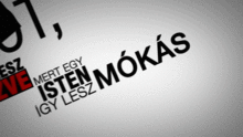
Kinetic typography—the technical name for "moving text"—is an animation technique mixing motion and text to express ideas using video animation. This text is presented over time in a manner intended to convey or evoke a particular idea or emotion.
History
With the advent of film and graphic animation, the possibility of matching text and motion emerged. Examples of animated letter-forms appeared as early as 1899 in the advertising work of George Melies.[1] Early feature films contained temporal typography, but this was largely static text, presented sequentially and subjected to cinematic transitions. It was not until the 1960s when opening titles began to feature typography that was truly kinetic. Scholars recognize the first feature film to extensively use kinetic typography as Alfred Hitchcock's North by Northwest (1959).[2] This film's opening title sequence—created by Saul Bass—contained animated text, featuring credits that "flew" in from off-screen, and finally faded out into the film itself. A similar technique was also employed by Bass in Psycho (1960).[3]
Since then, the use of kinetic typography has become commonplace in film introductory titles and television advertisements. More recently, it has been a central feature of numerous television idents, notably Martin Lambie Nairn's first ident for the British Channel 4 television network in use from 1982.
Categories
Y. Y. Wong has proposed that it is important to distinguish between the properties of form (e.g. colour and font) and of behaviour (e.g. qualities of movement) in temporal typography. It is necessary to make this distinction in order to classify kinetic typography in ways that acknowledge their difference to static type (which may share properties of form, but not kinetic behaviours). Kinetic typography is therefore categorised according to behaviours or action, rather than appearance.
In classification, kinetic typography is a form of temporal typography (typography that is presented over time). It is distinct from other forms of temporal typography including 'serial presentation', which involves the sequential presentation of still typographic compositions.
Layouts
Barbara Brownie's model of temporal typography divides kinetic typography into 'motion typography' (subdivided into 'scrolling typography', 'dynamic layout') and 'fluid typography'.[4]
Motion typography
In dynamic layout, text elements move in relation to one another. Letters and words may move away from one another on a 2D plane, or in three-dimensional space. Likewise, scrolling typography can scroll across the flat screen, or can appear to recede or advance.
Fluid typography
In fluid typography, letterforms change and evolve without necessarily changing location.
Production
Kinetic typography is often produced using standard animation programs, including Adobe Flash, Adobe After Effects, and Apple Motion.[5] The effect is most often achieved by compositing layers of text such that either individual letters or words can be animated separately from the rest.
References
- ↑ Bellantoni, Jeff and Woolman, Matt, 'Type in Motion', Thames & Hudson, 1999.
- ↑ Zimmerman, Bill. "History of Kinetic Typography". WizMotions. Retrieved 20 February 2015.
- ↑ Lee, Johnny C.; Forlizzi, Jodi; Hudson, Scott E. "The Kinetic Typography Engine: An Extensible System for Animating Expressive Text" (PDF). Carnegie Mellon University. Retrieved 20 February 2015.
- ↑ https://web.archive.org/web/20080403044052/http://journalhosting.org/meccsa-pgn/index.php/netknow/article/view/27/61. Archived from the original on April 3, 2008. Retrieved November 27, 2008. Missing or empty
|title=(help) - ↑ http://kinetictypography.com/2-ways-of-communicating-with-kinetic-typography/
Typography terminology | |||||||||||||||
|---|---|---|---|---|---|---|---|---|---|---|---|---|---|---|---|
| Page | |||||||||||||||
| Paragraph | |||||||||||||||
| Character |
| ||||||||||||||
| Classifications |
| ||||||||||||||
| Punctuation | |||||||||||||||
| Typesetting | |||||||||||||||
| Typographic units | |||||||||||||||
| Digital typography |
| ||||||||||||||
| Related | |||||||||||||||
| |||||||||||||||