Roboto
.svg.png) | |
| Category | Sans-serif |
|---|---|
| Classification | Neo-grotesque |
| Designer(s) | Christian Robertson |
| Commissioned by | |
| Date created | 2011 |
| Date released | 2015 |
| License | Apache License |
| Latest release version | 2.001047;2015 |
Roboto is a sans-serif typeface family developed by Google as the system font for its mobile operating system Android.
Google describes the font as "modern, yet approachable" and "emotional".[1][2] The entire font family has been licensed under the Apache license[3] and was officially made available for free download on January 12, 2012, on the newly launched Android Design website. It belongs to the neo-grotesque genre of sans-serif typefaces, and includes Thin, Light, Regular, Medium, Bold and Black weights with matching oblique styles. It also includes condensed styles in Light, Regular and Bold, also with matching oblique designs.
Language coverage
Roboto supports Latin, Greek (partial) and Cyrillic scripts.[4] On Android, the Noto font is used for languages not covered by Roboto, including Chinese (simplified and traditional), Japanese, Korean, Thai and Hindi.[5]
Development
The font was designed entirely in-house at Google by Christian Robertson, an interface designer for Google, who previously had released an expanded Ubuntu-Title font through his personal type foundry Betatype.[6][7] It was released for the first time in 2011 with Android 4.0 "Ice Cream Sandwich".[8] Compared to Android's previous system font, the humanist sans-serif design Droid, it adopts a more stark grotesque design with oblique styles rather than true italics, and a wider range of weights.
Redesign
On June 25, 2014, Matias Duarte announced at Google I/O that the typeface for Roboto was significantly redesigned for Android 5.0 "Lollipop". The most significant changes are seen in the glyphs are: B (shrinking), R, P, a (expanding space), D, O, e, g (curving), k, and numbers: 1, 5, 6, 7, and 9. Punctuation marks and the tittles in the lowercase i and j have been changed from a square dot to a rounded dot.
Reception
Roboto received variable reviews on its release. Joshua Topolsky, Editor-In-Chief of technology news and media network The Verge, describes the font as "clean and modern, but not overly futuristic – not a science fiction font".[9] However, typography commentator Stephen Coles of typographica.org called the initial release of Roboto “a Four-headed Frankenfont”, describing it as a “hodgepodge” of different typographic styles which do not work well together.[10] Other type design professionals called out obvious errors in accented glyphs, while John Gruber called the font a “Helvetica ripoff”.[11][12]
Usage
Besides being the default font on the Android operating system, since 2013 it is also the default font of other Google services such as Google+, Google Play, YouTube, Google Maps,[13] and mobile Google Search.
Roboto Bold is the default font in Unreal Engine 4.
It has been announced that the font will be the default font in Kodi, a free and open source media player.[14]
Derivatives
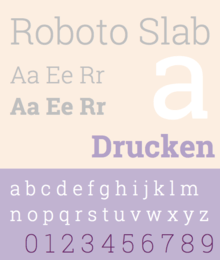
Roboto Slab
 | |
| Category | Serif |
|---|---|
| Classification | Slab Serif |
| Designer(s) | Christian Robertson |
| Commissioned by | |
| Date released | March 2013 |
| Latest release version | 1.100263 |
Roboto Slab is a slab serif font based on Roboto. It was introduced in March 2013, as the default font in Google's note-taking service Google Keep.[15] It has been released in four weights: thin, light, regular and bold. However, no oblique versions were released for it.
Heebo
Heebo is an extension of Roboto that includes Hebrew characters.[16]
References
- ↑ "New Design Philosophy of Ice Cream Sandwich". Engadget. Engadget. Retrieved November 4, 2011.
- ↑ "Design of Roboto". MSN. MSN. Retrieved November 4, 2011.
- ↑ "Roboto license".
- ↑ "Google Fonts Roboto". Google Inc. Retrieved 2015-09-16.
- ↑ "Typography - Style - Google design guidelines". Google Inc. Retrieved 2015-09-16.
- ↑ "Association with Google and Betatype". Christian Robertson. Christian Robertson. Retrieved November 12, 2011.
- ↑ "Roboto is a Four-headed Frankenfont". Typographica. Typographica. Retrieved November 4, 2011.
- ↑ "Google's New Font". Wired. Wired. October 19, 2011. Retrieved November 4, 2011.
- ↑ "Exclusive: Matias Duarte on the philosophy of Android, and an in-depth look at Ice Cream Sandwich". The Verge. Vox Media. Retrieved November 28, 2011.
- ↑ "Roboto Is Was a Four-headed Frankenfont".
- ↑ "Christoph Koeberlin". Twitter.
- ↑ "Daring Fireball Linked List: Roboto vs. Helvetica".
- ↑ Graham-Smith, Darien. Hands on with the new Google Maps, May 17th, 2013
- ↑ "XBMC 11.0 – May Cycle (updated)".
- ↑ Spradlin, Liam. "Closer Look: Google Keep Actually Shipped With A New (Serif) Font – Introducing Roboto Slab". Android Police. Retrieved 8 August 2014.
- ↑ "Heebo". Retrieved 2016-09-20.
External links
| Wikimedia Commons has media related to Roboto. |
- Official Roboto font download page
- Official Roboto Condensed font download page
- Official Roboto Slab font download page
| Development |
|  |
|---|---|---|
| Releases | ||
| Derivatives |
| |
| Google Pixel | ||
| Nexus devices | ||
| Google Play edition | ||
| Customized variants | ||
| Applications | ||
| APIs | ||
| Alternative user interfaces | ||
| Lists | ||
| Other | ||
| Related topics | ||