Baskerville
 | |
| Category | Serif |
|---|---|
| Classification | Transitional serif |
| Designer(s) | John Baskerville |
| Foundry |
G. Peignot et Fils Linotype |
| Variations | Mrs Eaves |
| Shown here |
Baskerville Ten by František Štorm |
Baskerville is a serif typeface designed in 1757 by John Baskerville (1706–1775) in Birmingham, England and cut by John Handy.[1] Baskerville is classified as a transitional typeface, intended as a refinement of what are now called old-style typefaces of the period, especially those of his most eminent contemporary, William Caslon.[2]
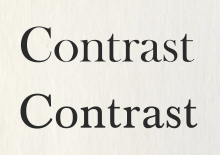
Compared to earlier designs, Baskerville increased the contrast between thick and thin strokes, making the serifs sharper and more tapered, and shifted the axis of rounded letters to a more vertical position.[3] The curved strokes are more circular in shape, and the characters became more regular. These changes created a greater consistency in size and form. Baskerville's typefaces remain very popular in book design and there are many modern revivals, which often add features such as bold type which did not exist in Baskerville's time.[4]
History

Baskerville's typeface was the culmination of a large series of experiments. Baskerville, a wealthy industrialist who had begun his career as a writing-master, sought to develop new and higher-quality methods of printing, developing also finely pressed, smooth paper and a high quality of ink.[5][6][7][8] The result was a typeface that reflected Baskerville's ideals of perfection, where he chose simplicity and quiet refinement.[9]
While Baskerville's types in some aspects recall the general design of William Caslon, the most eminent punchcutter of the time, John Dreyfus and others have written that aspects of his design recalled his handwriting and common elements of the calligraphy taught at the time, which had been used in copperplate engraving but had not been previously been cut into type.[10][11] Such details included many of the intricate details of his italic, such as the flourishes on the capital N and entering stroke at top left of the italic 'p'.
In 1757, Baskerville published his first work, a collection of Virgil, which was followed by some fifty other classics. In 1758, he was appointed printer to the Cambridge University Press. It was there in 1763 that he published his master work, a folio Bible, which was printed using his own typeface, ink, and paper. At the start of his edition of Paradise Lost, he wrote a preface explaining his ambitions.[12][13]
The crispness of his work seems to have unsettled his contemporaries, and some claimed the stark contrasts in his printing damaged the eyes.[12] Baskerville was never particularly successful as a printer, being a printer of specialist and elite editions. Abroad, however, he was much admired, notably by Pierre Simon Fournier, Giambattista Bodoni (who intended at one point to come to England to meet him), and Benjamin Franklin, who wrote him a letter praising his work.[14][15] His work was later admired in England by Thomas Frognall Dibdin, who wrote that 'in his Italic letter...he stands unrivalled; such elegance, freedom and perfect symmetry being in vain to be looked for among the specimens of Aldus and Colinaeus...Baskerville was a truly original artist, he struck out a new method of printing in this country and may be considered as the founder of that luxuriant style of typography at present so generally prevails; and which seems to have attained perfection in the neatness of Whittingham, the elegance of Bulmer and the splendour of Bensley."[16] Thomas Curson Hansard seems to have had misgivings about his work, praising him in some ways but also suggesting that he was a better printer than a type designer.[6] On his death his widow Sarah eventually sold his material to a Paris literary society connected to Beaumarchais, placing them out of reach of British printing.
Having been an early admirer of the beauty of Letters, I became insensibly desirous of contributing to the perfection of them. I formed to myself ideas of greater accuracy than had yet appeared, and had endeavoured to produce a Set of Types according to what I conceived to be their true proportion...It is not my desire to print many books, but such only as are books of Consequence, of intrinsic merit or established Reputation, and which the public may be pleased to see in an elegant dress, and to purchase at such a price as will repay the extraordinary care and expense that must necessarily be bestowed upon them.[2]
Baskerville's preface to Milton
Baskerville's styles of type and printing, although initially unpopular in Britain, proved influential for a brief transitional period in the late eighteenth and early nineteenth century, with printers and type designers such as Fry, Moore and Wilson of Glasgow. Bulmer, cut by the brother of Baskerville's foremen, was one design inspired by it, as is Bell.[3][13] This period saw an increasing influence of Didone printing from the Continent, from typefaces such as Didot and Bodoni. It then disappeared from view following a trend towards Didone typefaces, often with a much darker style of impression; Updike suggests that this change mostly happened around 1815-20.[13] The Scotch Roman genre which proved popular in Britain and America is something of an intermediate between Didone typefaces and Baskerville's influence. The succession of more extreme "Didone" typefaces quickly replacing Baskerville's style has led to Baskerville being called "transitional" on the road to the Didone style which dominated printing for a long period, although Baskerville would not have considered his design "transitional" but as a successful end in itself.[17][10]
Baskerville was revived in 1917 by Bruce Rogers, for the Harvard University Press, and released by G. Peignot et Fils in Paris (France). Modern revivals have added features, such as italics with extra or no swashes and bold weights, that were not present in Baskerville's original work.
The font is used widely in documents issued by the University of Birmingham (UK) and Castleton University (Vermont, USA).[18] A modified version of Baskerville is also prominently used in the Canadian government's corporate identity program—namely, in the 'Canada' wordmark. Another modified version of Baskerville is used by Northeastern University (USA), and the ABRSM. Monotype Baskerville is often used by the band Chvrches.
Characteristics


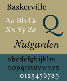
Key features of Baskerville are its E where the bottom arm projects further than the upper, a J with a ball terminal at the bottom, and where the loop rises to the top and right to join the main stem and a g where the bottom loop is open. Many characters have clear ball terminals, in contrast to the more wedge-shaped serifs of earlier fonts. In italics, the J has a centre-bar, the p a tail pointing downwards and to the right and a w with a centre loop and swash on the right. In general, Baskerville's type has been described as 'rounder, more sharply cut' than its predecessors.[19] (Some distinctive features of the capitals are discarded in many revivals, as seen below.) Baskerville's type featured text figures or lower-case numbers, the only form which was used at the time.[6][13]
Baskerville also produced a font for Greek, which survives at Oxford.[20] It has generally been considered as not successful.[21][22]
Hot type versions
The following foundries offered versions of Baskerville:
- The original punches were sold by Baskerville's widow and eventually ended up in the possession of G. Peignot et Fils by way of Beaumarchais. Charles Peignot donated them to Cambridge University Press in 1953.[23][24]
- With Baskerville's equipment unavailable in France, the Fry type foundry of Bristol cut its own version in the late eighteenth century, presumably by house designer Isaac Moore who later showcased them on his own specimen.[25][26][lower-alpha 1] Moore's designs feature a slightly different 'a' at large sizes followed in many revivals.[27]
- When Fry's successors closed, this version was acquired and issued (or possibly recut) in hot metal by Stephenson Blake under the name "Baskerville Old Face".[28] Moore's italic was considered substandard by revivalist printers, and Baskerville Old Face revivals have tended to either synthesise their own or offer none.
- The Fry Foundry version was also sold by American Type Founders with an italic designed in 1915 by Morris Fuller Benton.
- Lanston Monotype's Baskerville was cut in 1923 under the direction of Stanley Morison. Italic and bold versions were cut by Sol Hess. These versions were modified slightly and then offered by Intertype. As with other Monotype revivals, the design is sometimes called Baskerville MT. It is bundled with OS X in a somewhat slender digitisation.[29][30][31]
- Schriftgießerei D. Stempel issued a revival in 1926 under the name "Original-Baskerville".
- Linotype AG, the German arm of Mergenthaler Linotype, adapted the Stempel cutting of the face for linecasting in 1927.[32]
- Linotype's Baskerville was cut in 1923 by George W. Jones, though it was subsequently re-cut in 1936. A bold version was cut by Chauncey H. Griffith in 1939. It may sometimes be called Baskerville LT.
More loosely, the Scotch Roman genre of transitional types reflects the influence of Baskerville's work, with increasing influence of Didone type from the continent around the beginning of the nineteenth century; the font Georgia is influenced by this genre. Due to the cachet of the name, other completely unrelated designs were named 'Baskerville' in the hot metal period.[33][34]
Cold type versions
As it had been a standard type for many years, Baskerville was widely available in cold type. Alphatype, Autologic, Berthold, Compugraphic, Dymo, Star/Photon, Harris, Mergenthaler, MGD Graphic Systems, Varityper, Hell AG and Monotype, all sold the face under the name Baskerville, while Graphic Systems Inc. offered the face as Beaumont.[35]
Digital versions
As a somewhat precise design that emphasises contrast between thick and thin strokes, modern designers may prefer different revivals for different text sizes, printing methods and onscreen display, since a design intended to appear elegant in large text sizes could look too spindly for body text.[4] Factors which would be taken into account include compensation for size and ink spread, if any (the extent of which depends on printing methods and type of paper used; it does not occur on screens). Among digitisations, František Štorm's extremely complete range of versions is particularly praised for featuring three optical sizes, the text version having thicker strokes to increase legibility as metal type does.[38][39] Meanwhile, the common digitisation of Baskerville Old Face bundled with many Microsoft products features dramatic contrasts between thin and thick strokes. This makes it most suited to headings, especially since it does not have an italic.[40][41]
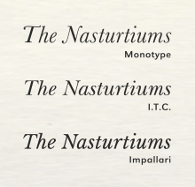
Another common question facing revivals is what to do with some letters such as 'N' in italics. On faithful revivals such as the Storm digitisation (shown at top right) they have a swash, but this may be thought too distracting for general use or to space poorly in all-caps text. Accordingly, many revivals substitute (or offer as an alternate) capitals without swashes.
Dieter Hofrichter, who assisted Günter Gerhard Lange in designing a Baskerville revival for Berthold around 1980, commented:
We went to Birmingham where we saw original prints by Baskerville. I was quite astounded by how sharp the printing of his specimens is. They are razor-sharp: it almost hurt your eyes to see them. So elegant and high-contrast! He showed in this way what he could achieve. That was Baskerville's ideal - but not necessarily right for today.[42][43]
Many companies have provided digital releases (some of older Baskerville revivals), including Linotype, URW++, Bitstream and SoftMaker as well as many others. These may have varying features, for example some lacking small caps. Monotype Baskerville is installed on Macs as part of OS X, while many Windows computers receive Moore's adaptation under the name of Baskerville Old Face in the URW digitisation (that described above) without an italic or bold weight.
Adaptations
A particularly idiosyncratic Baskerville revival is Mrs Eaves (1996), designed by Zuzana Licko.[44] Named after Baskerville's housekeeper-turned-wife, it uses a low x-height to create a bright page without reducing stroke width. It is often used on book titles and headings.[45][46][47] It uses a variety of ligatures to create effects with linked characters.[48] Harriet is an adaptation by Okaytype inspired by American nineteenth-century printing.[49] Big Moore by Matthew Carter is a recent, complex digitisation of the larger sizes of Isaac Moore's early adaptation, that often called Baskerville Old Face, adding an italic.[25][27][50][51]
Effect on readers

A research study showed that the use of the Baskerville font increased the likelihood of the reader agreeing with a statement by 1.5% as compared to the average of five other fonts, including Comic Sans which had the most negative influence on agreement of the six.[52]
Gallery
Some examples of volumes published by Baskerville.
-

John Milton's Paradise Lost (1758)
-

Volume One of The works of Joseph Addison (1761)
-
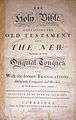
Title page of Baskerville's 1763 Bible
-
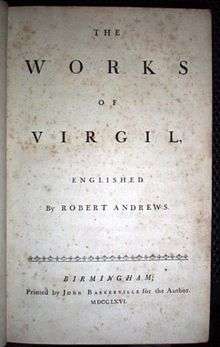
The 1766 translation of Virgil into English, by Robert Andrews

References
- ↑ Benton, Josiah (2014). John Baskerville : type-founder and printer, 1706 -1775. [S.l.]: Cambridge Univ Press. ISBN 9781108076227. Retrieved 10 December 2015.
- 1 2 Baskerville, John (1758). Preface to Paradise Lost & Paradise Regained. Birmingham: John Baskerville, for J & R Tonson.
- 1 2 Phinney, Thomas. "Transitional & Modern Type Families". Graphic Design & Publishing Center. Retrieved 30 October 2015.
- 1 2 Coles, Stephen. "Top Ten Typefaces Used by Book Design Winners". FontFeed. Retrieved 2 July 2015.
- ↑ John Baskerville: type-founder and printer, 1706 -1775. [S.l.]: Cambridge Univ Press. 2014. ISBN 9781108076227.
- 1 2 3 Hansard, Thomas Curson (1825). Typographia, an Historical Sketch of the Origin and Progress of the Art of Printing. p. 355. Retrieved 12 August 2015.
- ↑ William West (1830). The history, topography and directory of Warwickshire: inclusive of some portions of the ancient histories of Rous, Camden, Speed, and Dugdale, with curious memoirs of the lives of these early English writers ... a directory of every town and considerable village in the county; a gazetteer of all towns, villages, parishes and hamlets ... and an itinerary ... R. Wrightson. pp. 260–273.
- ↑ John Nichols (1812). Literary Anecdotes of the Eighteenth Century;: Comprizing Biographical Memoirs of William Bowyer, Printer, F.S.A. and Many of His Learned Friends; ... pp. 450–461.
- ↑ Bartram, Alan (2004). Bauhaus, modernism and the illustrated book. New Haven, CT: Yale Univ. Press. ISBN 9780300101171.
- 1 2 Johnson, Alfred F. (1930). "The Evolution of the Modern-Face Roman". The Library. s4-XI (3): 353–377. doi:10.1093/library/s4-XI.3.353.
- ↑ Dreyfus, John (1950). "The Baskerville Punches 1750–1950". The Library. s5–V (1): 26–48. doi:10.1093/library/s5-V.1.26.
- 1 2 Loxley, Simon (2005). Type: the secret history of letters. London [u.a.]: I. B. Tauris. ISBN 9781845110284.
- 1 2 3 4 Updike, Daniel (1922). Printing types, their history, forms, and use; a study in survivals. Harvard University Press.
- ↑ Lawson, Alexander (1990). Anatomy of a Typeface (1st ed.). Boston: Godine. pp. 184–. ISBN 9780879233334.
- ↑ Benjamin Franklin (1840). The Works of Benjamin Franklin: Containing Several Political and Historical Tracts Not Included in Any Former Edition, and Many Letters, Official and Private, Not Hitherto Published; with Notes and a Life of the Author. Hillard, Gray. pp. 212–5.
- ↑ Dibdin, Thomas (1808). An introduction to the knowledge of rare and valuable editions of the Greek and Latin classics (Dibdin on the Classics).
- ↑ Eliason, Craig (October 2015). ""Transitional" Typefaces: The History of a Typefounding Classification". Design Issues. 31 (4): 30–43. doi:10.1162/DESI_a_00349.
- ↑ "Castleton State College: Athletic Logo Usage and Style Guidelines" (PDF). Castleton State College. August 2008. Retrieved August 18, 2012.
- ↑ "Monotype Baskerville" (PDF). Monotype Recorder. 32 (1): 27.
- ↑ Alfred W. Pollard. A Short History of English Printing, 1476-1898. Library of Alexandria. pp. 252–4. ISBN 978-1-4655-4384-4.
- ↑ "Greek Typefaces of the 18th century". Greek Font Society. Retrieved 14 October 2016.
- ↑ Allen Kent (28 February 1986). Encyclopedia of Library and Information Science: Volume 40 - Supplement 5: Austria: National Library of to The Swiss National Library. CRC Press. pp. 18–9. ISBN 978-0-8247-2040-7.
- ↑ Jaspert, W. Pincus, W. Turner Berry and A.F. Johnson. The Encyclopedia of Type Faces. Blandford Press Lts.: 1953, 1983, ISBN 0-7137-1347-X, p. 15
- ↑ Lawson, Alexander. Anatomy Of A Typeface. David R. Godine, Publisher, Inc.: 1990, p. 194
- 1 2 "A Specimen by Isaac Moore & Co., 1766". Providence Public Library. saac Moore & Co. Retrieved 30 October 2015.
- ↑ "Obituary: Dr Fry". The Gentleman's Magazine (May): 557–8. May 1838.
- 1 2 "Baskerville Old Face". Microsoft. Retrieved 24 June 2015.
- ↑ Mosley, Professor James. "Comments on Typophile thread". Typophile (archived). Archived from the original on August 22, 2012. Retrieved 24 June 2015.
- ↑ MacGrew, Mac, American Metal Typefaces of the Twentieth Century, Oak Knoll Books, New Castle, Delaware, 1993, ISBN 0-938768-34-4, p. 27.
- ↑ "Monotype Baskerville specimen book" (PDF). Monotype. Retrieved 30 October 2015.
- ↑ Coles, Stephen. "Twitter post". Typographica.
Digital versions are poor for text. Too light.
- ↑ Lawson, Alexander. Anaotomy Of A Typeface. David R. Godine, Publisher, Inc.: 1990, p. 192
- ↑ Hoefler, Jonathan. "What's in a font name?". Hoefler & Frere-Jones. Retrieved 2 July 2015.
- ↑ Specimens of Type. London: Caslon & Co. 1915. p. 64.
- ↑ Lawson, Alexander, Archie Provan, and Frank Romano, Primer Metal Typeface Identification, National Composition Association, Arlington, Virginia, 1976, pp. 34 - 35.
- ↑ "ITC New Baskerville". MyFonts. Retrieved 10 December 2015.
- ↑ Impallari, Pablo. "Libre Baskerville". Impallari Type. Retrieved 10 December 2015.
- ↑ Twardoch, Adam. "Baskerville 10". Typographica. Retrieved 12 July 2015.
- ↑ Butterick, Matthew. "Better options for Baskerville". Typography for Lawyers (archived). Archived from the original on 15 March 2015. Retrieved 7 August 2016.
The Baskerville system font is mediocre: brittle and excessively quaint. The best recreation of the traditional Baskerville look is Baskerville 10. The definitive modernist reinterpretation is Mrs Eaves.
- ↑ "Storm Type Baskerville Original Pro". MyFonts. Monotype. Retrieved 9 July 2015.
- ↑ "Baskerville Old Face". Fonts In Use.
- ↑ Reynolds, Dan. "Dieter Hofrichter". MyFonts. Monotype. Retrieved 17 June 2015.
- ↑ "Baskerville Book Pro". Berthold. Retrieved 13 July 2015.
- ↑ Eye, Number 43, Volume 11, Spring 2002.
- ↑ `. "Introducing Mrs Eaves XL" (PDF). Emigre. Retrieved 6 November 2014.
- ↑ "Mr Eaves". Emigre Fonts. Retrieved 6 November 2014.
- ↑ "Mr Eaves specimen". Emigre. Retrieved 6 November 2014.
- ↑ "Mrs Eaves Design Information: Emigre Fonts". Emigre.com. Retrieved 2012-08-13.
- ↑ Mora, André. "Harriet series". Typographica. Retrieved 19 October 2015.
- ↑ "Introducing Big Moore". Font Bureau. Retrieved 9 July 2015.
- ↑ "Big Moore FB". Font Bureau. Retrieved 9 July 2015.
- ↑ Errol Morris, "Hear, All Ye People; Hearken, O Earth", The New York Times
- ↑ Moore was a Birmingham native, but does not appear to have had any connection with Baskerville himself.
- Lawson, Alexander S. (1990), Anatomy of a Typeface, Boston: Godine, ISBN 0-87923-333-8.
- Meggs, Philip B. & Carter, Rob (1993), Typographic Specimens: The Great Typefaces, New York: Van Nostrand Reinhold, ISBN 0-442-00758-2
- Meggs, Philip B. & McKelvey, Roy (2000), Revival of the Fittest, New York: RC Publications, ISBN 1-883915-08-2.
- Updike, Daniel Berkley (1980) [1922], Printing Types Their History, Forms and Use, II, New York: Dover Publications, ISBN 0-486-23929-2 - general survey of printing including of the years after Baskerville & his influence on printing. Many illustrations.
External links
| Wikimedia Commons has media related to Baskerville. |
- Typophile: Baskerville
- John Baskerville I Love Typography, Sep. 23, 2007
- Open Baskerville – an open-source revival of Moore's Baskerville, without an italic
macOS typefaces | |
|---|---|
| Latin, Greek, Cyrillic |
|
| Non-alphabetic | |