Temperature–entropy diagram
For other uses, see Tanabe-Sugano diagram.
| Thermodynamics | ||||||||||||
|---|---|---|---|---|---|---|---|---|---|---|---|---|
 The classical Carnot heat engine | ||||||||||||
|
Branches |
||||||||||||
|
||||||||||||
| Book:Thermodynamics | ||||||||||||


A temperature entropy diagram, or T-s diagram, is used in thermodynamics to visualize changes to temperature and specific entropy during a thermodynamic process or cycle. It is a useful and common tool, particularly because it helps to visualize the heat transfer during a process. For reversible (ideal) processes, the area under the T-s curve of a process is the heat transferred to the system during that process.[1]
An isentropic process is depicted as a vertical line on a T-s diagram, whereas an isothermal process is a horizontal line.[2]
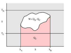
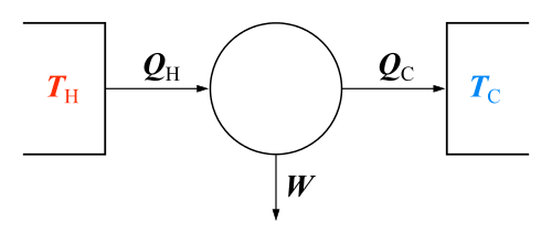
This example T-s diagram shows a thermodynamic cycle taking place between a hot reservoir at temperature TH and a cold reservoir at temperature TC. For reversible processes, such as those found in the Carnot cycle, the area in red QC is the amount of energy exchanged between the system and the cold reservoir. The area in white W is the amount of work energy exchanged by the system with its surroundings. The amount of heat QH exchanged with the hot reservoir is the sum of the two. The thermal efficiency of the cycle is the ratio of the white area (work) divided by the sum of the white and red areas (total heat). If the cycle moves in a clockwise sense then it is a heat engine that outputs work, if the cycle moves in a counterclockwise sense it is a heat pump that takes in work and moves heat QH from the cold reservoir to the hot reservoir.

T-s diagram for steam, US units.
See also
References
- ↑ "Temperature Entropy (T-s) Diagram - Thermodynamics - Thermodynamics". Engineers Edge. Retrieved 2010-09-21.
- ↑ "P-V and T-S Diagrams". Grc.nasa.gov. 2008-07-11. Retrieved 2010-09-21.
This article is issued from Wikipedia - version of the 6/8/2016. The text is available under the Creative Commons Attribution/Share Alike but additional terms may apply for the media files.