Gill Sans
 | |
| Category | Sans-serif |
|---|---|
| Classification | Humanist |
| Designer(s) | Eric Gill |
| Foundry | Monotype |
| Date created | 1926 |
| Date released | 1928 (Monotype) |
| Design based on | Johnston |
| Variations | Gill Kayo |
Gill Sans is a sans-serif typeface designed by Eric Gill and released by the British branch of Monotype from 1928 onwards.
Gill Sans takes inspiration from the calligrapher and lettering artist Edward Johnston's 1916 "Underground Alphabet", the corporate font of London Underground, now (although not at the time) most often simply called the "Johnston" typeface. Gill as a young artist had assisted Johnston in its early development stages. In 1926, Douglas Cleverdon, a young printer and later a BBC executive, opened a bookshop in Bristol, and Gill painted a fascia for the shop in sans-serif capitals. In addition, Gill sketched an alphabet for Cleverdon as a guide for him to use for notices and announcements. By this time Gill had become a prominent stonemason, artist and creator of lettering in his own right and had begun to work on creating typeface designs.
Gill was commissioned to develop his design into a full metal type family by Stanley Morison, an influential Monotype executive and historian of printing. Morison hoped that it could be a competitor to a wave of German sans-serif fonts in a new "geometric" style, which included Erbar, Futura and Kabel families, which were being launched to considerable attention in Germany during the latter 1920s. Gill Sans was released in 1928 by Monotype, initially as a set of titling capitals that was quickly followed by a lower-case. Gill's aim was to blend the influences of Johnston, classic serif typefaces and Roman inscriptions to create a design that looked both cleanly modern and classical at the same time.
Marketed by Monotype as a design of "classic simplicity and real beauty", it was intended as a display typeface that could be used for posters and advertisements, as well as for the text of documents that need to be clearly legible at small sizes or from a distance, such as book blurbs, timetables and price lists.[1] Designed before setting documents entirely in sans-serif text was common, its standard weight is noticeably bolder than most modern body text fonts.
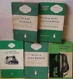
An immediate success, the year after its release the London and North Eastern Railway chose it for all its posters, timetables and publicity material, a use later extended across all British railways. It also soon became used on the modernist, deliberately simple covers of Penguin books, and was sold up to very large sizes which were often used in British posters and notices of the period. Gill Sans was one of the dominant typefaces in British printing in the years following its release, and remains extremely popular: it has been described as "the English Helvetica" because of its lasting popularity in British design.[2] Gill Sans has influenced many other typefaces, and helped to define a genre of sans-serif, known as the humanist style.
Monotype rapidly expanded the original regular or medium weight into a large family of styles, which it continues to sell. A basic set is included with some Microsoft software and Mac OS X.
Characteristics

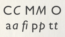
The proportions of Gill Sans stem from monumental Roman capitals in the upper case, and traditional "old-style" serif letters in the lower. This gives Gill Sans a very different style of design to geometric sans-serifs like Futura, based on simple squares and circles, or realist or grotesque designs like Akzidenz-Grotesk, Helvetica and Univers influenced by nineteenth-century lettering styles.[3][4] For example, compared to realist sans-serifs the "C" and "a" have a much less "folded up" structure, with wider apertures.[5] The "a" and "g" in the roman or regular style are "double-storey" designs, rather than the "single-storey" forms used in handwriting and blackletter often found in grotesque and especially geometric sans-serifs.
.jpg)
The upper-case of Gill Sans is partly modelled on Roman capitals like those found on the Column of Trajan. Edward Johnston in one of his books on lettering had written that "the Roman capitals have held the supreme place among letters for readableness and beauty. They are the best forms for the grandest and most important inscriptions."[7][8] While Gill Sans is not based on purely geometric principles to the extent of the geometric sans-serifs that had preceded it, some aspects of Gill Sans do nonetheless have a geometric feel. The "O" is an almost perfect circle and the capital "M" is based on the proportions of a square with the middle strokes meeting at the centre; this was not inspired by Roman carving but is very similar to Johnston.[7][lower-alpha 1][lower-alpha 2] But the influence of traditional serif letters is clear in the "two-storey" lower-case "a" and "g," unlike that of Futura, and the "t" with its curve to bottom right and slanting cut at top left, unlike Futura's which is simply formed from two straight lines.[11] The lower-case "a" also narrows strikingly towards the top of its loop, a common feature of serif designs but rarer in sans-serifs.
Following the traditional serif model the italic has different letterforms from the roman, where many sans-serifs simply slant the letters in what is called an oblique style. This is clearest in the "a", which becomes a "single storey" design similar to handwriting, and the lower-case "p", which has a calligraphic tail on the left reminiscent of italics such as those cut by Caslon in the eighteenth century.[7][12] The italic is nonetheless quite restrained, almost an oblique in many characters such as the "e" with its straight line on the underside of the bowl where serif fonts normally add a curve.[7][lower-alpha 3] Like most serif fonts (but unlike most sans-serif fonts), several weights and releases of Gill Sans use ligatures to allow its expansive letter "f" to join up with or avoid colliding with following letters.[12]
The basic letter shapes do not look consistent across styles (or even in the metal type era all the sizes of the same style), especially in Extra Bold and Extra Condensed widths, while the Ultra Bold style is effectively a different design altogether and was originally marketed as such.[14] Monotype executive Dan Rhatigan, author of an article on Gill Sans's development after Gill's death, has commented that "Gill Sans grew organically ... [it] takes a very 'asystematic' approach to type. Very characteristic of when it was designed and of when it was used."[15][16] (At this time the idea that sans-serif typefaces should form a consistent family, with glyph shapes as consistent as possible between all weights and sizes, had not fully developed: it was quite normal for families to vary as seemed appropriate for their weight until developments such as the groundbreaking release of Univers in 1957.[17])
In the light weights, the slanting cut at top left of the regular "t" is replaced with two separate strokes.[lower-alpha 4] From the bold weight upwards Gill Sans has an extremely eccentric design of "i" and "j" with the dots (tittles) smaller than their parent letter's stroke.[18][19]
Development

Morison commissioned Gill to develop Gill Sans after they had begun to work together on Gill's serif design Perpetua from 1925 onwards. Morison is known to have visited Cleverdon's bookshop while in Bristol in 1927 where he would have seen Gill's fascia and alphabet. Gill wrote that "it was as a consequence of seeing these letters"[19] that Morison commissioned him to develop them, although this may not have been the exact point when he started to consider commissioning a sans-serif design from Gill; they had been collaborating for some years by this point and could have discussed the idea earlier.[19][20][21] In the period during and after his closest collaboration with Johnston, Gill had intermittently worked on sans-serif letter designs, including an almost sans-serif capital design in an alphabet for sign-painters in the 1910s, some "absolutely legible-to-the-last-degree ... simple block letters" for Army and Navy Stores in 1925 and some capital letter signs around his home in Capel-y-ffin, Wales.[19][22][lower-alpha 5] Gill had greatly admired Johnston's work on their Underground project, which he wrote had redeemed the sans-serif from its "nineteenth-century corruption" of extreme boldness.[7][25] Johnston apparently had not tried to turn the alphabet (as it was then called) that he had designed into a commercial typeface project.[26] He had tried to get involved in type design before starting work on Johnston Sans, but without success since the industry at the time mostly created designs in-house.[24] Morison similarly respected the design of the Underground system, one of the first uses of a standard lettering style as corporate branding, writing that it "conferred upon [the lettering] a sanction, civic and commercial, as had not been accorded to an alphabet since the time of Charlemagne."[27]
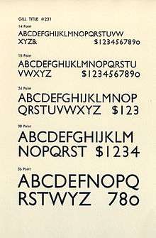
Morison and Gill had met with some tension within Monotype while developing Perpetua and while Morison was an enthusiastic backer of the project, Monotype's engineering manager and type designer F. H. Pierpont was deeply unconvinced, commenting that he could "see nothing in this design to recommend it and much that is objectionable".[28][29][30] (Pierpont was the creator of Monotype's previous mainstay sans-serif, a loose family now called Monotype Grotesque. It is a much less sculptured design inspired by German sans-serifs.[31]) Morison also intervened to insist that the letters "J" and "Q" be allowed to elegantly descend below the baseline, something not normal for titling typefaces which were often made to fill up the entire area of the metal type.[32] In the early days of its existence it was not always consistently simply called "Gill Sans", with other names such as "Gill Sans-serif", "Monotype Sans-Serif" (the latter two both used by Gill in some of his publications) or its order numbers (such as Series No. 231) sometimes used.[33][34]
Extensive material on the development of Gill Sans survives through records in Monotype's archives and in Gill's papers. While the capitals (which were prepared first) resemble Johnston quite closely, the archives document Gill (and the drawing office team at Monotype's works in Salfords, who developed a final precise design and spacing) grappling with the challenge of creating a viable humanist sans-serif lower-case and an italic, which Johnston did not have.[16][lower-alpha 6] Gill's first draft proposed many slanting cuts on the ends of ascenders and descenders, looking less like Johnston than the final draft did.[37][38] Early art for the italic looked very different, with swashes on many capitals.[7][12][16][lower-alpha 7] However, Gill did not use the calligraphic italic "g" of his serif designs Perpetua and Joanna, using instead a standard "double-story" "g" in italic.[7][23]

In the regular or roman style of Gill Sans, some letters were simplified from Johnston, with diamond dots becoming round and the lower-case "L" becoming a simple line, but the "a" became more complex with a curving tail in most versions and sizes.[16][39] In addition, the design was simply refined in general, for example by making the horizontals slightly narrower than verticals so that they do not appear unbalanced, a standard technique in font design which Johnston had not used.[7][26] The "R" with its widely splayed leg is Gill's preferred design, unlike that of Johnston; historian James Mosley has suggested that this may be inspired by an Italian Renaissance carving in the Victoria and Albert Museum in London.[40][41] Particular areas of discussion during the design process were the "a" (several versions and sizes in the hot metal era had a straight tail like Johnston's or a mildly curving tail) and the "b", "d," "p" and "q," where some versions (and sizes, since the same weight would not be identical at every size) had stroke ends visible and others did not.[14][16][18][lower-alpha 8] Rhatigan has commented that Monotype's archives contain "enough [material] for a book just about the "b," "d", "p", and "q" of Gill Sans."[16][43]
The titling capitals of Gill Sans were first unveiled at a printing conference in 1928; it was also shown in a specimen issued in the Fleuron magazine edited by Morison.[12][32] While initial response was partly appreciative, it was still considered dubious by some ultra-conservative printers who saw all sans-serif type as modern and unsound; one called it "typographical Bolshevism".[22][44] Sans-serifs were still regarded as vulgar and commercial by purists in this period: Johnston's pupil Graily Hewitt privately commented of them that:
In Johnston I have lost confidence. Despite all he did for us...he has undone too much by forsaking his standard of the Roman alphabet, giving the world, without safeguard or explanation, his block letters which disfigure our modern life. His prestige has obscured their vulgarity and commercialism.[45]
Nonetheless, Gill Sans rapidly became popular after its release.
.jpg)
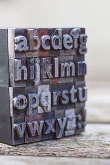
Gill Sans' technical production followed Monotype's standard method of the period. The characters were drawn on paper in large plan diagrams by the experienced drawing office team, led and trained by American engineer Frank Hinman Pierpont and Fritz Steltzer, both of whom Monotype had recruited from the German printing industry.[46] The drawing staff who executed the design was disproportionately female and in many cases recruited from the local area and the nearby Reigate art school. The diagrams were then used as a plan for machining metal punches by pantograph to stamp matrices.[46][47] It was Monotype's standard practice at the time to first engrave a limited number of characters and print proofs (some of which survive) from them to test overall balance of colour on the page, before completing the remaining characters.[16] Gill's biographer Malcolm Yorke has described Gill as "tactless" in his claims that the design was "as much as possible mathematically measurable ... as little reliance as possible should be placed on the sensibility of the draughtsmen and others concerned in its machine facture", when so much of the development process such as size-specific design and spacing was contributed by Monotype's largely anonymous but highly experienced drawing office team; Monotype executive Daniel Rhatigan has made similar comments.[16][22]
Reception
Gill Sans rapidly became very popular due to its design. Its success was greatly aided by Monotype's sophisticated marketing, and due to its practicality and availability for machine composition in a very wide range of sizes and weights.[48]
Despite the great popularity of Gill Sans, some reviews have been critical. Gill's colleague Robert Harling wrote in his 1976 anthology that the density of the basic weight made it unsuitable for extended passages of text, printing a passage in it as a demonstration, although it has been used successfully in body text for uses such as guides to countryside walks published by the LNER system.[23][49] William Addison Dwiggins described it and Futura as "fine in the capitals and bum in the lower-case" while proposing to create a more individualistic competitor, Metro, for Linotype around 1929.[50] Modern writers, including Stephen Coles and Ben Archer, have criticised it for failing to improve on Johnston and unevenness of colour, especially in the bolder weights (discussed below).[18][2]
Gill broached the topic of the similarity with Johnston in a variety of ways in his work and writings, writing to Johnston in 1933 to apologise for the typeface bearing his name and describing Johnston's work as being important and seminal.[45][51] However, in his Essay on Typography, he proposed that his version was "perhaps an improvement" and more "fool-proof" than Johnston's.[34] Johnston and Gill had drifted apart by the beginning of the 1920s, something Gill's groundbreaking biographer Fiona MacCarthy describes as partly due to the anti-Catholicism of Johnston's wife Greta.[52][53] Frank Pick, the Underground Electric Railways Company managing director who commissioned Johnston's typeface, privately thought Gill Sans "a rather close copy" of Johnston's work.[45]
Weights and styles

Following the initial success of Gill Sans, Monotype rapidly produced a wide variety of other variants.[16] In addition, Monotype sold moulds (matrices) for Gill Sans in very large sizes for their "Supercaster" type-casting equipment. Popular with advertisers, this allowed end-users to cast their own type at a very competitive price.[9][48] This made it a popular choice for posters. Gill's biographer Malcolm Yorke has described it as "the essence of clarity for public notices".[54]
Versions of Gill Sans exist in a wide range of styles such as condensed and shadowed weights.[16] An ultra-light version slightly lighter than the normal light style was also not digitally available until the 2015 Nova release.[16][55] Several shadowed designs are currently available, including a capitals-only regular shadowed design and a light-shadowed version with deep relief shadows. In the metal type era, a 'cameo ruled' design that placed white letters in boxes or against a stippled black background was available.[56][57][58] These can be used together with the regular, printing in different colours, to achieve a simple multicolour effect.[59] Some of the decorative versions may predominantly have been designed by the Monotype office, with Gill examining, critiquing and approving the designs sent to him by post.[60] Monotype would later also create a book weight, intermediate between the light and regular weight, suitable for body text.[61] The long series of extensions, redrawings and conversions into new formats of one of Monotype's most important designs (extending long beyond Gill's death) has left Gill Sans with a great range of alternative designs and releases.[16]
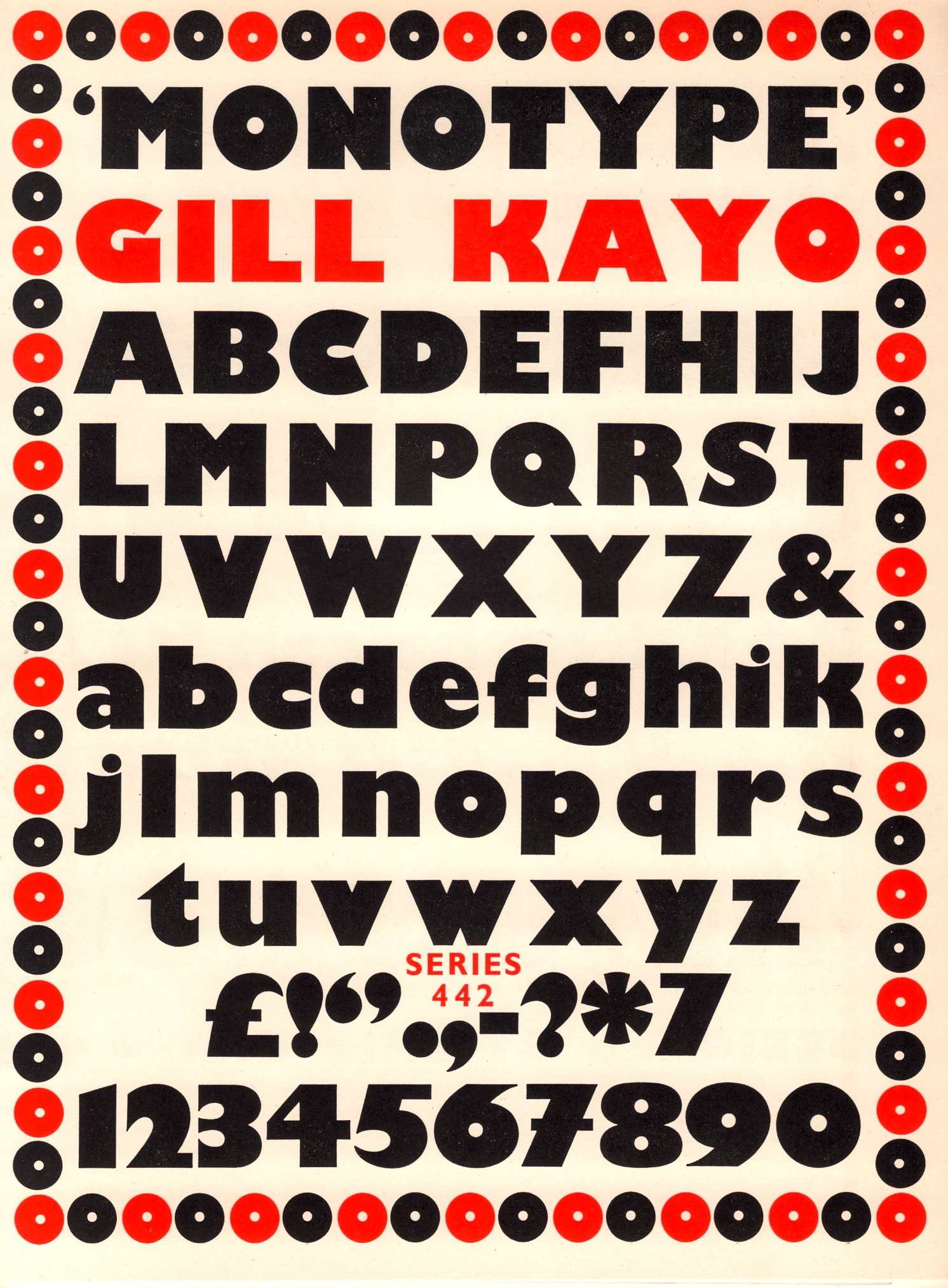
Gill Kayo

In 1936, Gill and Monotype released an extremely bold design named Kayo (from KO, or knockout, implying its solidity). This has often been branded as Gill Sans Ultra Bold, though in practice many letters vary considerably from the structure of Gill Sans.[16] It is available in regular and condensed widths.[62][63][64] Gill, who thought of the design as something of a novelty, considered naming it "Double Elefans".[65][66] Gill's colleague Robert Harling (who many years later would collect an anthology and assessment of Gill's lettering) described it as "dismal" and sarcastically commented that "typographical historians of 2000AD (which isn't, after all, so very far away) will find this odd outburst in Mr Gill's career, and will spend much time in attempting to track down this sad psychological state of his during 1936."[67][68] In his 1976 book on Gill's work, he described it as "the most horrendous and blackguardly of these display exploitations".[23] Some initial drawings of Kayo may have been prepared by Gill's son-in-law Denis Tegetmeier; it was particularly popular in graphic design of the 1970s and 80s.[60][69]
The bold weights of Gill Sans, including Kayo, are particularly controversial for design issues such as the eccentric design of the "i" and "j", and for their extreme boldness.[2][7] (Gill Sans' standard weight is, as already noted, already quite bold by modern standards.[2][22]) Gill argued in his Essay on Typography that the nineteenth-century tendency to make sans-serif typefaces attention-grabbingly bold was self-defeating, since the result was compromised legibility.[70] In the closing paragraph he ruefully noted how he had contributed to the genre:
There are now about as many different varieties of letters as there are different kinds of fools. I myself am responsible for designing five different sorts of sans-serif letters – each one thicker and fatter than the last because each advertisement has to try and shout down its neighbours.[71]
Alternate characters

To cater for the tastes and national printing styles of different countries, Monotype developed a set of alternate characters. These include Futura-inspired designs of "N", "M", "R", "a", "g", "t" and others, a four-terminal "W" in the French style, tighter versions of "R", an alternative "Q" with tail that looped upwards (similar to that on Century among others, and preferred by the LNER), oblique designs as opposed to the standard true italic, a more curving, true-italic "e" and several alternative numeral designs.[16][72][73][74][75] In particular, in the standard designs for Gill Sans the numeral "1", upper-case "i" and lower-case "L" are all a vertical line and look identical, so an alternate "1" with a serif was sold for number-heavy situations where this could otherwise cause confusion, such as on price-lists.[2] (Not all timetables used it: for example, the L.N.E.R. preferred the simple version.[73]) Some early versions of Gill Sans also had features later abandoned such as an unusual "7" matching the curve of the "9", a "5" with a different shape, and a lower-case letter-height "0".[34]
Gill was involved in the design of these alternates, and Monotype's archive preserves notes that he rethought the geometric alternates.[16][19] With the increasing popularity of Futura Gill Sans was not alone in being adapted: both Erbar and Dwiggins' Metro would undergo what historian Paul Shaw has called a "Futura-ectomy" to conform to taste.[76] Monotype would later add text figures to Gill Sans, numbers at the height of lower-case letters. Popular in design for body text, these are a traditional feature on serif fonts which Gill Sans did not originally have.[5]
Phototypesetting
Monotype offered Gill Sans on film in the phototypesetting period. The fonts released in 1961 included Light 362, Series 262, Bold 275, Extra Bold 321, Condensed 343, all of which were released in film matrix sets "A" (6–7 points) and "B" (8–22, 24 points).[16][77] Also after Gill's death, Monotype created versions for the Greek and Cyrillic alphabets.
Infant and rounded versions
Monotype created an 'infant' version of Gill Sans using single-storey "a" and "g", and other more distinguishable characters such as a rounded "y", seriffed "1" and lower-case "L" with a turn at the bottom.[14][78] Infant designs of fonts are often used in education and toys as the letters are thought to be more recognisable to children being based on handwriting, and are often produced to supplement popular fonts such as Akzidenz-Grotesk and Bembo.[79][80][81] Monotype also created a version with rounded stroke ends for John Lewis for use on toys.[82]
Digital releases

The digital releases of Gill Sans fall into several main phases: releases before 2005 (which includes most bundled "system" versions of Gill Sans), the 2005 Pro edition, and the 2015 Nova release which adds many alternate characters and is in part included with Windows 10. In general characteristics for common weights the designs are similar, but there are some changes: for example, in the book weight the 2005 release used circular ij dots but the 2015 release uses square designs, and the 2015 release simplifies some ligatures.[14][83][84] Digital Gill Sans also gained character sets not present in the metal type, including text figures and small capitals.[5]
Like all metal type revivals, reviving Gill Sans in digital form raises several decisions of interpretation, such as the issue of how to compensate for the ink spread that would have been seen in print at small sizes more than larger. As a result, printed Gill Sans and its digital facsimile may not always match. The digital release of Gill Sans, like many Monotype digitisations, has been criticised, in particular for excessively tight letter-spacing and lack of optical sizes: with only one design released that has to be used at any text size, it cannot replicate the subtlety of design and spacing of the metal type, for which every size was drawn differently. In the hot metal era the structure of the font varied by size as is normal for metal type, with wider spacing and other detail changes at smaller text sizes.[85] In the phototype period Monotype continued to offer two or three sizes of master, but all of this subtlety was lost on transfer to digital.[14][16][77] To replicate this, it is necessary to make manual adjustment to spacing to compensate for size changes, such as expanding the spacing and increasing the weight used at smaller sizes.[86][lower-alpha 9]
Former ATypI president John Berry commented of Gill Sans' modernised spacing that "both the regular weight and especially the light weight look much better when they're tracked loose."[88] In contrast, Walter Tracy wrote that he preferred the later spacing: "the metal version ... was spaced, I suspect, as if it were a serif face".[89]
Gill Sans Nova (2015)
A massive remastering and expansion, Gill Sans Nova adds many additional variants, including some of the previously undigitised inline versions and stylistic alternates and an ultra-light weight (once an option in metal type) which had been digitised for Grazia.[14][90][91][92] The basic set of Regular, Light and Bold weights is bundled with Windows 10. The fonts differ from Gill Sans MT in their adoption of the hooked 1 as default, while the regular weight is renamed 'Medium'. Monotype celebrated the release with a London exhibition on Gill's work, as they had in 1958 to mark the general release of Gill's serif design Joanna.[93][94][95][96] One addition was italic swash caps, which had been considered by Gill but never released.[14]
Usage

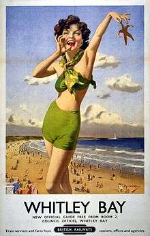
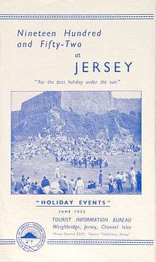
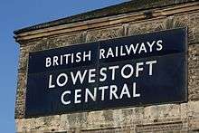
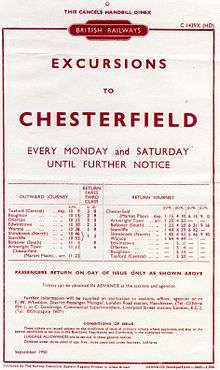
First unveiled in a single uppercase weight in 1928, Gill Sans achieved national prominence almost immediately, when it was chosen the following year to become the standard typeface for the LNER railway system, soon appearing on every facet of the company's identity, from metal locomotive nameplates and hand-painted station signage to printed restaurant car menus, timetables and advertising posters.[42][97][98] The LNER promoted their rebranding by offering Gill (who was fascinated with railway engines) a footplate ride on the Flying Scotsman express service; he also painted for it a signboard in the style of Gill Sans, which survives in the collection of the St Bride Library.[9][73][99]
When British Railways was created by nationalisation in 1948, Gill Sans was used in much of its printed output, very often in capitals-only settings for signage. Specially drawn variations were developed by the Railway Executive (part of the British Transport Commission) for signs in its manual for the use of signpainters painting large signs by hand. Other users included Penguin Books' iconic paperback jacket designs from 1935 and British official mapping agency Ordnance Survey.[100] It was also used by London Transport for documents which could not be practically set in Johnston.[101] Paul Shaw, a historian of printing, has described it as a key element of the 'Modernist classical' style from the 1930s to the 1950s, that promoted clean, spare design, often with all-capitals and centred setting of headings.[102]
Gill Sans remains popular, although a trend away from it towards grotesque and neo-grotesque typefaces took place around the 1950s and 1960s under the influence of continental and American design.[103][104] Typefaces that became popular around this time included original early "grotesque" sans-serifs, as well as new and more elegant designs in the same style such as Helvetica and Univers. Mosley has commented that in 1960 "orders unexpectedly revived" for the old Monotype Grotesque design: "[it] represents, even more evocatively than Univers, the fresh revolutionary breeze that began to blow through typography in the early sixties."[105] He added in 2007 "its rather clumsy design seems to have been one of the chief attractions to iconoclastic designers tired of the...prettiness of Gill Sans".[31][105] As an example of this trend, Jock Kinneir and Margaret Calvert's corporate rebranding of BR as British Rail in 1965 introduced Helvetica and Univers for printed matter and the custom but very similar Rail Alphabet for signage, and abandoned the classical, all caps signage style with which Gill Sans is often associated. Kinneir and Calvert's road signage redesign used a similar approach.[106][107][108] Linotype and its designer Hermann Zapf, who had begun development on a planned Gill Sans competitor in 1955, first considered redrawing some letters to make it more like these fonts before abandoning the design project (now named "Magnus") around 1962-3.[109][110]
An additional development which reduced Gill Sans' dominance was the arrival of phototypesetting, which allowed typefaces to be printed from photographs on film and (especially in display use – hot metal continued for some body text setting for longer) massively increased the range of typefaces that could cheaply be used. Dry transfers like Letraset had a similar effect for smaller projects; their sans-serif Compacta and Stephenson Blake's Impact exemplified the design trends of the period by choosing dense, industrial designs.[111][112][113][114] Of the period from the 1930s to 1950s, when he was growing up, James Mosley would later write:
The Monotype classics dominated the typographical landscape...in Britain, at any rate, they were so ubiquitous that, while their excellent quality was undeniable, it was possible to be bored by them and to begin to rebel against the bland good taste that they represented. In fact we were already aware by 1960 that they might not be around to bore us for too long. The death of metal type...seemed at last to be happening.[115][lower-alpha 10]
While extremely popular in Britain, and to a lesser extent in European printing, Gill Sans did not achieve popularity with American printers in the hot metal era, with most preferring gothic designs like Franklin Gothic and geometric designs like Futura and Monotype's own Twentieth Century.[3] Monotype's competitor Linotype was dominant in the American market at the time, which may have been a factor in this.[7][9] The shadow-effect capitals-only fonts appear in some US specimen brochures that otherwise excluded it in this period.[117][118] Gill Sans therefore particularly achieved worldwide popularity after the close of the metal type era and in the phototypesetting and digital era, when it became a system font on Macintosh computers and Microsoft Office.[119] One use of Gill's work in the United States in this early period, however, was a custom wordmark and logo made by Gill for Poetry magazine in 1930 based on Gill Sans. Its editor Harriet Monroe had seen Gill's work in London.[120]
.JPG)
The BBC adopted the typeface as its corporate typeface in 1997 for many but not all purposes, including on its logo.[121] Explaining the change, designer Martin Lambie-Nairn said that "by choosing a typeface that has stood the test of time, we avoid the trap of going down a modish route that might look outdated in several years' time."[122] The BBC had an earlier association with Gill, who created some sculptures on Broadcasting House. Other more recent British organisations using Gill Sans have included Railtrack (and initially its successor Network Rail), John Lewis and the Church of England, which adopted Gill Sans as the typeface for the definitive Common Worship family of service books published from 2000.[123][124][125] Notable non-British modern businesses using Gill Sans include United Colours of Benetton (which commissioned a custom variant), Tommy Hilfiger and Saab Automobile.[126][127][128][129] British rock band Bloc Party has used Gill Sans in its logo.[130] AT&T used it until 2006, before changing it to Clearview after feeling that it was too in keeping with market research that people found the company "monolithic."[131] Edward Tufte, the information design theorist, uses Gill Sans on his website and in some of his published works.[132][133] The Wikimedia Foundation uses Gill Sans on its wordmark.[134]
Similar fonts
Early competitors

An immediate metal type competitor to Gill Sans was Granby from Stephenson Blake; it was based on Gill Sans and also Johnston.[18][45][135] Stephenson Blake had cut the original metal type for Johnston, making them familiar with its design and perhaps explaining its Johnston-influenced diamond-dot tittles.[18][45]
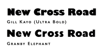
Granby was a large family with condensed and inline styles. It also included a "Granby Elephant" weight influenced by Gill Kayo.[136]
Another similar but more eccentric design was created by Johnston's student Harold Curwen for the use of his family company, the Curwen Press of Plaistow. Named "Curwen Sans" or "Curwen Modern", it has many similarities to Johnston also, and was occasionally used by London Transport in work printed by the Curwen Press.[137][138][139] Curwen described it as based on his time studying with Johnston in the 1900s, although it was not cut into metal until 1928, around the same time as Gill Sans was released.[45] Jan Tschichold, who would later make extensive use of Gill Sans while designing books for Penguin, created a similar design for an early phototype machine, which was at the time little-used.[140][141] As described above, Linotype began work in 1955 on a Gill Sans competitor, intended to be named 'Magnus'.[lower-alpha 11] Designed by the distinguished German type designer Hermann Zapf with input from British Linotype manager Walter Tracy, the design was ultimately abandoned by 1963 for reasons of lack of manufacturing capacity and changing tastes, although it progressed as far as test proofs.[109][7]
Besides similar fonts, many signs and objects made in Britain during the period of Gill Sans' dominance, such as the famous Keep Calm and Carry On poster, received hand-painted or custom lettering similar to Gill Sans.[142][143] Fighter Command during the war used a standard set of letters similar to it and Matthew Carter, later a prominent font designer, recalled in a 2005 profile playing with linoleum block letters in the style cut by his mother during the Blitz.[144][145]
Later and digital-only designs
The category of humanist sans-serif typefaces, which Gill Sans helped to define, saw great attention during the 1980s and 1990s, especially as a reaction against the overwhelming popularity of Helvetica and Univers in the 1960s and 1970s.[18] It can be identified by a tendency to use 'double-storey' as and gs in the roman and "single-storey" as in italic, like serif fonts.
Modern sans-serif designs inspired by Gill often adapt the concept by creating a design better proportioned and spaced for body text, a wider and more homogeneous range of weights, something easier since the arrival of the computer due to the use of multiple master or interpolated font design, or more irregular and hand-drawn in style.[146][18] Jeremy Tankard's Bliss and Volker Küster's Today Sans are modern variations; Tankard commented on the genre's eclipse that his aim was to create "the first commercial typeface with an English feel since Gill Sans."[147][148][18] Rowton Sans is inspired by Gill but has a nearly upright italic, similar to that used by Gill in his serif font Joanna.[149][150] More distantly, Arthur Vanson's Chesham Sans is inspired by the British tradition of sans-serif signpainting, with many similarities to Gill's work.[151] Bitstream's Humanist 521 was an unofficial digitisation, to which its Russian licensee ParaType added a Cyrillic version in 1997.[152][153] The companies SoftMaker and Fontsite also released Gill Sans digitisations under different names including 'Chantilly', 'Gibson' and others.[154][155]
More loosely, Syntax by Hans Eduard Meier is similar in some ways. Released in 1968, it was intended to be a more dynamic, handwriting-influenced sans-serif form.[7][156] Tschichold, whose serif font Sabon had influenced it, described it as "very easy to read, well designed: better than the related Gill Sans."[157] Its italic is, however, more of an oblique than Gill's.[5] Hypatia Sans, designed by Thomas Phinney and released by Adobe, was intended to be a more characterful humanist sans design.[158][159]
Font superfamilies
A logical extension of the humanist sans-serif concept is the font superfamily: a serif font and a matching humanist sans-serif with similar letterforms. Martin Majoor's FF Scala Sans is a popular example of this influenced by Gill's work, as are Charlotte Sans and Serif by Letraset and Mr and Mrs Eaves by Zuzana Licko, which are based on Baskerville.[5][7][160][161][162] Indeed, Monotype themselves released Joanna Sans in 2015, as a screen-optimised sans-serif font intended to complement (but not exactly match) Gill's serif design Joanna. It is intended for use at smaller sizes than Gill Sans.[163][164]
Legal aspects


Typeface designs are in many countries not copyrightable, while in others such as the United Kingdom the design is out of copyright with 70 years passed since Gill's death in 1940, by which time the metal type family was essentially completed.[16][165][166][167] This makes it legally permissible to create alternative digitised versions of Gill Sans (although not necessarily of later Monotype additions to the font such as the book weight and Euro sign). However, the name "Gill Sans" remains a Monotype trademark (no. 1340167 in the US) and therefore is not eligible to be used to name any derivative font.[168][169]
No complete, direct open-source Gill Sans clone has yet been released. One of the most extensive is Gillius, a derivative by the Arkandis Digital Foundry project and designer Hirwen Harendal, which includes bold, italic, condensed and condensed bold styles. It is not a pure clone, but rather partly created by modifying Bitstream Vera, and adds influences from geometric fonts particularly visible in the design of the "w".[170] K22, a foundry in Quezon City operated by the designer "Toto G", has released two Gill Sans shadowed variants as K22 EricGill Shadow (digitising the Gill Sans Shadow 338 design) and K22 EricGill Shadow Line, an inline variant, for free for "personal, private and non-commercial purposes" and for sale for commercial use.[171][172] A direct clone of the medium weight, Sans Guilt, was released by Brussels open source design group OSP in 2011, but it contains several obvious glitches such as misaligned "w" and "x" characters.[173] As a pioneering example of the humanist sans-serif style, many other designs are influenced by Gill Sans to some extent.
Notes
- ↑ Mosley speculates that this may have been Gill's idea even in Johnston, since it does not resemble Johnston's calligraphy, although there are naturally many past precedents for the design in signpainting and type.[9]
- ↑ A publicity writer at Hoefler & Frere-Jones wrote of Gill and Johnston's work that "Because these designs were rooted in classical form, and their designers dedicated to traditional crafts, the new style became known as the Humanist sans serif. Nonetheless, these designs were often products more of the machine than the hand, chilly and austere designs shaped by unbending rules, whose occasional moments of whimsy were so out of place as to feel volatile and disquieting."[10]
- ↑ Morison had argued for the theory that an oblique made a better match than an italic to an upright font through offering less of a contrast to it. This contention had been a major part of the protracted and tense development of the Perpetua project, begun before Gill Sans but released second, since Monotype management scrapped the oblique for a more normal italic.[13]
- ↑ This is necessary since the slanting cut would unbalance the letter if the stroke weights were lighter.
- ↑ The A&NS letters no longer survive and may not have been a finished project – they are known from a letter from Gill to his former assistant Desmond Chute. Gill's friend John Dreyfus also remembered Gill doing some work on sans-serif letters that he thought were a project for Cunard.[23] The sign-painter's alphabet had very small wedge serifs, similar to the capitals of Copperplate Gothic and similar designs. This style was occasionally used at the time. Johnston had considered it as a possible structure for the Underground alphabet and it was used on some variants of Johnston by the Underground with the involvement of Johnston's pupil Percy Delf Smith.[24]
- ↑ Some revivals of Johnston, such as a project by Berthold Wolpe, the ITC digitisation and that used by Transport for London have attempted to synthesise an italic or oblique for Johnston, but Johnston never created one.[35] P22's revival declined to add one.[36]
- ↑ This resulted in a design somewhat similar to Goudy Sans of a few years later. The development of Johnston had gone through a similar paring-down process a decade earlier, in which the idea of incorporating many calligraphy-influenced glyphs, like a capital-form "q" in the lower-case, was considered then abandoned.[7]
- ↑ An accessible specimen showing this is the Monotype Recorder article on the LNER timetable, which prints the sizes and weights the LNER favoured: stroke ends are visible on the 18 pt medium on "d," "p" and "q," but not at 10 pt.[42]
- ↑ Monotype's early digital releases of their classic typefaces, some unlike Gill Sans never fully revisited, were widely seen as erratic: Jonathan Hoefler commented sarcastically that "Gill Sans retired the trophy for 'Worst Digital Adaptation of an Okay Foundry Type', with Bembo & Centaur close behind."[87]
- ↑ A major part of Mosley's career in the period, indeed, was accumulating for St Bride Library metal type equipment from companies disposing of it.[116]
- ↑ Britannia was also considered, but abandoned due to Stephenson Blake's pre-existing Britannic design.
References
- ↑ "Promotional Poster, 1928". Red List. Monotype.
- 1 2 3 4 5 Archer, Ben. "Eric Gill got it wrong; a re-evaluation of Gill Sans". Typotheque. Retrieved 7 January 2011.
- 1 2 Tracy, Walter (January 2003). Letters of Credit: A View of Type Design. D.R. Godine. pp. 87–98. ISBN 978-1-56792-240-0.
- ↑ Kupferschmid, Indra. "Multi-axes type families". kupferschrift. Retrieved 8 December 2014.
- 1 2 3 4 5 Majoor, Martin. "My Type Design Philosophy". Typotheque. Retrieved 12 November 2015.
- ↑ Nash, John. "In Defence of the Roman Letter" (PDF). Journal of the Edward Johnston Foundation. Retrieved 13 October 2016.
- 1 2 3 4 5 6 7 8 9 10 11 12 13 14 Tam, Keith (2002). Calligraphic tendencies in the development of sanserif types in the twentieth century (PDF). Reading: University of Reading (MA thesis).
- ↑ Johnston, Edward (1906). Writing & Illuminating & Lettering. Macmillan. pp. 268–269, 384, 391.
- 1 2 3 4 5 Mosley, James (November 10, 2015). Lecture on Gill's work (Speech). 'Me & Mr Gill' talk. Old Truman Brewery, London.
- ↑ "Ideal Sans". Hoefler & Frere-Jones. Retrieved 26 December 2015.
- ↑ Rabinowitz, Tova (1 January 2015). Exploring Typography. Cengage Learning. pp. 127–9. ISBN 978-1-305-46481-0.
- 1 2 3 4 "Fifty Years of Typecutting" (PDF). Monotype Recorder. 39 (2): 11, 21. 1950. Retrieved 12 July 2015.
- ↑ Allan Haley (15 September 1992). Typographic Milestones. John Wiley & Sons. pp. 91–98. ISBN 978-0-471-28894-7.
- 1 2 3 4 5 6 7 Rhatigan, Dan (November 10, 2015). Lecture on the history of Gill Sans (Speech). 'Me & Mr Gill' talk. Old Truman Brewery, London.
- ↑ Rhatigan, Dan. "All about Workflow". Eye Magazine. Retrieved 15 February 2015.
- 1 2 3 4 5 6 7 8 9 10 11 12 13 14 15 16 17 18 Rhatigan, Daniel (September 2014). "Gill Sans after Gill" (PDF). Forum (28): 3–7. Retrieved 26 December 2015.
- ↑ Budrick, Callie; Biemann, Emil (1961). "Subtleties of the Univers". Print. Retrieved 22 January 2016.
- 1 2 3 4 5 6 7 8 Coles, Stephen. "Questioning Gill Sans". Typographica. Retrieved 18 December 2015.
- 1 2 3 4 5 "Eric Gill" (PDF). Monotype Recorder. 41 (3). 1958. Retrieved 16 September 2015.
- ↑ MacCarthy, Fiona. Eric Gill. p. 300. ISBN 978-0-571-26582-4.
- ↑ Paul Townsend (20 October 2009). "Douglas Cleverdon Book Publishers". Flickr.com. Retrieved 7 January 2011.
- 1 2 3 4 Yorke, Malcolm (2000). Eric Gill, man of flesh and spirit. London: Tauris Parke Paperbacks. pp. 258–261. ISBN 978-1-86064-584-6.
- 1 2 3 4 Harling, Robert (1975). The Letter Forms and Type Designs of Eric Gill ([1st U.S. ed.]. ed.). Westerham, Kent: Published by Eva Svensson, and printed by the Westerham Press. pp. 36–48. ISBN 0-903696-04-5.
- 1 2 Howes, Justin (2000). Johnston's Underground Type. Harrow Weald, Middlesex: Capital Transport. pp. 8, 20–21. ISBN 1-85414-231-3.
- ↑ Shewring, Walter, ed. (1948). The Letters of Eric Gill. Devin-Adair. pp. 435–8.
As perhaps you know, I was a pupil of Edward Johnston and was living almost next door to him when he was designing the LPTB sans-serif. It was a revolutionary thing and as you know, it redeemed the whole business of sans-serif from its nineteenth-century corruption. It was not until 1927 that I was asked by the Monotype Corporation to do a sans-serif for them.
- 1 2 Loxley, Simon (2005). "Chapter 9: Going Underground: Edward Johnston's Letters for London". Type: the secret history of letters. London: I. B. Tauris. pp. 109–121. ISBN 978-1-84511-028-4. Retrieved 26 December 2015.
- ↑ Simon Garfield (21 October 2010). Just My Type: A Book About Fonts. Profile Books. pp. 114–124. ISBN 1-84765-292-1.
- ↑ Mosley, James. "Eric Gill and the Cockerel Press". Upper & Lower Case. International Typeface Corporation. Retrieved 7 October 2016.
- ↑ Mosley, James. "Eric Gill's Perpetua Type". Fine Print.
- ↑ Mosley, James (1989). "Eric Gill's Perpetua Type". In Ginger, E.M. Fine Print on Type. Lund Humphries. pp. 54–58.
- 1 2 Mosley, James. "The Nymph and the Grot, an update". Type Foundry (blog). Retrieved 6 March 2016.
- 1 2 Barker, Nicolas (1972). Stanley Morison. London: Macmillan. pp. 218–286.
- ↑ Gill, Eric (1940). Eric Gill: an Autobiography. Lund Humphries. p. 220.
- 1 2 3 Gill, Eric. An Essay on Typography. p. 46.
- ↑ "ITC Johnston". fonts.com. Monotype. Retrieved 11 July 2015.
- ↑ "P22 Underground pdf specimen". P22. Retrieved 11 July 2015.
- ↑ "Gill Sans working drawing". St. Bride's Library. Retrieved 11 January 2016.
- ↑ Walters, John; Weinzierl, Terrance. "Terrance Weinzierl: Joanna Sans style and legacy". Monotype. Retrieved 25 April 2016.
- ↑ Baines, Phil. "Ditchling Museum of Art & Craft". Fonts In Use. Retrieved 15 April 2016.
- ↑ Mosley, James. "Eric Gill's R: the Italian connection". Type Foundry. Retrieved 11 November 2015.
- ↑ "Monument to Marchese Spinetta Malaspina". Victoria & Albert Museum. Retrieved 11 November 2015.
- 1 2 Robinson, Edwin (1939). "Preparing a railway timetable" (PDF). Monotype Recorder. 38 (1): 14–17, 24–26. Retrieved 16 September 2015.
- ↑ Rhatigan, Dan. "Twitter post". Twitter. Twitter/Monotype. Retrieved 3 May 2015.
- ↑ Ashworth, Mikey. "Sample page of Eric Gill's "Gill Sans" from The Fleuron, 1928". Flickr. Retrieved 1 May 2016.
- 1 2 3 4 5 6 Howes, Justin (2000). Johnston's Underground Type. Harrow Weald, Middlesex: Capital Transport. pp. 73–78. ISBN 1-85414-231-3.
- 1 2 Rhatigan, Dan. "Time and Times again". Monotype. Retrieved 28 July 2015.
- ↑ Morison, Stanley. "Changing the Times". Eye. Retrieved 28 July 2015.
- 1 2 Badaracco, Claire (1991). "Innovative Industrial Design and Modern Public Culture: The Monotype Corporation, 1922–1932" (PDF). Business & Economic History. Business History Conference. 20 (second series): 226–233. Retrieved 19 December 2015.
- ↑ ""Rambles in …" series, London and North Eastern Railway". Fonts in Use. Retrieved 17 September 2016.
- ↑ Shaw, Paul. "William Addison Dwiggins: Jack of All Trades, Master of More than One". Linotype. Retrieved 26 December 2015.
- ↑ Derrick, Michael. "Book of the Week: The Ditchling Community". The Tablet. Retrieved 24 August 2016.
- ↑ MacCarthy, Fiona (1990). Eric Gill. London: Faber. p. 141. ISBN 0-571-14302-4.
- ↑ Loxley, Simon. Type. pp. 161–3. ISBN 978-0-85773-017-6.
- ↑ Yorke, Malcolm (7 July 2000). Eric Gill: Man of Flesh and Spirit. Tauris Parke Paperbacks. p. 249. ISBN 978-1-86064-584-6.
- ↑ Rhatigan, Dan. "Gill Sans Extra Light". Instagram. Monotype via Instagram. Retrieved 3 May 2015.
- ↑ Fuga, Giangiorgio. "Riscatype 028029: Gill Sans specimen booklet 1938".
- ↑ Fuga, Giangiorgio. "Riscatype 0030: Gill Sans specimen book 1938".
- ↑ "Gill Sans specimen book". Flickr photo of Gill Sans specimen book. Monotype. Retrieved 3 May 2015.
- ↑ "Gill Sans Shadow colours". Flickr. Monotype. Retrieved 18 December 2015.
- 1 2 Morris, Sallie (November 6, 2015). Lecture on Gill's typefaces (Speech). 'Me & Mr Gill' talk. Old Truman Brewery, London.
- ↑ "The Monotype Chronicles: 1992–1996". Monotype. Retrieved 6 March 2016.
- ↑ Devroye, Luc. "Kayo Poster". Luc Devroye. Monotype (original design). Retrieved 2 January 2015.
- ↑ Pitt, John. "Kayo – also known as Gill Sans Ultra Bold". Stone Letters. Retrieved 2 January 2015.
- ↑ Coles, Stephen. "Gill Kayo". Fonts in Use. Retrieved 2 January 2015.
- ↑ "Signature Typeface". Eye. Retrieved 22 July 2015.
- ↑ Yorke, Malcolm (7 July 2000). Eric Gill: Man of Flesh and Spirit. Tauris Parke Paperbacks. p. 260. ISBN 978-1-86064-584-6.
- ↑ "Kayo – also known as Gill Sans Ultra Bold". Stone Letters. Retrieved 5 November 2015.
- ↑ Harling, Robert (1937). The Penrose Annual: Review of Graphic Arts, Volume 39 (1937). Lund Humphries.
- ↑ "Fonts in Use: Gill Kayo". Fonts In Use. Retrieved 11 November 2015.
- ↑ Gill, Eric (2007). "2: Lettering". An essay on typography. Boston: David R. Godine. pp. 40–47. ISBN 978-0-87923-950-3.
Mere weight and heaviness of letter ceases to be effective in assisting the comprehension of the reader when every poster plays the same shouting game ... a return to mere legibility seems desirable even if the effect be less striking.
- ↑ Gill, Eric (2007). "9". An essay on typography. Boston: David R. Godine. p. 132. ISBN 978-0-87923-950-3.
- 1 2 Specimen Book of Monotype Printing Types. UK: Monotype. Retrieved 5 November 2015.
- 1 2 3 Robinson, Edwin (1939). "Preparing a Railway Timetable" (PDF). Monotype Recorder. 38 (1): 24. Retrieved 12 July 2015.
- ↑ Coles, Stephen. "Royal System by Paul Cadovius logo and advertising". Fonts In Use. Retrieved 3 April 2016.
- ↑ Coles, Stephen. "Gill Sans Alts 362, 262, 275". Flickr. Retrieved 3 April 2016.
- ↑ Shaw, Paul. "From the Archives: Typographic Sanity". Paul Shaw Letter Design. Retrieved 26 December 2015.
- 1 2 "The design of faces for 'Monophoto' film matrices" (PDF). Monotype Recorder. 42 (2): 15–23. 1961. Retrieved 3 January 2016.
- ↑ "Gill Sans Infant". Fonts.com. Monotype. Retrieved 1 May 2016.
- ↑ Walker, Sue; Reynolds, Linda (1 January 2003). "Serifs, sans serifs and infant characters in children's reading books". Information Design Journal. 11 (3): 106–122. doi:10.1075/idj.11.2.04wal.
- ↑ "Akzidenz Grotesk Schoolbook". Berthold. Retrieved 1 May 2016.
- ↑ "Bembo Infant". MyFonts. Retrieved 1 May 2016.
- ↑ Coles, Stephen; Rhatigan, Daniel. "John Lewis Toys". Fonts In Use. Retrieved 1 May 2016.
- ↑ "Gill Sans Pro". Fonts.com. Retrieved 7 January 2011.
- ↑ Shaw, Paul. "Nova: a new Gill Sans for the DIY era". Design Observer. Retrieved 11 February 2016.
- ↑ Frere-Jones, Tobias. "MicroPlus". Frere-Jones Type. Retrieved 1 December 2015.
- ↑ Sowersby, Kris. "Playing Favourites, Part Two.". Klim Type Foundry. Retrieved 16 February 2016.
I cannot stand any of the digital versions, they have something fundamentally wrong with them that I just can't put my finger on.
- ↑ Hoefler, Jonathan. "Twitter post". Hoefler & Frere-Jones. Retrieved 14 February 2016.
- ↑ Berry, John. "dot-font". Creative Pro. Retrieved 22 July 2015.
- ↑ Tracy, Walter (January 2003). Letters of Credit: A View of Type Design. D. R. Godine. p. 71. ISBN 978-1-56792-240-0.
- ↑ "Gill Sans Nova". Monotype. Retrieved 4 November 2015.
- ↑ Walters, John. "George Ryan: The Gill Sans two-step". Monotype. Retrieved 25 April 2016.
- ↑ Hallmundur, Aegir. "Eric Gill Series". Typographica. Retrieved 10 June 2016.
- ↑ Steven, Rachael. "Monotype releases new Eric Gill collection". Creative Review. Retrieved 5 November 2015.
- ↑ Brownlee, John. "How Monotype Remastered Eric Gill For The 21st Century". Fast Co Design. Retrieved 5 November 2015.
- ↑ Bennett, Neil. "Why we're not joining in the celebration of typographer Eric Gill". Digital Arts. Retrieved 5 November 2015.
- ↑ "Monotype remasters classic Gill typeface for digital age". More About Advertising. Retrieved 5 November 2015.
- 1 2 Skelton, Stephen. "Gill Sans" (PDF). New Writing. University of East Anglia. Retrieved 3 May 2015.
- ↑ Cole, Beverley; Durack, Richard (1992). Railway Posters 1923–1947: From the Collection of the National Railway Museum, York. Laurence King Publishing. pp. 15–23. ISBN 978-1-85669-014-0.
- ↑ "East Coast Joys: Tom Purvis and the LNER".
- ↑ Powell, Katie. "Ordnance Survey: not just paper maps". Creative Review. Retrieved 21 December 2015.
- ↑ "Eiichi Kono on New Johnston". Creative Review. Retrieved 25 April 2016.
- ↑ Shaw, Paul. "The Univers of Helvetica: A Tale of Two Typefaces". Print. Retrieved 26 June 2016.
- ↑ Margolin, Victor (15 September 1989). Design Discourse: History, Theory, Criticism. University of Chicago Press. p. 136. ISBN 978-0-226-50514-5.
- ↑ Tracy, Walter (January 2003). Letters of Credit: A View of Type Design. D.R. Godine. p. 39. ISBN 978-1-56792-240-0.
- 1 2 Mosley, James (1999). The Nymph and the Grot. London. p. 9.
- ↑ Christopher, Elizabeth (3 September 2012). Communication Across Cultures. Palgrave Macmillan. p. 65. ISBN 978-1-137-01097-1.
- ↑ Job, Nick. "Double Arrow blog". Double Arrow. Retrieved 21 December 2015.
- ↑ Calvert, Margaret. "New Transport". A2-TYPE. Retrieved 2 May 2016.
- 1 2 Nikolaus Julius Weichselbaumer (14 December 2015). Der Typograph Hermann Zapf: Eine Werkbiographie. Walter de Gruyter GmbH & Co KG. pp. 170–3. ISBN 978-3-11-041505-6.
- ↑ Hermann Zapf: ein Arbeitsbericht. Hamburg: Maximilian-Gesellschaft. 1984. p. 74. ISBN 9783921743287.
- ↑ "ITC Compacta". fonts.com. Retrieved 23 August 2015.
- ↑ Dempsey, Mike. "Schmalfette: Tall, dark and handsome". Graphic Journey. Retrieved 22 August 2015.
- ↑ Dempsey, Mike. "Frederick Lambert: Graphic Design Britain". Design Journey. Retrieved 22 August 2015.
- ↑ Lee, Geoffrey. "Comments on Typophile thread". Typophile (archived). Archived from the original on 26 August 2005. Retrieved 27 October 2014.
- ↑ Mosley, James (2003). "Reviving the Classics: Matthew Carter and the Interpretation of Historical Models". In Mosley, James; Re, Margaret; Drucker, Johanna; Carter, Matthew. Typographically Speaking: The Art of Matthew Carter. Princeton Architectural Press. pp. 31–34. ISBN 9781568984278. Retrieved 30 January 2016.
- ↑ Barnes, Paul. "James Mosley: a life in objects". Eye magazine. Retrieved 11 December 2015.
- ↑ Barco Type Founders specimen brochure. Northlake, IL: Barco Type Founders. pp. 24, 31. Retrieved 19 August 2015.
- ↑ Acme Type Specimen and Revised Price List (Catalog No. 6) (6 ed.). Chicago: Acme Type Foundry. 1947. p. 41. Retrieved 19 August 2015.
- ↑ "Gill Sans MT in Microsoft products". Microsoft.com. Retrieved 7 January 2011.
- ↑ Gehl, Paul. "100 Years of Poetry: Designing the Magazine, 1912–2012". Poetry (magazine). Poetry Magazine Foundation. Retrieved 22 April 2016.
- ↑ "BBC Commissioning: Credits and branding". BBC. Retrieved 9 May 2016.
- ↑ Walker, Hayden. "BBC Logo: 1997–present". TV Ark. Retrieved 26 December 2015.
- ↑ Hitner, David. "StudioSmall on its ten-year partnership with fashion designer Margaret Howell". Creative Review. Retrieved 22 April 2016.
- ↑ Northover, Jim. "Letters that sell: a typographic history of UK department store John Lewis". Eye magazine. Retrieved 22 April 2016.
- ↑ Coles, Stephen. "Church of England Common Worship Prayer Book, 2000". Fonts In Use. Retrieved 26 December 2015.
- ↑ Coles, Stephen. "Tommy Hilfiger launch campaign and identity". Fonts In Use. Retrieved 9 May 2016.
- ↑ "Speak Up Archive: Saab or Dodgeball?". Underconsideration.com. Retrieved 7 January 2011.
- ↑ Challand, Skylar. "Know Your Type: Gill Sans". IDSGN. Retrieved 21 December 2015.
- ↑ Kyselý, Radek. "Benetton identity redesign". Fonts In Use. Retrieved 1 June 2016.
Pentagram's redesign of Benetton's visual identity system...includes a custom typeface based on Gill Sans, which was used previously by the brand. Benetton Sans was designed by Joe Finocchiaro. Key differences from Gill Sans include the normalized proportions of the caps, a straight-leg ‘R', and more contemporary shapes for ‘j, s, y'.
- ↑ "Twitter post". Twitter. Monotype. Retrieved 1 May 2016.
- ↑ Yaffa, Joshua. "The Road to Clarity". New York Times. Retrieved 6 February 2016.
- ↑ "Edward Tufte forum: What's your font?".
- ↑ "Edward Tufte forum: Tufte book fonts".
- ↑ "Visual identity guidelines". Wikimedia Foundation. Retrieved 21 April 2016.
The font Gill Sans is used to construct both the title and the descriptor of the mark.
- ↑ Millington, Roy (2002). Stephenson Blake: The Last of the Old English Typefounders. Oak Knoll Press. pp. 170–175. ISBN 1-58456-086-X.
- ↑ Jackaman, Steve; Muir, Ashley. "Granby Elephant RRF". MyFonts. Red Rooster Fonts. Retrieved 15 February 2016.
- ↑ "Typefaces in use at the Curwen Press, 1952". Curwen Press. 1952. Retrieved 18 December 2015.
- ↑ "Curwen Modern". Flickr. Curwen Press. Retrieved 19 December 2015.
- ↑ Curwen Sans type specimen. An Endless Supply. 2012. ISBN 978-0-9570614-1-5.
- ↑ Hollis, Richard (2006). Swiss graphic design: the origins and growth of an international style, 1920–1965. London: Laurence King. p. 199. ISBN 978-1-85669-487-2.
- ↑ "Tschichold". MyFonts. Presence Typo. Retrieved 8 November 2015.
- ↑ Bustillos, Maria. "The Vicious Trademark Battle Over 'Keep Calm and Carry On'". The Awl. Retrieved 15 February 2016.
- ↑ Hatherley, Owen. "Keep Calm and Carry On – the sinister message behind the slogan that seduced the nation". The Guardian. Retrieved 15 February 2016.
- ↑ Howes, Justin (2000). Johnston's Underground Type. Harrow Weald, Middlesex: Capital Transport. pp. 71–72. ISBN 1-85414-231-3.
- ↑ Wilkinson, Alex. "Man of Letters". New Yorker. Retrieved 15 February 2016.
Carter, his mother, and his younger brother were able to take little with them, and no toys that Carter remembers.To teach him to read, his mother cut an alphabet for him from linoleum. "Gill Sans," he says, "a popular typeface of the time."
- ↑ Butterick, Matthew. "Alternatives to Gill Sans". Typography for Lawyers (archived). Retrieved 7 August 2016.
Gill Sans lit the way for other sans serif fonts that combine geometric precision with looser hand-drawn features, like Mr Eaves, FF Scala Sans, and FF Quadraat Sans.
- ↑ Tankard, Jeremy. "Bliss Pro". Jeremy Tankard Typography. Retrieved 18 December 2015.
- ↑ Neil Macmillan (2006). An A-Z of Type Designers. Laurence King Publishing. pp. 26–7. ISBN 978-1-85669-395-0.
- ↑ Coles, Stephen. "New Arrivals – December 2014". Identifont. Retrieved 26 December 2015.
- ↑ "Rowton Sans". MyFonts. FontYou. Retrieved 8 November 2015.
- ↑ Vanson, Arthur. "LHF Chesham Sans". Letterhead Fonts.
- ↑ "Humanist 521". MyFonts. ParaType. Retrieved 22 April 2016.
- ↑ "Humanist 521". MyFonts. Bitstream. Retrieved 22 April 2016.
- ↑ "Chantilly". FontSpring. Retrieved 3 May 2015.
- ↑ "Chantilly Serial". MyFonts. Monotype. Retrieved 3 May 2015.
- ↑ de Jong, Cees; Purvis, Alston W.; Friedl, Friedrich (2005). Creative Type: A Sourcebook of Classic and Contemporary Letterforms. Inmerc. pp. 148–151. ISBN 978-90-6611-250-6.
- ↑ Peters, Yyves. "Hans Eduard Meier Passes Away At Age 91". FontFeed. Retrieved 14 February 2016.
- ↑ Phinney, Thomas. "Hypatia Sans Pro, my new typeface". Typekit Blog. Adobe Systems. Retrieved 2 May 2016.
- ↑ "Hypatia Sans Pro". Fontspring. Retrieved 2 May 2016.
- ↑ "Charlotte Sans". MyFonts. Letraset. Retrieved 12 November 2015.
- ↑ "Mr Eaves". Emigre Graphics. Retrieved 12 November 2015.
- ↑ "Mr Eaves (pdf specimen)". Emigre Graphics. Retrieved 12 November 2015.
- ↑ Boyd, Natalie. "Monotype's Eric Gill Series". How Design. Retrieved 12 November 2015.
- ↑ Weinzierl, Terrance. "Joanna Sans Nova MT". MyFonts. Monotype. Retrieved 6 November 2015.
- ↑ Copyright, Designs and Patents Act 1988 (c. 48), § 54 (England)
- ↑ Copyright and Related Rights Act, 2000 (Ireland), §§ 84-85. Accessed January 31, 2013.
- ↑ Raustiala, Kal; Sprigman, Christopher (15 August 2012). The Knockoff Economy: How Imitation Sparks Innovation. Oxford University Press. pp. 130–135. ISBN 978-0-19-991176-9.
- ↑ Lawrence D. Graham (1999). Legal Battles that Shaped the Computer Industry. Greenwood Publishing Group. pp. 47–48. ISBN 978-1-56720-178-9.
- ↑ "GILL SANS - Trademark Details". Justia. Retrieved 1 May 2016.
- ↑ "ADF Fonts". Arkandis Digital Foundry.
- ↑ Devroye, Luc. "Toto". luc.devroye.org. Retrieved 14 December 2014.
- ↑ Toto G (22 March 2014). "K22 EricGill Shadow". K22 Fonts. Retrieved 14 December 2014.
- ↑ "Sans Guilt release" (PDF). OSP. Retrieved 7 September 2014.
Bibliography
- Carter, Sebastian. Twentieth Century Type Designers. W.W. Norton, 1995. ISBN 0-393-70199-9.
- Johnson, Jaspert & Berry. Encyclopedia of Type Faces. Cassell & Co, 2001. ISBN 1-84188-139-2.
- Ott, Nicolaus, Friedl Fredrich, and Stein Bernard. Typography and Encyclopedic Survey of Type Design and Techniques Throughout History. Black Dog & Leventhal Publishers. 1998, ISBN 1-57912-023-7.
External links
| Wikimedia Commons has media related to Gill Sans. |
Digital release:
History:
- Monotype Recorder (article on the origins of Gill Sans, 1958)
- Gill Sans after Gill (article by Dan Rhatigan, Monotype Type Director)
- Gill Sans Arabic
Metal type era publicity materials:
- 1928 showing, The Fleuron (shows the first rare alternate 'R' with shorter leg, 5 without a vertical and 7 with curving leg)
- Monotype Recorder, Winter 1933 special issue:
- 'The Story of Gill Sans' (Monotype Recorder, winter 1933)
- Use by the LNER (Monotype Recorder, winter 1933)
- Gill on the Flying Scotsman
- First showing of Kayo (1936): 1, 2
- Gill Sans posters: 1, 2
- Gill Sans Colour Series (example of using a regular and shadowed design together to achieve a multicolour effect)
- Gill Sans Ultra Light specimen
- Series numbers index (also listed in Rhatigan)
Design
Transport use:
- British Railways Standard Signs Manual (1948; for signpainters)
- Example compositions – British Railways almost always used all-caps settings where possible
- British Railways tourism poster for Shrewsbury – many were issued in the 1940s and 50s to this general design
- London Transport bus timetable, 1962 – while London Transport has historically used Johnston for signs, the more widely available Gill Sans was also often used for printed material
Curwen Sans:
Johnston:
- Railway Sans – open source digitisation. Numerous commercial digitisations also exist – see Johnston article
Monotype typefaces | |
|---|---|
| 1900s |
|
| 1910s |
|
| 1920s |
|
| 1930s |
|
| 1940s |
|
| 1950s |
|
| 1960s | |
| 1970s |
|
| 1980s | |
| 1990s |
|
| 2000s |
|
| 2010s |
|