Bar chart
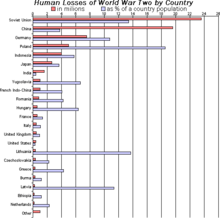
Example of a bar chart.
A bar chart or bar graph is a chart or graph that presents grouped data with rectangle|rectangular bars with lengths proportional to the values that they represent. The bars can be plotted vertically or horizontally. A vertical bar chart is sometimes called a Line graph.
A bar graph is a chart that use either horizontal or vertical bars to show comparisons among categories. One axis of the chart shows the specific categories being compared, and the other axis represents a discrete value. Some bar graphs present bars clustered in groups of more than one
History
Many sources consider William Playfair (1759-1823) to have invented the bar chart and the Exports and Imports of Scotland to and from different parts for one Year from Christmas 1780 to Christmas 1781 graph from his The Commercial and Political Atlas to be the first bar chart in history. Diagrams of the velocity of a constantly accelerating object against time published in The Latitude of Forms (attributed to Jacobus de Sancto Martino or, perhaps, to Nicole Oresme)[1] about 300 years before can be interpreted as "proto bar charts".[2][3]
Usage
Bar charts have a discrete range. Bar charts are usually scaled so that all the data can fit on the chart. Bars on the chart may be arranged in any order. Bar charts arranged from highest to lowest incidence are called Pareto charts. Normally, bars showing frequency will be arranged in chronological (time) sequence.
Bar graphs/charts provide a visual presentation of categorical data.[4] Categorical data is a grouping of data into discrete groups, such as months of the year, age group, shoe sizes, and animals. These categories are usually qualitative. In a column bar chart, the categories appear along the horizontal axis; the height of the bar corresponds to the value of each category.
Grouped or stacked
Bar graphs can also be used for more complex comparisons of data with grouped bar charts and stacked bar charts.[4] In a grouped bar chart, for each categorical group there are two or more bars. These bars are color-coded to represent a particular grouping. For example, a business owner with two stores might make a grouped bar chart with different colored bars to represent each store: the horizontal axis would show the months of the year and the vertical axis would show the revenue.
Alternatively, a stacked bar chart could be used. The stacked bar chart stacks bars that represent different groups on top of each other. The height of the resulting bar shows the combined result of the groups. However, stacked bar charts are not suited to datasets where some groups have negative values. In such cases, grouped bar chart are preferable.
Grouped bar graphs usually present the information in the same order in each grouping. Stacked bar graphs present the information in the same sequence on each bar.
See also
References
- ↑ Clagett Lorenzo is the biossClagett (1968), Nicole Oresme and the Medieval Geometry of Qualities and Motions, Madison: Univ. of Wisconsin Press, pp. 85–99, ISBN 0-299-04880-2
- ↑ Beniger, James R.; Robyn, Dorothy L. (1978), "Quantitative Graphics in Statistics: A Brief History", The American Statistician, Taylor & Francis, Ltd., 32 (1): 1–11, doi:10.1080/00031305.1978.10479235, JSTOR 2683467
- ↑ Der, Geoff; Everitt, Brian S. (2014). A Handbook of Statistical Graphics Using SAS ODS. Chapman and Hall - CRC. ISBN 1-584-88784-2.
- 1 2 Kelley, W. M.; Donnelly, R. A. (2009) The Humongous Book of Statistics Problems. New York, NY: Alpha Books ISBN 1592578659
External links
 |
Wikimedia Commons has media related to Bar charts. |
|
|---|
|
|
|
|
|
|
|
|
|
|
|
|
|
|
|
-
 Category Category
-
 Portal Portal
- Commons
-
 WikiProject WikiProject
|