Fraktur
| Latin script (Fraktur hand) | |
|---|---|
 | |
| Type | |
| Languages | German¹ and some other European languages |
Time period | 16th – mid-20th centuries |
Parent systems |
Blackletter
|
Child systems | Kurrentschrift, including Sütterlin |
Sister systems | See Blackletter |
| Direction | Varies |
| ISO 15924 |
Latf, 217 |
0020–00FF² | |
Fraktur (German: [fʀakˈtuːɐ]) is a calligraphic hand of the Latin alphabet and any of several blackletter typefaces derived from this hand. The blackletter lines are broken up; that is, their forms contain many angles when compared to the smooth curves of the Antiqua (common) typefaces modeled after antique Roman square capitals and Carolingian minuscule. From this, Fraktur is sometimes contrasted with the "Latin alphabet" in northern European texts, which is sometimes called the "German alphabet", despite simply being a typeface of the Latin alphabet. Similarly, the term "Fraktur" or "Gothic" is sometimes applied to all of the blackletter typefaces (known in German as Gebrochene Schrift, "Broken Script").
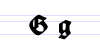
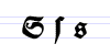
Here is the English alphabet in Fraktur:
𝕬 𝕭 𝕮 𝕯 𝕰 𝕱 𝕲 𝕳 𝕴 𝕵 𝕶 𝕷 𝕸 𝕹 𝕺 𝕻 𝕼 𝕽 𝕾 𝕿 𝖀 𝖁 𝖂 𝖃 𝖄 𝖅
𝖆 𝖇 𝖈 𝖉 𝖊 𝖋 𝖌 𝖍 𝖎 𝖏 𝖐 𝖑 𝖒 𝖓 𝖔 𝖕 𝖖 𝖗 𝖘 𝖙 𝖚 𝖛 𝖜 𝖝 𝖞 𝖟
The word derives from the past participle fractus ("broken") of Latin frangere ("to break"); the same root as the English word "fracture".
Characteristics
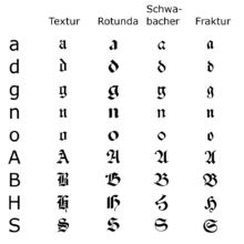
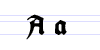
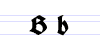
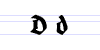
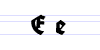
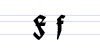
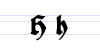
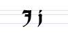
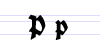
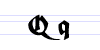
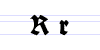
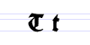
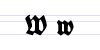
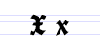
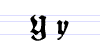
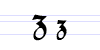
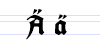
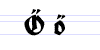
Besides the 26 letters of the Latin alphabet, Fraktur includes the ß (Eszett [ɛsˈtsɛt]), vowels with umlauts, and the ſ (long s). Some Fraktur typefaces also include a variant form of the letter r known as the r rotunda, and many a variety of ligatures which are left over from cursive handwriting and have rules for their use. Most older Fraktur typefaces make no distinction between the majuscules "I" and "J" (where the common shape is more suggestive of a "J"), even though the minuscules "i" and "j" are differentiated.
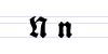
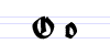
One difference between the Fraktur and other blackletter scripts is that in the lower case o, the left part of the bow is broken, but the right part is not. In Danish texts composed in Fraktur, the letter ø was already preferred to the German and Swedish ö in the 16th century.[1]
Origin
The first Fraktur typeface arose in the early 16th century, when Emperor Maximilian I commissioned the design of the Triumphal Arch woodcut by Albrecht Dürer and had a new typeface created specifically for this purpose, designed by Hieronymus Andreae. Fraktur types for printing were established by the Augsburg publisher Johann Schönsperger at the issuance of a series of Maximilian's works such as his Prayer Book (Gebetbuch, 1513) or the illustrated Theuerdank poem (1517).
Fraktur quickly overtook the earlier Schwabacher and Textualis typefaces in popularity, and a wide variety of Fraktur fonts were carved and became common in the German-speaking world and areas under German influence (Scandinavia, the Baltic states, Central Europe). In the 18th century, the German Theuerdank Fraktur was further developed by the Leipzig typographer Johann Gottlob Immanuel Breitkopf (Breitkopf Fraktur). While over the succeeding centuries, most Central Europeans switched to Antiqua, German-speakers remained a notable holdout.
Use
Typesetting in Fraktur was still very common in the early 20th century in all German-speaking countries and areas, as well as in Norway, Estonia, and Latvia, and was still used to a very small extent in Sweden, Finland and Denmark,[2] while other countries typeset in Antiqua in the early 20th century. Some books at that time used related blackletter fonts such as Schwabacher; however, the predominant typeface was the Normalfraktur, which came in slight variations.
.jpg)
From the late 18th century to the late 19th century, Fraktur was progressively replaced by Antiqua as a symbol of the classicist age and emerging cosmopolitanism in most of the countries in Europe that had previously used Fraktur. This move was hotly debated in Germany, where it was known as the Antiqua–Fraktur dispute. The shift affected mostly scientific writing in Germany, whereas most belletristic literature and newspapers continued to be printed in broken fonts.
The Fraktur typefaces were in heavy use in Nazi Germany, when they were initially represented as true German script; official Nazi documents and letterheads employed the font, and the cover of Hitler's Mein Kampf used a hand-drawn version of it.[5] (However, ironically, the typefaces most popular in Nazi Germany, especially for running text as opposed to decorative uses such as in titles, were actually the more modernized fonts of the Gebrochene Grotesk type such as Tannenberg, designed in the early 20th century, mainly the 1930s, as grotesque versions of blackletter typefaces.) The press was scolded for its frequent use of "Roman characters" under "Jewish influence" and German émigrés were urged to use only "German script".[6] This radically changed on January 3, 1941, when Martin Bormann issued a circular to all public offices which declared Fraktur (and its corollary, the Sütterlin-based handwriting) to be Judenlettern (Jewish letters) and prohibited their further use.[7] German historian Albert Kapr has speculated that the régime had realized that Fraktur would inhibit communication in the territories occupied during World War II.[8]
Fraktur traditions after 1941
Even with the abolition of Fraktur, some publications include elements of it in headlines.
Very occasionally, academic works still used Fraktur in the text itself. Notably, Joachim Jeremias' work "Die Briefe an Timotheus und Titus" (The Letters of Timothy and Titus) was published in 1963 using Fraktur. More often, some ligatures ch, ck from Fraktur were used in antiqua-typed editions.
That continued mostly up to the offset type period.
Fraktur saw a brief resurgence after the War, but quickly disappeared in a Germany keen on modernising its appearance.
Fraktur is today used mostly for decorative typesetting: for example, a number of traditional German newspapers such as the Frankfurter Allgemeine, as well as the Norwegian Aftenposten, still print their name in Fraktur on the masthead (as indeed do some newspapers in other European countries) and it is also popular for pub signs and the like. In this modern decorative use, the traditional rules about the use of long s and short s and of ligatures are often disregarded.
Individual Fraktur letters are sometimes used in mathematics, which often denotes associated or parallel concepts by the same letter in different fonts. For example, a Lie group is often denoted by G, while its associated Lie algebra is . A ring ideal might be denoted by while an element is . The Fraktur is also used to denote the cardinality of the continuum of the real line. In model theory, is used to denote an arbitrary model, with A as its universe.


Fraktur in Unicode
In Unicode, Fraktur is treated as a font of the Latin alphabet, and is not encoded separately. The additional ligatures that are required for Fraktur fonts will not be encoded in Unicode.[9] Instead, Unicode proposes to deal with these ligatures using smart-font technologies such as OpenType, AAT or Graphite. There are many Fraktur fonts that do not use smart-font technologies, but use their own legacy encoding instead that is not compliant with Unicode.
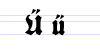
There are Fraktur symbols in the Unicode blocks of mathematical alphanumeric symbols, letterlike symbols, and Latin E. However, these are meant to be used only in mathematics.[10] Therefore, letters such as long s, ä, ö, ü, and ß, which are not used in mathematics, are excluded.
𝔄𝔅ℭ𝔇𝔈𝔉𝔊ℌℑ𝔍𝔎𝔏𝔐𝔑𝔒𝔓𝔔ℜ𝔖𝔗𝔘𝔙𝔚𝔛𝔜ℨ 𝔞𝔟𝔠𝔡𝔢𝔣𝔤𝔥𝔦𝔧𝔨𝔩𝔪𝔫𝔬𝔭𝔮𝔯𝔰𝔱𝔲𝔳𝔴𝔵𝔶𝔷 ꬲꬽ
Typeface samples


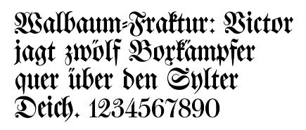
In the figures below, the German sentence that appears after the names of the fonts (Walbaum-Fraktur in Fig. 1 and Humboldtfraktur in Fig. 2) reads, "Victor jagt zwölf Boxkämpfer quer über den Sylter Deich". It means "Victor chases twelve boxers across the Sylt dike" and contains all 26 letters of the alphabet plus the umlauted glyphs used in German, making it an example of a pangram.

See also
|
References
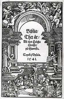
- ↑ Cf., inter alia, Bibla: Det er den gantske Hellige Scrifft: udsæt paa Danske. 1550. (Danish) & Biblia: Det er Den gantske Hellige Scrifft paa Danske igien offuerseet oc prentet effter vor allernaadigste herris oc Kongis K. Christian den IV. Befaling. 1633. (Danish)
- ↑ In Denmark in 1902 the percentage of printed material using antiqua amounted to 95% according to R. Paulli, "Den sejrende antikva", i: Det trykte Ord, published by Grafisk Cirkel, Copenhagen, 1940.
- ↑ R. Paulli, "Den sejrende antikva", i: Det trykte Ord, published by Grafisk Cirkel, Copenhagen, 1940.
- ↑ Rem, Tore (2009). "Materielle variasjoner. Overgang fra fraktur til antikva i Norge". In Malm, Mats; Sjönell, Barbro Ståhle; Söderlund, Petra. Bokens materialitet: Bokhistoria och bibliografi. Stockholm: Svenska Vitterhetssamfundet. ISBN 978-91-7230-149-8.
- ↑ "1941: The Nazis ban Jewish fonts". historyweird.com. Retrieved 2015-11-21.
- ↑ Eric Michaud, The Cult of Art in Nazi Germany, tr. Janet Lloyd, Stanford, California: Stanford University Press, 2004, ISBN 9780804743266, pp. 215–16 and Plate 110.
- ↑ Facsimile of Bormann's Memorandum (in German)
The memorandum itself is typed in Antiqua, but the NSDAP letterhead is printed in Fraktur.
"For general attention, on behalf of the Führer, I make the following announcement:
It is wrong to regard or to describe the so-called Gothic script as a German script. In reality, the so-called Gothic script consists of Schwabach Jew letters. Just as they later took control of the newspapers, upon the introduction of printing the Jews residing in Germany took control of the printing presses and thus in Germany the Schwabach Jew letters were forcefully introduced.
Today the Führer, talking with Herr Reichsleiter Amann and Herr Book Publisher Adolf Müller, has decided that in the future the Antiqua script is to be described as normal script. All printed materials are to be gradually converted to this normal script. As soon as is feasible in terms of textbooks, only the normal script will be taught in village and state schools.
The use of the Schwabach Jew letters by officials will in future cease; appointment certifications for functionaries, street signs, and so forth will in future be produced only in normal script.
On behalf of the Führer, Herr Reichsleiter Amann will in future convert those newspapers and periodicals that already have foreign distribution, or whose foreign distribution is desired, to normal script". - ↑ Kapr, Albert (1993). Fraktur: Form und Geschichte der gebrochenen Schriften. Mainz: H. Schmidt. p. 81. ISBN 3-87439-260-0.
- ↑ http://www.unicode.org/faq/ligature_digraph.html#7
- ↑ Unicode Consortium. "Ligatures, Digraphs, Presentation Forms vs. Plain Text".
Further reading
- Bain, Peter and Paul Shaw. Blackletter: Type and National Identity. Princeton Architectural Press: 1998. ISBN 1-56898-125-2.
- Silvia Hartmann: Fraktur oder Antiqua. Der Schriftstreit von 1881 bis 1941, Peter Lang, Frankfurt am Main u. a. 1998 (2. üb. A. 1999), ISBN 978-3-631-35090-4
- Fiedl, Frederich, Nicholas Ott and Bernard Stein. Typography: An Encyclopedic Survey of Type Design and Techniques Through History. Black Dog & Leventhal: 1998. ISBN 1-57912-023-7.
- Macmillan, Neil. An A–Z of Type Designers. Yale University Press: 2006. ISBN 0-300-11151-7.
External links
- A complete Fraktur chart
- (German) Website of Dieter Steffmann, which has a large number of digitized Fraktur fonts
- Blackletter: Type and National Identity
- (German) Delbanco: German Purveyors of Fraktur fonts (commercial)
- Setting up Microsoft Windows NT, 2000 or Windows XP to support Unicode supplementary characters
- UniFraktur: Free Unicode-compliant Fraktur fonts and resources
Typography terminology | |||||||||||||||
|---|---|---|---|---|---|---|---|---|---|---|---|---|---|---|---|
| Page | |||||||||||||||
| Paragraph | |||||||||||||||
| Character |
| ||||||||||||||
| Classifications |
| ||||||||||||||
| Punctuation | |||||||||||||||
| Typesetting | |||||||||||||||
| Typographic units | |||||||||||||||
| Digital typography |
| ||||||||||||||
| Related | |||||||||||||||
| |||||||||||||||